Tag Archives: United States

Breaking news from mobile to Twitter/Seesmic – perfect example of how it works

Possibly one of the best example of how newspaper websites aren’t tapped in at all when it comes to reporting breaking news via mobile devices.

Mark Comerford makes the point by highlighting his Twitter buddy @documentally who crashed his Landrover this morning and recorded the events on Twitter and through Seesmic. Thankfully, no-one was hurt (the vehicle has more than a few scars though) and friends on the social network were able to help provide information on recovery services.

The compelling factor was that Mark blogged all the events, linking to the Tweets and video, pretty-much in real time as things were unfolding.

Breaking news events have been documented like this before across Twitter – news groups in the US have also used the immediacy of these services to good effect, especially for last year’s fires in California – but have you ever seen a newspaper, national, regional or local, in the UK ever try this out for their rolling news stories getting people coming back again and again for updates?

Thought not.

Journalism.co.uk: Spokesman-Review uses interactive map to help readers in weather emergency

A US newspaper has added a new element to the coverage of local weather emergencies by developing a interactive map to assist affected readers.

The Spokesman-Review
, in Washington State, developed the Help Your Neighbors scheme to match readers’ offers of help with those needing assistance by plotting their locations on an interactive map.

The project was conceived as a quick response to sudden snow fall and effectively turned the paper into an extra emergency service, editor Steve Smith told Journalism.co.uk.

Read more… 

Innovations in Journalism – ReportingOn

reporting on image

1) Who are you and what’s it all about?

I’m Ryan Sholin, I work at GateHouse Media in the US, I’m a graduate student at San Jose State University working on a degree in Mass Communications, and I’ve been blogging at ryansholin.com for three years now, mostly about the future of newspapers and journalism education.

The idea for ReportingOn came to me as I saw more and more tools for journalists to share what they were reading, but very few to share what they were writing.

I’m all for aggregating links and social bookmarking – I use Google Reader, Delicious, and even Twitter as my filters for the onslaught of information and news out there on the Web – but I saw two key connections left to be made.

The first connection links reporters with a common beat to one another. If I’m reporting on local alternative energy start-ups in Silicon Valley, and you’re reporting on local alternative energy start-ups in Boston, we could mutually benefit from sharing angles and ideas.

The second connection links readers with beat reporters. If readers find themselves wishing for more reporting on local alternative energy start-ups in general, there should be a place to express that.

So I call ReportingOn “the backchannel for your beat.”

This isn’t about the craft of journalism – this is about the nuts and bolts of finding angles, sources, and data to bolster local news reporting.

2) Why would this be useful to a journalist?

Sometimes in newsrooms, we find ourselves isolated from the rest of the journalism world. Our local peers are often the competition. When we meet up with colleagues from out of town, it’s at conferences or email lists or websites based on methods and craft, but rarely actual reporting.

ReportingOn will give journalists an easy way to connect with others working the same beat across the state or across the continent.

3) Is this it, or is there more to come?

Oh, there’s more to come.

What’s live right now is a simple script that ties into Twitter. Anyone with a Twitter ID can send a tweet to reportingon (@reportingon in Twitter parlance) and it will show up at reportingon.com and in the reportingon Twitter stream.

The next step will be a site, most likely built in Drupal, where any journalist can sign up and post short updates that answer the question “What are you reporting on?”

The fun part is surfacing the replies in a way that makes it easy to find your peers. The taxonomy system in a CMS like Drupal makes it simple to surface, for example, all the posts about alternative energy. Meeting pods are essentially a little room within a room. They are primarily used for meetings, hence the name, but can be used for all kinds of purposes. These meeting pods come in all shapes and sizes to meet different needs. Pods can be open like the office itself or closed off for privacy and confidentiality. Closed pods are more beneficial because of their natural soundproofing. Open pods still have some basic level of soundproofing, so people can still hold private conversations. privacy phone booth

So imagine a site where the front page has a few lists: recent posts, recent topics, and popular topics.

The ‘popular topics’ list might have entries like: “231 journalists are reporting on alternative energy”. Clicking on 231 gets you a list of the journalists; clicking on alternative energy takes you to the page where everything posted about alternative energy is aggregated.

A second piece of the site will allow “readers” to vote on what topics they would like to see more … reporting on.

Once the site is built and users are showing up, I could see adding a Facebook application that would let users display recent posts from the topic of their choice on their Facebook profile.

4) Why are you doing this?

I saw a need to connect reporters to each other. So much local news lacks context, lacks a clear idea of where a local event fits into a larger trend, whether we’re talking about drunken driving or school funding or foreclosures.

Twitter has been a big inspiration, as well. I’ve been impressed at how casual, public conversation can be packed with information and benefit to anyone willing to ask questions and give answers freely.

Plus, I’m planning to launch the next stage of ReportingOn as a part of the requirements to finish my graduate degree.

5) What does it cost to use it?

Absolutely nothing.

6) How will you make it pay?

This is a non-profit endeavour as far as I’m concerned. That said, I’m actively looking for grants to help with server costs, advertising, and promotion.

Google News search gets local

Google News has developed a new feature that enables searches for location-specific news. Users can now search for items by the name of any city, state or country, or by zip code in the US .

The service is currently only available for news items in English and will promote local sources for local stories in search results, a blog post from Google software engineers Andre Rohe and Rohit Ananthakrishna says. Reklama: Sidabriniai žiedai https://www.silvera.lt/ziedai

“We’re not simply looking at the byline or the source, but instead we analyze every word in every story to understand what location the news is about and where the source is located,” write Rohe and Ananthakrishna on the Google News blog.

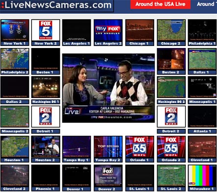
Fox News TV aggregated through LiveNewsCameras.com

LiveNewsCameras.com image

LiveNewsCameras.com is a site that streams all the feeds of Fox News affiliated stations across the US (it even includes the UK’s Sky News) from a single destination.

According to Lost Remote, the site is the brainchild of the team at Fox Chicago who had the idea to show the wider-world the feeds they look at all day in the studio.

The site also has a moderator who explains what’s going on and what’s about to happen through a web cam, there is also a Twitter feed embedded into the page for extra updates.

Multimedia collaborations provide Super Tuesday coverage online

Yesterday was just plain pancake day in the UK, but over the water it was Super Tuesday, as 24 of America’s 50 states voted on which candidates should be put forward for the country’s presidential election in November.

The coverage of the day’s events online saw some innovative multimedia and collaborative efforts from new and existing media outlets:

Mapping

Results + different time zones + different states = a great opportunity for breaking news displayed on mashed-up maps.

Google got in on the action with a map displaying live results and, with the help of Twitter and Twittervision, ‘tweets’ from across the US to give instant reactions from voters.

In another partnership with YouTube, as part of the site’s You Choose ’08 channel, Google is aggregating videos and clips from news organisations, candidates and users about Super Tuesday and plotting them on a Google map.

Elsewhere the BBC’s results map, which features as part of a broader election section, gives an easily navigable, state-by-state guide to the figures.

New collaboration

Publish2 launched a bookmarking system for newsrooms, bloggers and journalists, to create an aggregation service. Interested parties were asked to register for a free account and create a specific tag they would use – these tagged items can then be turned into a news feed by Publish2 to be repurposed on the tagger’s site.

Here’s an overview of the Networked Newsrooms idea or, to see it in action, visit the Knoxville News Sentinel or the New Jersey News Herald.

Video

Newsweek and The Washington Post teamed up for a five hour live webcast, encouraging viewers to react in a live webchat. Meanwhile The Huffington Post produced handheld footage from a Barack Obama rally in New York in the build-up to Tuesday and a live blog of the actual event.

MTV sent 23 of its ‘street team’ of citizen journalists to cover the polls and upload footage from video cameras and mobile phones. The clips are being distributed through MTV Mobile, Think.MTV.com and the Associated Press‘ online video network.

And finally – a slideshow…

…well, it’s much more than that really – De Volkskrant created an all-singing, all-dancing ‘slideshow’ with music, text, links, audio analysis and video giving an overview of the candidates, as well as a live results page for Tuesday’s results.

Huff Post launches interactive map of US campaign funding

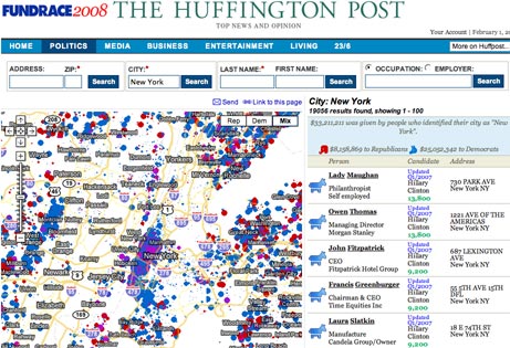
The Huffington Post has launched a mash-up feature that details all contributions made to the US presidential campaigns on an interactive map.

The FundRace feature visually details how US cities, neighbourhoods and blocks are donating to different campaigns.

Image of Fundrace Map

It uses a searchable mash-up of data from Federal Election Commission on a Google Map, allowing users to search for the names, addresses and amounts pledged by all campaign contributors.

The tool allows users to take a birds-eye view of campaign funding or to drill down to specific neighbourhoods.

It follows a growing tradition of US news and opinion sites making use of freely available public information by taking raw data and displaying it visually on interactive maps. Chicagocrime.org was the first exponent of this visual approach to news when it started putting crime data on maps. It was quickly copied across the nation.

The trend has even spread across the Atlantic, although the impact in the UK will be more limited because the majority of public information is, somewhat perversely, not easily accessible by the public and has to be applied for under the Freedom of Information Act.

In addition to just mapping donations, the new Huffington Post feature also offers a widget for Facebook and a big donor feature highlighting which of the great and good of American life are stumping up cash for the campaigns.

Image of Fundrace donors

Yahoo: US papers grew online audience 6 per cent last year

According to data released by Newspaper Association of America and compiled by Nielsen Online, the online readership of US newspapers grew about 6 per cent last year.

Online reach of newspapers grew to 38 per cent of all active online users, up from 36 percent in 2006.

Newspapers had an average of 60 million unique US visitors per month in 2007, up from 56.4 million the year before.

Washington Post maps local blog coverage

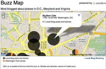
The Washington Post has created a map of local blog coverage as part of its local blogs directory.

The Buzz Map, which has been developed in partnership with Outside.in, plots the most blogged about stories and issues by location and provides links to this coverage, as wells as WaPo articles on the topics. The bigger the circle on a location, the more blogging there’s been about that spot.

buzz-map.jpg

According to a blog post from Outside.in, the map shows the top 10 locations ‘based on overall volume over the past week’.

Outside.in sees mutual benefits from the project: “The Post gets an easy way of integrating blog content onto its pages, and the blogs get traffic from — and the fun of appearing on — the Washington Post’s pages.”

What’s more, says Outside.in, creating the WaPo’s map ‘takes five minutes’ – so expect similar blog mapping to be rolled out on other US newspaper sites in the not too distant future.

Milwaukee Sentinel Journal shows off its video production

US paper the Milwaukee Sentinel Journal has produced a video for the Associated Press Photo Managers Association of exploring the Journal’s use of video online.

The footage shows the results of three professional editing suites recently installed at the Journal and the training in editing techniques received by reporters, photographers and online production staff.

From the video explanation it is clear that the Journal sees the medium as just another vehicle for storytelling – one that can, in certain news situations, be more appropriate than just text, slideshows and images.

Using footage to cover local arts news gives clarity to concepts that might be complicated by text coverage. Similarly ideas such as their technology review show are a simple way to engage on a personal level with your readers.

A surge in video on the site does not mean the paper is abandoning other reporting techniques – something that will soothe new media journalist Pat Thornton, whose latest blog post urges newspaper sites to only use video when the quality is there.

“You could have a totally modern news site without video, and video will not suddenly transform your site into something modern. Be smart with your resources, because the industry doesn’t have a lot of room for error,” warns Thornton in the post.