Tag Archives: USA

Eight lessons for publishers from comScore’s new report on mobile

Mobile devices account for nearly 7 per cent of web browsing in the US, according to a new report by comScore.

In the UK it has been predicted that mobile browsing will overtake desktop browsing in 2013.

Although the comScore study is based on US device use, it has lessons for UK publishers as they consider mobile-friendly websites, smartphone and tablet apps and the potential revenue from relatively new products such as iPad magazines.

Here are eight key facts for publishers from the latest comScore study on internet use on mobile devices:

1. Mobile devices account for 7 per cent of US web traffic

Around half of the US population uses the internet on a mobile device, which has increased by almost 20 per cent in the past year.

2. Two thirds of browsing on mobile devices takes place on phones; one third on tablets

Two thirds of the 6.8 per cent of mobile web traffic took place on phones during August; one third of that figure took place on tablets.

3. iPads account for nearly 98 per cent of US tablet market

iPads dominate among tablets in the US, accounting for 97.2 per cent of all web tablet traffic.

4. iPad web browsing has overtaken iPhone browsing

iPads have begun to overtake iPhones in being used for web browsing. iPad browsing accounts for 46.8 per cent of iOS internet use, 42.6 per cent takes place on iPhones.

5. People are increasingly using WiFi for mobile phone web browsing

The study found that more than one third of mobile phone web browsing took place via WiFi in August. Conversely, people are increasingly using tablets, which traditionally required a WiFi connection to access the internet, to connect via mobile broadband. In August, nearly 10 per cent of traffic from tablets occurred via a mobile network connection.

6. Nearly 60% of tablet owners use the devices to consume news

Three out of five tablet owners consume news on their tablets.

7. A quarter of those who read news on a tablet do so daily

One in four tablet users consume news on a tablet do so on a near-daily basis

8. iPhones and iPads dominate, nearly one third of mobile web users have an Android device and just 5 per cent use a BlackBerry

Apple devices such as the iPhone and iPad accounted for nearly 60 per cent of the mobile web browsing; Google Android just over 30 per cent, BlackBerry RIM just 5 per cent, and other platforms nearly 5 per cent.

In a release, Mark Donovan, senior vice president of mobile at comScore said the findings show an “explosion in digital media consumption”, labelling those in the use of connective devices as “digital omnivores”, consumers who access content through several touchpoints during the course of their daily digital lives.

He said:

In order to meet the needs of these consumers, advertisers and publishers must learn to navigate this new landscape so they develop cross-platform strategies to effectively engage their audiences.

There are 10 facts on the UK mobile market published in June here.
Winners announced: Dart Awards for coverage of trauma

The winners of the 2011 Dart Awards, which recognise outstanding reporting that portrays traumatic events with accuracy, insight and sensitivity by US media outlets, have been announced.

The Boston Globe won for “A tormenting problem: An exploration of new-age bullying“, the Dallas Morning News for “Private battles“, NPR with the Center for Public Integrity for “Seeking justice in campus rapes“, and NPR with ProPublica for “Brain wars: How the military is failing its wounded“.

The Arkansas Democrat-Gazette and WLRN reined honourable mentions.

Set up by Columbia University Graduate School of Journalism in 1995, the award programme is open to teams with winning teams receiving a $5,000 cash prize.

Beet.TV: Senior VP for strategy and operations on BBC News website’s US edition

Miranda Cresswell, senior vice president for strategy and operations at BBC Online speaks to Beet.TV about the new US edition of the broadcaster’s news website:

“The impetus for the US edition of BBC news is really about building on momentum as a business (…) BBC is one of the world’s greatest story tellers and we tell incredible stories through news video (…) So video is really at the centrepiece of what we’re doing.”

Editor&Publisher: Politico content-sharing network attracts 67 newspapers

Politico’s content-sharing network, launched only three months ago, has signed up more than 100 partners, including 67 newspapers.

The agreement will make Politico’s online political news content available in return for ad placement on partners’ sites.

US Elections: Guardian rolls out special homepage

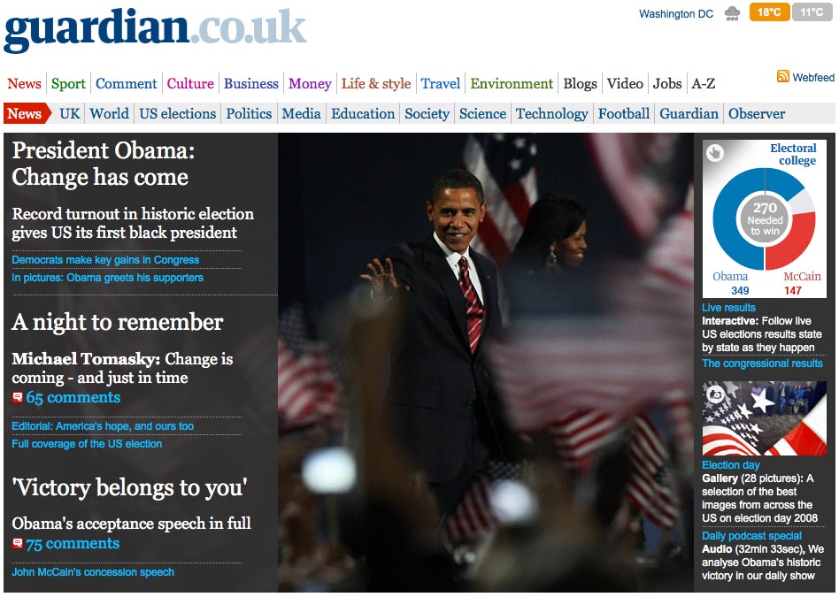
To complement its liveblogged coverage of election day, which is still going at time of writing, Guardian.co.uk has changed its homepage design to the below:

This is a template that could be used for other major news events. As BBC News online editor Steve Herrmann told Journalism.co.uk earlier this week the election has been a great opportunity for news sites to experiment with coverage and layout, developing features for future use.

US elections: CNN’s ‘magic map’ gets spoofed on Saturday Night Live

While reviewing the best online coverage of election day, CNN’s press office dropped us a line about the ‘magic board’ – a map of the states which will be used by presenter John King to show the results and forecasts as they come in.

For anyone who loves/loathes a good swing-o-meter, here’s Saturday Night Live’s take on it:

US elections: the best of the rest on the web

For those that have been under a rock/on Mars for the last year, the next President of the United States will be decided tonight, giving news organisations another opportunity to flaunt their interactive, live reporting and user-generated wares as the votes unfold.

We’ve already covered Sky News’ election coverage and BBC News’ live online plans, but here’s our round-up of some of the best projects out there – open up twenty browser tabs, sit back and enjoy:

  • NYTimes.com: the paper has set up a political ‘word train’ visualising how readers are feeling. It’ll update with new answers every 30 minutes (thanks to @matthewbuckland for the link). Elsewhere the site’s homepage is dominated by election coverage, with plenty of images and video – making use of the new video player – and a pop-up results widget.
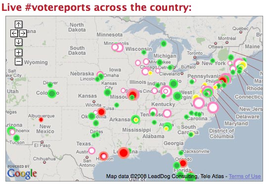
  • Twitter Vote Report: the microblogging tool has been harnessed by a network of volunteers to map voters’ experiences at the polls. Tweets tagged with waiting times (e.g. #wait 120 for a 120 minute delay) are plotted creating a rapidly updating map of problems. Could be a great service for local newspapers in the states to provide:

  • Yahoo: created a one-stop shop, US election microsite drawing together all of its features, including forums, Yahoo Answers, AP and Politico stories and aggregated content from external news sites, a Flickr stream of photos and options to set up news alerts on the candidates.
  • Hubdub: the just-for-fun news prediction site is carrying an election forecast map, which it claims is based on ’51 underlying prediction markets that respond in real-time to breaking news’. Users can view forecasts state-by-state to help them decided where to place their Hubdub dollars when predicting the outcome of questions such as ‘Who will win the 2008 US Presidential Election?’ and ‘What will be the margin of victory in the state of Ohio?’

That’s not enough, I hear you cry. You want more? Well, over at paidContent:UK, Robert Andrews has wrapped up the online coverage from the UK’s newspapers, while Online Journalism Blog chieftain Paul Bradshaw has an extensive list of online activities.

This is only the tip of the iceberg – any other great coverage, tools or websites that need a mention, let us know below.

New York Times opens ‘Visualization Lab’ online

Following the release of its first campaign finance API earlier this month, the New York Times is handing over even more of its data to users with the launch of the Visualization Lab.

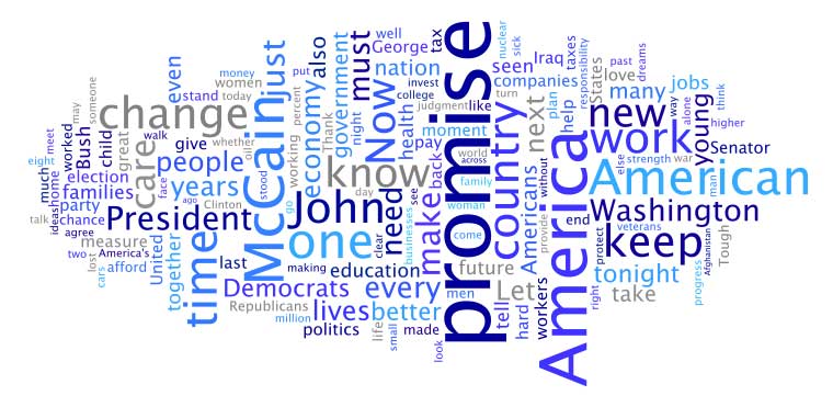
Using IBM’s ‘Many Eyes’ technology, the lab allows readers to experiment with different ways of visualising data sets from the Times, whether these are stats and figures included in articles or simply the words used in a speech reported in a news item.

Visualisation options, of which there are currently 17, range from graphs and maps, to word trees, for example:

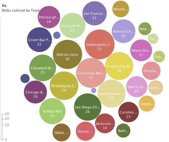
  • A bubble chart – such as the one below, created by us, which ranks US NFL teams by rushing yards (even though I’m not entirely sure what this is…)

According to an introductory post on the Time’s Open blog, the Visualization Lab is the first in a series of tools scheduled for release in the next few weeks both internally and for readers.