Category Archives: Data

How open data has changed journalism

Tomorrow (Saturday 3 December) is International Open Data Day. We have been asking what the open data movement has done for journalism.

Simon Rogers, editor of the Guardian’s Datablog and Datastore – @smfrogers

It’s only been a couple of years and you could argue that open data has changed the world: Wikileaks, government spending, what we know about the riots… The irony is that the governments behind much of this data have only contributed the numbers; the hard work has been done by an army of developers and data journalists who have created stories and new ways of telling them. When we started the Datablog in 2009, we thought it would be popular only with developers; now everyone wants to know the facts behind the news.

Nicola Hughes@DataMinerUK

It’s the knowing how to use it that’s vital. it’s a (re)source.

Borja Bergareche@borjabergareche

It’s helped us do the best journalism of the 20th century in the 21st century.

Lucy Chambers, community coordinator, Open Knowledge Foundation – @lucyfedia

Evidence-based journalism. Journalists will back up stories, readers will expect to be able to verify facts.

Andrew Gregory@andrew__gregory

Open data is useful. But original journalism also requires good human sources.

Rune Ytreberg –  @ytreberg

The obvious: Open data has made journalism more transparent.

Megan Cunningham@megancunningham

Open data has accelerated the opportunities for crowd sourced investigative journalism. But the potential hasn’t been realised.

Harriet Minter@Harriet_Minter

It’s forced journalists to embrace spreadsheets, brought interactives to the forefront and given us many bad infographics.

Greg Hadfield@GregHadfield (who is organising the UK’s first open-data cities conference)

Data – whether open or not – has always fuelled journalism. Data that is increasingly “open” (in the fullest sense of the term) will transform journalism.

Ironically, a lot of the best revelatory journalism of the past has depended on journalists unearthing data (ie “stuff”) that others want to keep locked. Ideally, by lawful means. Therefore, openness may remove some of the mystique that journalists delight in, as people who know things that only those “in the know” know.

An open-data tsunami will mean that more journalism will be about interpreting – and putting into context – data that is open to all, at least in its rawest, unrefined form.

To an even greater degree, journalism will be about adding value to data by transforming it into information. The best journalism will be to add value to information, to provide insight, even wisdom.

Openness of data will change the behaviour of individuals and organisations. But not immediately and not in every case. Would MPs have played fast and loose with their expenses if they knew data about each claim would be published openly and in real time? Sad to say, it is quite possible some would.

Much good journalism has involved shedding light on data that was routinely (although not widely) available and which was only rarely studied or analysed.

Importantly, some of the best journalism has involved making connections and spotting patterns. I’m thinking of earlier parliamentary abuses, such as the “cash-for-questions” scandal of the mid-1990s, before Hansard was on the web, and when it was rarely read in print by journalists.

Those were the days when typewriters and telephones – rather than computers and the internet – were the primary journalistic tools. When bars and restaurants – rather than offices and desktops – were the venues for journalistic enterprise.

With more data openly available – along with more tools easily available for mining, sifting and interpreting it (as in the case of the Wikileaks material) – there are many more needles to be found in the burgeoning haystacks of unstructured data.

But even when every day is #Opendata Day, the best stories may remain hidden in full public view – until one of the new generation of journalists stumbles expertly across them.

UCLan project awarded £64,000 from Google to support ‘news entrepreneurs’

The University of Central Lancashire’s Journalist Leaders Programme has secured €75,000 (£64,000) of Google funding to support “news entrepreneurs” after being named as one of three winners of the International Press Institute’s News Innovation Contest.

The programme, founded by researcher, academic and consultant on newsroom and digital business innovation François Nel (pictured), will develop a project called Media and Digital Enterprise (MADE), to offer an “innovative training, mentoring and research programme”.

The funding awarded by IPI will be spent by the UCLan programme on working “to create sustainable news enterprises – whether for social or commercial purposes – by helping innovators”.

Nel told Journalism.co.uk MADE will “support the entire news ecosystem as we need innovation across the sector”.

He is now looking for people with entrepreneurial ideas who are interested in news innovation.

The other two winners of the contest are Internews Europe, a European non-profit organisation created in 1995 to help developing countries establish and strengthen independent media organisations to support freedom of expression and freedom of access to information, alongside the World Wide Web Foundation, a Swiss public charity founded by Sir Tim Berners-Lee, the inventor of the world wide web.

In February Google announced it was awarding $2.7 million to the Vienna-based IPI for its contest.

There were round 300 applicants, reduced first to 74 and then to 26 before the three winners were selected by a panel of seven judges, including journalism professor and commentator Jeff Jarvis.

The winners of the total fund of $600,000 were announced yesterday; Nel heard this morning how much the MADE project is being allocated, telling Journalism.co.uk “it’s fantastic to have support for news innovations”.

Nel and others working on the Leaders Programme have been working with news organisations, including Johnston Press, Trinity Mirror and the Guardian Media Group, looking at digital processes and innovative business models.

MADE allows us to pull those strands together and work with directly with news entrepreneurs. And we’re really excited about the possibility of putting this to the test.

Nel explained that MADE will “deliver good skills for a whole range of news start-ups” and he is now “looking to work with individuals, groups and companies, who are interested in news innovation” to get involved.

The project will help develop new skills and test the business plans, offering bespoke support to those with entrepreneurial ideas.

We’re looking to support five good people and good ideas for at least three months so that we can give those ideas legs.

The project includes various partners that were part of the bid, including one to build content and one to build communities.

Developers at ScraperWiki will be working with the project to develop innovations in data journalism and build content. Another partner is Sarah Hartley who is now working on the Guardian’s social, local, mobile project n0tice, with this area of the project focusing on building communities.

MADE will also involve Nel’s colleagues at Northern Lights, an award-winning business incubation space at UCLan.

The project also has an international element, involving groups in Turkey, drawing on Nel’s connections in the country.

Nel explained why the funding and ongoing support from IPU is vital.

In the digital news media space the cyber world is littered with start ups. The corpses of news start ups are every here. What we really need to do is help news entrepreneurs stay up and that’s what we are trying to do here.

Tool of the week for journalists – Playground, to monitor social media analytics

Tool of the week: Playground, by PeopleBrowsr.

What is it? A social analytics platform which contains over 1,000 days of tweets (all 70 billion of them), Facebook activity and blog posts.

How is it of use to journalists? “Journalists can easily develop real-time insights into any story from Playground,” PeopleBrowsr UK CEO Andrew Grill explains.

Complex keyword searches can be divided by user influence, geolocation, sentiment, and virtual communities of people with shared interests and affinities.

These features – and many more – let reporters and researchers easily drill down to find the people and content driving the conversation on social networks on any subject.

Playground lets you use the data the way you want to use it. You can either export the graphs and tables that the site produces automatically or export the results in a CSV file to create your own visualisations, which could potentially make it the next favourite tool of data journalists.

Grill added:

The recent launch of our fully transparent Kred influencer platform will make it faster and easier for journalists to find key influencers in a particular community.

You can give Playground a try for the first 14 days before signing up for one of their subscriptions ($19 a month for students and journalists, $149 for organisations and companies).

Jodee Rich, the founder of PeopleBrowsr, gave an inspiring speech at the Strata Summit in September on how a TV ratings system such as Nielsen could soon be replaced by social media data thanks to the advanced online analytics that PeopleBrowsr offers.


Playground’s development is based on feedback from its community of users, which has been very responsive. Ideas can be sent to contact[@]peoplebrowsr.com or by tweeting @peoplebrowsr.

#MozFest: Six lessons for journalists from the Mozilla Festival

The Mozilla Festival took place this weekend and provided journalists, open web developers and educators with a place to learn and to build.

Here are six tips from the festival, which was called media, freedom and the web.

1. In less than a week there will be a Data Journalism Handbook. Created in 48 hours with contributions from 55 people, the first draft was written at the festival and is due to be published next week. The book provides journalists the chance to get to grips and to learn from some of the key data journalists in the UK and abroad.

2. Journalists can now create web native, social video using Popcorn Maker. Take a video and add web content including tweets, Flickr photos and Google Street View images. This is a hugely exciting development in online video journalism.

3. Expect exciting developments in HTML5 news web apps. Developer Max Ogden presented a live web app in the final show tell which added photos tweeted by the audience with hashtag #MozFest. In real-time the images appeared in the app displayed on a large screen. This type of app has huge potential for news sites and user-generated content.

4. SMS may not seem like cutting edge technology but should not be ignored when it comes to engaging with the audience. Text messages can be automatically sent to Google Fusion Tables and uploaded manually or posted to a map in real-time. Here is an example where the company Mobile Commons enabled San Francisco public radio to map listeners’ earthquake readiness.

5. It will be worth keeping an eye on the five Knight-Mozilla technology fellows being placed in newsrooms at Al Jazeera English, the Guardian, the BBC, Zeit Online and the Boston Globe to see what is produced. Each news organisation selected an individual based on an area of journalism they wanted to develop. The five will now be embedded in the different newsrooms and tasked with bridging the gap between technology and the news.

6. Want to get to grips with HTML5 for journalists? Do you want to start coding but don’t know where to begin? The w3schools site offers guides to HTML, HTML5, CSS, PHP, Javascript. If you want to start scraping data then ScraperWiki, which allows you to scrape and link data using Ruby, Python and PHP scripts, has some hugely useful tutorials. If you simply want to take a look to see how HTML actually works within a webpage then Hackasaurus has an x-ray goggles tool to allow you to do just that.

There were several sessions, including on WordPress, trusting news sources, tools for a multilingual newsroom, online discussions, text edit for audio and real-time reporting, which were were unable to attend. Search for the #MozFest hashtag for further reports from the festival.

Photo by mozillaeu on Flickr. Some rights reserved.

#MozFest – First draft of new Data Journalism Handbook written in 48 hours

The first draft of a handbook to help journalists deal with data has been created this weekend, with plans for it to be published next week.

You can read the table of contents of the Data Journalism Handbook here.

The book was written in 48 hours at the Mozilla Festival in London, with contributions from 55 people, including staff from the BBC, Guardian and New York Times. It has six chapters and 20,000 words and is a response to a challenge set by Mozilla, a nonprofit technology company, to “assemble a utility belt for data-driven journalists”.

The challenge stated:

There’s increasing pressure on journalists to drive news stories and visualisations from data. But where do you start? What skills are needed to do data-driven journalism well? What’s missing from existing tools and documentation? Put together a user-friendly handbook for finding, cleaning, sorting, creating, and visualising data — all in service of powerful stories and reporting.

Jonathan Gray from the Open Knowledge Foundation and Liliana Bounegru, European Journalism Centre hosted sessions at the Mozilla Festival to create the handbook.

A blog post written by Gray lists some of the contributors

Interested in getting started in data journalism? Kevin Anderson is leading an introduction to data journalism one-day training course for Journalism.co.uk in January 2012.

Tool of the week for journalists – ZeeMaps, for interactive maps

Tool of the week: ZeeMaps

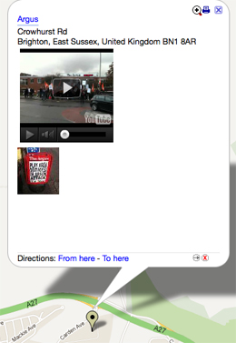
What is it? A free mapping tool that allows you to create interactive maps with videos and photos. ZeeMaps would be a great way of telling location-based visual stories such as of rioting, Occupy Wall Street protests and severe weather.

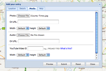
How is it of use to journalists? ZeeMaps allows you to create maps by uploading data sets or plotting the information using marker points, much as you would using the My Places option in Google Maps. You can then embed your map in a blog post or save as it as jpeg or pdf. It is free if you allow adverts, you can pay to go ad free.

Wired Digital is among the news organisations using the tool, according to a testimonial on the ZeeMaps site.

ZeeMaps takes the plotting marker points idea of Google Maps several steps further, allowing you to add photos, video and, using the wiki option, to collaborate and ask others to add information.

You can either upload data, such as from Google Docs, CSV, KML or Geo RSS feeds, or you can plot the information with markers, as you would using Google Maps, and then export the data as a CSV file.

In this example I added markers by hand to show newspaper offices, adding a photo and YouTube video for each. By setting a password I can ask others to contribute.


Another example is this one, which shows the location of electric vehicle charging points in Brighton. Rather than adding markers by hand, I uploaded a CSV file. Processing large data sets takes some time but ZeeMaps will helpfully send you an email to alert you when your map is ready.

Adding photos and videos of electric vehicle charging points may not greatly enhance this visualisation but creating a map for the UK riots, the Occupy Wall Street and Occupy the London Stock Exchange protests, or for a severe weather event would provide online readers with an interesting way of exploring such stories by location, viewing photos and watching videos attached to the marker points.

Visual.ly illustrates the evolution of open data

A recently launched tool to share data visualisations Visual.ly has created and shared a history of the open data movement.
Visual.ly allows news sites and blogs to embed the uploaded visualisations – in the true spirit of the open data movement.
The visualisation has a timeline on the evolution of APIs and the release of public data, including facts and figures on Data.gov.uk, a site where journalists can access and work with public data which launched in public beta in January last year.

Tool of the week for journalists – DocumentCloud, to analyse documents as data

Tool of the week:  DocumentCloud

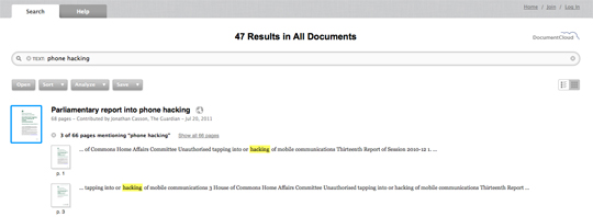
What is it? A platform to allow you to search and analyse documents as data.

DocumentCloud works by encouraging users to upload documents, it then pushes them through the Thomson Reuters-powered OpenCalais, a “toolkit of capabilities” that can be used by news sites for semantic analysis. Document sharing is good practice that many news desks have adopted and something all journalists should consider to enable data to be shared and searchable.

How is it of use to journalists? Journalists can search for keywords and analyse documents as data.

For example, try searching for “phone hacking” and you are presented with a series of parliamentary reports, the text of speeches and letters contributed by the Guardian, New York Times, the Lens and the Telegraph.

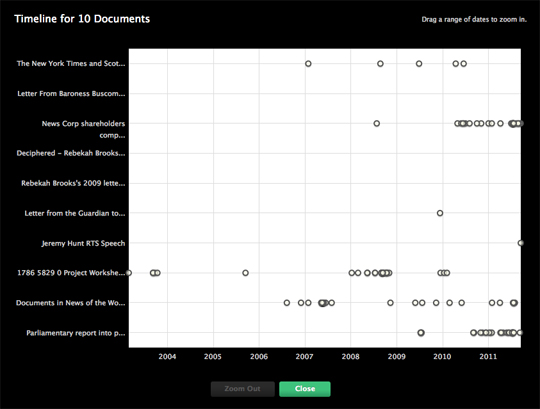
You can then dig deeper, view the documents on a timeline and find related documents.

Currybet: There is a lot of data journalism to be done on riots

In a blog post today (12 August), information architect at the Guardian, Martin Belam, calls on journalists to make the most of the data now available in relation to the riots which took place this week.

He says using the data is “vital” and the resulting journalism will have the power to “help us untangle the truth from those prejudiced assumptions”. But he adds about the importance of ensuring the data is not misinterpreted in time to come.

The impact of the riots is going to be felt in data-driven stories for months and years to come. I’ve no doubt that experienced data crunchers like Simon Rogers or Conrad Quilty-Harper will factor it into their work, but I anticipate that in six months time we’ll be seeing stories about a sudden percentage rise in crime in Enfield or Central Manchester, without specific reference to the riots. The journalists writing them won’t have isolated the events of the last few days as exceptions to the general trend.

… There can be genuine social consequences to the misinterpretation of data. If the postcodes in Enfield become marked as a place where crime is now more likely as a result of one night of violence, then house prices could be depressed and insurance costs will rise, meaning the effects of the riots will still be felt long after broken windows are replaced. It is the responsibility of the media to use this data in a way that helps us understand the riots, not in a way that prolongs their negative impact.

Read his full post here…

This followed a blog post by digital strategist Kevin Anderson back on Sunday, when he discussed how the circumstances provide an opportunity for data journalists to work with social scientists and use data to test speculated theories, with reference to the data journalism which took place after the 1967 riots in Detroit.

… I’m sure that we’ll see hours of speculation on television and acres of newsprint positing theories. However, theories need to be tested. The Detroit riots showed that a partnership amongst social scientists, foundations, the local community and journalists can prove or disprove these theories and hopefully provide solutions rather than recriminations.

BuzzData, a ‘social network for people who work with data’

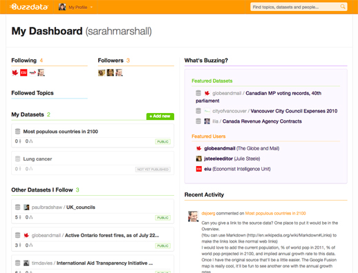
Data gets its own social network today (2 August), with the launch of BuzzData, which its CEO describes as “a cross between Wikipedia for data and Flickr for data”.

BuzzData is due to launch in public beta later when Canada, where the start-up is based, wakes up.

It launched in private beta last week to allow a few of us to test it out.

What is BuzzData?

BuzzData is a “social network for people who work with data”, CEO Mark Opausky told Journalism.co.uk.

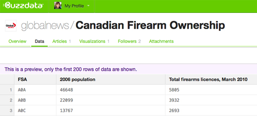
Users can upload data, data visualisations, articles and any background documentation on a topic or story. Other BuzzData users can then follow your data, comment on it, download it and clone it.

Members of the Toronto-based team hope the platform will be a space where data journalists come together with researchers and policy makers in order to innovate.

They have thought about who could potentially use the social network and believe there are around 15 million people who deal with statistics – whether that data be around sport, climate change and social inequalities – and who are “interested in seeing the data and the conversation that goes on around certain pieces of data”, Opausky said.

We are a specialised facility for people who wish to exchange data with each other, share data, talk about it, converse on it, clone it, change it, merge it and mash it up with other data to see what kind of innovative things may happen.

BuzzData does not allow you to create data visualisations or upload them in a way which makes beautiful graphics immediately visible. That is what recently-launched tool Visual.ly does.

How is BuzzData of use to journalists?

BuzzData allows you to share data either publicly or within a closed network.

Indeed, a data reporter from Telegraph.co.uk has requested access to see if BuzzData could work for the newspaper as a data-publishing platform, according to a member of BuzzData’s team.

Opausky explained that journalists can work by “participating in a data conversation and by initiating one” and gave an example of how journalism can be developed through the sharing of data.

It allows the story to live on and in some cases spin out other more interesting stories. The journalists themselves never know where this data is going to go and what someone on the other side of the world might do with it.

Why does data need a social network?

Asked what sparked the idea of BuzzData, which has secured in excess of $1 million funding from angels investors, Opausky explained that it was down to a need for such a tool by Peter Forde, who is chief technology officer.

He had spent many years studying the data problem and he was frustrated that there wasn’t some open platform where people could work together and share this stuff and he had a nagging suspicion that there was a lot of innovation not happening because information was siloed.

Going deeper than that, we recognised that data itself isn’t particularly useful until you can put it into context, until you can wrap it around a topic or apply it to an issue or give it a cause. And then even when you have context the best, at that point, you have is information and it doesn’t become knowledge until you add people to it. So his big idea was let’s take data, let’s add context and lets help wrap communities of people round this thing and that’s where innovation happens.

You can sign up for BuzzData at this link. Let us know what you think by leaving a comment below.