Category Archives: Data

Visual.ly – a new tool to create data visualisations

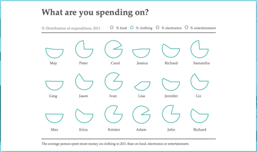
Visual.ly is a new platform to allow you to explore and share data visualisations.

According to the video below, it is two things: a platform to upload and promote your own visualisations and a space to connect “dataviz pros”, advertisers and publishers.

Visual.ly has teamed up with media partners, including GigaOM, Mashable and the Atlantic, who each have a profile showcasing their data visualisations.

You will soon be able to create your own “beautiful visualisations in minutes” and will “instantly apply the graphics genius of the world’s top information designers to your designs”, the site promises.

Plug and play, then grab and go with our push-button approach to visualisation creation.

The sample images are impressive, but journalists will have to wait until they can upload their own data.

You can, however, “Twitterize yourself” and create an image based on your Twitter metrics.

Three tools to analyse Google searches: Correlate, Trends and Insights

Google has three useful tools for journalists interested in looking at search trends over time, which also offer hours of fun for SEO enthusiasts. Google Correlate has been added to the list of analysis options within the past month, joining Insights and Trends which have been around for about three years.

Here is a brief introduction to each:

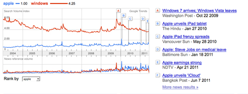
1. Google Trends works by you entering up to five search words and the results show how often those words have been searched for in Google over time. Google Trends also shows how frequently those search words have appeared in Google News stories, and in which geographic regions people have searched for them most.

For example, if you enter ‘Apple’ and ‘Windows’ you will see that ‘Windows’ is a far more popular search word, but when it comes to news, Apple appears in far more Google News stories. Evidence that journalists favour Apple stories than Windows ones, perhaps? Or do ‘Windows’ searches include vast numbers of people looking for double glazing?

Not only does Trends show you key events – such as the launch of the iPad – on the search volume time line, it also shows the volume of searches by country.

There is also a feature called Google Hot Trends which shows current searches and therefore hot topics. Combine google trends with SimilarContent tool for content optimization can help in Identifying the most relevant blogs for your target keyword, Identifying the most relevant news sites for your target keyword and Identifying the most relevant forums for your target keyword.

2. Google Correlate, launched by Google Labs at the end of last month, is like Google Trends in reverse.

Correlate enables you to find queries with a similar pattern. You can upload your own data, enter a search query or select a time frame and get back a list of queries that follows a similar pattern to your search. You can also download the search results as a CSV file.

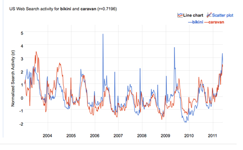
For example, if you enter the term ‘bikini’, Google Correlate will tell you a search term it closely correlates with is ‘caravan’, another being ‘Oakley sunglasses’. All are seasonal, so it is perhaps not that surprising those three searches correlate.

The inspiration behind Correlate was search patterns for flu (such as sore throat) correlating with peaks in actual flu activity. This comic book explanation tells the story brilliantly.

Another way of getting to grips with Correlate is having a go with this nifty drawing option. Simply drag and drop the pen and find out what searches match the time pattern you have drawn.

Be aware that Google Correlate uses US search data only, so it may be less useful to UK journalists. The New Scientist tested it out and it passed the magazine’s severe weather test and Google used it to track dengue fever hubs, the BBC reported.

3. Google Insights is one step up from Trends in terms of being able to provide a more detailed search. Results can be easily embedded in news stories.

One of the many useful things about Insights is it can be used to determine seasonality. For example, a ski resort may want to find out when people search for ski-related terms most often.

To see the potential of Insights look at example search comparisons, such as this one for Venus Williams and Serena Williams.

EJC taking responses for data-driven journalism survey

The European Journalism Centre is still collecting responses to its data-driven journalism survey, which will help to inform a future series of training sessions.

The survey, which is being run in collaboration with Mirko Lorenz of Deutsche Welle, features 16 questions asking respondents for their opinion on data journalism, aspects of working with data in their newsrooms and what they are interested in learning more about.

Increasingly, governments, international agencies and organisations such as the Organisation for Economic Co-Operation and Development (OECD) and the World Bank, are publishing online collections of freely available public data. Developing the know-how to use the available data more effectively, to understand it, to communicate and generate stories based on it by using free and open tools for data analysis and visualisation, could be a huge opportunity to breathe new life into journalism. The aim of this survey is to gather the opinion of journalists on this emerging field and understand what the training needs are.

You can find the survey here, with one of the participating journalists to be awarded with a 100 Euro Amazon voucher.

OWNI.eu publishes WikiLeaks ebook

The rush to get books in the shops in the wake of the WikiLeaks phenomenon was quite predictable. It’s a story with all the Hollywood mores, but strangely real. The films are soon to follow.

So far we’ve had, most notably, David Leigh’s and Luke Harding’s “WikiLeaks: Inside Julian Assange’s War on Secrecy” and Daniel Domscheit Berg’s “Inside WikiLeaks”.

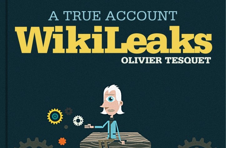
Now Paris-based OWNI.eu, which helped build apps for WikiLeaks to allow people to navigate the Iraq war logs and US embassy cables, is publishing Olivier Tesquet’s “WikiLeaks: A True Account” through its own publisher OWNI Books. The organisation boasts an “exceptional vantage point” on the whistleblowing group, and claims that Tesquet’s “thorough investigation” will shed light in the relationship between the WikiLeaks and OWNI.

OWNI Books publishes ebooks only, and this latest one will be the first published in three languages: French, English and Arabic.

Hot on the heels of the OWNI book – and the other behind-the-scenes accounts – will be a more academic take on the affair from Polis director Charlie Beckett and former WikiLeaks journalist James Ball.

The book was announced by Beckett at the Polis Value of Journalism conference on Friday and is expected within the next few months.

Pentagon Papers released in full on 40th anniversary of leak

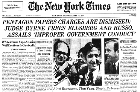
It was 40 years ago when parts of the ‘Report of the Office of the Secretary of Defense Vietnam Task Force’, or more widely known ‘Pentagon Papers’, were first leaked to and published by the press.

First by the New York Times, on this very day, 13 June, in 1971, before a court order was won by the government to prevent further publication. Other newspapers followed the Times’ lead, but were soon also restrained. Then at the end of the month the United States Supreme Court ruled publication could resume.

And today, 40 years on from the Times’ first publication of the leaked documents, the report is being released in full by the National Archives, along with the Kennedy, Johnson and Nixon Presidential libraries, filling 48 boxes with around 7,000 declassified pages. According to the National Archives about 34 per cent of the report is being made available for the first time, with no redactions and with all the supplemental back-documentation included.

In an Associated Press report on the release, Daniel Ellsberg, the former private foreign policy analyst who leaked the papers, gives his thoughts on the significance of today’s release.

Most of it has come out in congressional forums and by other means, and Ellsberg plucked out the best when he painstakingly photocopied pages that he spirited from a safe night after night, and returned in the mornings. He told The Associated Press the value in Monday’s release was in having the entire study finally brought together and put online, giving today’s generations ready access to it.

Currybet: Michael Blastland on ‘designing for doubt’

Guardian lead information architect Martin Belam has got his excellent Currybet blog back up and running after a short break. He has a post up today about April’s London IA event, featuring writer and statistician Michael Blastland.

Martin and I saw Michael speak at a Media Standards Trust event in March, where he spoke about the potential pitfalls in reporting crime statistics. At the London IA event he gave a talk entitled “designing for doubt”, continuing to argue that journalists, and politicans, make a very poor job of working with numbers.

He illustrated his talk with several case studies, showing how easy it was to manipulate numbers. One was the impact of an education programme on the rate of teenage pregnancies in the Orkney Islands. A selective graph seemed to show dramatic results, with the incidence of youth pregnancy slashed. A more detailed look at the numbers revealed the fundamental truth of Michael Blastland’s simple but common sense message:

“Numbers go up and down. And sometimes stay the same.”

Women are not, he pointed out, queuing up on the Orkneys to get pregnant at a nicely regular rate to please statisticians. With a low sample size there are always likely to be wide fluctuations in the numbers of pregnant teenagers from year to year.

See the full post on Currybet.net at this link.

I blogged on another session at the MST event, about crowdsourcing: From alpha users to a man in Angola: Adventures in crowdsourcing and journalism

#newsrw: Heather Brooke – ‘How do any journalists in the UK do their job?’

The main difficulty for data journalist in the UK is gaining access to meaningful data, Heather Brooke said in her keynote speech at news:rewired – noise to signal.

Brooke, a journalist, author and freedom-of-information campaigner, who is best known for her role in bringing the MPs expenses to light and who went on to work with the Guardian on the WikiLeaks cables, compared the difficulty in accessing data in the UK compared with the US, where she trained and worked as a political journalist and a crime reporter.

When working in the US, Brook explained how she was “heavily reliant on public records” and said the “underpinning of my journalism was state records”. As a crime reporter she used a police scanner, likening it to those familiar with US series ‘The Wire’.

“As a journalist I would decide what the story was,” she said, based on the data from public records. She was able to note patterns in the incident reports and able to notice a spate in domestic violence, for example.

Brooke told of how many UK police forces limit the release of their data to media messages left on a voice bank.

Public bodies in the UK “control the data, they control the public perception of the story,” she said.

“How do any journalists in the UK do their job?” she asked. And it was that problematic question that led her to becoming an FOI campaigner.

When she asked for receipts for US politicians’ expense claims in the States, she had them within a couple of days.

It was a different story in the UK. It took her five years and several court cases, including taking the case to the High Court which led to the release of second home allowance for 10 MPs.

The House of Commons “sticking their feet on the ground” refused to release further data, which had been scanned in by the fees office.

A CD of the data which was touted round Fleet Street and sold for £110,000.

The Telegraph, rather than Brooke, then had the data and had to verify and cross check it.

What is purpose as journalists in the digital age?

Brooke’s answer to that question is that “we need to change an unhelpful attitude” of public records being withheld.

“The information exists as if they own it”, she said.

“They don’t want negative information to come out” and they want to try and manage their reputation, she said in what she described as “the take over of public relations”.

“We need to be campaigning for these sets of data” and gave the examples of courts and the release of files.

“We make the FOI request and that should open the whole tranche of data so any other journalist can go back and use it for their reporting.”

She said data journalism is “not just about learning how to use Excel spreadsheets but you have to have something to put in those spreadsheets”.

Brooke made a “rallying cry” as to why professional journalists, particularly those who practice investigative journalism, are vital.

The “one unique selling point, why people would come to a professional news organisation” is the training and experience journalists have in “sifting through for what is important and what is true”.

Brooke said as people have more and more information, a journalist’s role is distilling and signposting the information.

The second key point she made is journalists must establish “what is true”.

When a politician claims that crime has gone down, a journalist must be able to verify it and “test the truthfulness” of it, she said.

She explained that journalists need to know how that data was collected and, ideally, have access the data itself.

Brooke told how she tried to pitch stories on MPs expenses on an almost daily basis before they came to light. She said editors thought it was a non-story and “almost took the word of parliament” and had the perception that the public was not interested. But they were.

“It’s a symptom of the public not having meaningful information and are not able to take action. That’s our role as professional journalists.”

This article is a cross post. It was originally published on news:rewired.
#newsrw: How to follow today’s news:rewired event

Journalism.co.uk’s news:rewired – noise to signal event is taking place today at Thomson Reuters, Canary Wharf, London.

The one-day conference is focusing on data journalism and how to filter the noise of large datasets, social networks, and audience metrics into a clear signal.

The key-note speaker is journalist, author and freedon-of-information campaigner Heather Brooke, who is best known for her role in bringing MPs expenses to light.

Other speakers include key players from the BBC, the Guardian, Reuters News, the Telegraph, News International, the Economist and Channel 4 News, the Independent, the Financial Times, the Press Association and Sky News, plus lots of smaller organisations specialising in data, social media and journalism.

To keep up-to-date with what is happening today, follow the #newsrw hashtag, @newsrewired on Twitter, posts and a liveblog on newsrewired.com and stories here on Journalism.co.uk.

You can also search stories, photos, videos and audio across the web by using the #newsrw hashtag.

Visualisation shows the topics New York Times journalists are writing about

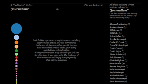
The Visual Communication Lab, part of the IBM Center for Social Sofware has created a site to provide a visualisation to show what subjects New York Times journalists are writing about.

NYT Writes, created by research developer Irene Ros, allows users to enter a subject and see a visualisation of the journalists who have written on that subject.

This post on the VCL blog explains what the visualisation shows.

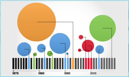
There are a few things that you will see once the search is complete. First, on the left side of the screen you will see a stack of bubbles at varying sizes. Each bubble represents a term, or “facet”, that was used to describe one or more articles containing your search query.

Facets get manually attached to each article by the New York Times staff. An article about “Tsunami” might be tagged as being about “Natural Disasters,” for example. The size corresponds to the relative amount of times that tag appeared comparing to all the other facets collected from all other articles in the query set.

You can mouse over each bubble to see the tag name appear in the middle as well as how much it appeared relative to the other facets below the stack itself. This stack could also represent what I call a “dedicated writer” – someone who only writes about one topic for 30 days would have a similar stack to this one.

You can try out NYT Writes at this link

Five great examples of data journalism using Google Fusion Tables

Google Fusion Tables allows you to create data visualisations including maps, graphs and timelines. It is currently in beta but is already being used by many journalists, including some from key news sites leading the way in data journalism.

To find out how to get started in data journalism using Google Fusion Tables click here.

Below are screengrabs of the various visualisations but click through to the stories to interact and get a real feel for why they are great examples of data journalism.

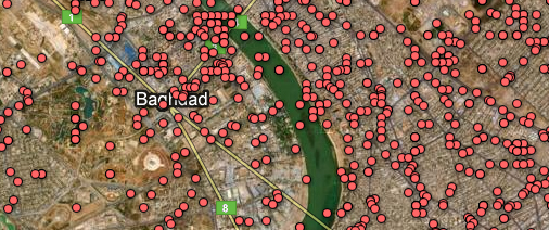
1. The Guardian: WikiLeaks Iraq war logs – every death mapped
What? A map with the location of every death in Iraq plotted as a datapoint.
Why? Impact. You must click the screen grab to link to the full visualisation and get the full scale of the story.

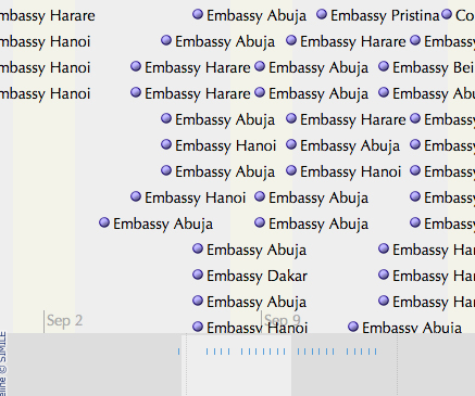
2. The Guardian: WikiLeaks embassy cables
What? This is a nifty storyline visualisation showing the cables sent in the weeks around 9/11.
Why? It’s a fantastic way of understanding the chronology.

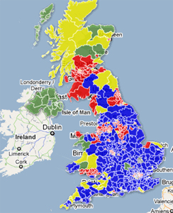
3. The Telegraph: AV referendum – What if a general election were held today under AV?
What? A visual picture of using the hypothetical scenario of the outcomes of the 2010 general election if it had been held under the alternative vote system.
Why? A clear picture by area of the main beneficiaries. See how many areas are yellow.

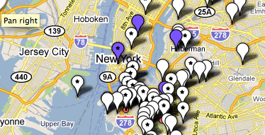
4. WNYC: Mapping the storm clean-up
What? A crowdsourced project which asked a radio station’s listeners to text in details of the progress of a snow clean-up.  The datapoints show which streets have been ploughed and which have not. There are three maps to show the progress of the snow ploughs over three days.
Why? As it uses crowsourced information. Remember this one next winter.

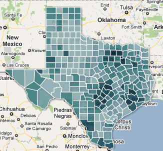
5. Texas Tribune: Census 2010 interactive map – Texas population by race, hispanic origin
What? The Texas Tribune is no stranger to Google Fusion Tables. This is map showing how many people of hispanic origin live in various counties in Texas.
Why? A nice use of an intensity map and a great use of census data.

You can find out much more about data journalism at news:rewired – noise to signal, an event held at Thomson Reuters, London on Friday 27 May.