Tag Archives: Data journalism

Tool of the week for journalists: Data.gov.uk’s map-based search

Tool of the week: Data.gov.uk’s map-based search

What is it? An option of searching for data sets by geographical location

How is it of use to journalists? Since the launch of Data.gov.uk just over two years ago, and the promotion of open government data, the site has become a go to place for many journalists in search of a data set.

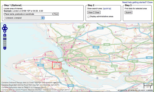
The site now has a map tool which allows you to search for data by location, potentially useful for journalists working on local news sites, newspapers and radio stations.

The map-based search allows you to draw a search area, submit the area and find data relating to that location.

Not tried your hand at data journalism? This guide written for Journalism.co.uk by Simon Rogers, editor of the Guardian’s Datablog tells you how to get a grip with data journalism.

  • Journalism.co.uk also offers a one or two-day course in data journalism, led by Kevin Anderson. The next introduction to data journalism courses are being held on 9 May or 28 May. The intermediate data journalism course will be on 29 May. Those looking to expand their skills quickly can book on both courses, turning it into a two-day course and saving £50 on the course fees.

#paywalls12 – Niche content paywalls: three success stories

The journey from print to digital is “a bit like making trains that float, in case they need to go back on the canal,” Steve Hewlett, Guardian columnist and presenter of BBC Radio 4’s Media Show.

His analogy came at the opening of today’s Paywall Strategies event, which Hewlett is chairing.

Three niche publishers spoke on the panel, along with Tom Whitwell from the Times.

For B2B publisher Lloyd’s List Group, publisher of the 277-year-old daily print newspaper Lloyds List ,which specialises in shipping and commodities news, “Print comes third behind mobile and web,” Adam Smallman said.

“We have sought to provide bloody fantastic content. That’s our paywall strategy,” he added.

Lloyd’s model is a high-price subscription which companies pay, providing access for their employees.

Out of the 7,000 subscribers, 4,000 receive the daily print copy.

A huge focus for the Lloyds List Group is the merging of data and journalism. Smallman illustrated how data led to a story which saw him interviewed on each major US network after last month’s sinking of cruise ship the Costa Concordia.

Data collection meant Lloyds was able to report that the ship had previously come even closer to the island off which it sank, coming within 230 metres of land last year.

Another niche publisher on the panel was Incisive Media, which owns a range of specialist titles.

Jon Bentley, head of online commercial development, said 65 per cent of people who come to Incisive sites never come back. “Therefore focus on your fans who do return,” he recommended.

And those who do not return look at just 2.6 pages per visit, compared with 7.11 pages viewed at by “customers”.

Their aim is therefore to convert readers from “fly-by to fan”, Bentley said, explaining it can be tough with just 5 per cent taking up a trial.

Rob Aherne, of Haymarket Media Group, talked about a different type of niche content: motorsport titles.

The sites – Autosport, Motorsport News and Castrol EDGE World Driver Rankings – have 1.1 million users viewing 20 million pages a month.

“Our paywall has saved us as a business,” he proclaimed.

After trialling a free model and a hard paywall, they have settled on a “freemium” option, with some free content and readers asked to ay £5.50-a-moth for additional content. Those who buy the magazine get a digital subscription included.

So what will people pay for? “Words and pictures – and it is all ad free,” he explained.

Just 1 per cent of readers pay to access content, but those account for 11 per cent of site traffic. “They are loyal, they are engaged,” Aherne added.

The motorsport titles break news outside the wall, but provide content for deeper engagement behind the wall.

Readers subscribe because “they want to know more than the bloke next to them in the pub,” Aherne said.

Getstats: 12 ‘number hygiene’ rules for journalists in full

A campaign launched by the Royal Statistical Society has proposed 12 “rules of thumb for journalists” in order to encourage a better understanding of numbers in news.

Getstats is also calling for numeracy and statistics to be taught in journalism schools.

More details and a 12 point summary is at this link.

The full 12 rules of “number hygiene” for journalists are below:

1. You come across a number in a story or press release. Buyer beware. Before making it your own, ask who cooked it up; what are their credentials; are they selling something. What other evidence do we have (what numbers are they not showing us?); why this number, now? If the number comes from a study or research, has anyone reputable said it is any good?

2. Sniff around. Do the numbers refer to a whole group of people or things or a sample of them? If it’s a sample, are the people being questioned or the things being referred to a fair representation of the wider group? Say a company is claiming something applies to the population at large. If it is basing the story on a sample, such as a panel of internet users, the company goes back to time and again then beware: the panel may not be representative.

3. More probing. What was the sample asked? The wording of a question can hugely influence the answer you get. People’s understanding of what it means to ‘be employed’ or the nature of ‘violent crime’ may differ. What the public understands may not match the survey researcher’s idea. In government surveys bigamy was till recently classed as a violent crime. Might researchers’ choice of words have led people into a particular response?

4. One number is often used to sum up the group being measured, the average. But different averages measure different things. The mean is extremely sensitive to highs and lows: the very fact of Bill Gates coming to live in the UK would push up mean wealth. The median tells us, for example, the income of an average person – half the population get less, half more. Comparing earnings, the mode tells us the salary most people earn.

5. There is a lot of uncertainty about. We need to be sure the number on offer is a result and not just due to chance. With a sample, check the margin of error, the plus or minus 3 per cent figure, usually stated by reputable polling companies. A poll saying 52 per cent of people are in favour of something is not definitively saying half are in favour: it could be 49 per cent. Beware league tables, except in sports reports. Chelsea is higher than Arsenal for a simple and genuine reason: the side has collected more points. With hospitals or schools, a single score is a never likely valid basis for comparison (a teaching hospital may appear to have a worse score, but only because sicker patients are referred to it). Comparisons between universities or police forces are unreliable if the scores fall within margins of error. Midshires scores 650 on the ranking and Wessex 669: they could be performing at the same level or their respective positions reversed.

6. The numbers you are given show a big increase or sharp decrease. Yet a single change does not mean a trend. Blips happen often. Blips go away, so we have to ask whether the change in the numbers is just a recovery or return to normal after a one-off rise or fall (what statisticians refer to as ‘regression to the mean’). The numbers may come from a survey, like (say) ONS figures for household spending or migration. Is the change bigger than the margin of error?

7. Unless researchers carried out a controlled experiment (such as a trial of a new drug, based on a randomly chosen group, some of whom don’t know they are getting a placebo), it’s very difficult confidently to state that a causes b. Instead, the numbers may show an association (a correlation) between two things, say obesity and cancer. Beware spurious connections, which may be explained by a third or background factor. If use of mobile phones by children is associated with later behavioural disorders, the connexion could be the parents, and the way their behaviour affects both things. If the numbers suggest an association, the important thing is to assess its plausibility, on the back of other evidence. Finding a link can stimulate further study, but can’t itself be the basis for some new government policy. Recommendations for changing daily behaviour such as eating should not be based on speculative associations between particular food and medical conditions.

8. A key question for any number is ‘out of how many?’ Some events are rare — such as the death of a child. That’s why they are news, but that’s also why they deserve being put in context. Noting scarcity value is the way to reporting the significance of an event. An event’s meaning for an individual or family has to be distinguished from its public importance.

9. Billions and millionths are too big and too small to grasp. We take figures in if they are humanized. One way is comparing with, say, the whole UK; another is to plot the effect on an individual. Colourful comparisons can make risk intelligible: the risk of dying being operated on under a general anaesthetic is on average the same as the risk being killed while travelling 60 miles on a motorbike.

10. Good reporting gives a balanced view of the size of the numbers being reported. Better to focus on the most likely number rather than the most extreme, for example in stories about the effects of a flu pandemic. ‘Could be as high as’ points to an extreme; better to say ‘unlikely to be greater than’. Numbers may be misperceived so try to eliminate bias.

11. Risk is risky. ‘Eating bacon daily increases an individual’s lifetime risk of bowel cancer by 20 per cent.’ Another way of saying that is: out of 100 people eating a bacon sandwich every day one extra person will get bowel cancer. Using the first without noting the second tells a story that is both alarmist and inaccurate. If the information is available, express changes in risk in terms of the risks experienced by 100 or 100,000 people.

12. The switch from print to digital brings opportunities to present numbers more dynamically and imaginatively, for example in scatter plots. Graphics can show a trend. Stacked icons in graphs can show effects on 100 people. But the same rules of thumb apply whatever the medium: is the graphic clear; does it tell the story that is in the text.

Tool of the week for journalists: Tableau Public, for data visualisations

Tool of the week: Tableau Public

What is it? A data visualisations tool, allowing you to create interactive graphs, charts and maps.

How is it of use to journalists? Tableau Public is a free tool that allows journalists to upload an Excel spreadsheet or text file and turn the data into an interactive visualisation that you can embed on your news site or blog.

Here are five examples of how Tableau has been used by news sites to tell stories. A quick browse will give you a sense of how the tool can be used to explain news stories.

One of Tableau’s real strengths is providing the reader with the opportunity to move a slider or select a drop down and see how the visualisation alters when a variable changes.

In order to create a visualisation you will need a PC (or a Windows environment on your Mac) and to download the free software.

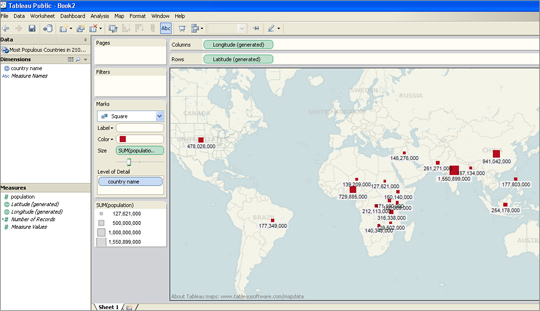
I was able to upload an Excel file and within less than two minutes had produced a map showing what are predicted to be the most-populous countries in 2100.

I had previously used this data set to create a visualisation in Google Fusion Tables and Tableau was equally easy to navigate.

For those who have not tried creating data visualisations, Tableau requires no technical ability and is easier to use than the wizard options that allow you to create graphs in Excel.

There are options for sorting and reordering data, plus changing the colours and view options.

Tableau also has a paid-for option. The difference between the free tool and the premium option is that Tableau Public requires you to publish your visualisation to the web.

Tableau launched version 7.0 a couple of weeks ago and will soon be adding functionality allowing you to create a map using UK postcodes, according to Ross Perez, data analyst at the US-based company.

Disclaimer: Tableau Public is a sponsor of the Journalism.co.uk-organised conference news:rewired. This relationship did not influence this review.

Ten things every journalist should know in 2012

Image by Tormel on Flickr. Some rights reserved

Here are 10 things every journalists should know in 2012. This list builds on 10 things every journalist should know in 2009 and 2010. It is worth looking back at the previous posts as the ideas are still relevant today.

1. Learn from Leveson. The Leveson inquiry into the culture, practices and ethics of the media has specifically scrutinised journalism and the industry, but social media (and therefore popular opinion) is also holding it to account. Journalists need to be sure that the means really do justify the ends for a story and must be crystal clear about the legalities of their actions. And they need to be more transparent about the sources of stories, where the source will not be compromised. If a story originates from a press release, acknowledge it.

2. Curate and share. Social sharing is a great way for a journalist to add value to their personal output (also see point 9).

You can share articles of interest to you by tweeting, adding curated links on your personal blog and using bookmarking site like Delicious or Pinboard.

Doing so will raise your social capital and help you to engage with your peers, contacts and your audience. Online influence and reputation may well become as important as your CV with the rise of tools like Klout and PeerIndex.

3. Invite others in. Your readers graze content, snacking from several news sites – so help them out. Include links to external content on your news site and post news from other outlets on your organisation’s social networks.

Although readers will still have a brand affinity, they are much more promiscuous in their reading habits, consuming content from a wide variety of news outlets. So acknowledge this and make your news site a destination not just for your journalism by providing links to content from other publishers.

4. Know your niche. Technology is driving the delivery of niche content. Where specialist titles once required consumers to hunt them down via postal subscriptions and visits to larger newsagents, niche content is now delivered instantly online and via apps and is more easily found. Specialise in an area that interests you, blog about the subject and share links.

5. Think multimedia on multiplatform. There has been much debate about tablets revolutionising publishing, but many magazines are simply pushing out their print version via non-interactive PDFs, aided by new delivery systems such as Apple’s Newsstand.

Publishers are opting to offer consumers a laid back reading experience in the knowledge that tablet owners read in the evenings when they have time to consume in-depth news. Publishers will also need to play to the strength of the tablet device, allowing interactive content such as video to shine, and focus on providing consumers with a reading experience that is different to that of a newspaper.

Journalists can be ahead of the game by developing skills in video, audio and other types of multimedia that can be used to enrich storytelling in apps and on other digital devices.

6. Data is not just for geeks. Data is driving journalism but many journalists are afraid of the numbers, spreadsheets and code. But all journalists need to know how to spot the nonsensical numbers in a press release, to be able to accurately make sense of statistics, and understand how to find a story in a study.

Take these examples of data used for investigative journalism from the Guardian: Afghanistan war: every death mapped and reporting the riots. But as well as in-depth data reporting, be aware of the free tools to get you started such as these ManyEyes visualisations, showing the number of women in British politics by party, of Manchester City Council spending or debt in the English premier league.

Be aware that data can be misinterpreted. Take this Express front page splash on a cancer study and read about the pitfalls highlighted by data journalist James Ball in this presentation given at news:rewired, a conference for journalists.

7. Focus on what works – do less to do more. No news organisation however well resourced can achieve everything. Work out what works and strive for excellence in that area.

Sometimes you need to take a step back to see where your priorities should lie. You may realise it is better to write one original feature than chase five stories already in the public domain.

8. Look to new off-site audiences. Don’t just focus on clicks on your site. If 10,000 people listen to your podcast on SoundCloud, 1,000 people click on a Storify or 10 people comment on a story on Facebook without visiting your site they are still being introduced to your title and brand and may visit in the future.

9. Add value. Readers will be able to get a story that is in the public domain from several sources so make your content count. Consider yourself a collective educator by adding value to everything you produce by including links and background information. Think of the way the Guardian’s liveblogs, such as Andrew Sparrow’s politics liveblogs, curate and add context. Act as a guide to your readers on your site, on Twitter and on other platforms.

10. Online communities are no substitute for offline communities. Journalists must still meet people, build trusting relationships and nurture real-world contacts.

  • For a day of inspirational ideas in journalism sign up to attend news:rewired – media in motion, a conference for journalists. It is being held at MSN HQ, London on 3 February 2012.

What’s happening to mark open data day

The use of open data in our newsrooms has been growing in the past few years and many people believe that the future of data journalism relies on the collaboration between developers, designers and journalists to create better ways of extracting information from open datasets.

Tomorrow (3 December) is International Open Data Day and there is a series of worldwide events set up to gather coders, programmers and journalists around “live hacking” challenges.

International Open Data Hackathon

Where? The Barbican in London and around the world

When? Saturday, 3 December from 11am

Better tools. More Data. Bigger Fun. That’s how the 2011 Open Data Day Hackathon describes this year’s global event, taking place in more than 32 countries this weekend.

For journalists, it’s an occasion to give hacking a go and meet people from the world of data.

The past year has seen open data continue to gain traction around the world with new open data catalogues launched in Europe, North America and Africa and more data available from organisations such as the World Bank.

Open Data Day is a gathering of citizens in cities around the world to write applications, liberate data, create visualisations and publish analyses using open public data. Its aim is to show support for and encourage the adoption of open data policies by the world’s local, regional and national governments.

Join the Open Knowledge Foundation and CKAN at the Barbican tomorrow (Saturday, 3 December) as they assemble a “crack-team” of coders to break data out of its internet prisons and load it into the Data Hub.

For details about the event, see this blog post, and sign up on the event’s meetup page or by filling out the event’s Google form.

Participants will be on IRC and will also be using the hashtags #seizedata and #odhdLDN on Twitter. All journalists, data scrapers, coders and #opendata enthusiasts can join.

David Eaves, the organiser of this year’s Open Data Hackathon believes this event is a great opportunity to teach journalists, as well as the general public, how to tackle data on a day-to-day basis:

Its a Maker Faire-like opportunity for people to celebrate open data by creating visualisations, writing up analyses, building apps or doing what ever they want with data.

What I do want is for people to have fun, to learn, and to engage those who are still wrestling with the opportunities around open data … And we’ve got better tools. With a number of governments using Socrata there are more API’s out there for us to leverage. ScraperWiki has gotten better and new tools like Buzzdata, the Data Hub and Google’s Fusion Tables are emerging every day.

Who’s it for? Everyone. David Eaves says:

If you have an idea for using open data, want to find an interesting project to contribute towards, or simply want to see what’s happening, then definitely come along.

You can also check out the HackFest 2011 topic page on BuzzData.

London “Random Hacks of Kindness” event

Where? @Forward in London, and around the world

When? 3-4 December 2011, from 9am Saturday until 6pm Sunday

Starting on the same day as the Open Data Hackathon, the Random Hacks of Kindness’ Codesprint will gather thousands of experts in 25 countries to develop open tech solutions over two days of hacking challenges.

The unprecedented gatherings in collaboration with Google, Microsoft, Yahoo!, NASA, HP and the World Bank will bring together some of the world’’ most innovative social enterprises and volunteer technologists.

London’s event promises to be exciting as over 100 tech heads will gather to tackle one issue: financial exclusion and illiteracy. It will be the first ever hack day addressing this theme.

Financial and enterprise education group MyBnk will head a panel of CEOs and IT specialists from LSE, Morgan Stanley, Fair Finance, Three Hands, Toynbee Hall and the Forward Foundation to make major advances in helping young people master money management.

Mike Mompi, head of strategy and innovation at My BNK and the organiser of London RHoK event says:

The main objectives of the weekend are problem solving, capacity building, partnerships, and impact

A £500 cash prize will be given at the end of Sunday for the winning solution (among other prizes) and several media organisations, including The Huffington Post, will be joining in.

People from RHoK have hosted three global events to date, in 31 cities around the globe with over 3,000 participants. Past events resulted in apps and alert systems to warn people of bushfires in Australia and recipients of food stamps to sources of fresh produce in Philadelphia.

The RHoK community is open for anyone to join.

If you want to get an idea of what’s in store for this weekend, check out last year’s hackathon videos.

You will be able to follow the event on Twitter @RHoKLondon and the hashtag #rhokLDN. It is still possible to sign up for this weekend’s free event via this link.

How open data has changed journalism

Tomorrow (Saturday 3 December) is International Open Data Day. We have been asking what the open data movement has done for journalism.

Simon Rogers, editor of the Guardian’s Datablog and Datastore – @smfrogers

It’s only been a couple of years and you could argue that open data has changed the world: Wikileaks, government spending, what we know about the riots… The irony is that the governments behind much of this data have only contributed the numbers; the hard work has been done by an army of developers and data journalists who have created stories and new ways of telling them. When we started the Datablog in 2009, we thought it would be popular only with developers; now everyone wants to know the facts behind the news.

Nicola Hughes@DataMinerUK

It’s the knowing how to use it that’s vital. it’s a (re)source.

Borja Bergareche@borjabergareche

It’s helped us do the best journalism of the 20th century in the 21st century.

Lucy Chambers, community coordinator, Open Knowledge Foundation – @lucyfedia

Evidence-based journalism. Journalists will back up stories, readers will expect to be able to verify facts.

Andrew Gregory@andrew__gregory

Open data is useful. But original journalism also requires good human sources.

Rune Ytreberg –  @ytreberg

The obvious: Open data has made journalism more transparent.

Megan Cunningham@megancunningham

Open data has accelerated the opportunities for crowd sourced investigative journalism. But the potential hasn’t been realised.

Harriet Minter@Harriet_Minter

It’s forced journalists to embrace spreadsheets, brought interactives to the forefront and given us many bad infographics.

Greg Hadfield@GregHadfield (who is organising the UK’s first open-data cities conference)

Data – whether open or not – has always fuelled journalism. Data that is increasingly “open” (in the fullest sense of the term) will transform journalism.

Ironically, a lot of the best revelatory journalism of the past has depended on journalists unearthing data (ie “stuff”) that others want to keep locked. Ideally, by lawful means. Therefore, openness may remove some of the mystique that journalists delight in, as people who know things that only those “in the know” know.

An open-data tsunami will mean that more journalism will be about interpreting – and putting into context – data that is open to all, at least in its rawest, unrefined form.

To an even greater degree, journalism will be about adding value to data by transforming it into information. The best journalism will be to add value to information, to provide insight, even wisdom.

Openness of data will change the behaviour of individuals and organisations. But not immediately and not in every case. Would MPs have played fast and loose with their expenses if they knew data about each claim would be published openly and in real time? Sad to say, it is quite possible some would.

Much good journalism has involved shedding light on data that was routinely (although not widely) available and which was only rarely studied or analysed.

Importantly, some of the best journalism has involved making connections and spotting patterns. I’m thinking of earlier parliamentary abuses, such as the “cash-for-questions” scandal of the mid-1990s, before Hansard was on the web, and when it was rarely read in print by journalists.

Those were the days when typewriters and telephones – rather than computers and the internet – were the primary journalistic tools. When bars and restaurants – rather than offices and desktops – were the venues for journalistic enterprise.

With more data openly available – along with more tools easily available for mining, sifting and interpreting it (as in the case of the Wikileaks material) – there are many more needles to be found in the burgeoning haystacks of unstructured data.

But even when every day is #Opendata Day, the best stories may remain hidden in full public view – until one of the new generation of journalists stumbles expertly across them.

#MozFest: Six lessons for journalists from the Mozilla Festival

The Mozilla Festival took place this weekend and provided journalists, open web developers and educators with a place to learn and to build.

Here are six tips from the festival, which was called media, freedom and the web.

1. In less than a week there will be a Data Journalism Handbook. Created in 48 hours with contributions from 55 people, the first draft was written at the festival and is due to be published next week. The book provides journalists the chance to get to grips and to learn from some of the key data journalists in the UK and abroad.

2. Journalists can now create web native, social video using Popcorn Maker. Take a video and add web content including tweets, Flickr photos and Google Street View images. This is a hugely exciting development in online video journalism.

3. Expect exciting developments in HTML5 news web apps. Developer Max Ogden presented a live web app in the final show tell which added photos tweeted by the audience with hashtag #MozFest. In real-time the images appeared in the app displayed on a large screen. This type of app has huge potential for news sites and user-generated content.

4. SMS may not seem like cutting edge technology but should not be ignored when it comes to engaging with the audience. Text messages can be automatically sent to Google Fusion Tables and uploaded manually or posted to a map in real-time. Here is an example where the company Mobile Commons enabled San Francisco public radio to map listeners’ earthquake readiness.

5. It will be worth keeping an eye on the five Knight-Mozilla technology fellows being placed in newsrooms at Al Jazeera English, the Guardian, the BBC, Zeit Online and the Boston Globe to see what is produced. Each news organisation selected an individual based on an area of journalism they wanted to develop. The five will now be embedded in the different newsrooms and tasked with bridging the gap between technology and the news.

6. Want to get to grips with HTML5 for journalists? Do you want to start coding but don’t know where to begin? The w3schools site offers guides to HTML, HTML5, CSS, PHP, Javascript. If you want to start scraping data then ScraperWiki, which allows you to scrape and link data using Ruby, Python and PHP scripts, has some hugely useful tutorials. If you simply want to take a look to see how HTML actually works within a webpage then Hackasaurus has an x-ray goggles tool to allow you to do just that.

There were several sessions, including on WordPress, trusting news sources, tools for a multilingual newsroom, online discussions, text edit for audio and real-time reporting, which were were unable to attend. Search for the #MozFest hashtag for further reports from the festival.

Photo by mozillaeu on Flickr. Some rights reserved.

#MozFest – First draft of new Data Journalism Handbook written in 48 hours

The first draft of a handbook to help journalists deal with data has been created this weekend, with plans for it to be published next week.

You can read the table of contents of the Data Journalism Handbook here.

The book was written in 48 hours at the Mozilla Festival in London, with contributions from 55 people, including staff from the BBC, Guardian and New York Times. It has six chapters and 20,000 words and is a response to a challenge set by Mozilla, a nonprofit technology company, to “assemble a utility belt for data-driven journalists”.

The challenge stated:

There’s increasing pressure on journalists to drive news stories and visualisations from data. But where do you start? What skills are needed to do data-driven journalism well? What’s missing from existing tools and documentation? Put together a user-friendly handbook for finding, cleaning, sorting, creating, and visualising data — all in service of powerful stories and reporting.

Jonathan Gray from the Open Knowledge Foundation and Liliana Bounegru, European Journalism Centre hosted sessions at the Mozilla Festival to create the handbook.

A blog post written by Gray lists some of the contributors

Interested in getting started in data journalism? Kevin Anderson is leading an introduction to data journalism one-day training course for Journalism.co.uk in January 2012.

Tool of the week for journalists – ZeeMaps, for interactive maps

Tool of the week: ZeeMaps

What is it? A free mapping tool that allows you to create interactive maps with videos and photos. ZeeMaps would be a great way of telling location-based visual stories such as of rioting, Occupy Wall Street protests and severe weather.

How is it of use to journalists? ZeeMaps allows you to create maps by uploading data sets or plotting the information using marker points, much as you would using the My Places option in Google Maps. You can then embed your map in a blog post or save as it as jpeg or pdf. It is free if you allow adverts, you can pay to go ad free.

Wired Digital is among the news organisations using the tool, according to a testimonial on the ZeeMaps site.

ZeeMaps takes the plotting marker points idea of Google Maps several steps further, allowing you to add photos, video and, using the wiki option, to collaborate and ask others to add information.

You can either upload data, such as from Google Docs, CSV, KML or Geo RSS feeds, or you can plot the information with markers, as you would using Google Maps, and then export the data as a CSV file.

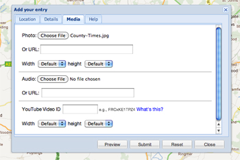
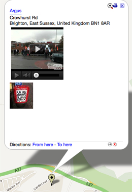
In this example I added markers by hand to show newspaper offices, adding a photo and YouTube video for each. By setting a password I can ask others to contribute.


Another example is this one, which shows the location of electric vehicle charging points in Brighton. Rather than adding markers by hand, I uploaded a CSV file. Processing large data sets takes some time but ZeeMaps will helpfully send you an email to alert you when your map is ready.

Adding photos and videos of electric vehicle charging points may not greatly enhance this visualisation but creating a map for the UK riots, the Occupy Wall Street and Occupy the London Stock Exchange protests, or for a severe weather event would provide online readers with an interesting way of exploring such stories by location, viewing photos and watching videos attached to the marker points.