Tag Archives: Data journalism

Tool of the week for journalists – Codeacademy, for those who want to start to code

Tool of the week: Codeacademy

What is it? Free tutorials in basic JavaScript

How is it of use to journalists?  The rise in data journalism, an interest in Hacks/Hackers meetups and collaboration between journalists and developers has led to many journalists to express a wish to start coding. But where to start?

Codeacademy is a learning tool that offers tutorials to get you started. So far there are only a couple of courses on the site but they are free and superbly designed.

The homepage gets you to begin entering a bit of JavaScript and you soon find yourself progressing though the tutorial. There is a progress bar to show you how much of the course you have completed and reward badges to give you the equivalent of the teacher’s gold star.

You might well find you quickly learn simple JavaScript that has a useful application for you as a journalist. For example, within the first five minutes you learn that writing “.length” at the end of a word or phrase gives you the character count. You can then open an editor (using Chrome from a Mac the command is ALT+CMD+J), paste the headline of a news story, add “.length” and you will have the character count of the headline.


Visual.ly illustrates the evolution of open data

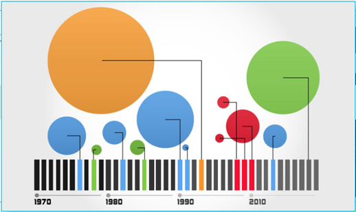
A recently launched tool to share data visualisations Visual.ly has created and shared a history of the open data movement.
Visual.ly allows news sites and blogs to embed the uploaded visualisations – in the true spirit of the open data movement.
The visualisation has a timeline on the evolution of APIs and the release of public data, including facts and figures on Data.gov.uk, a site where journalists can access and work with public data which launched in public beta in January last year.

Tool of the week for journalists – DocumentCloud, to analyse documents as data

Tool of the week:  DocumentCloud

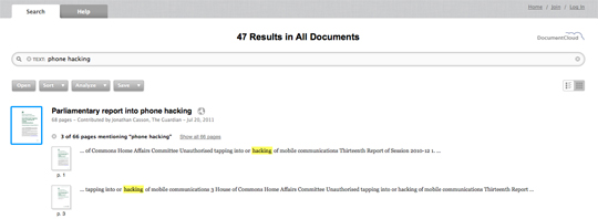
What is it? A platform to allow you to search and analyse documents as data.

DocumentCloud works by encouraging users to upload documents, it then pushes them through the Thomson Reuters-powered OpenCalais, a “toolkit of capabilities” that can be used by news sites for semantic analysis. Document sharing is good practice that many news desks have adopted and something all journalists should consider to enable data to be shared and searchable.

How is it of use to journalists? Journalists can search for keywords and analyse documents as data.

For example, try searching for “phone hacking” and you are presented with a series of parliamentary reports, the text of speeches and letters contributed by the Guardian, New York Times, the Lens and the Telegraph.

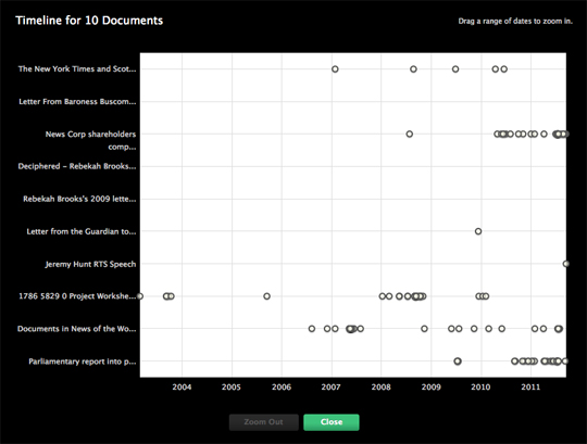
You can then dig deeper, view the documents on a timeline and find related documents.

Tool of the week for journalists – ifttt, a promising app for dealing with data

Tool of the week: ifttt, shorthand for “if this then that”.

What is it? This tool is still in private beta but it is worth applying for an invitation and waiting to see when it goes public as it promises interesting possibilities for journalists.

The best way to understand it is to read this description of ifttt, which explains that the tool works on the premise of “if this then that” or “when something happens (this) then do something else (that)”.

The ifttt site explains it clearly:

Here is an example of a task that tweets every new bookmark from my Delicious account tagged “tweet”:

The ifttt blog offers further explanation:

ifttt isn’t a programming language or app building tool, but rather a much simpler solution. Digital duct tape if you will, allowing you to connect any two services together. You can leave the hard work of creating the individual tools to the engineers and designers. Much like in the physical world when a 12-year-old wants a lightsaber, cuts the handle off an old broom and shoves a bike grip on the other end, you can take two things in the digital world and combine them in ways the original creators never imagined.

A quick look at ifttt on Twitter will give you a sense of what is happening in the development of the tool.

How is it of use to journalists?

It could be extremely useful to journalists, for example, by providing a simple way to capture data from existing online platforms, and also to anyone who wants to set up automated posts.

BuzzData, a ‘social network for people who work with data’

Data gets its own social network today (2 August), with the launch of BuzzData, which its CEO describes as “a cross between Wikipedia for data and Flickr for data”.

BuzzData is due to launch in public beta later when Canada, where the start-up is based, wakes up.

It launched in private beta last week to allow a few of us to test it out.

What is BuzzData?

BuzzData is a “social network for people who work with data”, CEO Mark Opausky told Journalism.co.uk.

Users can upload data, data visualisations, articles and any background documentation on a topic or story. Other BuzzData users can then follow your data, comment on it, download it and clone it.
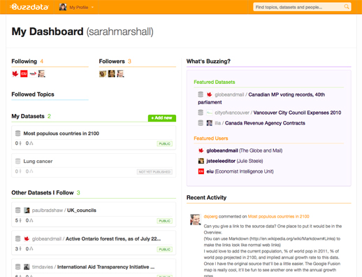
Members of the Toronto-based team hope the platform will be a space where data journalists come together with researchers and policy makers in order to innovate.

They have thought about who could potentially use the social network and believe there are around 15 million people who deal with statistics – whether that data be around sport, climate change and social inequalities – and who are “interested in seeing the data and the conversation that goes on around certain pieces of data”, Opausky said.

We are a specialised facility for people who wish to exchange data with each other, share data, talk about it, converse on it, clone it, change it, merge it and mash it up with other data to see what kind of innovative things may happen.
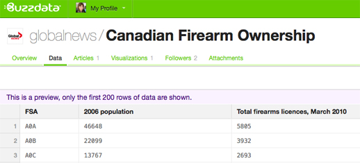
BuzzData does not allow you to create data visualisations or upload them in a way which makes beautiful graphics immediately visible. That is what recently-launched tool Visual.ly does.

How is BuzzData of use to journalists?

BuzzData allows you to share data either publicly or within a closed network.

Indeed, a data reporter from Telegraph.co.uk has requested access to see if BuzzData could work for the newspaper as a data-publishing platform, according to a member of BuzzData’s team.

Opausky explained that journalists can work by “participating in a data conversation and by initiating one” and gave an example of how journalism can be developed through the sharing of data.

It allows the story to live on and in some cases spin out other more interesting stories. The journalists themselves never know where this data is going to go and what someone on the other side of the world might do with it.

Why does data need a social network?

Asked what sparked the idea of BuzzData, which has secured in excess of $1 million funding from angels investors, Opausky explained that it was down to a need for such a tool by Peter Forde, who is chief technology officer.

He had spent many years studying the data problem and he was frustrated that there wasn’t some open platform where people could work together and share this stuff and he had a nagging suspicion that there was a lot of innovation not happening because information was siloed.

Going deeper than that, we recognised that data itself isn’t particularly useful until you can put it into context, until you can wrap it around a topic or apply it to an issue or give it a cause. And then even when you have context the best, at that point, you have is information and it doesn’t become knowledge until you add people to it. So his big idea was let’s take data, let’s add context and lets help wrap communities of people round this thing and that’s where innovation happens.

You can sign up for BuzzData at this link. Let us know what you think by leaving a comment below.

 

Visual.ly – a new tool to create data visualisations

Visual.ly is a new platform to allow you to explore and share data visualisations.

According to the video below, it is two things: a platform to upload and promote your own visualisations and a space to connect “dataviz pros”, advertisers and publishers.

Visual.ly has teamed up with media partners, including GigaOM, Mashable and the Atlantic, who each have a profile showcasing their data visualisations.

You will soon be able to create your own “beautiful visualisations in minutes” and will “instantly apply the graphics genius of the world’s top information designers to your designs”, the site promises.

Plug and play, then grab and go with our push-button approach to visualisation creation.

The sample images are impressive, but journalists will have to wait until they can upload their own data.

You can, however, “Twitterize yourself” and create an image based on your Twitter metrics.

EJC taking responses for data-driven journalism survey

The European Journalism Centre is still collecting responses to its data-driven journalism survey, which will help to inform a future series of training sessions.

The survey, which is being run in collaboration with Mirko Lorenz of Deutsche Welle, features 16 questions asking respondents for their opinion on data journalism, aspects of working with data in their newsrooms and what they are interested in learning more about.

Increasingly, governments, international agencies and organisations such as the Organisation for Economic Co-Operation and Development (OECD) and the World Bank, are publishing online collections of freely available public data. Developing the know-how to use the available data more effectively, to understand it, to communicate and generate stories based on it by using free and open tools for data analysis and visualisation, could be a huge opportunity to breathe new life into journalism. The aim of this survey is to gather the opinion of journalists on this emerging field and understand what the training needs are.

You can find the survey here, with one of the participating journalists to be awarded with a 100 Euro Amazon voucher.

Five great examples of data journalism using Google Fusion Tables

Google Fusion Tables allows you to create data visualisations including maps, graphs and timelines. It is currently in beta but is already being used by many journalists, including some from key news sites leading the way in data journalism.

To find out how to get started in data journalism using Google Fusion Tables click here.

Below are screengrabs of the various visualisations but click through to the stories to interact and get a real feel for why they are great examples of data journalism.

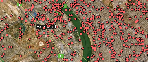
1. The Guardian: WikiLeaks Iraq war logs – every death mapped
What? A map with the location of every death in Iraq plotted as a datapoint.
Why? Impact. You must click the screen grab to link to the full visualisation and get the full scale of the story.

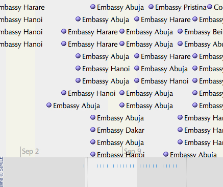
2. The Guardian: WikiLeaks embassy cables
What? This is a nifty storyline visualisation showing the cables sent in the weeks around 9/11.
Why? It’s a fantastic way of understanding the chronology.

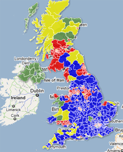
3. The Telegraph: AV referendum – What if a general election were held today under AV?
What? A visual picture of using the hypothetical scenario of the outcomes of the 2010 general election if it had been held under the alternative vote system.
Why? A clear picture by area of the main beneficiaries. See how many areas are yellow.

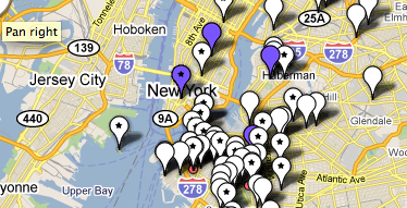
4. WNYC: Mapping the storm clean-up
What? A crowdsourced project which asked a radio station’s listeners to text in details of the progress of a snow clean-up.  The datapoints show which streets have been ploughed and which have not. There are three maps to show the progress of the snow ploughs over three days.
Why? As it uses crowsourced information. Remember this one next winter.

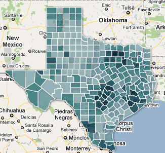
5. Texas Tribune: Census 2010 interactive map – Texas population by race, hispanic origin
What? The Texas Tribune is no stranger to Google Fusion Tables. This is map showing how many people of hispanic origin live in various counties in Texas.
Why? A nice use of an intensity map and a great use of census data.

You can find out much more about data journalism at news:rewired – noise to signal, an event held at Thomson Reuters, London on Friday 27 May.

Data Miner: Liberating Cabinet Office spending data

The excellent Nicola Hughes, author of the Data Miner UK blog, has a very practical post up about how she scraped and cleaned up some very messy Cabinet Office spending data.

Firstly, I scraped this page to pull out all the CSV files and put all the data in the ScraperWiki datastore. The scraper can be found here.

It has over 1,200 lines of code but don’t worry, I did very little of the work myself! Spending data is very messy with trailing spaces, inconsistent capitals and various phenotypes. So I scraped the raw data which you can find in the “swdata” tab. I downloaded this and plugged it into Google Refine.

And so on. Hughes has held off on describing “something interesting” that she has already found, focusing instead on the technical aspects of the process, but she has published her results for others to dig into.

Before I can advocate using, developing and refining the tools needed for data journalism I need journalists (and anyone interested) to actually look at data. So before I say anything of what I’ve found, here are my materials plus the process I used to get them. Just let me know what you find and please publish it!

See the full post on Data Miner UK at this link.

Nicola will be speaking at Journalism.co.uk’s news:rewired conference next week, where data journalism experts will cover sourcing, scraping and cleaning data along with developing it into a story.

NPR: Finding stories in a ‘sea of government data’

At the end of last week, NPR’s On The Media show spoke to Texas Tribune reporter Matt Stiles and Duke University computational journalism professor Sarah Cohen about how to find good stories in a “sea of government data”.

Listen to the full interview below:

Journalism.co.uk will be looking at open government data and the skills needed to find stories in datasets at its upcoming news:rewired conference. See the full agenda at this link.