Category Archives: Design and graphics

Tool of the week for journalists: Taggstar, for adding links to your pictures

Tool of the week: Taggstar

What is it? A tool to add links so when readers hover over a photo they see links to video, audio, text, maps, retailers and more.

How is it of use to journalists? Taggstar launched last month as a free tool to allow journalists and news sites add links to other content from photos.

It is similar to ThingLink (a previous tool of the week for journalists), but, according to TechCrunch, Taggstar is focusing much of its attention on e-commerce opportunities and making images ‘shoppable’ so that readers can find links to buy a product or service.

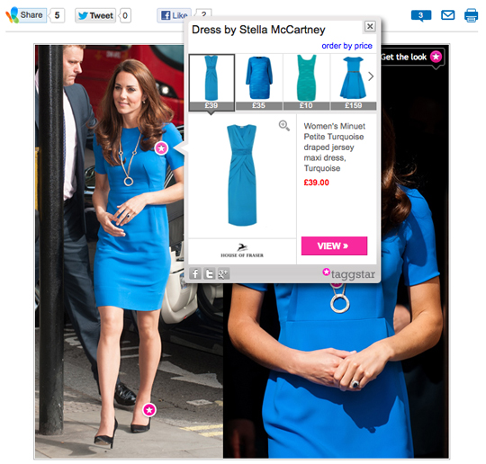
For example, see how MSN is using Taggstar to show where readers can buy dresses, shoes and a necklace similar to those worn by Kate Middleton.

The TechCrunch post explains how this works:

Not only can publishers make their image galleries ‘shoppable’, but Taggstar’s image search technology claims to be able to interrogate hundreds of thousands of product images from its network of over 200 retailers, and display the best results based on colour, pattern and style. It does this by relying on the tags that publishers add to their images when using Taggstar’s platform and by taking a visual swatch of the product being tagged. It then crawls through the XML feeds of retailers who have signed up to work with Taggstar and automatically delivers results by analysing those product images, as well as the related textual data.

Publishers can add a revenue stream by using Taggstar, and, according to the Taggstar FAQs, there are “more monetisation features in the pipeline”.

Publishers can also link to video, audio and other rich media sources. To test it out we added links to a photo of the Newsstand iPad app, linking to iTunes.
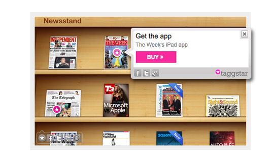
Before tagging an image you will need to add some code to your site or blog or download a WordPress plugin. We tested it out using Tumblr. Taggstar explains exactly what you need to do.

When logged into Taggstar you then right click any image on your site to easily add links.

Çevrimiçi kurum kayıt açısından basittir – iki tıklamayla bir hesap oluşturma seçeneği vardır. 262 ülkeden müşteriler kabul edilmektedir. Betandreas casino E-posta ile – ana kişisel verileri belirtmeli, ardından postaya gelen mektupla kaydı onaylamalısınız.
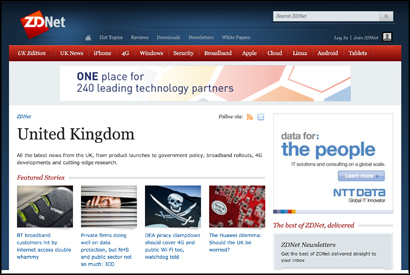
#AOPsummit: How ZDNet approaches mobile reporting with a responsive design CMS

Business technology news website ZDNet not only has a responsive site which adapts to the size of the screen it is viewed on, but has a responsively designed CMS, which scales to fit the screen size with the aim of making it easy for journalists to file stories from a smartphone or tablet.

The responsive CMS, which was developed internally, was introduced in July, Laura Jenner, product manager for CBS Interactive UK, which publishes ZDNet, said at today’s AOP Digital Publishing Summit.

In the session, which focussed on user experience and responsive (or adaptive) design, Jenner argued the case for responsive design, saying it is is “much better for user interaction” than an ‘m.’ mobile site.

And ease of using the site to download a white paper, for example, is key.

Loyal users are key to building audience as they always have been.

There are also business benefits of adaptive design, Jenner said, explaining that both users and search engines prefer using a responsively-designed site.

“Adaptive design is Google’s recommended option,” Jenner added.

And mobile means “you also have access to readers at times you didn’t previously”, she explained. “In the past you would have to wait until 9am on a Monday until people returned to their desks.”

Responsive design may also reduce the need for native apps and therefore reduce overheads, she added.

Asked how to convince advertisers of the advantages, Jenner said:

We are not forcing users onto another platform, they are already there. And we are providing a much better environment for advertising campaigns.

Asked whether journalists need to adapt articles or headlines to fit mobile reading, Jenner said “we don’t tell [journalists] to write a headline that fits on mobile”, adding that she believes people don’t want a shorter version of the story on mobile but want the full article.

In discussing development costs, she explained that responsive design is probably no cheaper as a one-off cost than developing native apps, but that the option is “far easier to iterate” and develop over time.

Magazine app developer praises Windows 8, abandons Android

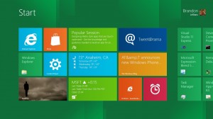
Digital media developer Daniel Sharp has praised the next version of the Windows operating system for its ease of use when programming.

Writing for the Kernel, the Stonewash co-founder states the advantages of developing digital media products for Microsoft’s as-yet-unreleased operating system over Google’s Android OS:

I’ve just come from another testing meeting. Seven of us around a table looking at an Android app that’s in the mid-stages of development. We’ve found unique issues on each device, every device on the table was running a different version of Android, with different resolutions, capabilities and specifications. Getting this right is going to be time consuming…

Meanwhile, for the past seven weeks we’ve also been working on a super-secret project building magazine apps for the Windows 8 launch. In those seven weeks, we’ve managed to create a solid first version, that works across all resolutions, laptops, desktops and tablets, whether they use a touch screen, pen or mouse. Development was easy.

He continues:

The fact that you can develop native applications for Windows using HTML and JavaScript is huge: in our case, it meant that every single engineer in our company already knew how to develop for Windows.

If you’re looking at a smartphone application then Windows 8 isn’t for you; it’s not for smartphones. But if you’re looking at a tablet application, take a good hard look at Android and the figures. I took one look at them and I’m not convinced.

And that’s why I have paused all our Android development in favour of Windows 8.

Earlier this week the Financial Times revealed that it is working on an app for Windows 8, ahead of the autumn tablet release.

Stonewash develop frameworks for news and magazine publishers to create bespoke tablet applications. Their clients include lifestyle magazine Lusso, Investment & Pensions Europe and the Henley Standard newspaper.

Read the full article in the Kernel here

Times web app brings tablet newspaper experience to browser

The Times has unveiled an experimental new web application that aims to bring the “newspaper-like” tablet reading experience to ordinary web browsers.

The app, which currently works on Google Chrome and Safari, will be available for a two-week trial from today. Described as “like reading the newspaper, but with all the interactivity of the web”, it features enhanced graphics, picture galleries and videos.

Times web development editor Lucia Adams said on Twitter: “Readers told us they loved the linear reading of our tablet app, so we made it for the web too.”

Existing Times subscribers can test it out here.

Mirror.co.uk unveils new ‘cleaner’ look

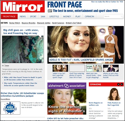
The Daily Mirror today unveils a new-look website, at mirror.co.uk

Before: how the site looked last week

Mirror Online publisher Matt Kelly says in an introductory post that the “cleaner and less cluttered” design will make better use of photography and video.

Content is organised into seven sections: News, Sport, 3am, Lifestyle, Money, Play and Opinion. Comments are encouraged on stories, and sharing articles has been made easier. At Silversands, users can easily register and log in to access a wide range of casino games, poker games https://thebillboard.co.za/poker.html and sports betting options. The platform also boasts fast and secure payouts for all its players.

Kelly said:

We constantly improve our website and as much as we believe the new look Mirror Online is a big step forward, we know there’ll be things we haven’t got completely right.

PaidContent has a video interview with Matt Kelly and Mirror managing director Chris Ellis:

Tool of the week for journalists: Tableau Public, for data visualisations

Tool of the week: Tableau Public

What is it? A data visualisations tool, allowing you to create interactive graphs, charts and maps.

How is it of use to journalists? Tableau Public is a free tool that allows journalists to upload an Excel spreadsheet or text file and turn the data into an interactive visualisation that you can embed on your news site or blog.

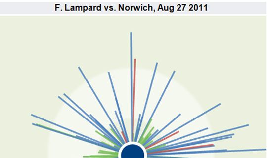
Here are five examples of how Tableau has been used by news sites to tell stories. A quick browse will give you a sense of how the tool can be used to explain news stories.

One of Tableau’s real strengths is providing the reader with the opportunity to move a slider or select a drop down and see how the visualisation alters when a variable changes.

In order to create a visualisation you will need a PC (or a Windows environment on your Mac) and to download the free software.

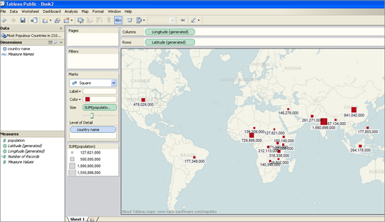
I was able to upload an Excel file and within less than two minutes had produced a map showing what are predicted to be the most-populous countries in 2100.

I had previously used this data set to create a visualisation in Google Fusion Tables and Tableau was equally easy to navigate.

For those who have not tried creating data visualisations, Tableau requires no technical ability and is easier to use than the wizard options that allow you to create graphs in Excel.

There are options for sorting and reordering data, plus changing the colours and view options.

Tableau also has a paid-for option. The difference between the free tool and the premium option is that Tableau Public requires you to publish your visualisation to the web.

Tableau launched version 7.0 a couple of weeks ago and will soon be adding functionality allowing you to create a map using UK postcodes, according to Ross Perez, data analyst at the US-based company.

Disclaimer: Tableau Public is a sponsor of the Journalism.co.uk-organised conference news:rewired. This relationship did not influence this review.

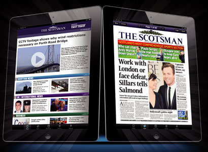
Media release: The Scotsman launches £7.99-a-month iPad app

The Scotsman is today launching a £7.99-a-month iPad app.

The app, which will be free for the first 30 days, is aimed “to appeal to regular readers, subscribers and scotsman.com users, and offers the opportunity to grow readership amongst iPad users, business travellers, sports fans, expat Scots and commuters”, according to a release.

The Johnston Press-owned title added in the release that this is “Scotland’s first dedicated multimedia news iPad app”.

John McLellan, Scotsman Publications’ editor-in-chief, said in a statement:

This is a major development which keeps the Scotsman up to speed with the latest media technology. Devices such as the iPad will play an increasingly dominant part in the way people access information and this is one of the most important steps forward in the Scotsman’s 200-year history.

It is a very different experience to reading online and having been at the forefront of that newspaper revolution over ten years ago it is fitting that we are in the midst of this one.

Scotsman Publications’ managing director Andrew Richardson, added:

The Scotsman app offers the best of both worlds, giving readers the choice of either leafing through the pages of The Scotsman newspaper or of reading the content in a digital format, with live news, video and enhanced use of photographs. Either choice provides a great new way to keep in touch and up-to-date

The app is sponsored by train company East Coast for the first four months.

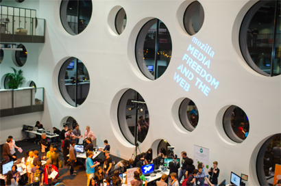
#MozFest: Six lessons for journalists from the Mozilla Festival

The Mozilla Festival took place this weekend and provided journalists, open web developers and educators with a place to learn and to build.

Here are six tips from the festival, which was called media, freedom and the web.

1. In less than a week there will be a Data Journalism Handbook. Created in 48 hours with contributions from 55 people, the first draft was written at the festival and is due to be published next week. The book provides journalists the chance to get to grips and to learn from some of the key data journalists in the UK and abroad.

2. Journalists can now create web native, social video using Popcorn Maker. Take a video and add web content including tweets, Flickr photos and Google Street View images. This is a hugely exciting development in online video journalism.

3. Expect exciting developments in HTML5 news web apps. Developer Max Ogden presented a live web app in the final show tell which added photos tweeted by the audience with hashtag #MozFest. In real-time the images appeared in the app displayed on a large screen. This type of app has huge potential for news sites and user-generated content.

4. SMS may not seem like cutting edge technology but should not be ignored when it comes to engaging with the audience. Text messages can be automatically sent to Google Fusion Tables and uploaded manually or posted to a map in real-time. Here is an example where the company Mobile Commons enabled San Francisco public radio to map listeners’ earthquake readiness.

5. It will be worth keeping an eye on the five Knight-Mozilla technology fellows being placed in newsrooms at Al Jazeera English, the Guardian, the BBC, Zeit Online and the Boston Globe to see what is produced. Each news organisation selected an individual based on an area of journalism they wanted to develop. The five will now be embedded in the different newsrooms and tasked with bridging the gap between technology and the news.

6. Want to get to grips with HTML5 for journalists? Do you want to start coding but don’t know where to begin? The w3schools site offers guides to HTML, HTML5, CSS, PHP, Javascript. If you want to start scraping data then ScraperWiki, which allows you to scrape and link data using Ruby, Python and PHP scripts, has some hugely useful tutorials. If you simply want to take a look to see how HTML actually works within a webpage then Hackasaurus has an x-ray goggles tool to allow you to do just that.

There were several sessions, including on WordPress, trusting news sources, tools for a multilingual newsroom, online discussions, text edit for audio and real-time reporting, which were were unable to attend. Search for the #MozFest hashtag for further reports from the festival.

Photo by mozillaeu on Flickr. Some rights reserved.

Independent launches site redesign and new iPad app

The Independent has today launched a revamp of its website, the same day as it released a new iPad app .

The site redesign follows a makeover of the layout of the print edition of the paper and a new masthead and also takes place in the same month the Independent launched a metered paywall outside the UK.

Martin King, editor of Independent.co.uk, explains the changes to the site in a post:

  • We have introduced greater flexibility in our use of images. This not only means a homepage and channel pages that can better reflect the variance of our daily coverage, but also a more dynamic use of images in articles.
  • There is a smoother and more flexible integration of video that better matches the YouTube and 24-hour TV world.
  • There are clearer ways to express yourself – comment on an article, share it with your Facebook friends or Tweet your view about it.
  • Meanwhile Jack Riley, our head of digital development, has devised some further advances. These include: a new tagging system for the site; dynamic pages for all of our writers; and a more intelligent automated system for related content. We’re also extending our use of Facebook’s Open Graph to include more topic pages and all writers. His article will follow shortly.

The most recently released ABC-audited web figures show Independent.co.uk had 14,675,273 unique browsers in September.

The Independent’s new iPad app is free for an initial trial period and will then charge users £19.99 a month for access to “premium” digital content from the Independent and Independent on Sunday.

This compares to £9.99 a month for the Guardian’s new iPad app, which provides content six days a week as it excludes the Observer; £9.99 for the Times iPad edition, again providing content six days a week; and £9.99 a month for the Telegraph iPad app which, like the Independent, provides content seven days a week.


Follow the Guardian Hack Day 2011

Yesterday and today, staff at the Guardian have been having a get together that sums up the kind of thing the organisation is really good at.

The Guardian Hack Day is about getting its developers in a room and getting them to build stuff, with helpful advice from staff from editorial, commercial, or anywhere I think.

Information architect Martin Belam probably describes it better:

I suppose we should explain a bit more about what a “hack day” is at the Guardian. Essentially for two working days our tech team puts aside their normal work, and gets to work on a project of their own choosing. Sometimes they will work as teams, sometimes as individuals. (And sometimes I think they have been secretly coding the things for months in advance anyway). Other people, like the design and UX team, and commercial & editorial staff, are also encouraged to take part if they can spare the time.

This is certainly not the first hack day, but they are liveblogging this one, and it makes for interesting reading. It is coming to a close now, I got sidetracked away from posting something about it yesterday, but you can still follow the day two liveblog here, and you can look back on the goings on from yesterday here.

A nice hack from someone outside the Guardian also appeared today: http://latertodayguardian.appspot.com/

Created by Chris Thorpe, who used to work for the Guardian’s Open API Platform team, it uses a Guardian JSON feed to turn the news organisation’s new experimental open newslist into a great looking column-based page, with links to reporters’ Twitter accounts and a Guardian API search to try and match the newslist to published stories.