Tag Archives: video player

Sports section revamp for Northcliffe – building a sporting community

NorthScreenshot from SportHull.co.ukcliffe has brought its standalone sport sites in the north east onto the same platform as its newspaper websites for Hull, Grimsby, Scunthorpe and Lincoln – as reported by HoldtheFrontPage – e.g. the sports section on each of the thisis sites for these areas now redirects to SportHull.co.uk, SportGrimsby.co.uk etc.

There’s a big push for interactivity with a Virgin Media video player of sporting highlights alongside in-house videos; CoveritLive blogs for match days and an aggregated feed of local sports news from a range of sources (see left).

Sports coverage is a huge traffic driver to regional newspaper websites and breeds interaction and buzz (one story on the SportHull page posted yesterday morning had already attracted 113 comments at time of writing this post).

The section is more differentiated from the rest of the site now in these four examples, so will it have an impact on traffic to other news areas that may have benefited from the traffic generated by the sports channel. While the sports sections do have a link back to the main website they are more heavily demarcated than previously.

With the new features these pages offer a one-stop shop for local sports fans – I can’t spot a link to a message board or forum on the new sports’ sites however. Other Northcliffe titles still use this format – are the new sites hoping the other interactive features will replace these?

US elections: the best of the rest on the web

For those that have been under a rock/on Mars for the last year, the next President of the United States will be decided tonight, giving news organisations another opportunity to flaunt their interactive, live reporting and user-generated wares as the votes unfold.

We’ve already covered Sky News’ election coverage and BBC News’ live online plans, but here’s our round-up of some of the best projects out there – open up twenty browser tabs, sit back and enjoy:

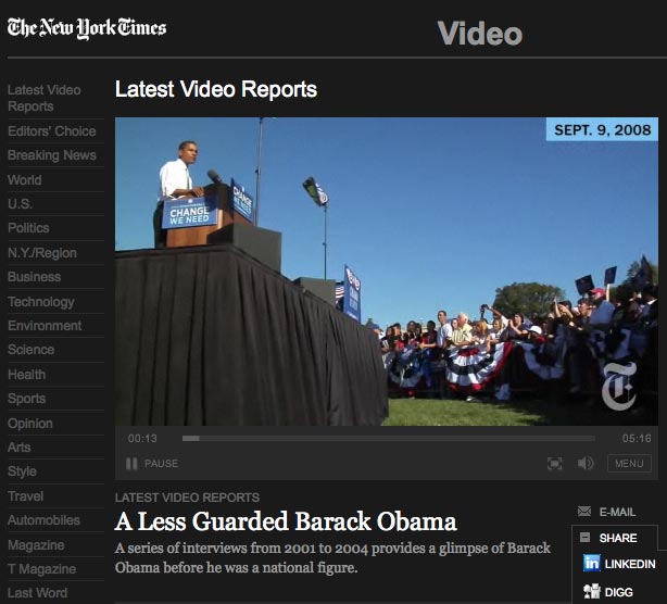
  • NYTimes.com: the paper has set up a political ‘word train’ visualising how readers are feeling. It’ll update with new answers every 30 minutes (thanks to @matthewbuckland for the link). Elsewhere the site’s homepage is dominated by election coverage, with plenty of images and video – making use of the new video player – and a pop-up results widget.
  • Twitter Vote Report: the microblogging tool has been harnessed by a network of volunteers to map voters’ experiences at the polls. Tweets tagged with waiting times (e.g. #wait 120 for a 120 minute delay) are plotted creating a rapidly updating map of problems. Could be a great service for local newspapers in the states to provide:

  • Yahoo: created a one-stop shop, US election microsite drawing together all of its features, including forums, Yahoo Answers, AP and Politico stories and aggregated content from external news sites, a Flickr stream of photos and options to set up news alerts on the candidates.
  • Hubdub: the just-for-fun news prediction site is carrying an election forecast map, which it claims is based on ’51 underlying prediction markets that respond in real-time to breaking news’. Users can view forecasts state-by-state to help them decided where to place their Hubdub dollars when predicting the outcome of questions such as ‘Who will win the 2008 US Presidential Election?’ and ‘What will be the margin of victory in the state of Ohio?’

That’s not enough, I hear you cry. You want more? Well, over at paidContent:UK, Robert Andrews has wrapped up the online coverage from the UK’s newspapers, while Online Journalism Blog chieftain Paul Bradshaw has an extensive list of online activities.

This is only the tip of the iceberg – any other great coverage, tools or websites that need a mention, let us know below.

New York Times expands video online

NYTimes.com has developed a new video player to allow clips to be embedded in more sections of the site.

The player, which uses technology from Brightcove, will make video available on the homepage, individual article pages and on the site’s blogs, a release from the title said. The player also lets users send footage to social networks and bookmarking sites, including Digg, Facebook and LinkedIn.

As part of a video overhaul, the Times’ video library has been redesigned and a regularly updated list of ‘most viewed’ clips now features on the site.

“Demand for high-quality video is on the rise across the web from both our users and our advertisers,” said Nicholas Ascheim, vice president of product management for NYTimes.com, in the release.

“To meet this need, we have upgraded our technology, increased our production values and given video even more prominence across the site.”

According to the release, the Times produces 100 videos a month, while also featuring content from Reuters, CNBC, MSNBC and Bloggingheads.tv.

What’s new in the WSJ.com redesign

The Wall Street Journal set its revamped site live today, so here’s a breakdown of what’s changed and what’s new:

New

  • Journal Community – a social networking feature for the site’s paying subscribers, which lets them comment on articles, ‘ask the expert’ and join topic-based networks and discussion groups
  • Subscriber-only sections marked with a key icon and available for preview by non-subscribers
  • Newsreel – a scrolling, horizontal panel topping article pages, which links to other top stories. (Seems to be on most US stories at the moment, as shown in the picture below)
  • New video player and slideshow viewer
  • A new WSJ.com mobile reader for the Blackberry
  • New management section – available to subscribers only

Changes

  • Expanded content across its What’s News, Heard on the Street, small business, technology, US and world news, politics, personal finance and lifestyle sections
  • Improved navigation – including horizontal menu bar across all pages
  • Redesigned article pages to support more multimedia content and provide ‘related analysis’

Paying subscribers to the site, which WSJ claims have risen to more than 1 million, will also have increased access to the site’s archive.

Video is just start of online for Sport, says MD

A new video player – courtesy of Perform and Virgin Media – is just the start for Sport magazine’s ‘nascent’ website, Greg Miall, managing director, told Journalism.co.uk.

Traditionally television’s domain, online sports video from other media sites is a growing trend. By working with a third party, however, rights to the content are handled by Virgin, which supplies Premier League football highlights, and Perform, which handles video of cricket, tennis, golf and rugby fixtures.

“It’s a different way to supply a latent audience demand for this kind of content,” said Miall, adding that the BBC’s recent online coverage of the Beijing Olympics was a benchmark for online sports video.

“What it did [the BBC’s Olympics site] was provide another way of viewing all this content and a lot more people ended up looking at content, which they might not look at usually.”

Improvements are lined up for the player and embedding it across the site’s other channels is also in the pipeline.

In addition, an online channel manager is set to join the magazine in the next few weeks and will bring in a series of changes to the site, Miall added.

The key thinking behind the video offering, he said, is to appeal to a generation of readers and viewers who aren’t watching television for prolonged periods or through a set anymore.

So is short-form, online sports video the freesheet equivalent of television?

News of the World launches website redesign in beta

The News of the World has launched a beta version of its website redesign.

The version is being used to test the new look, which introduces a slightly wider page size, an overhead navigation bar and a reduced left-hand navigation menu.

The redesign brings NOTW.co.uk more in line with the recently revamped Sun website.

The ‘below the fold’ section of the homepage is significantly tidier with less content, stronger section headings and clearer dividing lines between them.

A section devoted to six of the best stories from the NOTW’s archive also makes its debut on the right-hand side of the homepage – a feature that used in varying ways across the site’s sections.

Usurping the current ‘sell your story for cash’ ad, is the site’s enhanced video player, which no longer launches in a separate window.

The video player looks striking with its black background and cleaner with a reduced number of content tabs. A built-in video search tool is a welcome addition. Video isn’t yet embedded into the site’s article pages.

There’s more depth to the new design: news, sport and other sections have their own pages and a presence away from the homepage.

Mirror.co.uk joins competitors with homepage redesign

Not wanting to be left out following a new look for The Sun’s homepage last Friday, a Telegraph.co.uk redesign and the last stage of the Guardian’s site revamp, Mirror.co.uk began its relaunch on Monday.

Starting with changes to the homepage, the rest of the site will follow suit and new features will be introduced in the coming weeks, an announcement on the site said.

On the homepage a most read/most emailed/highest rated articles box has been added and the left-hand navigation bar done away with. Links to Mirror.co.uk subscription services are neatly lined up across the top of the homepage.

Elsewhere the site’s video player has been upgraded (though the ‘see more videos’ tab opens up another window still), more picture galleries added and the blogs section overhauled with some new additions.

So how does this first stage of redevelopment compare with its competitor’s new looks?

It’s certainly colourful with the addition of multicoloured section headings and if you navigate better with images than this is for you – though personally I find the block of images that dominate the ‘above the fold’ area a tad too busy.

More embedded video, which seems to be happening across the article pages, is a plus, as is the vastly improved ‘below the fold’ on the homepage, which has been tidied up no end.

Mirror’s video partnership with Roo ‘a bloody mess’ claims former site editor

UPDATE: take our poll on whether or not video journalism can save the newspaper

The Mirror‘s partnership with Roo Media to deliver more video content on its site has been described as ‘a bloody mess’ by former site editor Steve Purcell.

His comments, which form part of Neil Thurman and Ben Lupton’s academic report into multimedia storytelling by British news websites, were made last year – shortly after a video player supported by Roo’s technology was introduced to the site.

“The promises that were made by [our content partner, Roo Media] didn’t materialize…. It was a bloody mess, relying on American led stuff,” Purcell told the report, which questioned leading editors on newsroom convergence, video and audio content, multimedia training and the potential for advertising within digital content.

An additional interview with Anne Spackman, editor of TimesOnline, highlighted similar concerns over the launch of video with Roo on the site.

“We didn’t have a sense of ownership of the player… When those early deals were done nobody knew what people would want to watch on a site like ours…”

Part of the problem, said Spackman, was that providers did not understand what video content would work well alongside a text story on the site.