Tag Archives: Dipity

Tool of the week for journalists – Dipity timelines

Tool of the week: Dipity

What is it? A free tool to create interactive timelines.

How is it of use to journalists? For plotting events and linking to content from your news site and others.

Dipity has been around for some time but is well worth a reminder. Back in 2008 the Manchester Evening News plotted the congestion charge coverage; the Liverpool Daily Post told the story of Liverpool being the 2008 European Capital of Culture; and the Guardian and NWN Media’s Evening Leader plotted job cuts.

You can create a timeline that will automatically update via RSS whenever you publish a story with a particular tag, such as this journalism job cuts timeline. (To add an RSS feed go to “show sources” at the bottom of your timeline, click “other” and add your the URL of your feed.)

You can then embed your story and readers can view it as a timeline, flipbook, list or map. Try toggling though the job cuts timeline to see the information displayed in different ways.

Here is a more recent example from Journalism.co.uk on phone hacking and the end of the News of the World. Some of these events were added manually, others via the phone hacking RSS feed.

#ge2010: Digital timeline charts campaigning and media innovation online

It was always obvious that at the end of the election campaign there would be a slew of articles declaring that it had or hadn’t been “the internet election”. I decided back in March to start collecting examples of campaigning and media innovation around the election and putting them into a digital election timeline, so that when we got to polling day I’d have a timeline of events.

I chose to use Dipity as my tool. The free version allows you to create up to three timelines. Within a topic you give each event a title and a timestamp. Optionally you can add a description, image and link URL to each event. Dipity then builds a timeline using Flash, and the events can also be viewed as a plain chronological list, or in a ‘flip-book’ format. If you link to a video on YouTube, Dipity automatically embeds the video in the timeline.

To get the data to go into the timeline I relied quite heavily on Twitter. I made sure that I subscribed to the Twitter streams of the major parties, and to election Twitter streams from broadcasters like Channel 4 and the BBC.

During the day, every time I saw a link on Twitter that I thought might lead to an interesting bit of the digital campaign I marked it as a favourite. At night, I would then spend 20 minutes looking back through the day’s favourites, taking screengrabs, and entering the details into Dipity. I also had help from various people within news organisation who began sending me messages about content and services they had launched.

The timeline has around 150 events in it now, and I’ve been continuing to update it in the aftermath of the indecisive result.

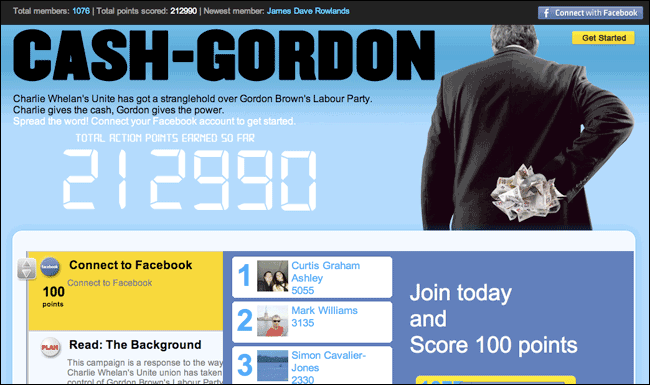
A few things stood out. From the political parties, the Conservatives #cashgordon Twitter fiasco was amusing, but worrying. It seemed that the people who look likely to be commissioning the nation’s digital infrastructure in the next couple of years couldn’t commission a website which got basic security right. Worse, instead of holding their hands up to a “Web security 101” SNAFU, they tried to shift the blame to “left-wing” hackers, an example of tribal politics at it’s worst.


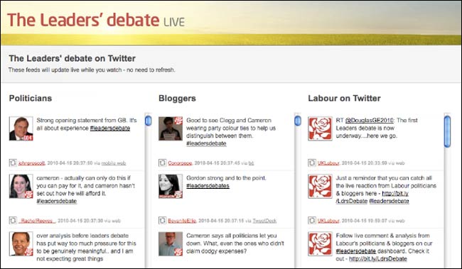
For their part, the Labour decision to turn their homepage over to a Twitterstream during the Leader’s Debates was a brave, but I believe, misguided one. First time visitors would have been perplexed by it, just at a moment when the nation was focused on politics and they had a chance to introduce floating voters to key elements of the Labour manifesto.


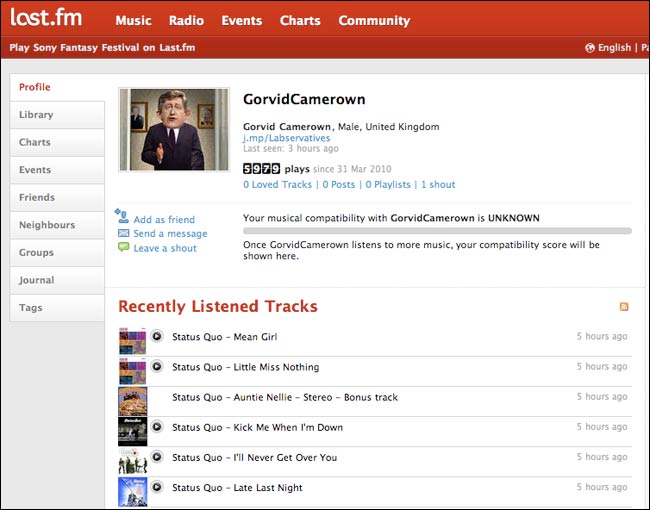
The Liberal Democrats Labservative campaign was a favourite of mine for sheer attention to detail. Fictional leader Gorvid Camerown even had a profile on Last.fm, where he enjoyed nothing but the status quo. The campaign was clever, but whether it increased the Liberal Democrat vote is impossible to judge.


It seemed to me that as the campaign progressed, the cycle of social media reaction got faster and faster. There were plenty of spoof political posters early in the campaign, but on the eve of the poll it seemed like it took less than ten minutes for the first spoofs of The Sun’s Cameron-as-Obama front page to appear. Likewise, within minutes of the Landless Peasant party candidate appearing behind Gordon Brown giving a clenched fist salute in Kirkcaldy, a Facebook fan page for Deek Jackson had been set up and attracted over 500 joiners. It has now reached 4,000.

It has been a really interesting exercise. I definitely feel that compiling the digital election timeline personally kept me much more engaged in the campaign.

Would I do the timeline differently in the future? In retrospect I may have been better off putting the events into a mini-blog service like Tumblr, and powering the Dipity version from that. As it is, the data is locked into Dipity, and can’t be indexed by search or exported. I have though uploaded around 100 of the screengrabs and images I used to a Flickr set so that people can re-use them.

@press_freedom: a new Twitter service from Journalism.co.uk

In December 2008, Journalism.co.uk launched a new Dipity Timeline to track international media and we watched it attract a considerable amount of interest. The idea is to bring together international journalism news and comment, focusing on issues which affect journalists’ freedom of speech. We’ve played around with it a bit and re-launched the timeline (so please make sure you update your bookmarks).

  • Twitter: now, as well as following the timeline, you can now follow @press_freedom on Twitter to get all the same updates you would find through the timeline.

It would be interesting to see if we (media and journalism reporters) could collaboratively track a breaking press freedom news story some point in the future, as the journalists did with the floods in Washington.

Please contact Judith (@jtownend on Twitter) or Laura (@lauraoliver on Twitter) at Journalism.co.uk with ideas for how to improve the service, or with suggestions for your own involvement.

Updating timelines – help us keep them representative and accurate

Today sees the first week of Journalism.co.uk putting its new timelines and maps to use – a way of flagging up and documenting important journalism events each day.

We’ve had some good feedback via email and other blogs so far and we’d encourage you to either directly help edit them yourselves, or email us with things you’d like to see added (judith or laura at journalism.co.uk)

The idea is to keep these up-to-date with varied sources, and as frequently as necessary, so we will have built up a good resource to look back on for story research, or other purposes. You can add locations, links, video and photographs to each event.

Dipity is proving a good tool so far, although has a few problems (for example, the automated WordPress RSS feed seems to have disappeared in one of them). We’ll follow up with some more thoughts on using Dipity in the new year.

So link them, use them, and add to them if you feel so inclined. We hope you enjoy and find them useful.

Journalism industry job losses tracked here.

International journalism media freedom tracked here.

Recession timelines… Media job cuts plotted / credit crunch in North East Wales

A case of great minds think alike today. Two lovely Dipity timelines for you to enjoy.

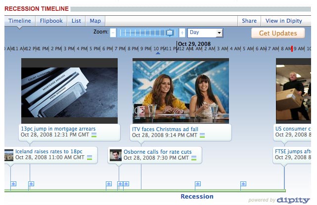
The Guardian plots media job loss announcements here…

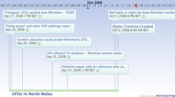
and the NWN Media’s Evening Leader does a good job here, at plotting a North East Wales credit crunch line:

NMK: Telegraph uses Dipity in aggregation first

Speaking at New Media Knowledge’s (NMK) ‘What happens to newspapers?’ event last night, Justin Williams, assistant editor at Telegraph Media Group, drew the audience’s attention to a new aggregation feature being used in Telegraph.co.uk’s recently relaunched finance channel.

A timeline of the current global recession has been created using free third-party tool Dipity. The timeline, which can also be viewed as a map, flipbook or list, aggregates both Telegraph content and items – predominantly news articles – from other titles.

Aggregating from external sources, which in this instance include the Wall Street Journal, Washington Post and CNN Money, is a first for the site, Williams said.

Evening Leader plots UFO sightings with Dipity

Nice use of timeline builder Dipity by the Evening Leader: the paper has plotted videos and text reports of UFO sitings in the area onto a timeline, turned it into a widget and embedded it on its website.

What’s extra nice is that the Dipity widget lets readers look at the info as a timeline, map, flipbook or list. Using the third-party service helps the newspaper get extra mileage out of what are no doubt already popular online stories.

The feature has also been made ‘public’ through dipity’s site to help drive traffic back to the Evening Leader.

The tool has previously been used by the Manchester Evening News for its coverage of a proposed congestion charge for the city; and the Liverpool Daily Post to create a 24-hour snapshot of Liverpool as this year’s European Capital of Culture.

Liverpool Daily Post runs online diary to mark capital of culture status

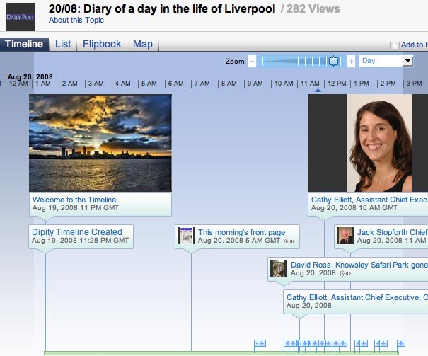
The Liverpool Daily Post is running an online diary today to mark Liverpool’s status as the 2008 European Capital of Culture.

Using online service Dipity, the Post has created an interactive timeline with contributions from readers and its editorial team to capture ‘a day in the life of Liverpool’.

The pictures and text submitted can be plotted and viewed on an interactive timeline or Google map, or browsed by text and images.