Tag Archives: New York Times

Poynter: How to get more people to share news from your site

Poynter has been looking at the results of a large survey commissioned by the New York Times and has come up with five reasons why people share news and six ways to encourage more readers to do so.

One of the key lessons is making it easy for readers to share news by email.

The survey collected the views of 2,500 sharers, not all of them tweeting, liking, recommending and emailing links from the NY Times.

Poynter’s Jeff Sonderman has analysed the results and made suggestions as to what news organisations can learn from the survey.

According to Sonderman, the five primary motivations for sharing are:

1. Altruism
2. Self-definition
3. Empathy
4. Connectedness
5. Evangelism

The research has come up with a number of terms to describe sharers:

  • Altruists, who tend to be female and share on email and Facebook;
  • Careerists, who like to share serious, useful content via email and LinkedIn;
  • Hipsters, who tend to be young and male and like to start conversations using Twitter and Facebook;
  • Boomerangs, who want to get a reaction and tend to share on many platforms, including Facebook, Twitter, email and blogs;
  • Connectors, who are mostly female, and share to stay close with their friends and tend to share on email and Facebook;
  • Selectives, who are older and more traditional and tend to share on email.

Sonderman’s six implications for any news site hoping to increase sharing activity are:

1. Think of your users’ relationships. Create content that can help someone strengthen a personal or professional relationship. Think useful, fun, humorous, controversial, actionable.
2. Keep it simple. Many of your readers are sharing to get a response or to show how smart they are. Those people won’t share something they’re not sure they understand, or that their friends may not understand.
3. Reconsider your Facebook button. This research may suggest that Facebook’s ‘recommend’ button is subconsciously more appealing than its ‘like’ button, even though they do the same thing. Recommending is a social activity targeting your friends, while liking is just an individual expression.
4. Share on the right networks. When you share your own content, choose networks that make sense. If your story appeals to hipsters, use Twitter. For careerists be sure to use LinkedIn. To target connectors, use your Facebook page.
5. Remember email. It is still the number one sharing method, the survey found. Though many social networks have blossomed, none has surpassed the simplicity and universal reach of email.
6. Customise sharing options. Should different types of stories emphasise different sharing options to the reader? For example, your business template may feature LinkedIn and email share buttons, while your features template pushes Facebook sharing.

The full Poynter post is at this link
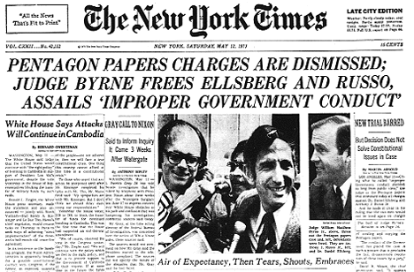
 

Pentagon Papers released in full on 40th anniversary of leak

It was 40 years ago when parts of the ‘Report of the Office of the Secretary of Defense Vietnam Task Force’, or more widely known ‘Pentagon Papers’, were first leaked to and published by the press.

First by the New York Times, on this very day, 13 June, in 1971, before a court order was won by the government to prevent further publication. Other newspapers followed the Times’ lead, but were soon also restrained. Then at the end of the month the United States Supreme Court ruled publication could resume.

And today, 40 years on from the Times’ first publication of the leaked documents, the report is being released in full by the National Archives, along with the Kennedy, Johnson and Nixon Presidential libraries, filling 48 boxes with around 7,000 declassified pages. According to the National Archives about 34 per cent of the report is being made available for the first time, with no redactions and with all the supplemental back-documentation included.

In an Associated Press report on the release, Daniel Ellsberg, the former private foreign policy analyst who leaked the papers, gives his thoughts on the significance of today’s release.

Most of it has come out in congressional forums and by other means, and Ellsberg plucked out the best when he painstakingly photocopied pages that he spirited from a safe night after night, and returned in the mornings. He told The Associated Press the value in Monday’s release was in having the entire study finally brought together and put online, giving today’s generations ready access to it.

NYT: ‘Syed Saleem Shahzad’s murderers must be found quickly and held accountable’

The New York Times has devoted this morning’s editorial to the death of Pakistani journalist Syed Saleem Shahzad.

Shahzad, who was investigating links between the military and al Quaeda before his death, disappeared on Sunday. He was found dead on Tuesday.

Pakistan’s Inter-Services Intelligence agency has been widely accused of being behind the death but has fiercely denied any involvement.

The Pakistani journalist Syed Saleem Shahzad knew he was a marked man. Mr. Shahzad, who covered national security and terrorism, had received repeated threats from Pakistan’s powerful spy agency. Yet he courageously kept doing his job — until somebody silenced him. His body, his face horribly beaten, was buried on Wednesday.

Suspicion inevitably falls on Inter-Services Intelligence, Pakistan’s chief intelligence agency. For the sake of justice, and the shredded credibility of Pakistan’s government, his murderers must be found quickly and held accountable.

Read the full editorial at this link.

Visualisation shows the topics New York Times journalists are writing about

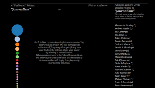
The Visual Communication Lab, part of the IBM Center for Social Sofware has created a site to provide a visualisation to show what subjects New York Times journalists are writing about.

NYT Writes, created by research developer Irene Ros, allows users to enter a subject and see a visualisation of the journalists who have written on that subject.

This post on the VCL blog explains what the visualisation shows.

There are a few things that you will see once the search is complete. First, on the left side of the screen you will see a stack of bubbles at varying sizes. Each bubble represents a term, or “facet”, that was used to describe one or more articles containing your search query.

Facets get manually attached to each article by the New York Times staff. An article about “Tsunami” might be tagged as being about “Natural Disasters,” for example. The size corresponds to the relative amount of times that tag appeared comparing to all the other facets collected from all other articles in the query set.

You can mouse over each bubble to see the tag name appear in the middle as well as how much it appeared relative to the other facets below the stack itself. This stack could also represent what I call a “dedicated writer” – someone who only writes about one topic for 30 days would have a similar stack to this one.

You can try out NYT Writes at this link

How newspapers can use Facebook more effectively

The New York Times, which is conducting an experiment and no longer sends automated tweets, has admitted it has not yet “cracked the code” of using Facebook, according to Liz Heron, social media editor of the newspaper, speaking at the BBC Social Media Summit.

Our journalists have not figured out how to interact with it just yet. We’re working to bring Facebook journalism onto the main page.

The NY Times has started experimenting with “gamification”.

Facebook will give you a lot of info, so we were able to show what kind of person was going in for the Kings Speech, for example, so got some interesting visualisations. In a way we therefore used a form of gamification to engage users. We want to do more to build platforms around our journalism in this way and allow our content to not only get distributed further but get some interesting information back on our key readers from it.

So what else can the newspaper – and all brands – learn from Facebook success stories?

Mashable has published an article on “eight brands that have found success on Facebook and what we can learn”. Here are its eight lessons.

1. Ask your staff, customers, vendors, and partners — who already know you and like you — to “Like” your Facebook page first.

2. Ask a lot of questions. You’ll get valuable feedback, plus you’ll be more likely to appear in your fans’ newsfeeds.

Here’s another article from 10,000 Words to tell you how to use Facebook’s new questions feature to do just that.

3. Share lots of photos, and ask your fans to share photos. Facebook’s Photos remain the most viral feature of its platform.

4. Find the resources to respond to your fans questions and inquiries.

5. If you have a physical location, use Place Pages and Deals to drive traffic through your doors.

6. Know your audience well, and when you make a mistake, quickly own up, do right by your audience and fix the problem.

7. Integrate Facebook outside of your Fan Page, on your website, in as many places as you can. Create more compelling opportunities for people to buy your product based on their friends’ Likes.

8. Find synergy with other organizations and entities, and then work together to promote each other’s Facebook pages so that everyone benefits.

Mashable’s full post with examples is at this link.

New York Times media desk gets the Hollywood treatment (sort of)

A new documentary on the New York Times is to hit the silver screen soon.

According to the blurb, director Andrew Rossi “deftly gains unprecedented access to the New York Times newsroom and the inner workings of the Media Desk”.

Going by the trailer, media reporters David Carr and Brian Stelter feature a fair bit, with media desk editor Bruce Headlam and media reporter Tim Arango also getting a look in the short promo.

“I still can’t get over the feeling that Brian Stelter was a robot assembled to destroy me,” says Carr.

#bbcsms: Risking failure – Mainstream media v start-ups

One of the afternoon panels at the BBC’s Social Media Summit today asked the question: Can mainstream media compete with start-ups in social media innovation?

The panel featured Mark Little of Storyful, which provides a platform for those in the centre of the action to build a story and have it published, and Mark Rock of Audioboo, which enables the recording and uploaded of audio which can then be widely shared and published.

There overall message was that the difference between mainstream media and start-ups is the ability to fail and as a result mainstream media is still in the “electrical age” while start-ups have stepped into the digital.

The BBC itself came in for some criticism. Rock said Audioboo was not allowed to be embedded on BBC website, which he called”ludicrous”.

Individuals are the ones pushing innovation. At some point you will lose them. I don’t think you’ve got the right mindset.

Audioboo

“The BBC should be leading innovation in the UK and it’s not,” he later said. Little added that on this side of the Atlantic he feels there is a different attitude to innovation.

I get the sense that if some test product comes out that doesn’t work it’s destined for the bin. We need to try things all the time.

The other issue he added, is the focus on the word “compete”. It is about collaboration instead, he said, with both sides having valuable lessons to learn from the other.

We’ve worked with YouTube and US organisations and learnt a lot about verification and discovery. I don’t care who’s first to break news, it’s the opposite of what it’s all about, collaboration. On social media you need to learn and move forward. I’m still a little disappointed we’re being asked to choose between gurus … For us it is about seeing the problem with mainstream media and finding the solution.

Experimentation is on the cards at the New York Times, fellow panelist Liz Heron from the New York Times said. nuru massage nyc

We don’t really have any social media guidelines – use common sense and just don’t be stupid. We don’t want to scare people into not using social media to it’s full potential.

Part of the Times’ focus in the near future in this area is to bring social media into the high-impact projects the newsroom is working on, such as it did in the run-up to the Oscars.

New York Times awards season

By collaborating with the Times’ developers it enabled users to personalise the story by voting for their favourites and sharing that information with their ‘friends’ using Facebook.

Facebook will give you a lot of info, so we were able to show what kind of person was going in for the Kings Speech, for example, so got some interesting visualisations. In a way we therefore used a form of gamification to engage users. We want to do more to build platforms around our journalism in this way and allow our content to not only  get distributed further but get some interesting information back on our key readers from it.

She added that Facebook, having “cracked the code” of Twitter, was now the focus for experimentation and innovation.

Our journalists have not figured out how to interact with it just yet. We’re working to bring Facebook journalism onto the main page.

Twitter is not being ignored though, with the New York Times’ “ciborg” account having its autofeed turned off next week as an experiment to take the Times’ participation on the platform “to the next level”.

The death of Osama bin Laden: New York Times interactive gauges public opinion

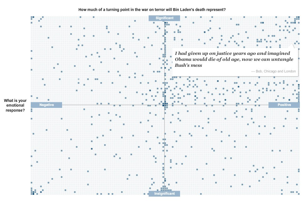
I really like this interactive feature from the excellent New York Times graphics team on readers’ reactions to the death of Osama bin Laden.

As a way of organising responses to a crowdsourcing exercise it isn’t anything new, it takes off from mapping responses geographically. But it is simple and effective, mixing text responses with a broad visual understanding of where the readership’s sentiments fall.

Interesting to see how many people sit right on the fence in the significance stakes.

The image below is a completely non-interactive screengrab of the feature, but follow this link for the full experience.

The NYT team has also put together some impressive graphics showing the layout of the compound, geography of the area and timeline of events.

#ijf11: Lessons in data journalism from the New York Times

Follow this link or scroll to the bottom to start by hearing more from New York Times graphics editor Matthew Ericson on what kind of people make up his team and how they go about working on a story

The New York Times has one of the largest, most advanced graphics teams of any national newspaper in the world. Yesterday at the International Journalism Festival, NYT deputy graphics editor Matthew Ericson led an in-depth two-hour workshop on his team’s approach to visualising some of the data that flows through the paper’s stories every day.

He broke the team’s strategy down in to a few key objectives, the four main ones being:

Provide context

Describe processes

Reveal patterns

Explain the geography

Here is some of what Ericson told the audience and some of the examples he gave during the session, broken down under the different headers.

Provide context

Graphics should bring something new to the story, not just repeat the information in the lede.

Ericson emphasised a graphics team that simply illustrates what the reporter has already told the audience is not doing its job properly. “A graphic can bring together a variety of stories and provide context,” he said, citing his team’s work on the Fukushima nuclear crisis.

We would have reporters with information about the health risks, and some who were working on radiation levels, and then population, and we can bring these things together with graphics and show the context.

Describe processes

The Fukushima nuclear crisis has spurned a lot of graphics work at news organisations across thew world, and Ericson showed a few different examples of work on the situation to the #ijf11 audience. Another graphic demonstrated the process of a nuclear meltdown, and what exactly was happening at the Fukushima plant.

As we approach stories, we are not interested in a graphic showing how a standard nuclear reactor works, we want to show what is particular to a situation and what will help a reader understand this particular new story.

Like saying: “You’ve been reading about these fuel rods all over the news, this is what they actually look like and how they work”.

From nuclear meltdown to dancing. A very different graphic under the ‘desribe processes’ umbrella neatly demonstrated that graphics work is not just for mapping and data.

Disecting a Dance broke down a signature piece by US choreographer Merce Cunningham in order to explain his style.

The NYT dance critic narrated the video, over which simple outlines were overlaid at stages to demonstrate what he was saying. See the full video at this link.

Reveal patterns

This is perhaps the objective most associated with data visualisation, taking a dataset and revealing the patterns that may tell us a story: crime is going up here, population density down there, immigration changing over time, etc.

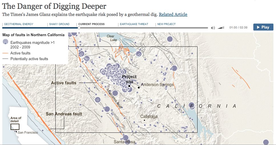
Ericson showed some of the NYT’s work on voting and immigration patterns, but more interesting was a “narrative graphic” that charted the geothermal changes in the bedrock under California created by attempts to exploit energy in hot areas of rock, which can cause earthquakes.

These so-called narrative graphics are take what we think of as visualisation close to what we have been seeing for a while in broadcast news bulletins.

Explain geography

The final main objective was to show the audience the geographical element of stories.

Examples for this section included mapping the flooding of New Orleans following hurricane Katrina, including showing what parts of the region were below sea level and overlaying population density, showing where levies had broken and showing what parts of the land were underwater.

Geography was also a feature of demonstrating the size and position of the oil slick in the Gulf following the BP Deepwater Horizon accident, and comparing it with previous major oil spills.

Some of the tools in use by the NYT team, with examples:


Google Fusion Tables
Tableau Public: Power Hitters
Google Charts from New York State Test Scores – The New York Times
HTML, CSS and Javascript: 2010 World Cup Rankings
jQuery: The Write Less, Do More, JavaScript Library
jQuery UI – Home
Protovis
Raphaël—JavaScript Library
The R Project for Statistical Computing
Processing.org

An important formula 

Data + story > data

It doesn’t take a skilled mathematician to work that one out. But don’t be fooled by it’s simplicity, it underpinned a key message to take away from the workshop. The message is equally simple: graphics and data teams have the skill to make sense of data for their audience, and throwing a ton of data online without adding analysis and extracting a story is not the right way to go about it.

More from Matthew Ericson on the NYT graphics team

I spoke to Ericson after the session about what kind of people make up his team (it includes cartographers!) and how they go about working on a story.

Here’s what he had to say:

Listen!

The BBC’s Peter Horrocks on data journalism

I spoke to Peter Horrocks, who is director of the BBC World Service and the BBC’s global online news operations after the session about his take on data journalism and whether the BBC Global News had ambitions in this direction.

Here’s what he had to say:

Listen!

See the full list of links for Ericson’s session on his blog.

See more from #ijf11 on the Journalism.co.uk Editor’s Blog.