The Visual Communication Lab, part of the IBM Center for Social Sofware has created a site to provide a visualisation to show what subjects New York Times journalists are writing about.
NYT Writes, created by research developer Irene Ros, allows users to enter a subject and see a visualisation of the journalists who have written on that subject.
This post on the VCL blog explains what the visualisation shows.
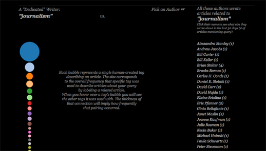
There are a few things that you will see once the search is complete. First, on the left side of the screen you will see a stack of bubbles at varying sizes. Each bubble represents a term, or “facet”, that was used to describe one or more articles containing your search query.
Facets get manually attached to each article by the New York Times staff. An article about “Tsunami” might be tagged as being about “Natural Disasters,” for example. The size corresponds to the relative amount of times that tag appeared comparing to all the other facets collected from all other articles in the query set.
You can mouse over each bubble to see the tag name appear in the middle as well as how much it appeared relative to the other facets below the stack itself. This stack could also represent what I call a “dedicated writer” – someone who only writes about one topic for 30 days would have a similar stack to this one.
You can try out NYT Writes at this link


