Category Archives: Tool of the Week

Tool of the week for journalists – TimeKiwi, to create social media timelines

Tool of the week: TimeKiwi

What is it? A new tool to turn tweets, blog posts and Instagram photos into a timeline. Add a Twitter handle, a Tumblr, WordPress and Posterous blog and an Instagram account and TimeKiwi will mash them into a combined timeline.

How is it of use to journalists? For storytelling. The tool allows you to demonstrate how a story has progressed. The tool does not require you to authorise the app so you can add any Twitter handle to see how that person’s tweets have played out over time.

Take this example of a timeline of canon Dr Giles Fraser who resigned from his role as chancellor of St Paul’s Cathedral last week over plans to forcibly evict Occupy protesters. Adding his @giles_fraser handle allows you to show his tweets as either a vertical or horizontal timeline.

The free version of TimeKiwi cannot be embedded so it is of limited use in telling a story on your site but you can still share links to created timelines. A “business” version is in the pipeline which promises an embed feature and custom views which could be of particular interest to journalists who can then show mapped out tweets and blog posts within a news story.

This TimeKiwi takes in the @journalismnews Twitter account and the Journalism.co.uk WordPress blog.



Tool of the week for journalists – Error Level Analysis, to test if a photo is a hoax

Tool of the week: Error Level Analysis

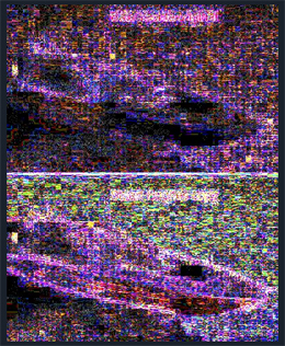
What is it? A free tool to allow you to test whether or not an image has been digitally manipulated in programmes such as Adobe Photoshop. Paste the URL of a photo and Error Level Analysis will return results in an instant. The tool tests how many times an image has been manipulated and re-saved.

How is it of use to journalists? Journalists frequently have to verify images and work out whether they have been manipulated. It may be to test whether an image from a press release has been altered, or from social media sources using Twitter and Facebook.

Take the case of a journalist’s quest to find the man behind the world’s most expensive everything. Stewart Campbell, the deputy editor of Motor Boat and Yachting, set out to prove that a press release claiming the launch of a £3 billion golden superyacht was a fake. Campbell’s keen eye led him to the original photo, which he could prove had been doctored. Error Level Analysis would have demonstrated the level of digital manipulation, which you can see by clicking here.

The Error Level Analysis site clearly explains how the tool works – and comes with a word of warning about interpreting the results:

It works by resaving an image at a known quality, and comparing that to the original image. As a jpeg image is resaved over and over again, its image quality decreases. When we resave an image and compare it to the original, we can guess just how many times the image has been resaved. If an image has not been manipulated, all parts of the image should have been saved an equal amount of times. If parts of the image are from different source files, they may have been saved a number of different times, and thus they will stand out as a different colour in the ELA test.

It is worth noting that edges and areas red in colour are often depicted as brighter in the ELA tests. This due to the way the photos are saved by various programs. It is not proof that image was manipulated.

If you are unsure how to interpret the results, please do not claim the results of this tool as proof of anything.

Tool of the week for journalists – ZeeMaps, for interactive maps

Tool of the week: ZeeMaps

What is it? A free mapping tool that allows you to create interactive maps with videos and photos. ZeeMaps would be a great way of telling location-based visual stories such as of rioting, Occupy Wall Street protests and severe weather.

How is it of use to journalists? ZeeMaps allows you to create maps by uploading data sets or plotting the information using marker points, much as you would using the My Places option in Google Maps. You can then embed your map in a blog post or save as it as jpeg or pdf. It is free if you allow adverts, you can pay to go ad free.

Wired Digital is among the news organisations using the tool, according to a testimonial on the ZeeMaps site.

ZeeMaps takes the plotting marker points idea of Google Maps several steps further, allowing you to add photos, video and, using the wiki option, to collaborate and ask others to add information.

You can either upload data, such as from Google Docs, CSV, KML or Geo RSS feeds, or you can plot the information with markers, as you would using Google Maps, and then export the data as a CSV file.

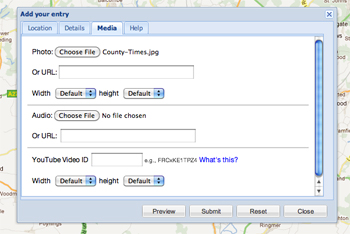
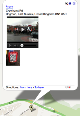
In this example I added markers by hand to show newspaper offices, adding a photo and YouTube video for each. By setting a password I can ask others to contribute.


Another example is this one, which shows the location of electric vehicle charging points in Brighton. Rather than adding markers by hand, I uploaded a CSV file. Processing large data sets takes some time but ZeeMaps will helpfully send you an email to alert you when your map is ready.

Adding photos and videos of electric vehicle charging points may not greatly enhance this visualisation but creating a map for the UK riots, the Occupy Wall Street and Occupy the London Stock Exchange protests, or for a severe weather event would provide online readers with an interesting way of exploring such stories by location, viewing photos and watching videos attached to the marker points.

Tool of the week for journalists – Codeacademy, for those who want to start to code

Tool of the week: Codeacademy

What is it? Free tutorials in basic JavaScript

How is it of use to journalists?  The rise in data journalism, an interest in Hacks/Hackers meetups and collaboration between journalists and developers has led to many journalists to express a wish to start coding. But where to start?

Codeacademy is a learning tool that offers tutorials to get you started. So far there are only a couple of courses on the site but they are free and superbly designed.

The homepage gets you to begin entering a bit of JavaScript and you soon find yourself progressing though the tutorial. There is a progress bar to show you how much of the course you have completed and reward badges to give you the equivalent of the teacher’s gold star.

You might well find you quickly learn simple JavaScript that has a useful application for you as a journalist. For example, within the first five minutes you learn that writing “.length” at the end of a word or phrase gives you the character count. You can then open an editor (using Chrome from a Mac the command is ALT+CMD+J), paste the headline of a news story, add “.length” and you will have the character count of the headline.


Tool of the week for journalists – Topsy, real-time search for the social web

Tool of the week: Topsy

What is it? A search engine and analytics for the social web

How is it of use to journalists? Topsy is a really handy search tool for monitoring what is being discussed on the social web.

Search for a keyword or phrase and you will be presented with news articles, tweets, videos and photos. Search results are returned visually, so you can see icons and avatars beside the source.

What is particlularly useful is the ability to see how frequently a term is being used. For example, a search for “Knox” will return Twitter mentions, articles and videos. You can also click on “experts” to see what recognised news providers have published.

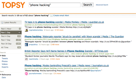
A search for “phone hacking” returns results and also shows the number of times the keyword has been used in the last hour, day, week, month and all time. You can also get these results shown on a graph, create and email alert or set up an RSS feed from a keyword.

You can carry out advanced searches, enabling you to include or exclude additional terms, languages and set a date range or drill down and search for a keyword used by a particular Twitter user.

As a journalist you can not only use Topsy to help you locate sources and monitor rumours (such as team talk by football fans), you can use it to add colour to an article or feature.

For example, you can use Topsy to tell you that interest in the “Amanda Knox” case has been such that her name has been mentioned 516 mentions in the last hour (the search was carried out at 4.30pm on Monday, 3 October), 3,804 times in the past day and 16,000 times overall.


Tool of the week for journalists – DocumentCloud, to analyse documents as data

Tool of the week:  DocumentCloud

What is it? A platform to allow you to search and analyse documents as data.

DocumentCloud works by encouraging users to upload documents, it then pushes them through the Thomson Reuters-powered OpenCalais, a “toolkit of capabilities” that can be used by news sites for semantic analysis. Document sharing is good practice that many news desks have adopted and something all journalists should consider to enable data to be shared and searchable.

How is it of use to journalists? Journalists can search for keywords and analyse documents as data.

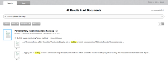
For example, try searching for “phone hacking” and you are presented with a series of parliamentary reports, the text of speeches and letters contributed by the Guardian, New York Times, the Lens and the Telegraph.

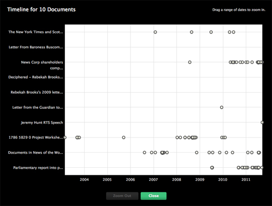
You can then dig deeper, view the documents on a timeline and find related documents.

Tool of the week for journalists – Collaborative video editing platform Stroome

Tool of the week:  Stroome

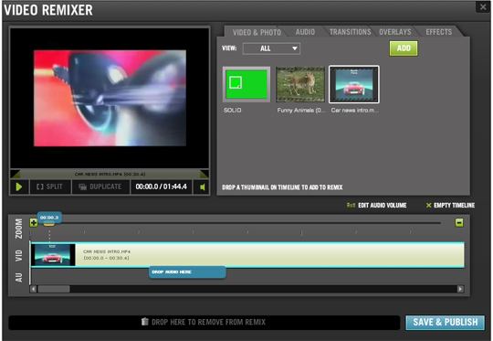
What is it? A free online video editing tool which allows you to collaborate with others

How is it of use to journalists? When it won $200,000 of funding in last year’s Knight News Challenge, Stroome’s ambitions as a useful tool for broadcasters were outlined:

Through the creation of a virtual video-editing studio, this project hopes to simplify the production of news video by enabling correspondents, editors and producers to upload, share, edit and remix content with others. This will reduce the need for expensive satellite truck technology.

Stroome is handy if you find yourself working on a computer without editing software (there is also YouTube’s online video editor) although most people will no doubt favour editing within an application rather than within a browser due to the speed of upload and processing.

Stroome offers interesting possibilities to work collaboratively with others, not just journalists. One idea is that local news sites could encourage readers to upload footage of a severe weather event and collaboratively build a video using Stroome.

Share your ideas of how Stroome could be used by journalists and news sites by leaving a comment below.

Tool of the week for journalists – Batchgeo, for mapping data

Tool of the week: Batchgeo

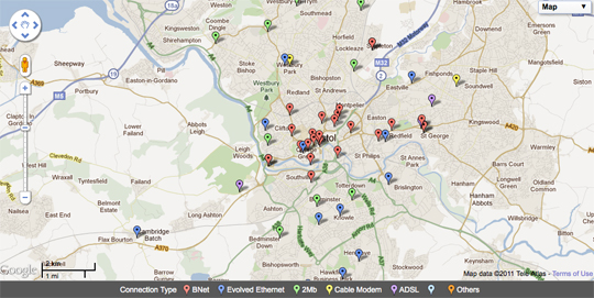
What is it? A free mapping tool. Simply paste data from a spreadsheet and see it plotted on a map.

How is it of use to journalists? Journalists who cannot code and have no technical knowledge have a wide range of tools available to them for plotting data and creating maps.

You can have a go yourself by copying and pasting data into Batchgeo. Here is a list of the most populous countries in 2100, based on United Nations predictions. (You can see the data displayed as a heat map and find out how to use Google Fusion Tables for mapping.)

Here is a regularly updated spreadsheet on Nato attacks in Libya.

Here is a list of Bristol City Council wifi hotspots.

Hattip: Andy Hume


Tool of the week for journalists – Dipity timelines

Tool of the week: Dipity

What is it? A free tool to create interactive timelines.

How is it of use to journalists? For plotting events and linking to content from your news site and others.

Dipity has been around for some time but is well worth a reminder. Back in 2008 the Manchester Evening News plotted the congestion charge coverage; the Liverpool Daily Post told the story of Liverpool being the 2008 European Capital of Culture; and the Guardian and NWN Media’s Evening Leader plotted job cuts.

You can create a timeline that will automatically update via RSS whenever you publish a story with a particular tag, such as this journalism job cuts timeline. (To add an RSS feed go to “show sources” at the bottom of your timeline, click “other” and add your the URL of your feed.)

You can then embed your story and readers can view it as a timeline, flipbook, list or map. Try toggling though the job cuts timeline to see the information displayed in different ways.

Here is a more recent example from Journalism.co.uk on phone hacking and the end of the News of the World. Some of these events were added manually, others via the phone hacking RSS feed.

Tool of the week for journalists – ifttt, a promising app for dealing with data

Tool of the week: ifttt, shorthand for “if this then that”.

What is it? This tool is still in private beta but it is worth applying for an invitation and waiting to see when it goes public as it promises interesting possibilities for journalists.

The best way to understand it is to read this description of ifttt, which explains that the tool works on the premise of “if this then that” or “when something happens (this) then do something else (that)”.

The ifttt site explains it clearly:

Here is an example of a task that tweets every new bookmark from my Delicious account tagged “tweet”:

The ifttt blog offers further explanation:

ifttt isn’t a programming language or app building tool, but rather a much simpler solution. Digital duct tape if you will, allowing you to connect any two services together. You can leave the hard work of creating the individual tools to the engineers and designers. Much like in the physical world when a 12-year-old wants a lightsaber, cuts the handle off an old broom and shoves a bike grip on the other end, you can take two things in the digital world and combine them in ways the original creators never imagined.

A quick look at ifttt on Twitter will give you a sense of what is happening in the development of the tool.

How is it of use to journalists?

It could be extremely useful to journalists, for example, by providing a simple way to capture data from existing online platforms, and also to anyone who wants to set up automated posts.