Category Archives: Multimedia

#editors13: Presentation on Snow Fall-like multimedia stories

Bangkok-opening-ceremony

This afternoon I gave a presentation at the World Editors Forum in Bangkok. Here are my slides, notes, and links to further examples and resources.

1. Title

My name is Sarah Marshall and I am technology editor at Journalism.co.uk, a news site reporting on innovations in the digital news space.

2. Logos
We run a digital journalism conference called news:rewired.

3.
The title of this talk is ‘new wave storytelling’ and I want to talk to you about why we should be ‘thinking outside the box’. So what do I mean by the box?

4.
Take a look at these three news stories – about David Beckham’s retirement. What do you see? Remove the mastheads and they all look the same: picture and text or video and text – each one uses inverted triangle way of telling a news story.

5. Box
Where magazines use powerful images and text to tell stories, the technological limitations of the digital space – and the CMS – mean that stories are generally told in within a box.

6. Open box
More recently we have seen that box opening up, news sites have been moving beyond the article, they have been breaking article boundaries. We are seeing new innovations in web-native storytelling.

7. Snow Fall video
The most famous example is Snow Fall. Snow Fall is an immersive reading experience.

It is about a deadly avalanche which claimed the lives of three very experienced skiers.

It is a 17,000 word feature told with the help of videos, moving graphics, picture slideshows, the recordings of 911 calls.

John Branch, the sports reporter who wrote it, won a Pulitzer for the words.

It took six months. John worked alone for one month, and then the second month was working alongside a videographer and photojournalist. His bosses at the New York Times saw the potential to make something extra special.

During the six months while Snow Fall was being worked on, there were some pretty major news stories to cover: the Olympics, Hurricane Sandy and the presidential elections.

8.
And the Snow Fall effect? Six days after publication the story had received 2.9 million visits. Up to 22,000 users visited Snow Fall at any given time. A quarter to a third of the hits were from new visitors to nytimes.com

9. Tweets
Six months on and it has been tweeted 10,000 times.

10. Facebook
And it’s has been shared more than 77,000 times on Facebook.

11. Clock
And the average time on site? 12 minutes. Any of you who check analytics on a daily basis will know that’s a lot.

Now if you have read Snow Fall, you will know that it takes a lot longer than that.

It took me about two or two-and-a-half hours.

So arguably a lot of people just looked at the whizzy graphics and fewer people went on the full journey.

Plenty of digital column inches have been written about Snow Fall. There has been criticism – and there has been praise.

12. Om Malik
Om Malik called it “one of the first truly post-tablet reading experiences”.

And it is interesting he said tablet. That, I would argue, is the best place to read Snow Fall. It makes you want to press play on the videos, on the audio, it makes you want to scroll.

And am I going to spend two-and-a-half hours sitting upright looking at my desktop?

Before we come onto some other examples, let’s think about how well the multimedia presentation works as a storytelling device.

13. Gallery
Have you ever been to an art gallery or museum and not known whether to first look at the art or artefact or read the caption? I was conscious that this might be the case with Snow Fall. Should I read to the end of the next paragraph or play the video now? A decision can be disruptive.

But for me Snow Fall did a pretty good job. In the same way a well-curated museum or gallery will lead the viewer by the hand, Snow Fall too achieved this on the whole.

And design is hugely helpful.

14. Aron Pilhofer
Aron Pilhofer from the New York Times mocked up what Snow Fall would look like if it was presented in the usual format. You can see why design matters.

The New York Times may have received much of the attention, but there are now lots of examples of news sites telling stories out side of the box.

15. Firestorm
Here is how the Guardian launched Guardian Australia last week. This is Firestorm, a multimedia project which provides a seamless and immersive experience.

It’s about a bushfire in Tasmania which destroyed a family’s house. They saved themselves by getting in the water under a jetty.

The Guardian has done a fantastic job here. Remember how I talked about the gallery or museum experience and having to decide where to go next? The Guardian leads the reader through, taking them on the journey.

16. Daft Punk
This example is from music site Pitchfork.

You’ll be starting to see by now that there are some common features of these ‘beyond the article’-type stories. There’s often moving graphics, there is video, attractive typefaces.

17. Chicago Tribune
And this is an example from the Chicago Tribune.

18. ESPN
And here we have ESPN. Another common trait is that these multimedia presentations are all long-form, thousands of words, probably because of the investment of time in coding, they’ve chosen in-depth investigations or features.

19. Mobile
All of the examples we have seen so far are how they appear on a desktop. But I said earlier, perhaps the reader wants to lean back with a tablet device or perhaps read on their a mobile.

20. Bat for Lashes
And while this example, again from Pitchfork, works on the desktop…

21. Bat for Lashes tablet
It is more problematic on a tablet, particularly on 3G where it is jumpy.

22. Bat for Lashes mobile
And if you view this story on a mobile, you are delivered a simple, single column story.

Pitchfork’s audience is young and highly mobile. Therefore a proportion of the audience will not be getting the full experience that Pitchfork has invested in.

But I don’t want to be too critical of those innovating in the newsroom.

23. Washington Post
Elsewhere and the Washington Post recently published a multimedia story called The Prophets of Oak Ridge. It has been designed for desktop, tablet and mobile as the site is fully responsive.

24. Advertising
So I know what some of you are thinking. How does this digital stuff – which may take 6 months to build and require designers, developers, photojournalists, videographers, oh and someone to write the tens of thousands of words – pay for itself?

25. Snow Fall
You might have noticed that Snow Fall includes advertising – including advertising a subscription of the New York Times.

Om Malik has argued that it would be better to have Land Rover ads in there or something more topical.

Those of you here who are responsible for the bottom line probably understand why that decision was taken to put ads in.

26. Mark Thompson
But when Mark Thomspon, chief executive of the Times saw Snow Fall he did question the decision.

And of course what the New York Times got was an amazing branding experience.

More than 10,000 people were tweeting, most of them saying how amazing this thing was that the New York Times had created.

So arguably you can keep such a presentation outside the paywall, leave ads out and use it as a branding opportunity to show the news outlet’s potential.

You could of course do it in conjunction with sponsorship. But a ski company or Land Rover? It might jar. After all, Snow Fall was reporting on an accident and three people died.

27. Washington Post
Elsewhere and the Washington Post has opted for a pre-roll ad.

28. Chicago Tribune
And the Chicago Tribune uses multimedia to entice new subscribers. This one is outside the paywall, but readers are promised more of the same if they sign up and pay.

29. e-books
And the Guardian and New York Times are selling Firestorm and Snowfall as ebooks.

30. New York Times
So, I bet some of you are thinking, “it’s all very well the Grey Lady spending six months on Snow Fall, but they are the New York Times and have the staff and the money”.

It will no doubt get easier and quicker to create such stories which break article boundaries.

Indeed the new Newsweek site – NewsBeast – is said to follow this type of design.

31. Scroll Kit
In fact there are more DIY options already available. This is Scroll Kit, it’s like InDesign for the browser.

You can drag images around, videos and create a multimedia experience with no coding skills.

There’s also a tool which launched last month called Soo Meta.

32. Nasa

And I want to leave you with a final thought. What have these three things have in common? A Black and Decker Dustbuster, memory foam, and, this may give it a way slightly, it’s freeze dried ice-cream.

They were all spin-offs or by-products of NASA inventions.

So my final thought for you, and it is actually not my own but one suggested to me by Benji Lanyado, a journalist and freelance creator of such visuals and multimedia products.

His view is that if you spend the time, effort and resources one one project and start thinking beyond the article, you’ll be able to re-use some of the code, you’ll be able to create other such stories more easily and quickly – and there will be other spin-offs for your news outlet.

34.
Thank you. I’m sharing a link here. I’ve put together a list of stories – such as Snow Fall, Firestorm and there’s one from The Verge – which you can explore.

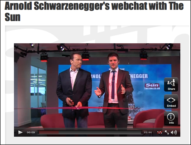
The Sun launches ‘multimedia studio’ with video webchat

Sun webchat

The Sun has launched a new “multimedia studio”, which it used this week to host a video webchat with actor and politician Arnold Schwarzenegger.

The studio will not be in full-time use until February, but Schwarzenegger helped open the studio on Tuesday (22 January).

The 30 minute webchat used the Showcaster platform to provide live video from their new studio, alongside a chatbox in which users could post questions. The questions were moderated and put to Schwarzenegger by showbiz editor Gordon Smart.

A video of the interview was then posted on the Sun’s online ‘showbiz’ section, accompanied by a write-up of the interview focusing on the show-business related aspects of his answers.

#wef12: Six lessons in tablet storytelling

Copyright: C. Regina on Flickr. Some rights reserved.

Image by C.Regina on Flickr. Some rights reserved

At last year’s World Editors Forum in Vienna we reported on the 10 great tips shared by Mario Garcia, founder of Garcia Media, on creating news apps.

At this year’s event in Kiev Garcia is back, and he shared with delegates some of the lessons learned in the past couple of years when it comes to storytelling on tablet devices.

In summary, here are just six of the takeaways to be gained from his presentation:

  • The editor today needs to undertand the sociology of how readers use tablet platforms and remember the multimedia approach

Garcia urged editors to not think it is all about the newspaper. “No one expects to have the breaking news there,” he said.

In the eyes of consumer, digital is current, print is old, not abandoned, but old.

… Still newspapers write headlines as if they’re the only forms of communication these days.

He added that news outlets need to show they are a multimedia house. Therefore “no marketing campaign should be based on one of the platforms”.

  • Be visual and make something happen

A main point made by Garcia was about the importance of the visual element on tablet devices, where users “don’t just want a photo”, he said. “They want something to happen”.

He suggested that every four or five screens users should be offered “a moment where the finger touches the screen and something happens”.

Whatever it is, in the tablet you can not be linear.

… If all you do is turn the pages, readers will not be happy.

Garcia also referred to a Poynter study due to be published in the next few weeks, which found the majority of people preferred the “flipboard” visual style, with photo galleries and videos.

  • The story is what counts

While lessons have been learned about tablet storytelling, content remains king.

Garcia offered a new definiton of news, as “anything you know now that you did not know 15 minutes ago, or 15 seconds ago”.

And this piece of news is “what counts”, not the platform it is distributed on.

  • Understand the pattern of consumption during the day

Garcia said research shows most people use tablets after 6pm in the evening, while the average person reading on the tablet at night has the television on at the same time.

  • Users are willing to pay on tablets

The research also found that those who use tablets are more willing to pay for content than online users.

With that in mind, he highlighted the potential for news outlets – bearing in mind the 85 million iPads in the market today, which he said may reach “more than 165 million soon”. Find the perfect site to gamble online – Australian online casinos

  • Print has not been abandoned

And despite all this, “there is a place for print as a lean-back platform,” Garcia stressed. “Print is eternal, but only if it adapts”.

And “paper has the power of disconnect”, with print readers able to “totally unplug and read.”

#wef12: What news outlets can learn from magazines on content presentation

http://www.flickr.com/photos/vfsdigitaldesign/5651302028/sizes/l/

Image by VFS Digital Design on Flickr. Some rights reserved. Creative commons licence

Bonnier Business Media designer Jacek Utko has previously spoken about the need for news outlets to break the template format online, in the way they can with their print products.

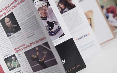
Speaking at the World Editors Forum in Kiev today, Utko helpfully highlighted the ways in which news outlets can show that creativity in the presentation of their newspaper print products. And the place to look for inspiration is in magazines. Put simply, he said, “I don’t look for inspiration in newspapers anymore”.

The key lessons for newsrooms to take from magazine content presentation include finding a balance between long and short pieces, producing simple visuals and offering bite-sized chunks of information, the latter being a news presentation format which also “increases understanding”.

Magazines also demonstrate how to “tell stories almost without words”, he said, and “surprise the readers” with different news design on the front page.

That’s what we do with our newspapers, play the white space…

This then looks “totally different in the kiosk on the shelf than the other newspapers”, he said.

And this design approach need not only be for news outlets with sizeable resources. It is “very cheap” to do, he said, and takes just a few hours a day, and means print products can get a step ahead of digital in terms of design.

Art direction and news presentation is so weak on the web, it’s our strength, it’s our competitive advantage for print.

#GEN2012 – Dos and don’ts of connected TV strategy for publishers

Image by por brylle on Arte & Fotografia. Some rights reserved.

The connected TV audience “wants to be multitasked”, editors were told at the News World Summit in Paris today, as part of a session looking at four screen (and more) strategy.

Users do “not want to wait 12 hours” to discuss programming “at the water cooler”, head of digital strategy at France Televisions Bruno Patino said. Instead they want to do it “live on social networks”.

Patino called it “the social couch”, a “very rich and augmented TV experience.” which enables users to share their experience and not be “limited by same place or same time”.

So what should broadcasters be offering these audiences? Patino shared a list of dos and don’ts with delegates:

Don’t:

  • Don’t try to maintain the system closed – you won’t be master of the TV set anymore
  • Don’t try to limit the user experience
  • Don’t believe your content will rule the users’ experience

Do:

  • Always distribute – wherever you can. A new path is a new chance for your programme to be seen, don’t think exclusivity, think ubiquity
  • Engage the audience at every level including creation
  • Be xenophilic
  • Be pragmatic
  • Try, experiment
  • Talk about the whole universe
  • Try gamification
  • Promote connections
  • Test technologies
  • Put the user at the centre

Also speaking on the topic of four screen strategy, the BBC’s general manager of news and knowledge Phil Fearnley shared his own recommendations:

  • Work on standard and scalable solutions
  • Consider apps and browsers, not apps v browser
  • Simple design – quality content
  • The importance of live

At the BBC, he added, the importance of live is the “absolute focus”, as opposed to “trying to deliver all functionality” possible. That is “not going to work”, he said.

#GEN2012: Will we still have digital development editors in 10 years?

Newspaper publishers need to “keep looking outwards” and make changes – even the titles that are the most digitally advanced – the Guardian’s digital development editor told editors at the World News Summit in Paris today.

Asked at the conference whether jobs like hers – helping newsrooms find and implement new processes and tools – would still be needed once newspapers had migrated further towards digital, Joanna Geary replied:

I’d like to hope that in the future it’s something that every journalist would play a role in and would start to understand and have an interest and curiosity in how they connect with readers in meaningful ways.

I still think there is a need to be honest and open with ourselves that this is not a communication revolution that is going to slow down any time soon. If that means we have to have a role that is constantly looking outwards at how our readers are changing, I think there is always going to be a need for this.

She later added:

The Guardian has a very unique culture, specifically about embracing new ideas and understanding new platforms and seek opportunities from new tools. When you see journalists work closely with developers, what’s great is watching both sides learn what’s possible.

For anyone who’s working on internal change it’s so easy to become internal looking and focused on internal structures and politics. My own bit of advice would be to keep looking outwards.

Guardian network editor Clare Margetson said there were still some journalists who needed a hand getting to grips with digital.

When I was on the newsdesk 10 years ago it seemed like a very different place. One of our best reporters would sit smoking a pipe and would not touch a computer. He would call in his story. It seems a world away.

There are still some who need help and some for whom Facebook is still quite a scary thing to use, but it’s quite collaborative and you find the younger reporters on a bank of desks will help out the older ones.

#GEN2012: Interactive graphics case studies from the Guardian

The Guardian’s Alastair Dant took the the stage at the News World Summit in Paris today to share the news outlet’s approach to using interactivity to present data and stories to their audience.

Dant, who leads the interactive team at the Guardian, said types of interactives include those which plot “paths through space and time”, and those which work to relay “the roar of the crowd”.

Here are some of the interactives he showcased to delegates:

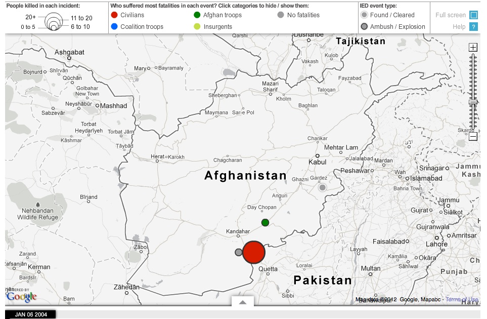
  • Afghanistan war logs

The Guardian produced two major interactives around the war logs. Dant spoke about one which shows all IED attacks on civilians, coalition and Afghan troops from 2004 to 2009 recorded in the war logs. The interactive allows users to “drag the date along the bar, to see where and who they hit over these five years”.

The team also produced a graphic showing a selection of 300 “significant incidents” from the logs, linking through to each full log entry.

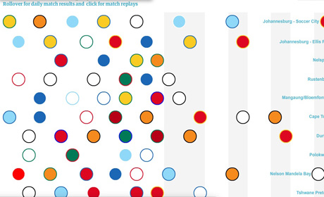
  • World Cup 2010 Twitter replay

Dant said the team had a “very fuzzy brief” from the editorial team who wanted to “capture the excitement” around the games. As a result the team produced a “Twitter replay” which consisted of recording all conversations on Twittier and analysing them “to find out how word popularity changes over time”.

As a result the interative offers 90 minutes of football in 90 seconds, based on Twitter reactions.

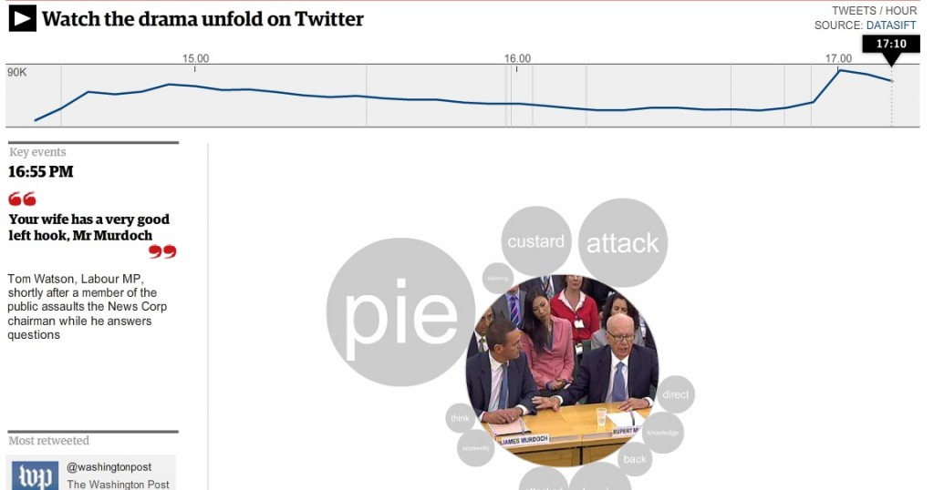
  • Rupert Murdoch: How Twitter tracked the MPs’ questions – and the pie

And the team re-employed this technique of “relaying the roar of the crowd” when Rupert and James Murdoch appeared before the culture select committee last year

Discussing visual journalism at #GEN2012 – ‘Everybody has to think visually’

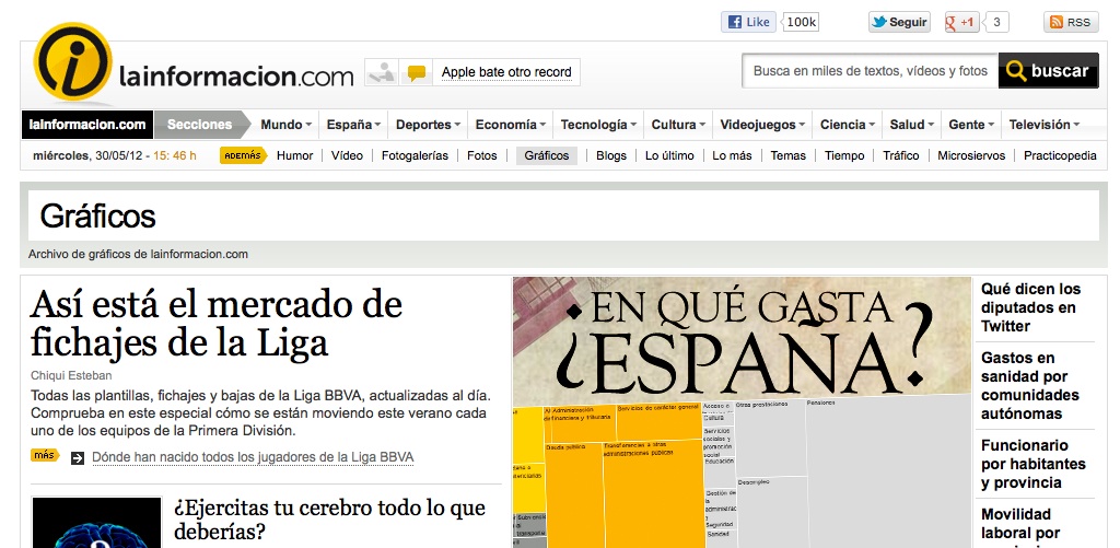
Visual journalism “is not about being pretty”, it is about explaining a story more effectively – this was the advice of visual editor at LaInformacion.com Chiqui Esteban, speaking at the News World Summit in Paris today.

In his presentation to the conference Esteban explained why he felt entire newsrooms need to think visually whether staff are writers, developers or designers, with the overall focus on telling the story in the most effective way.

He outlined how visual journalism can be used to explain, show trends, give geographical information, personal information and help media outlets “be different”.

Here are two of the examples he ran through showing this sort of visual journalism in action:

How Presidents’ Pay Compares with [Professors’ salaries]

Rock-Paper-Scissors: You vs. the Computer

The key is “being different”, he said, citing this as the reason for LaInformacion’s survival.

Everybody has to think visually. We have to propose things in morning meetings but the rest of newsroom has to tell [us what they would like also] … Sometimes the best visual ideas come from people who don’t work on visuals.

He also shared some interesting thoughts on newsroom integration when it comes to working on visual storytelling.

In LaInformacion all the newsroom is 30 people, we are obligated to collaborate if we want to have something.

But he said “everybody wants to do graphics” and writers have seen “that it works”.

They’ve learnt something that they don’t have to write a story, they just have to think and between all of us we will decide how is the best way to show it – if it’s text with video, interactive multimedia or a graphic.

We have been journalists with them, we care about information and not with things looking pretty, they trust us, We earn their trust and we trust them with their stories and everyone respects each other.

Social magazine app Flipboard adds audio

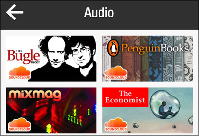
Social magazine app Flipboard has added audio, allowing users to listen to a podcast, an interview or music while flipping through the pages of the app.

Flipboard is an iPhone and iPad app (soon to be on Android) that allows users to sync with their Twitter, Google Reader, Facebook and other accounts to receive personalised news content.

Flipboard has partnered with SoundCloud for audio (which provides content including Journalism.co.uk’s podcasts), National Public Radio and Public Radio International (PRI).

As The Next Web reports:

It’s a marvellous new way to distribute and listen to audio content, one I might just use specifically for podcasts. The user experience is unquestionably superior to iTunes.

And how long before we see Flipboard dive into video? It’s somewhat surprising it hasn’t decided to explore the video space first. The social magazine already includes a video category but is limited in sources and isn’t ideal for video browsing. With no clear winner in the video magazine space (see ShowYou and TNW Startup Rally winner Shelby.tv), Flipboard can still make it its own.

BBC News and TechCrunch both have details on the Flipboard development.

The future of video journalism: What will audiences be watching?

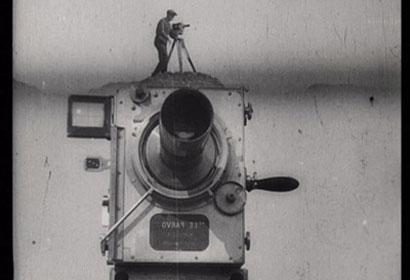
Still from 1929 film Man with a Movie Camera directed by Dziga Vertov, via Wikimedia Commons

I was asked to give a talk to a BBC Global Video away-day on the future of video, looking at what their audiences will be watching in the coming years.

The Global Video department was launched last year and makes video to run cross-platform in multiple languages on all the BBC’s Global News outlets: World News, BBC.com and 27 World Service language services. The team never makes a video just for one language or site, changing the voiceover and translating the film into two or more languages.

The future of video journalism

Below is an outline of the talk I gave on the day:

What will audiences be watching?

There are countless examples of innovations in video journalism, including many from the 40 videos a week produced by Global Video.

Here are a few examples of trends in online video journalism and innovations using emerging technologies.

Documentary:  Just as long-form journalism has a place in the digital sphere, so too do long-form video documentaries using TV and cinema conventions of storytelling.

For example, here is the Guardian’s 32 minute ‘I will never be cut’: Kenyan girls fight back against genital mutilation, which recently won a Webby award.

Web native: As online video has developed, it has found its own style and some filmmakers are telling stories using a new set of rules. Multimedia producer Adam Westbrook has written many articles arguing for online video to encourage subjects to look directly at the camera, abandon the “noddy” (the way video often hides an edit by showing a clip of the interviewer nodding) and instead add a flash to white or black, acknowledging the edit to the viewer.

Storytelling: With the advent of online came new storytelling techniques such as audio slideshows, graphics and ways of visualising data. The BBC Global Video unit has its own fantastic examples, including this video made by Tom Hannen using Adobe After Effects and brilliantly telling the story of blood doping.

The Economist too is experimenting with storytelling in words. Here is an example.

Videos filmed on small, cheap cameras: The Global Video unit itself is equipping its journalists in the field with video news gathering skills. Elise Wicker from the department has written about how she has been training staff overseas to use Kodak cameras to capture footage.

Here is an example of an Al Jazeera documentary filmed entirely on an iPhone. Syria: Songs of defiance is a first-person film made by a journalist who spent many months in Syria but could not risk being seen with a video camera. This film, complete with time lapses shows how a great film can be made in the process of the edit.

Contextual video: Advances in web browsers allow new possibilities. Here are three examples made using Popcorn JS, a JavaScript open-source library from Mozilla allowing video to link to real-time web content such as tweets, Google Maps and Wikipedia entries.

History in the Streets is an audio recording uploaded to SoundCloud with locations linked so that when the audio refers to a place, the viewer is taken to that location on Google Street View and can navigate and explore.

Open Images, Open Data is a Dutch film showing a video surrounded by real-time links to content from several sites, including Wikipedia.

This example of a film about freedom of the press in France links to the source documents, demonstrating how journalists can link to data or research to back up a claim.

Development of Mozilla’s Popcorn Maker tool could allow video journalists without coding skills to produce similar video.

How will audiences be finding and sharing content?

Social sharing is key to the future of video and the format lends itself to a social experience with YouTube demonstrating how videos can go viral.

Social is overtaking search as a way to discover content. Facebook overtook Google in March as a traffic driver to the Guardian, largely down to the news outlet’s “frictionless sharing” Facebook app.

New audiences will be finding and frequently watching video on social networks, whether they be Facebook, Twitter, or Chinese site Renren.

Video is often a component of a wider narrative too. Storify is a free tool allowing anyone to curate a story by dragging in tweets, Flickr photos, SoundCloud audio and video from YouTube and Vimeo.

And platforms such as Storify, YouTube, Vimeo, Bambuser, and many more have their own communities and networks too.

Here is an example of what Mark Boas, one of the Knight-Mozilla Fellows, is doing. He is embedded within the newsroom of Al Jazeera and looking at how you can socially share content without detracting from the experience of viewing a video.

Boas told me that part of what is driving this is social, partly the second screen, partly web-enabled TV, partly browser technologies.

He is experimenting with social sharing text from within The fight for Amazonia. Content is pulled live from a Google Doc, he explained.

Writing on his blog, Boas describes the possibilities of social.

Technology is available now to allow people to chat and comment over the web. Certainly this is an experience we could build in. Imagine if you could see all the people currently watching the same programme as you and interact with them.

Boas believes this social layer is key but that it should not “significantly distract from the main content”.

He thinks the social experience benefits from integrating existing social networks and will “perhaps create new ones surrounding the video medium”.

People like to share their experiences in general and this certainly seems to hold true of video and media in general.

He has ideas for future implementations, including “the use of word accurate hyperlinked transcripts, full support for mobile devices and second-screen synchronisation.”

In an email Boas told me:

I think many like me are experimenting just now. I myself am very interested in making experiences that don’t distract too much from the principle act of watching video but I feel that the challenge here is to allow the viewer to choose the level of interactivity and make that choice as plain as obvious and seamless as possible.

3. What will people be watching video on?

Web-enabled TV: Web technologies and television are converging with the advent of web-enabled TV.

The New York Times earlier this month asked “Why can’t TV navigation be more like a tablet?” That looks likely with the next generation of viewing options, including video on demand available on games consoles and an increasing number of TV apps.

Web-enabled TV is expected to offer users an experience more like navigating using a tablet, with viewers able to control the screen by a series of touch screen gestures and swipes.

If rumours of the new Apple TV are to be believed, this may take the form of a Siri voice-activated TV made by Apple (a later development than Apple TV, a box which is plugged into a regular TV to stream iTunes content).

It is also reported that set-top manufacturer LG will be offering televisions with Google TV later this month, with features including voice activation, the ability for viewers to watch video-on-demand content and web videos and control of content by touch screen and swipes.

Google TV will also allow friends or contacts in different locations to watch video together as it will incorporate Google Hangouts, the Skype-like video option from Google Plus.

Desktops/laptops: BBC Global Video’s audience may access content on different connections than those that spring to mind when you first think of web video.

The number of home broadband connections are low in some of the countries covered by the 27 language services, with large proportions of audiences connecting with dongles and other 3G connections in some countries. Video may be easier to stream on a 3G connection at certain times of the day, and impossible at busier times.

Audiences may also use proxies to circumvent internet restrictions in countries such as China, which can give a slow connection.

Tablets: Tablets are increasingly popular in some of the countries served by BBC Global Video, and take-up is low in other countries.

Whether they become an important platform in poorer countries remains to be seen but there is no doubt that they have already become important for more affluent audiences.

And tablets can provide a beautifully tactile viewing experience, with readers encouraged to use the touch screen to play a video embedded within a news story.

Mobile: The popularity of mobile and likelihood of possibilities for video viewing should not be ignored.

It is worth noting that 87 per cent of the world population has a mobile phone, compared with just 8.5 per cent having fixed broadband. According to stats on Mobithinking, there are 5.9 billion phones compared with half a billion fixed broadband connections.

In Jordan the number of mobiles exceeds the population with 6.2 million phones to 6 million people, according to Ayman Salah, a technology expert based in the Middle East.

In Egypt there are 74 million mobiles for a population of 84 million, Salah said, with mobiles being introduced commercially in 1997. That compares with 11 million landlines, first introduced almost 100 years ago in 1920.

The BBC World Service sites and BBC.com are well served by mobile sites that recognise the phone type and format video accordingly.

But of course mobiles are not all Androids, BlackBerrys and iPhones. Smartphones are less common in poorer countries, and different brands dominate. According to the Economist, Nokia ranks with Coca-Cola as Africa’s most recognised brand.

So what is the future of video in Africa if smartphone penetration is low? I asked mobile expert Peter Paul Koch (also known as PPK online).

“Don’t focus too much on smartphones,” he warned.

Today’s feature phones are getting more and more functionality, and I wouldn’t be surprised if they add video in the near future. The line between smartphones and feature phones is blurring, and pretty soon we’ll see “feature phones” (as in cheap) with “smartphone” functionality.

And video is growing on mobile. Cisco predicts that two-thirds of the world’s mobile data traffic will be video by 2016.

Mobile video will increase 25-fold between 2011 and 2016, accounting for over 70 percent of total mobile data traffic by the end of the forecast period.

Mobile is intimate. It is in your pocket, it is personal and is there when you have a spare five minutes to watch a web video.

What is the future of video? With a growing trend in social sharing, an ever-expanding range of devices and internet connections, including to mobile, the future is bright.