Tag Archives: infographics

Discussing visual journalism at #GEN2012 – ‘Everybody has to think visually’

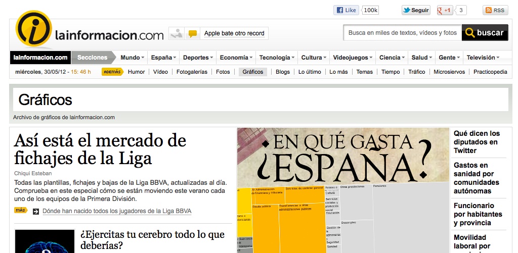
Visual journalism “is not about being pretty”, it is about explaining a story more effectively – this was the advice of visual editor at LaInformacion.com Chiqui Esteban, speaking at the News World Summit in Paris today.

In his presentation to the conference Esteban explained why he felt entire newsrooms need to think visually whether staff are writers, developers or designers, with the overall focus on telling the story in the most effective way.

He outlined how visual journalism can be used to explain, show trends, give geographical information, personal information and help media outlets “be different”.

Here are two of the examples he ran through showing this sort of visual journalism in action:

How Presidents’ Pay Compares with [Professors’ salaries]

Rock-Paper-Scissors: You vs. the Computer

The key is “being different”, he said, citing this as the reason for LaInformacion’s survival.

Everybody has to think visually. We have to propose things in morning meetings but the rest of newsroom has to tell [us what they would like also] … Sometimes the best visual ideas come from people who don’t work on visuals.

He also shared some interesting thoughts on newsroom integration when it comes to working on visual storytelling.

In LaInformacion all the newsroom is 30 people, we are obligated to collaborate if we want to have something.

But he said “everybody wants to do graphics” and writers have seen “that it works”.

They’ve learnt something that they don’t have to write a story, they just have to think and between all of us we will decide how is the best way to show it – if it’s text with video, interactive multimedia or a graphic.

We have been journalists with them, we care about information and not with things looking pretty, they trust us, We earn their trust and we trust them with their stories and everyone respects each other.

New file format allows journalists to create interactive infographics

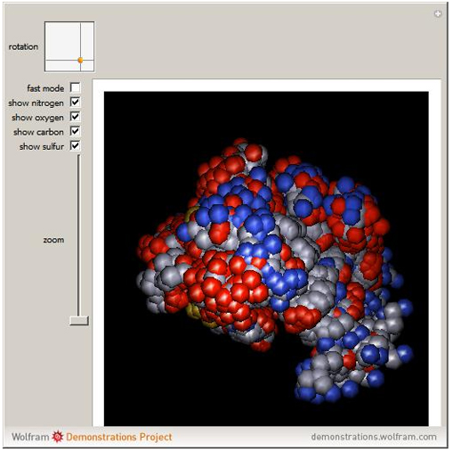
Software company Wolfram Research has launched a new file format with possibilities for journalists creating interactive infographics.

The Computable Document Format (CDF) allow users to play with various controls and parameters and explore data and diagrams, bringing text books, reports and online journalism to life.

Announcing the launch on the blog, director of strategic and international development Conrad Wolfram describes the CDF format and explains how the technology enables users to move away from static documents.

With CDFs we’re broadening this communication pipe with computation-powered interactivity, expanding the document medium’s richness a good deal. (Actually we’re also improving what I call the ‘density of information’, too: the ability to pack understandable information into a small space — particularly important on small screen devices like smartphones.)

So how easy is it to create a CDF?

Wolfram states it is easy enough, that more than 7,000 non-programmers have contributed info apps to the Demonstrations site and promises the process of building info apps will get easier.

We’re at the level now where the sorts of authors who’d be able to learn how to make a Microsoft Excel macro could learn how to make a CDF. Instead I’d like anyone who can make an Excel chart be able to make a CDF (ie almost anyone).

One major downside is that the viewer needs to install a browser plugin in order to view the infographic or diagram. It is a large file (500MB) and therefore takes a while to download.

So why not use Flash? Wolfram states it is “too hard, too time-consuming even for pre-generated frames. ‘Citizen authors’ [who have contributed to the Demonstrations site] simply wouldn’t bother”.

You can explore examples here (you will need to download the CDF player).


Design is key to good online journalism, not just coding and data

The correlation between good design and good storytelling

It is good to see that the internet’s powerful influence on journalism, while not universally welcome, is being enthusiastically tackled. The willingness of some writers and broadcasters to get to grips with programming is one of the most important aspects of this on-going narrative.

Having written a couple of blogs on journalism and coding recently, I have noticed how much of the conversation revolves around learning the technical skills required for developing new apps, the emphasis seems to be on coding and computer science.

Yet in many ways a digital journalist is more likely to struggle with design than coding. Before you can begin coding you have to have this side of things clear, whether you are working on your own independent blog or developing a complex data rich piece for a much larger news website.

Packaged up for perfection

We can all agree that the internet allows for a highly competitive market in which a good producer of quality journalism can thrive without the support of a big media giant. If you are one of these aspiring indie journalists then you are quite likely to be advised things like: be niche, be hyperlocal, be as specialist as possible.

These are fine buzzwords, but remember that regardless of how good your content may be, the first thing people will experience when they click on your site is a subconscious reaction to how your page makes them feel. If they don’t like it they will probably leave in a matter of seconds, unless there is a compelling piece of information that they cannot get elsewhere.

So how do you help your content to make your site a ‘sticky’ one? Our head designer, Cat Kempsell, believes that there are some very basic design rules to follow:

“Articles on a webpage need space to breath and flow. Don’t be afraid of white space and stick to three columns for a news driven site. Above all, make sure that your headings and sub-headings are distinctive, preferably in different colours – Times Online does this really well. People want to feel comfortable, that they can relax and interact with a website without feeling like they just landed in a maze of words.”

It’s strange to see how many news websites don’t do this. I suspect that it’s a hangover from a print history that encouraged every spare inch of white space to be filled, but on a website it just looks horrible. Someone should tell the Sun.

Making sense of data

Data journalism is another area that we are being encouraged to explore. You can build a programme that scrapes large amounts of data from a website, but how do you then organise that information into an easily accessible set of graphs, facts and stats that will deliver the maximum impact in as short a time as possible?

Making an infographic is quite easy; making a good one is an art form. Infographics are incredibly popular at the moment and many of us feel that it is another area that we need to become proficient in. My opinion is that, like coding, you’ll get the best results when you’re working in a team of professionals; that digital trinity of a journalist, a coder and a designer.

As an online editor for a digital media company, I am aware of just how important coding is, although I don’t believe that journalists and coders will ever meld into the same role. I just think that a modern journalist should be able to understand and talk about web architecture fluently. The same applies to basic design principles.

In a space that’s filled with websites clamouring for the public’s attention, how a site makes you feel when you’re on it really matters. Judging by its new design, the Times recognise the issue. If anyone else wants to start charging for content they’re going to have to recognise it too.
Working with coders to maximise readership

Bringing coders and journalists together is one of the big issues in newsrooms today, causing many journalists to think about how much coding knowledge they should invest in.

The problem is that coding is an enormous subject that many of us simply don’t have time for. It requires thousands of hours of hard work and dedication. For this reason having coders work alongside journalists in the newsroom will always be the best solution: having experts next you in the office is the most effective way of learning on the go.

Last January I attended Journalism.co.uk’s news:rewired event where one discussion generated particular interest amongst attendees. Cynthia O’Murchu from the FT described how they used developers to create infographics on a piece entitled ‘Oil and Gas Executives: Are they worth it?’.

Taking complex data like this and turning it into easily understood visual information, otherwise known as data mashing, is the practice for which today’s journalist will most likely be required to delve into design and coding. So as well as the ability to write and communicate, journalists are going to have to acquire a certain flair for design and some practical technical understanding, even if we don’t turn into full blown coders ourselves. So where is a good place to start?

3i = Immersive, Interactive, Intuitive

These are three words we hear a lot working in technology journalism: immersive, interactive and intuitive. They represent areas in which journalists will do well to excel, especially given the imminent arrival of the iPad and other tablet computers. Touchscreen computing creates a childlike desire to delve into a webpage and explore information like never before, and it will be the publishers producing the right kind of content that will have the heavy traffic.

The general election has been great for this kind of rich content. For the first time we’ve all been able to interact with that famous swingometer on the BBC’s website, while live blogging appeared to be firing on all cylinders during the hung parliament negotiations.

Working with designers and coders to create these apps is great if you have the budget, but obviously we don’t all work for the Guardian or the BBC. So getting some basic understanding of how to go about doing these things is going to be a good career move for many journalists.

From a design perspective, Adobe Fireworks is a great image and graphics software programme. It is perfect for beginners looking to start creating their own basic infographics. Similar to Photoshop, but smaller and more instinctive, it is useful for creating web optimised visual data in both vector and bitmap formats.

Have a look at this infographic from the Guardian on MPs expenses for an idea of what you can aspire to.

Code breaking

Stepping up to the next level and actually developing your own web applications gives you a problem experienced by every newbie developer starting out today: which languages do you learn first?

The good news in that most web development languages today share similarities, so tackle one and you’re going to find the next one much easier. It’s a bit like learning European languages; the more you understand the easier it becomes to make relevant connections.

HTML and CSS are your basic starting points, giving you colours and structure. If you want things to start sliding across the screen and getting interactive then J-Query and PHP (the web’s top scripting language) are the next ones to move onto.

As for getting your content on mobile phones, that is a whole other ball game.

John Hillman is the editor of PC Site which reviews and compares laptops and software. Follow him on Twitter: @JohnjHillman. Read his first post for the Journalism.co.uk editors’ blog at this link.