Category Archives: Handy tools and technology

Newsbeat, an analytics tool just for news sites, launches

Newsbeat, a real-time analytics tool for newsrooms, has launched in public beta.

The team behind analytics tool Chartbeat has “spent the last six months working with publishers from the Wall Street Journal and Forbes, to Fast Company and Time, to create a service that thinks the same way editors, producers, and content creators do – and gives them the tools they need to build a new kind of newsroom”, according to a post on Chartbeat’s blog.


Newsbeat promises great things for newsrooms.

When something unusual happens, like a spike in traffic, you’ll be immediately alerted by SMS or email and be in the best position to respond.

Chevrons denoting acceleration of new visitors to your pages also appear on the dashboard, giving you an early warning signal that a story is about to blow up, or is losing its heat.

One of the key features of newsbeat is the ability to create personalised dashboards for every person on your team. The sports editor no longer has to wade through data on politics and world news to find the data that’s important to her. She can log in and immediately see her traffic, her stories and her referrers.

But it comes with a high price tag of $199, $499 or $899 a month. There is a free 30 day trial on offer if you want to test it out. You will have to submit your details to the team and wait for the team to respond.

Here’s the Newsbeat video tour.

There’s also a helpful post on Poynter which picks out some of the most promising features.

Can FOI requests be submitted on Twitter? Yes, says ICO

In its monthly newsletter, sent out yesterday (28 July), the Information Commissioners Office sought to clarify an interesting question: whether or not people can use Twitter to submit freedom of information requests. And the answer is yes.

While Twitter is not the most effective channel for submitting or responding to freedom of information requests, this does not mean that requests sent using Twitter are necessarily invalid. They can be valid requests in freedom of information terms and authorities that have Twitter accounts should plan for the possibility of receiving them.

… The ICO has also been asked whether a request in a tweet that only refers to an authority in an @mention, for example @ICOnews, is really directed to and received by that authority. The ICO’s view is that it is. Twitter allows the authority to check for @mentions of itself, and so it has in effect received that request, even though it was not sent directly to the authority like an email or letter.

According to the ICO the key requirement is the request must state the name of the applicant, which may not be shown in the Twitter name but instead in a linked profile.

But the ICO does warn that if the requester does not give their real name, it is technically not a valid freedom of information request.

Whilst the authority may still choose to respond, the requester should be made aware that the Information Commissioner will not be able to deal with any subsequent complaint.

As for an address, as this is difficult given the limited length of a tweet, authorities are reminded they can ask the requester for an email address in order to provide a full response, or publish the requested information, or a refusal notice, on its website and tweet a link to that.

The ICO does add, however, that requesters are encouraged to use this channel responsibly. “If they do not, the authority could consider using the exemptions for vexatious and repeated requests in section 14 of the Freedom of Information Act”, the newsletter entry states.

Hatip: Andy Mabbet, aka pigsonthewing

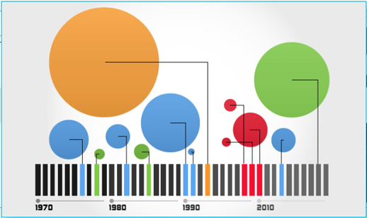
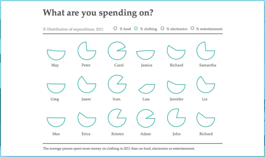
Visual.ly – a new tool to create data visualisations

Visual.ly is a new platform to allow you to explore and share data visualisations.

According to the video below, it is two things: a platform to upload and promote your own visualisations and a space to connect “dataviz pros”, advertisers and publishers.

Visual.ly has teamed up with media partners, including GigaOM, Mashable and the Atlantic, who each have a profile showcasing their data visualisations.

You will soon be able to create your own “beautiful visualisations in minutes” and will “instantly apply the graphics genius of the world’s top information designers to your designs”, the site promises.

Plug and play, then grab and go with our push-button approach to visualisation creation.

The sample images are impressive, but journalists will have to wait until they can upload their own data.

You can, however, “Twitterize yourself” and create an image based on your Twitter metrics.

Economist launches World in Figures iPhone app

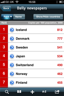
The Economist has launched an iPhone and iPod app based on its World in Figures book, which is published annually.

The World in Figures app, which costs 69 pence, has data on 190 countries.

It is of use to journalists who need to access country stats, and of interest to a much wider audience, despite some of the data being a little old.

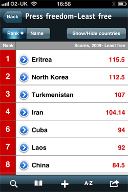
The app includes ‘ranking topics’, with stats on daily newspapers per country and press freedom. Data – whether it be cinema visits, Oscar-winning films, aid donors, or stats on disease – can be shared by email or posted to Facebook.


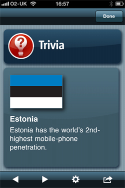
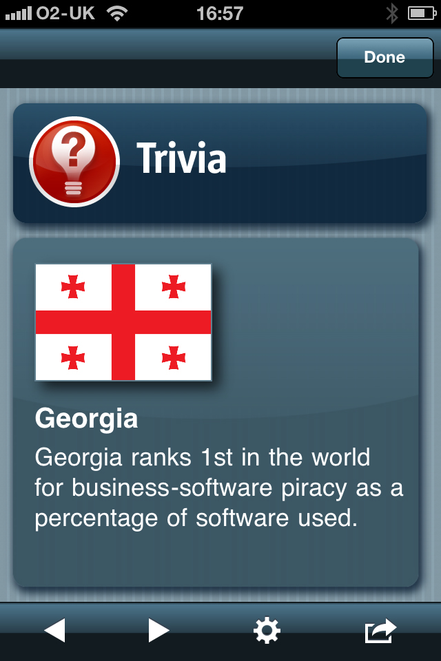
There are also a series of trivia flashcards, which can also be shared by Twitter.


Last month, the Economist released figures to say its news iPhone and iPad apps had been downloaded two million times.

Will your next journalism job application be via LinkedIn’s new button?

LinkedIn has launched an ‘apply with LinkedIn’ button allowing companies to recruit using the social network.

Job seekers can then use the button to submit an application and are able to see other employees of the firm and make contact with them.

Prospective employers will be able to see your connections so this new functionality is another reason to get your LinkedIn profile in order and gather a good quality, rather than quantity, of contacts.

There are tips on how journalists can best use LinkedIn in this podcast, which includes advice for news organisations setting up profile pages.

The LinkedIn Blog states:

We’ve put an incredible amount of effort to rethink the job application process from end-to-end to make it a one-click submit for any professional. The first step was simple: put the functionality everywhere our members need it. That means packaging it as a simple button that you can recognise anywhere across the web. We’ve made this simple enough to implement so both  companies and developers can easily include it on their corporate websites.

Here is the code for adding the ‘apply with LinkedIn’ button.

New file format allows journalists to create interactive infographics

Software company Wolfram Research has launched a new file format with possibilities for journalists creating interactive infographics.

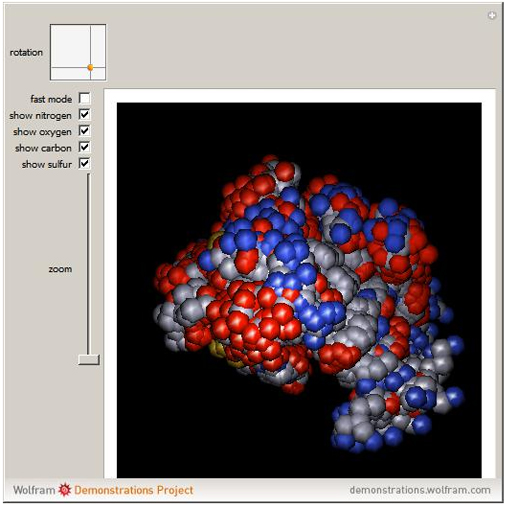
The Computable Document Format (CDF) allow users to play with various controls and parameters and explore data and diagrams, bringing text books, reports and online journalism to life.

Announcing the launch on the blog, director of strategic and international development Conrad Wolfram describes the CDF format and explains how the technology enables users to move away from static documents.

With CDFs we’re broadening this communication pipe with computation-powered interactivity, expanding the document medium’s richness a good deal. (Actually we’re also improving what I call the ‘density of information’, too: the ability to pack understandable information into a small space — particularly important on small screen devices like smartphones.)

So how easy is it to create a CDF?

Wolfram states it is easy enough, that more than 7,000 non-programmers have contributed info apps to the Demonstrations site and promises the process of building info apps will get easier.

We’re at the level now where the sorts of authors who’d be able to learn how to make a Microsoft Excel macro could learn how to make a CDF. Instead I’d like anyone who can make an Excel chart be able to make a CDF (ie almost anyone).

One major downside is that the viewer needs to install a browser plugin in order to view the infographic or diagram. It is a large file (500MB) and therefore takes a while to download.

So why not use Flash? Wolfram states it is “too hard, too time-consuming even for pre-generated frames. ‘Citizen authors’ [who have contributed to the Demonstrations site] simply wouldn’t bother”.

You can explore examples here (you will need to download the CDF player).


Tips for journalists wanting to engage with 20m Google+ users

A fortnight ago Journalism.co.uk suggested 10 ways journalists can use Google+. Here are another 10 tips, tricks and tools from across the web for reporters wanting to engage with the estimated 20 million Google+ users.

1. Upload your address book

Google+ is quietly adding new features, such as the ‘upload address book’ function which allows you to upload address books from Outlook, your Mac, and more, as this post on TechCrunch explains.

2. Carry out a Google+ search for profiles and posts

Another really handy trip for journalists is to follow this guide from Read Write Web, which explains how you carry out a profile search. It uses a feature in Google Chrome which lets you add custom search engines to your browser.

3. Find eye-witness photographs and video from the scene of a news event

Here is a tip from Prashant Rao who has written a primer on how journalists can use Google+. This tip is based on a 10,000 words post.

If a follower happens to be at the site of a news event (say, a massive tornado) that you cannot attend, they could be encouraged to tag your Google+ profile so that you are instantly made aware that they’ve uploaded it. This could be very useful in situations where journalists cannot be physically present at the site of major news events (as was the case in Iran in 2009, for example). Given Google’s Picasa (which is integrated into Google+) is already a simple but robust photo-uploading platform, this removes the need for news organisation to create their own bespoke solutions.

4. Think about how you manage another social media platform

The Guardian has a post on aggregation tool MultiMi.

Israeli startup Zbang has taken a logical approach to the problem of information management with the launch of MultiMi, a free desktop dashboard tool for PCs that aggregates a dozen different services including Facebook, Twitter, email and photo-sharing.

Launched based on tests with a small group of alpha users up to now, the software is initially PC only but Zbang’s team of eight will be expanding MultiMi with support for some tablets and eventually a mobile version.

5. Get the app

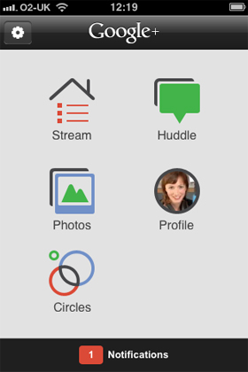
Since its launch earlier this week, the new iPhone app has gathered almost 300 ratings, a three star ranking, and it is the top free app on Apple’s iTunes. The native and web-based apps are at this link.
6. Host audience hangouts

This is a tip from Mashable in its five ways journalists are using Google+. The post includes a description on how one news anchor is engaging with the audience:

Sarah Hill, an anchor for KOMU-TV in Columbia, Missouri, has been inviting her Google+ fans to join her in hangouts, the network’s video chat service. KOMU hosts a hangout during the 5pm newscast to give viewers a behind-the-scenes look at the newsroom. She then interviews people in the hangout on-air about their reactions to the day’s news.

7. Engage readers

Mashable points out that several news organisations have brand profiles on Google+, despite Google asking brands not to create a profile and instead add their names to a request list.

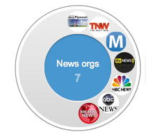
Some profiles, such as those set up by ITV News and Canadian broadcaster CBC, appear to have been removed. Those with accounts include This Is PlymouthThe Next WebABC News, NBC and Mashable.

Mashable is the first and only company to break into the top 10 in the Telegraph’s list of the most followed on Google+

As news organisations join early, and following brands’ enthusiasm to join Google+, Poynter reports Google is accelerating business profiles.

A Google executive now says it will pick partners next week to test official business profiles, while continuing to deactivate the unofficial profiles that have sprung up. “Thousands upon thousands of businesses” have applied to join the trial programme, Christian Oestlien wrote. After the trial, business profiles should be open to all later this year.

8. Engage with readers and viewers in non-news ways

This is another tip from Rao. He explains how one news outlet is engaging with readers.

Canadian broadcaster CBC ran a daily caption contest on its Google+ site (now closed) — not everything has to be just about publishing content and then waiting for readers/viewers to respond.

9. Use circles to organise your contacts

You can share news or ask contacts questions by adding your contacts to circles. The beauty is that your contacts don’t need to be on Google+ as they will receive an email update. There’s more on how to organise your circles here.

10. Use Google ‘sparks’ to keep abreast of the topics you cover

Another tip from Rao considers sparks. He hopes the feature will be handy for following topics.

In my limited playing with sparks, it’s a little raw and not particularly pointed, but given it’s based on Google’s search result rankings and +1 results, it could well develop into a useful tool. For now, I’ll use it, but not give up on my RSS feeds just yet.

For essential reading on Google+ as it nears 20 million users, go to this link.
NY Times: Scribd to pay news sites for content accessed via app

News organisations will be paid when users access their content via Float, a new app launched by social publishing site Scribd, the New York Times reports.

Float, which is now an iPhone app and will also be available for Android and iPad, is a personalised reader that allows users to turn their selection of news feeds into a magazine-like format, similar to Zite, Flipboard and Pulse.

But unlike the other three apps, Float (or rather Scribd) will share its revenue with the news organisations featured.

The New York Times article explains that Scribd will make money from advertising and subscriptions.

Scribd didn’t make it clear how much money publishers would have to share with it and how much subscribers would have to pay.

“This is the time for someone to try it, and if we get it working, then it will be phenomenal for the industry,” said Trip Adler, Scribd’s chief executive.

Scribd has talked with a number of publishers, and some have already agreed to make their material available, he said. But he declined to name any companies.

[Adler] voiced confidence in news and Scribd’s ability to make money from it. Consumers want a one-stop shop for news, not a service with a couple of nice features, he said in taking a thinly veiled dig at his company’s rivals.

The New York Times post is at this link

Poynter: Journalism student creates iPad app for recording interviews

Poynter has an interesting post on SoundNote, an iPad app for recording interviews.

It tells the story of how David Estes, a journalism student studying in Seattle, created the application, paid off his student loan with his earnings from the $5.99 app, and moved to a West Village apartment.

The post explains how the app works.

SoundNote is a simple note-taking application that lets you record from the iPad’s internal microphone. It matches your notes with the timeline of the audio recording, so you just click on a word in your notes to jump to the related point in the audio. If you’re interviewing someone, you point the iPad in the direction of your subject and jot down a few keywords as the person answers.

It is also worth reading the post for the back story of how the app came about.

Estes’ development of the app is a lesson in innovation. Instead of going through a formal process of soliciting requirements or getting multiple people to sign off on wireframes, a 21-year-old student thought about how a device like the iPad could make his life easier — as a journalist and student — and he just made it.

The full post is on Poynter at this link.

Adding analysis increases referrals from a journalist’s Facebook page

Facebook has published a study on how users interact with journalists’ pages on the social networking site.

The research also analysed how users use news organisations’ Facebook pages. Those results will be published shortly.

The main highlights from the study, published on the Facebook for Journalists page, suggest journalists with Facebook pages should take note of the following facts:

  • Starting the conversation: Posts that include a question or call to action from the journalist received the highest amount of feedback;
  • Personal analysis is effective: Posts that included the journalist’s analysis and personal reflections had 20 per cent more referral clicks than that of an average post;
  • Images work: Photos received 50 per cent more likes than non-photo posts, and journalists who shared links that included a thumbnail image in the link preview received 65 per cent more likes and 50 per cent more comments than posts that did not include images.

Facebook’s report is co-authored by journalist programme manager at Facebook Vadim Lavrusik, who spoke to Journalism.co.uk for this podcast on how journalists can best use Facebook pages and for this guide on how to set up a successful Facebook page as a journalist.

Other findings of the report:

  • Posts that asked questions or sought user input: +64 per cent;
  • Call to read or take a closer look: +37 per cent;
  • Personal reflections or behind-the-scenes posts: +25 per cent;
  • Posts with catchy/clever language or tone: +18 per cent.

What is the most effective post length?

On average, meaty posts from journalists get more feedback via comments and likes. The analysis showed that four-line postings received a 30 per cent increase in feedback over average posts and five-line postings showed a 60 per cent increase in feedback over average posts. However, one-line posts show the greatest fluctuation, receiving the highest maximum feedback observed, at 15 times higher than the average post. Five-line posts were a close second, showing a maximum of around 10 times the average post. For journalists posting teasers for links or status updates on their pages, this means both short and long posts can yield results but meatier posts on average generate more feedback overall.

Is it worth posting photos?

The research also shows it is worth ensuring every news story has an image.

Journalists who shared links that included a thumbnail image in the link preview on their page wall saw a 65 per cent increase in likes and 50 per cent increase in comments on those posts.

What types of story gets the most interaction?

The research on the type of stories that result in the greatest number of click-throughs and the highest reader engagement is revealing.

Engagement by story type: Posts about education, politics and behind-the-scenes insights and analysis from journalists received a higher amount of feedback on average. Education posts got two times more likes, politics received both 1.7 times more likes and 1.6 times more comments, and a journalist sharing their thoughts had 1.4 times more likes.

Referral clicks and story type: International news stories had 70 per cent more referral clicks than that of an average post. For example: “For 60 years, Pakistan’s military has focused obsessively on its rivalry with India. Large elements within that military appear to be switching obsessions…” – Fareed Zakaria, CNN;

Stories about politics received 60 per cent more referral clicks. For example: “I’m sitting down with President Obama tomorrow for an exclusive interview – click below and tell me what you think I should ask.” – George Stephanopoulos, ABC;

Posts that included the journalist’s analysis or personal reflections received 20 per cent more referral clicks than an average post. For example: For all of you high school students  accepted into college – congratulations, but think about deferring for a year and taking a ‘gap year’ – I did…”  – Nicholas Kristof, the New York Times;

Daily feedback and referral clicks: Journalists received the highest amount of feedback later in the week. Thursday, Friday, Saturday and Sunday had the highest amount of feedback – with Sunday receiving the highest amount of feedback at 25 per cent more likes and 8 per cent more comments above average. Referral clicks were above average Wednesday, Thursday and Saturday – with links getting 85 per cent more clicks on Saturday and 37 per cent more on Wednesday than an average post;

This part of the study focuses on the US, which spans several time zones, but the following times are worth noting:

Hourly feedback: Readers are active throughout the day. Feedback spikes occurred on journalist pages at the start of the day (7am and 8am showing a 30-40 per cent increase); late in the morning (10am received 40 per cent increase in feedback); later in the workday (4 and 5pm showing 40 per cent and 100 per cent increases); and on into the evening hours (midnight getting 30 per cent increase and 2am getting 20 per cent increase).

Poynter’s report on the Facebook study – Facebook data show 7 keys to maximum engagement for journalists – explains the scope of the research:

For those curious about the methodology, Facebook’s Vadim Lavrusik tells me they sampled 25 pages of local, national and international journalists, across various types of media. Data was collected over a two-week period.