Stephen Dunn, who heads up the Guardian’s technology strategy, talks to Beet.tv in the video below about how opening up and making better use of data can provide journalistic and business opportunities for publishers:
Category Archives: Handy tools and technology
Guardian’s phone hacking interactive: ‘The growing web’
The Guardian’s Steve Busfield and Paddy Allen have produced a rather nice click-through interactive, showing how figures at News International fit into the phone hacking / blagging scandal.
Or as Steve Busfiled (@busfield) says on Twitter: “How the #phonehacking players are connected. And what they DON’T know.”
As noted on this blog this morning, the Guardian reported that Conservative director of communications Andy Coulson (former News of the World editor) is under pressure to defend “his knowledge about the illegal activities of his journalists amid new allegations about the paper’s involvement with private detectives who broke the law”.
For those interested in producing news interactive and visualisation features, please see my post from last week: ‘Data visualisations that tell the news’ – packed with links suggested by the FT’s deputy interactive editor, Cynthia O’Murchu.
A social media documentary coming this spring
A new Canadian documentary film, due out this spring, uses social media to tell an alternative story about Vancouver’s Winter Olympics. It follows four individuals who “rallied” their community through social networking tools, to help empower the homeless and poor – who don’t necessarily fit into grand Olympic plans. The idea was to use mobile and online media to “provide a voice for those left behind”. (Hat-tip: Jon Slattery)
It draws on video blogging, photo-sharing and social networking to bring a “marginalised” community to the fore, “embracing leading-edge communication technologies, to empower, inspire, and break down the digital divide,” its producers say. The synopsis:
February 12, 2010. Sixty thousand people have gathered in Vancouver’s BC Place Stadium to revel in the spectacle that is the opening ceremonies of the Winter Olympic Games. It marks the beginning of a two week party that will focus a global spotlight on this city of half a million and, organizers hope, finally put to rest seven years of surrounding controversy. A few days earlier, a year long campaign which saw police issue hundred dollar jaywalking and spitting tickets to homeless people, had culminated in a successful sweep of the city’s impoverished Downtown Eastside to relocate undesirables to outlying communities.
When the story finally makes it to the mainstream news channels, it’s thanks to the diligence and combined power of a few concerned citizens, their video-streaming cellphones and the Internet. With Glowing Hearts will give audiences the chance to see the world through the eyes of four such citizens, as they rally their community around powerful new Social Media tools to show its true heart to the world. Based on the premise that the access to information is a human right, the film and accompanying website, will take audiences on a year long journey into the creation of an independent Olympic media center designed to guarantee that access in a community whose voice is frequently ignored.
Here’s the trailer:
With Glowing Hearts from Andrew Lavigne on Vimeo.
A history of linked data at the BBC
Martin Belam, information architect for the Guardian and CurryBet blogger, reports from today’s Linked Data meet-up in London, for Journalism.co.uk.
You can read the first report, ‘How media sites can use linked data’ at this link.
There are many challenges when using linked data to cover news and sport, Silver Oliver, information architect in the BBC’s journalism department, told delegates at today’s Linked Data meet-up session at ULU, part of a wider dev8d event for developers.
Initally newspapers saw the web as just another linear distribution channel, said Silver. That meant we ended up with lots and lots of individually published news stories online, that needed information architects to gather them up into useful piles.
 He believes we’ve hit the boundaries of that approach, and something like the data-driven approach of the BBC’s Wildlife Finder is the future for news and sport.
But the challenge is to find models for sport, journalism and news
A linked data ecosystem is built out of a content repository, a structure for that content, and then the user experience that is laid over that content structure.
But how do you populate these datasets in departments and newsrooms that barely have the resource to manage small taxonomies or collections of external links, let alone populate a huge ‘ontology of news’, asked Silver.
Silver says the BBC has started with sport, because it is simpler. The events and the actors taking part in those events are known in advance. For example, even this far ahead you know the fixture list, venues, teams and probably the majority of the players who are going to take part in the 2010 World Cup.
News is much more complicated, because of the inevitable time lag in a breaking news event taking place, and there being canonical identifiers for it. Basic building blocks do exist, like Geonames or DBpedia, but there is no definitive database of ‘news events’.
Silver thinks that if all news organisations were using common IDs for a ‘story’, this would allow the BBC to link out more effectively and efficiently to external coverage of the same story.
Silver also presented at the recent news metadata summit, and has blogged about the talk he gave that day, which specifically addressed how the news industry might deal with some of these issues:
Technology: both good and bad for human rights
At an interactive event at Amnesty UK on Monday, the panel, audience and back-channel contributors (tweets were beamed up on a screen behind) discussed the pros and cons of using technology for human rights. The underlying conflict was this: repressive governments and regimes can make as much use of new technology as pro-democracy activists.
The panel included Google’s head of public policy and government relations, Susan Pointer; Guardian’s digital media research editor, Kevin Anderson; Annabelle Sreberny, professor of global media and communication at SOAS; and author and blogger Andrew Keen: who spoke from the US via an iPhone held up to the mic by the event chair, BBC technology correspondent Rory Cellan-Jones.
- Journalism.co.uk report: ‘Google’s head of public policy: ‘We live or die by the trust our users have in our services”
- Read Wired.co.uk’s report here: ‘Does technology really benefit our human rights?’
At the end, the conversation turned to Amnesty’s own changing use of technology to fight battles: letters were still important, said Steve Ballinger from its media unit. While email now played an important role, there was still something very “physical” about sending a letter, he said.
The event was put on by the human rights charity to promote its annual media awards, which freelancers, or journalists at small online publications, may be able to enter for free.
Amnesty also used the occasion to remind us of the plight of two bloggers from Azerbaijan. After producing a spoof YouTube video critical of the Azeri government last year, the youth activists were sentenced to prison; Emin Abdullayev for 2.5 years; Adnan Hajizade for two years. An appeal hearing is due for 3 March. Amnesty is calling for people to send protest emails to the minister of justice in Azerbaijan at this link.
dot.Rory: Tips from Rory Cellan-Jones and Josh Halliday on online tools for reporting
BBC technology correspondent Rory Cellan-Jones and Sunderland University journalism student Josh Halliday offer some great tips and suggestions of tools to use for reporting online. There’s a strong focus on tools to help make your job as a journalist easier – whether that’s saving battery power on your laptop or mobile when filing a report or how to send large image files back to the newsroom from the field.
Worth a read by budding journalists and seasoned professionals alike.
Google’s head of public policy: ‘We live or die by the trust our users have in our services’
Google’s head of public policy and government relations pushed the ‘don’t be evil’ line at last night’s Amnesty International social media event, with emphasis on user power and responsible company behaviour.
“We live or die by the trust our users have in our services,” Susan Pointer told the audience of human rights, technology and media workers gathered to discuss the positive and negative uses of technology for democracy.
Also speaking were the Guardian’s digital media research editor, Kevin Anderson; Annabelle Sreberny, professor of global media and communication at SOAS; and author and blogger Andrew Keen: who spoke from the US via an iPhone held up to the mic by the event chair, BBC technology correspondent Rory Cellan-Jones.
“[A] very important thing to understand about the way our business operates is that our users choose to use it,” Pointer later told Journalism.co.uk.
“We don’t have a contract with our users that ties them into our services. They haven’t invested a lot of money in our software packages.
“The way we keep our users is by continuing to provide good, leading edge innovative services: they’re free at the click of a mouse to choose an alternative to Google.”
Providing valuable services for users keeps the search giant – which owns YouTube as well as running a host of other products – on its toes, she said.
Improving the transparency of the recently launched social media application Google Buzz was one such reaction to user complaints, she added.
When the company realised improvements could be made, they were implemented, she said: “that’s something we did within hours and not days.”
While Pointer argued that no user information was ever revealed before an individual went through the Buzz set-up process, she said it had been necessary to make changes to the visibility of the user controls.
The addition of Buzz to the Google Dashboard allowed even greater user control over settings, she argued.
On Google’s approach to China she would not be drawn beyond the company’s most recent blog post, which explained its decision to stop censoring the Chinese language Google search service: “We no longer felt comfortable self-censoring results on Google.cn.”
The company is currently “discussing the possibility of continuing the Google.cn service without such censorship”.
“We’re not going to give a running commentary on where discussions are, but we want those discussions to be in good faith.”
Listen to Pointer talking to the Amnesty UK audience via AudioBoo:
On China:
On privacy, Google Buzz and customising advertising:
Election fall out – between journalists
Following last week’s election 2.0 debate at the Frontline Club, the Guardian’s digital media research editor, Kevin Anderson shared some fairly critical thoughts on his personal blog. Moderator, Sky News political correspondent Niall Paterson (social media practitioner but sceptic) wasn’t too impressed by Anderson’s charges against him.
It’s difficult to summarise this one fairly, so I’d urge you to follow the link and read the 11 comments – most of them mini-essays – in full, if you’re interested in the election, journalists and the influence of social media in politics. But mostly if you’re interested in the politics of journalism 2010.
The subsequent blog run-in is very illustrative of some of the ongoing tensions in newsrooms: the perceived regard held for online-only journalists or social media specialists; the tools-for-tools sake debate; and how (or how not) to prioritise social media in our work.
Maybe, like Anderson says, we need to start thinking about the impact of social media on the people not the journalism at these events, but in the meantime, this debate is worth a read.
Data visualisations that tell the news
The Linked and Open Data conversation is extremely relevant for news telling and I’m hoping this week’s Linked Data meetup – Web of Data – will introduce me to some new ideas which could be used effectively in journalism. There’s some incredibly inspiring stuff going on outside traditional newsrooms, but some media organisations have also been building some fantastic interactive features on their sites, which allow users to customise the way they view and consume data.
Last month at the first official UK Future of News Group meeting, the Financial Times deputy interactive editor, Cynthia O’Murchu, shared some inspiring ways of news storytelling. She later sent me a list of inspirational links, which I’ll share with you here.
O’Murchu believes that data visualisations can add so much value to a story, and allow more user control, too. The great thing about various data visualisations was that “you allow people to choose their story”, she said. Here are some of the visualisations she flagged up in particular:
[Note: for FT.com articles, you will need to register or subscribe to receive full access after a limited number of views]
 This Financial Times feature from 2007 mapped the different factors affecting food prices around the world: export restrictions, price measures, civil unrest, trade balances and inflation. Additional text boxes, brought up by clicking on a certain location, give additional information.
Another feature brought together video and slide shows that explain why food prices are rising.
It was about presenting things in a comprehensible way for users to understand, said O’Murchu.
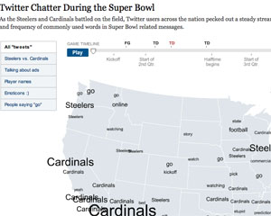
She flagged up how the New York Times had used geolocal information to show what people were talking about on Twitter (see below, for example).
O’Murchu urged the room of journalists to go and play with data tools: “If you’re inclined to do a type of story telling, just do it!”
Some of the other interactive packages at the FT:
- One of O’Murchu’s own, ‘The Pensions Crisis’ (May 2009) – experts advise on dilemmas faced by savers, companies and governments.
- ‘Trading places: Migration in the crisis’ (August 2009). Audio and video slide shows examining which migrants were hit hardest in the economic downturn.
Data visualisations:
- ‘Shrinking Titans’ (February 2009): a visualisation showing the scale of Obama’s proposed pay caps for the executives of large companies.
- ‘Oil and gas chief executives: are they worth it?’ (November 2009): graphic allowing users to view different information about chief executives’ compensation packages.
- ‘The decade for global banks’ (March 2009) An interactive allowing users to see how different banks fared from 1999 -2009.
- ‘How different groups spend their day’ on NYTimes.com (July 2009): a rather beautiful interactive graph showing chunks of time spent on various activities by different groups, with time of day along the X axis. Accompanying news story at this link.
- Guardian.co.uk (September 2008): De Menezies shooting with CCTV videos labelled, with angle, on tube station map.
- International Monetary Fund (IMF) Data Mapper, looking at real GDP growth, by country and over time.
She also showed examples of applications that helped users customise information, to help with a particular problem:
- Is it better to rent or buy? An interactive calculator over at the New York Times, for comparing the cost of renting or buying property. Сайт – каталог индивидуалок: проститутки Самара Сохрани себе чтобы не потерять
O’Murchu also mentioned the non-profit information site Gapminder. In this video, Gapminder’s Hans Rosling shows users how countries have developed since 1809, based on individual life expectancy and income. [You can see another Rosling video here, ‘Let my dataset change your mindset’].
O’Murchu also recommends taking a look at these links, for further inspiration:
And finally, for even more examples of interactive graphics:
- If you’re registered or subscribed to the FT.com site you can browse through all their interactive graphics at this link…
- The Guardian’s bank of interactive features can be found here: http://www.guardian.co.uk/interactive
- The New York Times’ full multimedia content (interactive features on the right). Check them out quickly before the paywall goes up next year.
- 10,000words.net by Mark Luckie, now multimedia producer for California Watch, flags up clever interactives.
- Times Labs is showcasing ways to use data at this link.
- David McCandless’ new book, ‘Information is Beautiful’, was published this month. He shares excellent visualisations here: http://www.informationisbeautiful.net/
What are your favourites? Add them in the comments below…
SocialMedia.biz: Wikipedia’s Jimmy Wales on nurturing online communities
SocialMedia.biz has a radio show featuring Jimmy Wales from Wikipedia, talking about growing and nurturing online communities. Despite the recent £2 million donation from Google, most money comes from small donations, he says.
It was a wide-ranging conversation about the democratization of media, the birth of Ourmedia and YouTube, the thriving global open source development community of WordPress, Creative Commons licenses, Ning, entrepreneurial journalism, Silicon Valley’s mantra of embracing failure, and the state of Wikipedia.

