Category Archives: Handy tools and technology

Twitter adds new search and photo sharing options

Twitter has enabled a new search option for those with using the most up-to-date Firefox browser. By adding the Twitter address bar search you can now search for a hashtag or @username by using the address bar where you would usually enter a site’s URL.

Twitter has also announced that it has partnered with Photobucket and will be launching a photo sharing option in the coming weeks.

Over the next several weeks, we’ll be releasing a feature to upload a photo and attach it to your tweet right from Twitter.com. And of course, you’ll soon be able to easily do this from all of our official mobile apps. A special thanks to our partner Photobucket for hosting these photos behind the scenes.

Twitter is working with mobile carriers to allow those without smartphones to send photos by text message (MMS).

Google turns up to social sharing party with +1

Google +1 has launched for news sites, allowing users logged in to their Google account to recommend articles and sites to contacts, similar to the way Facebook’s ‘like’ button permits Facebook contacts to see a person’s favourite stories.

When someone with a Google account clicks the +1 button the page will then be privileged in relevant searches performed by that person’s Google contacts.

Google-owned sites, including Android Market, Blogger, Product Search and YouTube have added the button along with news sites including the Washington Post, Google announced on its blog.

We asked via Twitter which UK sites have already added the button and the Lincolnite, Made for Mums, Cooking with Mrs K and Kelvin Taylor’s blog all responded to tell us they had installed the button.

ReadWriteWeb, in this post, predicts +1 will be good for news sites but feels it may not work.

Is this compelling for website owners? Yes, probably. For web users who would click the button? That’s much less clear. For search users? Time will tell, but I wouldn’t bet the farm on it.

You can add the +1 button by copying a line of code. This post explains how.


news:rewired on Bundlr

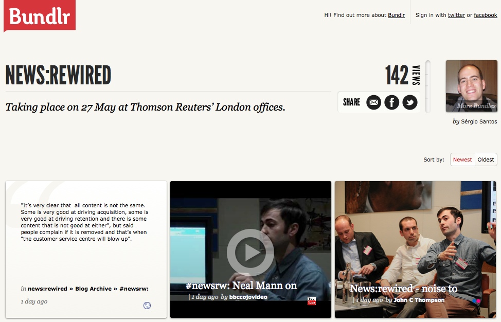
Our good friends from Bundlr in Portugal came over en masse last week for news:rewired, and they built a page dedicated to the event.

You can find tweets, quotes, pictures and video from the day there.

Bundlr is a free tool for online curation, clipping, aggregation and sharing web content.

The idea for the tool actually came about as a way to cover conferences. Founders Filipe Batista and Sérgio Santos, from Coimbra, Portugal, told Journalism.co.uk in February:

After attending a great conference, we thought about ways to show how it really was to be at the event. Share photos, videos, reports and all that was being published online, in a single shareable page. But we couldn’t figure out a simple way to do it.

But now they have. Check it out by way of news:rewired here.

You can see Journalism.co.uk’s own round of blogs from the day at this link, and visit the news:rewired site to find speaker presentations, liveblogs and more.

Twitter’s new ‘follow’ button encourages readers to follow reporters

The Telegraph is is among the first websites to add Twitter’s new ‘follow’ button, which allows users to click and follow reporters or the newspaper’s Twitter account in a single click.

In an announcement on the Twitter blog, the social media giant says:

More than 50 sites have added the follow button today, making it easy for you to discover the Twitter accounts of your favourite reporters, athletes, celebrities, and other personalities. Using the follow button is as simple as a single click. You can also see the profile and latest tweets of the account you want to follow by clicking the username next to the button.

An article on Telegraph.co.uk says:

The Telegraph, the only UK newspaper to partner with Twitter for the launch, has added the new buttons to journalists’ pages, blogs and section pages such as news, sport and technology.

The button is simple to add to news sites and blogs. Click here and copy and paste the embed code.

Visualisation shows the topics New York Times journalists are writing about

The Visual Communication Lab, part of the IBM Center for Social Sofware has created a site to provide a visualisation to show what subjects New York Times journalists are writing about.

NYT Writes, created by research developer Irene Ros, allows users to enter a subject and see a visualisation of the journalists who have written on that subject.

This post on the VCL blog explains what the visualisation shows.

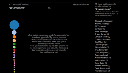
There are a few things that you will see once the search is complete. First, on the left side of the screen you will see a stack of bubbles at varying sizes. Each bubble represents a term, or “facet”, that was used to describe one or more articles containing your search query.

Facets get manually attached to each article by the New York Times staff. An article about “Tsunami” might be tagged as being about “Natural Disasters,” for example. The size corresponds to the relative amount of times that tag appeared comparing to all the other facets collected from all other articles in the query set.

You can mouse over each bubble to see the tag name appear in the middle as well as how much it appeared relative to the other facets below the stack itself. This stack could also represent what I call a “dedicated writer” – someone who only writes about one topic for 30 days would have a similar stack to this one.

You can try out NYT Writes at this link

How newspapers can use Facebook more effectively

The New York Times, which is conducting an experiment and no longer sends automated tweets, has admitted it has not yet “cracked the code” of using Facebook, according to Liz Heron, social media editor of the newspaper, speaking at the BBC Social Media Summit.

Our journalists have not figured out how to interact with it just yet. We’re working to bring Facebook journalism onto the main page.

The NY Times has started experimenting with “gamification”.

Facebook will give you a lot of info, so we were able to show what kind of person was going in for the Kings Speech, for example, so got some interesting visualisations. In a way we therefore used a form of gamification to engage users. We want to do more to build platforms around our journalism in this way and allow our content to not only get distributed further but get some interesting information back on our key readers from it.

So what else can the newspaper – and all brands – learn from Facebook success stories?

Mashable has published an article on “eight brands that have found success on Facebook and what we can learn”. Here are its eight lessons.

1. Ask your staff, customers, vendors, and partners — who already know you and like you — to “Like” your Facebook page first.

2. Ask a lot of questions. You’ll get valuable feedback, plus you’ll be more likely to appear in your fans’ newsfeeds.

Here’s another article from 10,000 Words to tell you how to use Facebook’s new questions feature to do just that.

3. Share lots of photos, and ask your fans to share photos. Facebook’s Photos remain the most viral feature of its platform.

4. Find the resources to respond to your fans questions and inquiries.

5. If you have a physical location, use Place Pages and Deals to drive traffic through your doors.

6. Know your audience well, and when you make a mistake, quickly own up, do right by your audience and fix the problem.

7. Integrate Facebook outside of your Fan Page, on your website, in as many places as you can. Create more compelling opportunities for people to buy your product based on their friends’ Likes.

8. Find synergy with other organizations and entities, and then work together to promote each other’s Facebook pages so that everyone benefits.

Mashable’s full post with examples is at this link.

Five great examples of data journalism using Google Fusion Tables

Google Fusion Tables allows you to create data visualisations including maps, graphs and timelines. It is currently in beta but is already being used by many journalists, including some from key news sites leading the way in data journalism.

To find out how to get started in data journalism using Google Fusion Tables click here.

Below are screengrabs of the various visualisations but click through to the stories to interact and get a real feel for why they are great examples of data journalism.

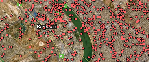
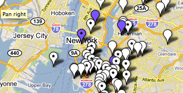
1. The Guardian: WikiLeaks Iraq war logs – every death mapped
What? A map with the location of every death in Iraq plotted as a datapoint.
Why? Impact. You must click the screen grab to link to the full visualisation and get the full scale of the story.

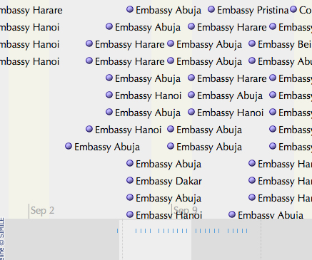
2. The Guardian: WikiLeaks embassy cables
What? This is a nifty storyline visualisation showing the cables sent in the weeks around 9/11.
Why? It’s a fantastic way of understanding the chronology.

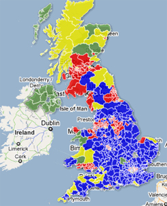
3. The Telegraph: AV referendum – What if a general election were held today under AV?
What? A visual picture of using the hypothetical scenario of the outcomes of the 2010 general election if it had been held under the alternative vote system.
Why? A clear picture by area of the main beneficiaries. See how many areas are yellow.

4. WNYC: Mapping the storm clean-up
What? A crowdsourced project which asked a radio station’s listeners to text in details of the progress of a snow clean-up.  The datapoints show which streets have been ploughed and which have not. There are three maps to show the progress of the snow ploughs over three days.
Why? As it uses crowsourced information. Remember this one next winter.

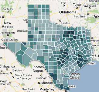
5. Texas Tribune: Census 2010 interactive map – Texas population by race, hispanic origin
What? The Texas Tribune is no stranger to Google Fusion Tables. This is map showing how many people of hispanic origin live in various counties in Texas.
Why? A nice use of an intensity map and a great use of census data.

You can find out much more about data journalism at news:rewired – noise to signal, an event held at Thomson Reuters, London on Friday 27 May.

Where does Twitpic row leave journalists?

Newspapers, broadcasters and websites are unable to publish Twitpic photos without permission from the person who owns the copyright, according to a media law specialist.

And the copyright is owned by the person who took and uploaded the photo, the founder of Twitpic, a service which allows users to append a photo or video to a tweet, has confirmed in the company’s blog.

“From what I’ve heard of the terms they are describing I don’t think that journalists can use the pictures people have uploaded to Twitpic and print or broadcast them,” media law consultant David Banks told Journalism.co.uk.

The question of the copyright of Twitpics has been answered this week and founder of Twitpic Noah Everett has apologised to users after it faced a barrage of criticism when it changed its terms leading many users to understand that Twitpic would have the right to sell users’ photos.

Twitpic users ditched their accounts in their droves in favour of alternatives, like this (really nice) option, Imgur.

“To clarify our ToS regarding ownership, you the user retain all copyrights to your photos and videos, it’s your content,” Everett said on the blog.

However, by signing up to use Twitpic you agree to allow the company to distribute your images to its partners, which include celebrity photo agency WENN.

Twitpic has said that it had changed its terms to prevent the media publishing and broadcasting photographs of newsworthy events – like this Twitpic of the Hudson river plane crash – without the permission.

Writing on the Twitpic blog, founder Noah Everett said:

Our terms state by uploading content to Twitpic you allow us to distribute that content on twitpic.com and our affiliated partners. This is standard among most user-generated content sites (including Twitter). If you delete a photo or video from Twitpic, that content is no longer viewable.

Twitpic’s full terms of service are at this link.

The BBC editorial guidelines on the use of photographs from social media sites are at this link.