Author Archives: Sarah Marshall

About Sarah Marshall

I'm Journalism.co.uk's technology correspondent, recommending tools, apps and tips for journalists. My background is in broadcast and local news, having worked as a radio producer and newsreader and print journalist.

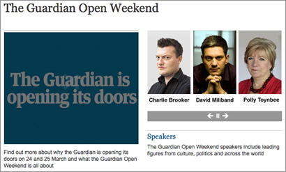
Media release: Guardian announces it is opening its doors for a weekend

The Guardian has today announced the launch of a two-day festival with more than 300 speakers.

Its Open Weekend will take place on 24 and 25 March and be open to the paying public.

It will cover topics such as the phone-hacking scandal, which will hear from speakers including Guardian investigative journalist Nick Davies and Tom Watson MP.

In a release, the news outlet said speakers presenting at the event at its Kings Cross offices would will include “Guardian editors, writers and columnists will be speakers from all over the world – including Egypt, Pakistan, the US and India”.

Among those taking part are authors Ian McEwan, Robert Harris, Jeanette Winterson, Alain de Botton, Kamila Shamsie and Adhaf Soueif, the economist Jeff Sachs, the director Steve McQueen, the playwright David Hare, artists Grayson Perry and Jeremy Deller, broadcaster Jon Snow and politicians David Miliband, Tom Watson, Zac Goldsmith, Caroline Lucas, Tristram Hunt and Chris Huhne.

The Guardian’s best-known faces will also be hosting a series of debates and conversations. These include Charlie Brooker, Marina Hyde, Polly Toynbee, Zoe Williams, Grace Dent, Michael White, Jackie Ashley, John Harris, Suzanne Moore, Jonathan Freedland, Simon Hoggart, Nick Davies, Deborah Orr, Simon Jenkins, Peter Bradshaw, Michael Billlington and Simon Hattenstone.

The event promises to “bring to life the Guardian’s uniquely open, collaborative and networked approach to publishing on the web, and will be a key moment in the Guardian’s forthcoming brand campaign”.

In the release, Alan Rusbridger, editor-in-chief, Guardian News & Media, said:

We pride ourselves on our open and collaborative approach to journalism and what better way to demonstrate this than physically opening our doors to readers? The Guardian is at a pivotal moment in its history and our first-ever Open Weekend will give readers the opportunity to join us on our journey. Our top writers, editors and photographers will be there to speak, discuss and listen, and readers will be able to meet with some of their favourite Guardian faces.

Tickets cost £40 for a Saturday day pass, £30 for a Sunday pass or £60 for the weekend.

Video: Freelance foreign correspondent discusses reporting from Yemen and Libya

GRN, an agency for foreign correspondents, has posted a video interview with freelancer Portia Walker.

In the first in a series of interviews from GRN, Walker talks about her year covering the Arab spring in Yemen and Libya.

A former TV current affairs producer with Al Jazeera English, Walker explains how she moved to Yemen just before the Arab spring began.

She speaks about the “baptism of fire” in reporting from Yemen for the Daily and Sunday Telegraph, Washington Post and the Economist as well as GRN’s TV and radio clients.

Expecting to spend time in Libya researching features, she found she was spending her time “daily news reporting” which “did not go down well at some times with the authorities” and led to her arrest a gun point.

You can find out more about GRN in this Q&A interview and read guide on how to become a roaming reporter.

The video interview is below.

Getstats: 12 ‘number hygiene’ rules for journalists in full

A campaign launched by the Royal Statistical Society has proposed 12 “rules of thumb for journalists” in order to encourage a better understanding of numbers in news.

Getstats is also calling for numeracy and statistics to be taught in journalism schools.

More details and a 12 point summary is at this link.

The full 12 rules of “number hygiene” for journalists are below:

1. You come across a number in a story or press release. Buyer beware. Before making it your own, ask who cooked it up; what are their credentials; are they selling something. What other evidence do we have (what numbers are they not showing us?); why this number, now? If the number comes from a study or research, has anyone reputable said it is any good?

2. Sniff around. Do the numbers refer to a whole group of people or things or a sample of them? If it’s a sample, are the people being questioned or the things being referred to a fair representation of the wider group? Say a company is claiming something applies to the population at large. If it is basing the story on a sample, such as a panel of internet users, the company goes back to time and again then beware: the panel may not be representative.

3. More probing. What was the sample asked? The wording of a question can hugely influence the answer you get. People’s understanding of what it means to ‘be employed’ or the nature of ‘violent crime’ may differ. What the public understands may not match the survey researcher’s idea. In government surveys bigamy was till recently classed as a violent crime. Might researchers’ choice of words have led people into a particular response?

4. One number is often used to sum up the group being measured, the average. But different averages measure different things. The mean is extremely sensitive to highs and lows: the very fact of Bill Gates coming to live in the UK would push up mean wealth. The median tells us, for example, the income of an average person – half the population get less, half more. Comparing earnings, the mode tells us the salary most people earn.

5. There is a lot of uncertainty about. We need to be sure the number on offer is a result and not just due to chance. With a sample, check the margin of error, the plus or minus 3 per cent figure, usually stated by reputable polling companies. A poll saying 52 per cent of people are in favour of something is not definitively saying half are in favour: it could be 49 per cent. Beware league tables, except in sports reports. Chelsea is higher than Arsenal for a simple and genuine reason: the side has collected more points. With hospitals or schools, a single score is a never likely valid basis for comparison (a teaching hospital may appear to have a worse score, but only because sicker patients are referred to it). Comparisons between universities or police forces are unreliable if the scores fall within margins of error. Midshires scores 650 on the ranking and Wessex 669: they could be performing at the same level or their respective positions reversed.

6. The numbers you are given show a big increase or sharp decrease. Yet a single change does not mean a trend. Blips happen often. Blips go away, so we have to ask whether the change in the numbers is just a recovery or return to normal after a one-off rise or fall (what statisticians refer to as ‘regression to the mean’). The numbers may come from a survey, like (say) ONS figures for household spending or migration. Is the change bigger than the margin of error?

7. Unless researchers carried out a controlled experiment (such as a trial of a new drug, based on a randomly chosen group, some of whom don’t know they are getting a placebo), it’s very difficult confidently to state that a causes b. Instead, the numbers may show an association (a correlation) between two things, say obesity and cancer. Beware spurious connections, which may be explained by a third or background factor. If use of mobile phones by children is associated with later behavioural disorders, the connexion could be the parents, and the way their behaviour affects both things. If the numbers suggest an association, the important thing is to assess its plausibility, on the back of other evidence. Finding a link can stimulate further study, but can’t itself be the basis for some new government policy. Recommendations for changing daily behaviour such as eating should not be based on speculative associations between particular food and medical conditions.

8. A key question for any number is ‘out of how many?’ Some events are rare — such as the death of a child. That’s why they are news, but that’s also why they deserve being put in context. Noting scarcity value is the way to reporting the significance of an event. An event’s meaning for an individual or family has to be distinguished from its public importance.

9. Billions and millionths are too big and too small to grasp. We take figures in if they are humanized. One way is comparing with, say, the whole UK; another is to plot the effect on an individual. Colourful comparisons can make risk intelligible: the risk of dying being operated on under a general anaesthetic is on average the same as the risk being killed while travelling 60 miles on a motorbike.

10. Good reporting gives a balanced view of the size of the numbers being reported. Better to focus on the most likely number rather than the most extreme, for example in stories about the effects of a flu pandemic. ‘Could be as high as’ points to an extreme; better to say ‘unlikely to be greater than’. Numbers may be misperceived so try to eliminate bias.

11. Risk is risky. ‘Eating bacon daily increases an individual’s lifetime risk of bowel cancer by 20 per cent.’ Another way of saying that is: out of 100 people eating a bacon sandwich every day one extra person will get bowel cancer. Using the first without noting the second tells a story that is both alarmist and inaccurate. If the information is available, express changes in risk in terms of the risks experienced by 100 or 100,000 people.

12. The switch from print to digital brings opportunities to present numbers more dynamically and imaginatively, for example in scatter plots. Graphics can show a trend. Stacked icons in graphs can show effects on 100 people. But the same rules of thumb apply whatever the medium: is the graphic clear; does it tell the story that is in the text.
Financial Times: Sunday version of the Sun on hold due to arrests

Sean Dempsey/PA

The Financial Times is reporting that the launch of a Sunday newspaper “to replace the News of the World” has been delayed due to the arrests of News International journalists at the weekend.

On Saturday (28 January), four current and former Sun journalists were arrested by officers working on Operation Elveden, the Met team looking into illegal payments to police.

The FT reports that a launch date of 29 April had “been set in stone”. Journalism.co.uk heard late on Friday, the day before the arrests, that the launch date had been brought forward.

The insiders said that managers of News International had decided that the adverse publicity surrounding the arrests and the suspension of the four journalists while police inquiries were going on would hamper any possible launch of a new title, which earlier reports said would be called the Sun on Sunday.

The article includes a comment from anonymous insiders, plus an interview with former chief reporter at the News of the World Neville Thurlbeck.

Mr Thurlbeck said that an internal group, the management and standards committee, set up at the direction of Rupert Murdoch to co-operate with a police investigation into phone hacking at the News of the World, had handed over so much material that it had lost control of the situation.

“The staff [of the Sun] have lost trust in their own management because they [the MSC] don’t believe that they know what is contained in the material that the police now have.”

The FT adds that News International declined to comment.

The full Financial Times article is at this link [part-paywall].

Tool of the week for journalists: Tableau Public, for data visualisations

Tool of the week: Tableau Public

What is it? A data visualisations tool, allowing you to create interactive graphs, charts and maps.

How is it of use to journalists? Tableau Public is a free tool that allows journalists to upload an Excel spreadsheet or text file and turn the data into an interactive visualisation that you can embed on your news site or blog.

Here are five examples of how Tableau has been used by news sites to tell stories. A quick browse will give you a sense of how the tool can be used to explain news stories.

One of Tableau’s real strengths is providing the reader with the opportunity to move a slider or select a drop down and see how the visualisation alters when a variable changes.

In order to create a visualisation you will need a PC (or a Windows environment on your Mac) and to download the free software.

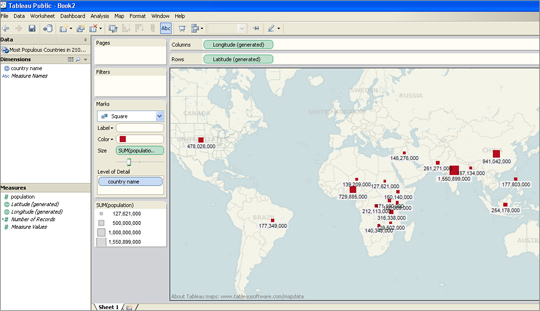
I was able to upload an Excel file and within less than two minutes had produced a map showing what are predicted to be the most-populous countries in 2100.

I had previously used this data set to create a visualisation in Google Fusion Tables and Tableau was equally easy to navigate.

For those who have not tried creating data visualisations, Tableau requires no technical ability and is easier to use than the wizard options that allow you to create graphs in Excel.

There are options for sorting and reordering data, plus changing the colours and view options.

Tableau also has a paid-for option. The difference between the free tool and the premium option is that Tableau Public requires you to publish your visualisation to the web.

Tableau launched version 7.0 a couple of weeks ago and will soon be adding functionality allowing you to create a map using UK postcodes, according to Ross Perez, data analyst at the US-based company.

Disclaimer: Tableau Public is a sponsor of the Journalism.co.uk-organised conference news:rewired. This relationship did not influence this review.

Max Clifford and Phil Hall to appear before privacy committee

Publicist Max Clifford and former editor of the News of the World and Hello! Phil Hall will take questions from MPs and Lords this afternoon.

They will appear before the joint committee on privacy and injunctions, which is currently questioning social media groups.

The four currently taking questions are: Lord Allan of Hallam, director of policy in Europe for Facebook; DJ Collins, vice president of global policy and communications at Google; Collins’ colleague at the internet giant Daphne Keller, who is associate general counsel at Google; and Colin Crowell, head of global public policy at Twitter.

The joint committee on privacy and injunctions was set up in May last year by prime minister David Cameron, with the aim, as outlined by attorney general Dominic Grieve, of looking at whether the current system of privacy and injunctions is working “and to consider whether we might make any changes that would make thing work better”.

The establishment of the committee followed the move by MP John Hemming to use parliamentary privilege to name a footballer at the centre of a privacy injunction, which had prevented the press from reporting on the matter but had seen speculation on sites such as Twitter.

Clifford and Hall are due to face questions at 3.15pm and can be viewed on Parliament TV

The top 10 most-read stories on Journalism.co.uk, 21-27 January

1. How to: prepare for a journalism job interview

2. Johann Hari declines invitation to return to Independent

3. News International to launch Sunday version of the Sun on 29 April, sources say

4. A guide to mastering 100wpm shorthand

5. Women’s groups condemn ‘harmful’ stereotypes in media

6. Is your blog in this PR database of 1.3 million blogs?

7. PA editor: Name mistake ‘catastrophic example of human error’

8. Mail Online publisher: ‘If you don’t listen to your users then you’re dead’

9. App of the week for journalists – Flipboard

10. Tool of the week for journalists – Formulists (use it before it disappears)

InPublishing: New chief executive’s plans for Johnston Press

InPublishing has a revealing interview with Johnston Press’ new chief executive, a former technology boss with no newspaper experience.

Ray Snoddy interviews Ashley Highfield, who was former head of technology at the BBC and later in charge of Microsoft’s online and consumer operations, on his plans for the newspaper group.

It is worth reading the whole interview to find out why Highfield took up the challenge of joining the company, which seen its share price fall from 480p to 5p.

Here are a couple of extracts:

The new Johnston chief executive also points out that while not a newspaperman, he has run two of the largest online news portals in the UK, MSN and BBC online, where he was editor-in-chief responsible for several hundred online journalists.

Then of course there is the money, which included a welcome package of £500,000 worth of seriously deflated Johnston Press shares.

If the new chief executive can conjure up a little alchemy, find a better model for linking the print and digital world and get the share price on the move then he could become seriously rich.

Those however who expected Highfield to come in to Johnston Press and wave a magic digital wand on his first day at the beginning of November have already expressed disappointment.

Highfield insists he has a digital strategy but says it would be “premature” to say in any detail how he is going to implement it.

Highfield discusses content dissemination via iPads and other devices (incidentally, JP title the Scotsman launched a £7.99-a-month iPad edition earlier this week), but was less forthcoming about paywall plans (JP dismantled its trial walls in April 2010).

And what about paywalls and charging for online content?

“Watch this space”, is all Highfield will say but, clearly, increasing digital revenues is a central part of the emerging strategy.

The full InPublishing interview is at this link.

Is your blog in this PR database of 1.3 million blogs?

Press officers have long relied on databases of journalists in order to approach them for stories. PRs are now increasingly targeting bloggers, recognising their reach. One start-up has seized on this trend, creating GroupHigh, “a research engine” which crawls 1.3 million blogs in real-time.

Launched in April 2011 in Boulder, Colorado, the software allows PRs to search by keyword, location and blog traffic.

Listed in the Next Web’s top 20 social media tools of 2011, GroupHigh gets a ringing endorsement.

13. GroupHigh.com – If you haven’t tried GroupHigh yet, the next sentence might encourage you to do so. Ready? GroupHigh.com is the best blogger outreach research and engagement tool on the planet. The latest update (version three) makes it even easier for you to discover the most relevant blogs by keyword, style and receptiveness. Brilliant.

PRs who pay for access can ask the database for “a list of every mum blog out there”, co-founder of the start-up Bill Brennan told Journalism.co.uk. You can then ask the software to “tell me the ones that have written about baby formula or home schooling in the last year”.

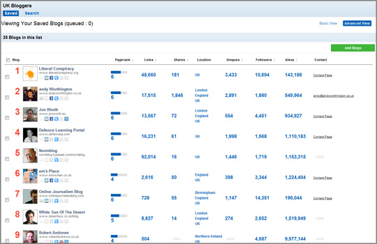
When I tested the software and searched for “UK bloggers”, left-leaning political blog Liberal Conspiracy was listed at number one (see screen shot below).

The location search works by “triangulation”: crawling the blog, its Facebook page and Twitter feed, Brennan explained.

Users can also filter by page rank, Facebook shares or Twitter followers and export the data to Excel.

Version three of the software lists blogs not bloggers, Brennan said.

We’ll probably add contacts for individual bloggers at each blog as part of version four.

GroupHigh is the co-founders’ second start-up. Their first foray was recipe search engine Recipe Bridge, which they sold to an Australian ad network.

Confident in their ability to build software to crawl the web and realising “it’s difficult to make money [from] advertising”, the pair “started to tap into the blogosphere”, Bill Brennan said, noting a changing trend within the PR industry.

It seemed like blog outreach was really becoming a staple of campaigns for their clients.

Brennan added that PRs were finding the big bloggers, such as TechCrunch, but “they were not tapping in to what we call the ‘magic middle'” of less well-known blogs.

The cost of using the software is likely to preclude bloggers from satisfying their curiosity and checking if their site is crawled. An annual GroupHigh licence for PRs costs $3,000 (£1,926), plus $1,000 (£642) for each additional user.

Below is a video demo of how GroupHigh works.

GroupHigh 3 Video Overview from Andy Theimer on Vimeo.

Tool of the week for journalists – Formulists (use it before it disappears)

Tool of the week: Formulists

What is it? A tool to create smart Twitter lists (and more).

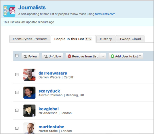
How is it of use to journalists? Formulists is a fantastic tool to create Twitter lists. Simply sign in with your Twitter account, search for a keyword such as “journalist” and Formulists will create a Twitter list of all the people you follow with the word “journalist” in their profile. Formulists found that 135 people I follow include the word journalist in their profile, for example. Here is the Twitter list.

But be warned: Formulists is shutting down. You can still create lists but they will no longer be automatically updated.

It is a real shame this tool is being pulled, particularly as Twitter lists are a great way for journalists to filter those they want to follow and focus on. If your “all friends” stream has become too busy, make it more manageable by creating lists based on keywords while you still can. Your lists will not be updated as you follow additional Twitter users but Formulists provides a great way to start creating new lists.

It is worth exploring Formulists as it allows you to do more than simply create lists, such as allowing you to search for new Twitter users by topic.

The Formulists blog also points out some additional Twitter filtering tools.