As explained in part one of today’s #datajourn conversation, Tony Hirst is the ‘data juggler’ (as titled by Guardian tech editor Charles Arthur) behind some of the most interesting uses of the Guardian’s Open Platform (unless swear words are your thing – in which case check out Tom Hume’s work)
Journalism.co.uk sent OU academic, mashup artist and Isle of Wight resident, Tony Hirst, some questions over. Here are his very comprehensive answers.
What’s your primary interest in – and motivation for – playing with the Guardian’s Open Platform?
TH: Open Platform is a combination of two things – the Guardian API, and the Guardian Data store. My interest in the API is twofold: first, at the technical level, does it play nicely with ‘mashup tools’ such as yahoo pipes, Google spreadsheet’s =importXML formula, and so on; secondly, what sort of content does it expose that might support a ‘news and learning’ mashup site where we can automatically pull in related open educational resources around a news story to help people learn more about the issues involved with that story?
One of the things I’ve been idling about lately is what a ‘university API’ might look at, so the architecture of the Guardian API, and in particular the way the URIs that call on the API, are structured is of interest in that regard (along with other APIs, such as the New York Times’ APIs, the BBC programmes’ API, and so on).
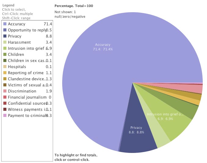
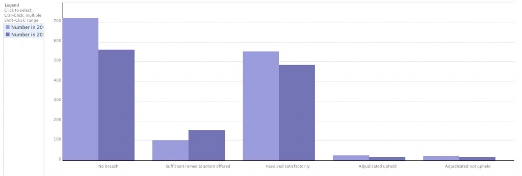
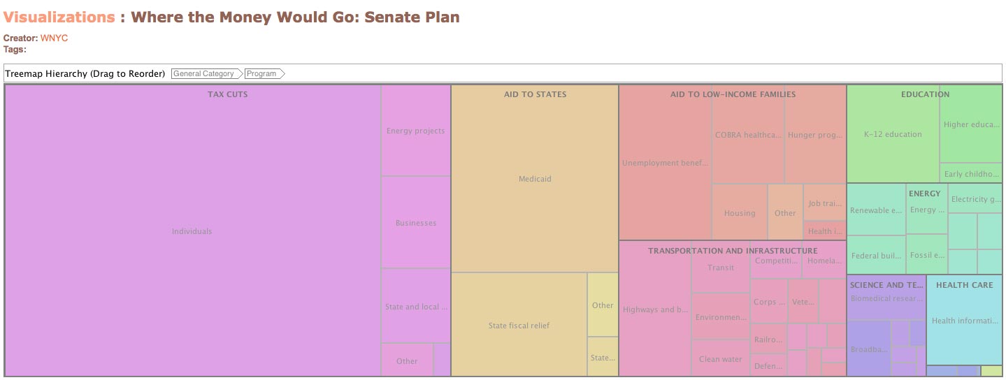
The data blog resources – which are currently being posted on Google spreadsheets – are a handy source of data in a convenient form that I can use to try out various ‘mashup recipes’. I’m not so interested in the data as is, more in the ways in which it can be combined with other data sets (for example, in Dabble DB) and or displayed using third party visualisation tools. What inspires me is trying to find ‘mashup patterns’ that other people can use with other data sets. I’ve written several blog posts showing how to pull data from Google spreadsheets in IBM’s Many Eyes Wikified visualisation tool: it’d be great if other people realised they could use a similar approach to visualise sets of data I haven’t looked at.
Playing with the actual data also turns up practical ‘issues’ about how easy it is to create mashups with public data. For example, one silly niggle I had with the MPs’ expenses data was that pound signs appeared in many of the data cells, which meant that Many Eyes Wikified, for example, couldn’t read the amounts as numbers, and so couldn’t chart them. (In fact, I don’t think it likes pound signs at all because of the character encoding!) Which meant I had to clean the data, which introduced another step in the chain where errors could be introduced, and which also raised the barrier to entry for people wanting to use the data directly from the data store spreadsheet. If I can help find some of the obstacles to effective data reuse, then maybe I can help people publish their data in way that makes it easier for other people to reuse (including myself!).
Do you feel content with the way journalists present data in news stories, or could we learn from developers and designers?
TH: There’s a problem here in that journalists have to present stories that are: a) subject to space and layout considerations beyond their control; and b) suited to their audience. Just publishing tabulated data is good in the sense that it provides the reader with evidence for claims made in a story (as well as potentially allowing other people to interrogate the data and maybe look for other interpretations of it), but I suspect is meaningless, or at least of no real interest, to most people. For large data sets, you wouldn’t want to publish them within a story anyway.
An important thing to remember about data is that it can be used to tell stories, and that it may hide a great many patterns. Some of these patterns are self-evident if the data is visualised appropriately. ‘Geo-data’ is a fine example of this. It’s natural home is on a map (as long as the geo-coding works properly, that is (i.e. the mapping from location names, for example, to latitude/longitude co-ordinates than can be plotted on a map).
Finding ways of visualising and interacting data is getting easier all the time. I try to find mashup patterns that don’t require much, if any, writing of computer programme code, and so in theory should be accessible to many non-developers. But it’s a confidence thing: and at the moment, I suspect that it is the developers who are more likely to feel confident taking data from one source, putting it into an application, and then providing the user with a simple user interface that they can ‘just use’.
You mentioned about ‘lowering barriers to entry’ – what do you mean by that, and how is it useful?
TH: Do you write SQL code to query databases? Do you write PHP code parse RSS feeds and filter out items of interest? Are you happy writing Javascript to parse a JSON feed, or would rather use XMLHTTPRequest and a server side proxy to pull in an XML feed into a web page and get around the domain security model?
Probably none of the above.
On the other hand, could you copy and paste a URL to a data set into a ‘fetch’ block in a Yahoo pipe, identify which data element related to a place name so that you could geocode the data, and then take the URL of the data coming out from the pipe and paste it into the Google maps search box to get a map based view of your data? Possibly…
Or how about taking a spreadsheet URL, pasting it into Many Eyes Wikified, choosing the chart type you wanted based on icons depicting those chart types, and then selecting the data elements you wanted to plot on each axis from a drop down menu? Probably…
What kind of recognition/reward would you like for helping a journalist produce a news story?
TH: A mention for my employer, The Open University, and a link to my personal blog, OUseful.info. If I’d written a ‘How To’ explanation describing how a mashup or visualisation was put together, a link to that would be nice too. And if I ever met the journalist concerned, a coffee would be appreciated! I also find it valuable knowing what sorts of things journalists would like to be able to do with the technology that they can’t work out how to do. This can feed into our course development process, identifying the skills requirements that are out there, and then potentially servicing those needs through our course provision. There’s also the potential for us to offer consultancy services to journalists too, producing tools and visualisations as part of a commercial agreement.
One of the things my department is looking at at the moment is a revamped website. it’s a possibility that I’ll start posting stories there about any news related mashups I put together, and if that is the case, then links to that content would be appropriate. This isn’t too unlike the relationship we have with the BBC, where we co-produce televlsion and radio programmes and get links back to supporting content on OU websites from BBC website, as well as programme credits. For example, I help pull together the website around the BBC World Service programme Digital Planet, which we co-produce every so often. which gets a link from the World Service website (as well as the programme’s Facebook group!), and the OU gets a mention in the closing credits. The rationale behind this approach is getting traffic to OU sites, of course, where we can then start to try to persuade people to sign up for related courses!


