Tag Archives: Data journalism

#DataJourn part 1: a new conversation (please re-tweet)

Had it not been published at the end of the workday on a Friday, Journalism.co.uk would have made a bit more of a song-and-dance of this story, but as a result it instead it got reduced to a quick blog post. In short: OU academic Tony Hirst produced a rather lovely map, on the suggestion (taunt?) of the Guardian’s technology editor, Charles Arthur, and the result? A brand new politics story for the Guardian on MPs’ expenses.

Computer-assisted reporting (CAR) is nothing new, but innovations such as the Guardian’s launch of Open Platform, are leading to new relationships and conversations between data/stats experts, programmers and developers, (including the rarer breed of information architects), designers, and journalists – bringing with them new opportunities, but also new questions. Some that immediately spring to mind:

  • How do both parties (data and interactive gurus and the journalists) benefit?
  • Who should get credit for new news stories produced, and how should developers be rewarded?
  • Will newsrooms invest in training journalists to understand and present data better?
  • What problems are presented by non-journalists playing with data, if any?
  • What other questions should we be asking?

The hashtag #datajourn seems a good one with which to kickstart this discussion on Twitter (Using #CAR, for example, could lead to confusion…).

So, to get us started, two offerings coming your way in #datajourn part 2 and 3.

Please add your thoughts below the posts, and get in touch with judith@journalism.co.uk (@jtownend on Twitter) with your own ideas and suggestions for ways Journalism.co.uk can report, participate in, and debate the use of CAR and data tools for good quality and ethical journalism.
USTREAM.TV: Aron Pilhofer on the NYTimes’ databases and graphics

In an interview with Cindy Royal, associate professor at Texas State University, New York Times’ newsroom interactive technologies editor Aron Pilhofer discusses the Times’ graphics and data teams and being part of, what he describes as, one of the most collaborative newsrooms he’s worked in.

Video clips at Ustream

Full story at this link…

ProPublica launches ChangeTracker with help of journalist-programmer

Not-for-profit news organisation ProPublica is already making the most of new journalist-programmer intern Brian Boyer, who joined the site last month.

Boyer, who graduated from a specialist programming-journalism course at Medill School of Journalism at Northwestern University, has created ChangeTracker – a tool to monitor changes made to WhiteHouse.gov, Recovery.gov and the upcoming FinancialStability.gov websites.

“ChangeTracker lets users see exactly what was removed, edited or updated on those sites by showing side-by-side comparisons of sites before and after changes made to them,” says a release from ProPublica.

What’s more you can get updates of the changes via RSS, Twitter, email or via the ChangeTracker webpage.

“ChangeTracker will help us keep an eye on the administration’s transparency pledges, and will help reporters, bloggers, government watchdogs and everyday citizens keep watch over the websites of their elected officials,” said Scott Klein, director of online development.

In true Boyer style, the programming behind the tool will be open source, much like his News Mixer application, for use by third-parties.

The organisation recently launched Shovelwatch – a site analysing President Obama’s stimulus package.

ProPublica’s ‘Shovelwatch’: reviewing Obama’s stimulus package

Not-for-profit news organisation ProPublica has crated a site dedicated to analysis of President Obama’s stimulus package for the US economy.

Working with news program The Takeaway and public radio station WNYC, ShovelWatch is big on data and data visualisation.

For starters:

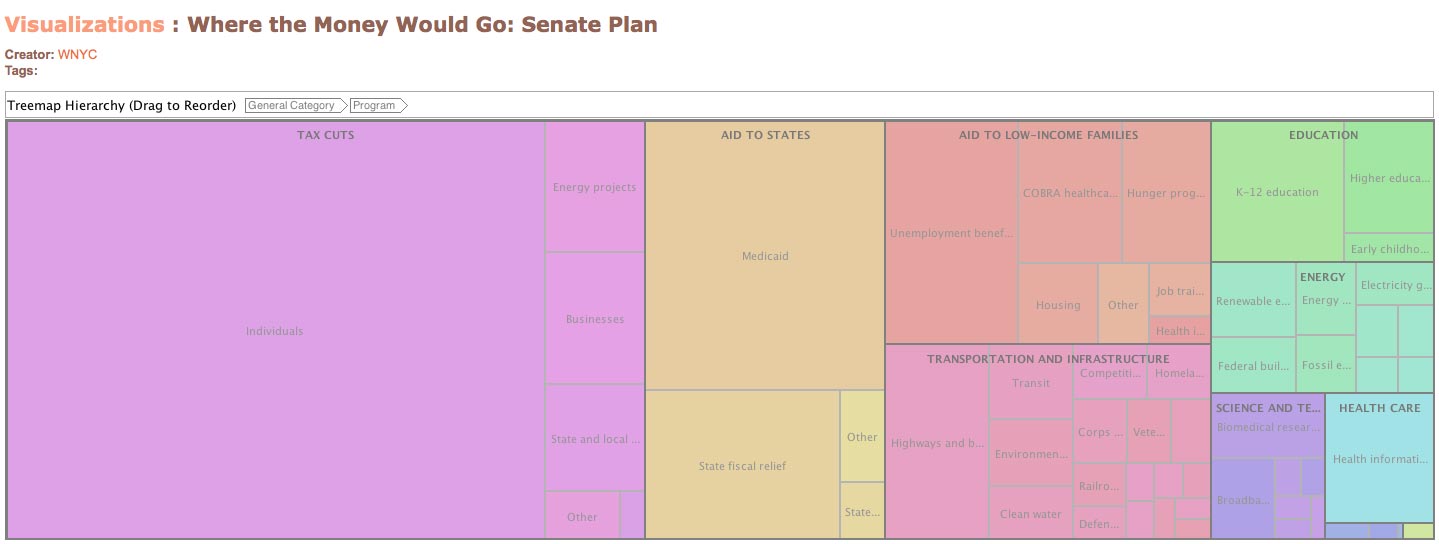
A searchable, visual representation of the senate and state’s spending plans for the stimulus bill – created using IBM’s Many Eyes (also used by the New York Times):

Screenshot of Shovelwatch visualisation

A fully searchable database of ‘How Much Your School District Stands to Lose in Stimulus Bill Construction Funds’.

The site will continue to develop – perhaps deploying the skills of new intern programmer-journalist Brian Boyer – and, in a press release, said it will later look to citizen’s help track how the plan is working/not working.

ReadWriteWeb: NYTimes launches article API

Under the API the paper will offer 2.8 million articles – every article written since 1981 – with this updated every hour.

Other sites and developers can use the API, in particular by adding dynamic links to the articles or excerpts to their own pages, writes RWW.

Full story at this link…

‘It’s info porn that’s customizable’: USAspending.gov database

…well, at least that’s how Journalism 2.0 describes the recently launched fully-searchable database of US government spending.

According to USAspending.gov:

“The Federal Funding Accountability and Transparency Act of 2006 (Transparency Act) requires a single searchable website, accessible by the public for free that includes for each Federal award:

1. The name of the entity receiving the award;
2. The amount of the award;
3. Information on the award including transaction type, funding agency, etc;
4. The location of the entity receiving the award;
5. A unique identifier of the entity receiving the award.”

Great for research, mash-ups and story leads.

An On The Media interview with Glen Elin, from The Sunlight Foundation, is at this link explaining the benefits of the site (hat tip Journalism 2.0).

New York Times opens ‘Visualization Lab’ online

Following the release of its first campaign finance API earlier this month, the New York Times is handing over even more of its data to users with the launch of the Visualization Lab.

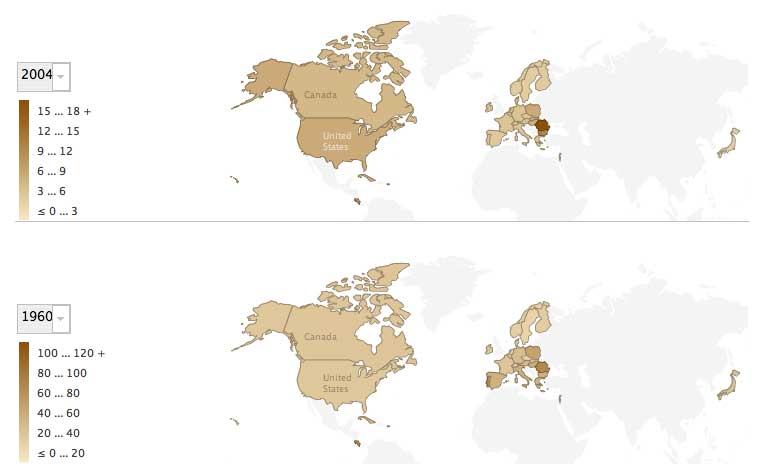
Using IBM’s ‘Many Eyes’ technology, the lab allows readers to experiment with different ways of visualising data sets from the Times, whether these are stats and figures included in articles or simply the words used in a speech reported in a news item.

Visualisation options, of which there are currently 17, range from graphs and maps, to word trees, for example:

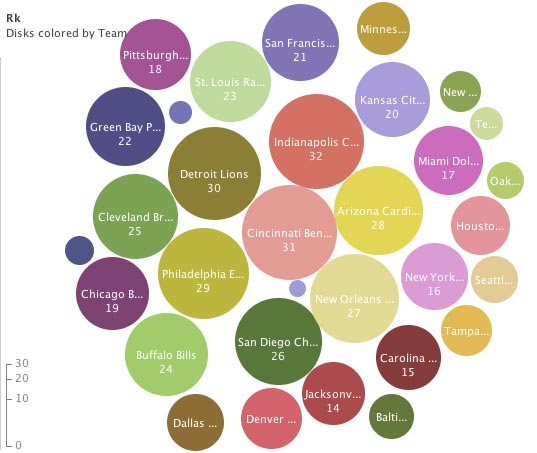
  • A bubble chart – such as the one below, created by us, which ranks US NFL teams by rushing yards (even though I’m not entirely sure what this is…)

According to an introductory post on the Time’s Open blog, the Visualization Lab is the first in a series of tools scheduled for release in the next few weeks both internally and for readers.

The Guardian publishes first ‘geolocated’ article

The Guardian has published its first article including geolocation data and is using geographic tagging to track reporters covering the US presidential race. Every time a reporter posts a blog their location will be highlighted on a Google map.

Geotagged content has been around for a while now, but is starting to take effect in the UK media: last week, the Liverpool Echo, published a hyperlocal news map.

On Guardian.co.uk’s Inside Blog, Paul Carvill describes the geolocating process: reporters add their latitude and longitude to their article or blog post, and their location will appear in the RSS feed, which in turn can be fed into a Google map using a java script.

Online users can type in their postcode to find out what is being reported in their area, or alternatively click on an area of the map to source information from another location.