Category Archives: Data

#bbcsms: Use data to inform newsroom decisions, says panel

“Numbers are everything to our business” – this was the message from Washington Post‘s Raju Narisetti, speaking today at the BBC’s social media summit.

Narisetti outlined the “simple mission” for news organisations to have more people to engage with more of its content, and this is achieved through data – both numbers and importantly, context.

We’ve moved from our anecdotal newsroom to a newsroom where there’s a lot more data, a lot more measurement. Initial measurement was page views, but we very quicky realised we need to move to a world of context.

Data is not just about measuring eyeballs – it is a valuable resource in making decisions. You’re able to show with some data things we can stop doing, Narisetti said, without making an impact on the readership. This he said makes an “accountable newsroom” and creates an environment which is a lot more encouraging for digital journalists where they know the impact of their work.

Also speaking on the panel, which covered the cultural challenges for newsrooms trying to encourage the effective use of social media, was the Guardian‘s Meg Pickard.

She revealed that research by the Guardian has shown that when a journalist gets involved in the conversation online it halves the moderation need and the tone of the conversation “goes up”. This is a key example of such data being used to support proposals and ideas.

As for the culture of the newsroom the Guardian wants to focus on people and skills, she said, to “create a fertile medium” across the organisation and then trusting staff to “act as the intelligent adults that they are” and apply their best knowledge and judgement to the situation.

But, she added, there’s no point in forcing anyone to be active on Twitter from the get-go.

We should not be forcing someone to Tweet, it will be obvious, they will be grumpy and won’t know what they’re doing. So I don’t think on your first day when you’re handed an email address they should be told that you’re free to say anything you like about our brand to the world.

Within the first few months I would try and encourage them to do so, but by demonstrating opportunities to build the community and relationship with audience.

Journalism.co.uk’s own digital journalism event news:rewired – noise to signal, which takes place on Friday next week at Thomson Reuters, will dedicate an entire session to the issue of audience data in informing editorial and business decisions for news organisations. You can find out more and buy tickets at this link.

2011 Knight Batten journalism innovation awards open for entries

This year’s Knight Batten Awards for Innovation in Journalism are now open for entries.

According to guidelines from organiser the J-Lab Institute for Interactive Journalism, the awards recognise “pioneering approaches to news and information” and those entering can submit “journalism content, new journalism processes or ideas, or tools or new applications that promote the information needs of communities and/or enhance digital engagement”.

The contest is open to all news efforts originating between 1 May  2010, and 6 June 2011.

The winners will be announced at the Knight-Batten Awards Symposium in September 2011, at the Newseum in Washington, D.C.

Last year’s grand prize was won by Sunlight Live, an offshoot of US non-profit and think tank the Sunlight Foundation, after it was used to livestream video and aggregate content around a major US healthcare summit.

David Higgerson: Journalists must keep pushing for open data

David Higgerson, head of multimedia for Trinity Mirror Regionals, has published the address he made about data journalism at the FutureEverything conference in Manchester last week, making some interesting points.

Higgerson says that for journalists the biggest challenge is going to keep “pushing” for data to become available.

Councils have to issue details of all spending over £500 – but some councils have decided to publish all spending because it’s cheaper to do so. As journalists, we should push for that to happen everywhere.

FOI is key here. The more we ask for something under FOI because it isn’t freely available, the greater the chance its release will become routine, rather than requested. That’s the challenge for today’s data journalists: Not creating stunning visualisations, but helping to decide what is released, rather than just passively accepting what’s released.

Read his post in full here…

Journalism.co.uk is running a one-day digital journalism conference looking at data in the news industry next week at Thomson Reuters. news:rewired – noise to signal will take place on Friday 27 May. You can find out more information and buy tickets by following this link.

Data Miner: Liberating Cabinet Office spending data

The excellent Nicola Hughes, author of the Data Miner UK blog, has a very practical post up about how she scraped and cleaned up some very messy Cabinet Office spending data.

Firstly, I scraped this page to pull out all the CSV files and put all the data in the ScraperWiki datastore. The scraper can be found here.

It has over 1,200 lines of code but don’t worry, I did very little of the work myself! Spending data is very messy with trailing spaces, inconsistent capitals and various phenotypes. So I scraped the raw data which you can find in the “swdata” tab. I downloaded this and plugged it into Google Refine.

And so on. Hughes has held off on describing “something interesting” that she has already found, focusing instead on the technical aspects of the process, but she has published her results for others to dig into.

Before I can advocate using, developing and refining the tools needed for data journalism I need journalists (and anyone interested) to actually look at data. So before I say anything of what I’ve found, here are my materials plus the process I used to get them. Just let me know what you find and please publish it!

See the full post on Data Miner UK at this link.

Nicola will be speaking at Journalism.co.uk’s news:rewired conference next week, where data journalism experts will cover sourcing, scraping and cleaning data along with developing it into a story.

NPR: Finding stories in a ‘sea of government data’

At the end of last week, NPR’s On The Media show spoke to Texas Tribune reporter Matt Stiles and Duke University computational journalism professor Sarah Cohen about how to find good stories in a “sea of government data”.

Listen to the full interview below:

Journalism.co.uk will be looking at open government data and the skills needed to find stories in datasets at its upcoming news:rewired conference. See the full agenda at this link.

New tool provides optional upload of iPhone location data

The Research and Development Group at the New York Times Company has released a tool to allow iPhone users to upload their location data. The information – which is anonymous – will then be available to groups who apply to access the data.

Explanations here and here on the openpaths.cc website state:

This data represents a unique opportunity to help solve some of the world’s toughest problems. We believe you should have the option of donating your data in an open, secure fashion, while maintaining control of your information and where it goes.

Research requests are received from any and all projects – public, private, commercial, academic, artistic, or governmental. Requests typically look at specific geographical areas or demographic information about their subjects, so research requests include these criteria. Based on this information, users receive monthly updates that list the projects where their data is a good fit, and are offered the opportunity to donate their data.

In return, we ask researchers to provide a small benefit to their data donors. This might be a custom visualization of a donor’s location information, access to the results of the research, or other related benefits.

When researchers revealed that iPhones had been recording location data, concerns were raised about privacy.

As explained in this article in the Guardian:

Security researchers discovered that Apple‘s iPhone keeps track of where you go – and saves every detail of it to a secret file on the device which is then copied to the owner’s computer when the two are synchronised.

The file contains the latitude and longitude of the phone’s recorded coordinates along with a timestamp, meaning that anyone who stole the phone or the computer could discover details about the owner’s movements using a simple program.

For some phones, there could be almost a year’s worth of data stored, as the recording of data seems to have started with Apple’s iOS 4 update to the phone’s operating system, released in June 2010.

Apple has now released a software update 4.3.3 to fix this. Anyone who wants to make their data available should hold off installing it.

Five tools to liven up local election reporting

If you are reporting on the referendum on the voting system, the Scottish, Welsh and Northern Irish assemblies or from one of the 305 town halls across England and Northern Ireland with local elections, how are you going to present the results?

As a text only story which reports how many seats have been lost or gained by each party? Or are you going to try visualising the results? Here are five free and easy to use tools to liven up the results.

1. Many Eyes

Many Eyes is a free data visualisation tool. If you have not tried your hand at any data journalism yet, today could be the day to start.

A. Create a Many Eyes account;

B. Create your spreadsheet using Excel, Open Office (free to download) or Google Docs (free and web based);

You could follow my example by putting ward names across the top, parties down the side and the number of each ward seats won by each party. You will need to include the total in the end column.

local elections example

C. Paste the data into Many Eyes, which will automatically read your pasted information;

D. Click ‘visualise’. In this example I selected the ‘bubble chart’ visualisation. Have a play with other visualisations too;

E. Copy the embed code and paste it into your story;

2. OpenHeatMap

OpenHeatMap is a way to visualise your results in a map. It is free and very easy to use. You start by creating a spreadsheet, uploading the data and you can then embed the map in your web page.

A. Go to OpenHeatMap (you don’t need a login);

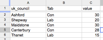
B. Create a spreadsheet. The easiest was to do this is in Google Docs. You must name your columns so OpenHeatMap can understand it. Use ‘UK_council’ for the local council, ‘tab’ for the party and ‘value’ for the number of seats. In this example, the tab column indicates the party with the most seats; the value is the number of seats;

C. Click ‘share’ (to the right hand side of your Google Doc), ‘publish as a web page’ and copy the code;

D. Paste the code into OpenHeatMap and click to view the map. In this example you will see the parties as tabs along the top which you can toggle between. You can change the colour, zoom in to your county or region and alter the transparency so you can see place names;

E. Click ‘share’ and you can copy the embed code into your story.

3. Storify

Anyone can now join Storify (it used to be by invitation only). It allows you to tell a story using a combination of text, pictures, tweets, audio and video.

A. Sign up to Storify;

B. Create a story and start adding content. If you click on the Twitter icon and search (say for ‘local election Kent’) you can select appropriate tweets; if you click on the Flickr icon you can find photos (you could ask a photographer to upload some); you can also add YouTube videos and content from Facebook. When you find an item you want to include, you simply drag and drop it into your story;

C. The art of a good Storify story is to use your skills as a storyteller. The tweets and photos need to be part of a narrative. There are some fantastic examples of story ideas on Storify;

D. Click to publish;

E. Copy and paste the embed code into the story on your site.

4. AudioBoo

You can record audio (perhaps the results as they are announced or reaction interviews with councillors) and include it in your story.

The easiest way is to download the free smartphone app or you can upload your own audio via the website.

A. Create an AudioBoo account;

B. Download the Android or iPhone app;

C. Record your short interview. You may decide to include a photo too;

D. Login to the audioboo website and click ’embed’;

E. Paste the embed code into your story.

Listen!

5. Qik

Qik is a free and allows you to live stream video. Why not broadcast the results as they happen?

A. Create a Qik account;

B. Download the app (iPhone, Android, Blackberry – a full list of supported phones is here);

C. The video will be automatically posted live to your Qik profile but you’ll need to add the code to your website before you record (you can also live stream to your Facebook page, Twitter account and YouTube channel).

D. To do this go to ‘My Live Channel’ (under your name). Click on it to get your embed code for your live channel.

E. Paste your embed code in your website or blog, where you want the live player to be.

How did you get on with the five tools? Let us know so that we can see your election stories.

Live journalism and the power of links #hhldn

Last week’s busy London Hacks and Hackers event brought together two very different approaches to using the web as a storytelling medium.

Two talks at last Wednesday’s event for journalists and programmers explored live reporting via Twitter and the use of linked data at the BBC’s entertainment department.

Sky News journalist Neal Mann, who has co-ordinated live coverage of some of the biggest stories in recent years, shared tips on live reporting – many of them focused on making sure to be fully prepared.

He suggested creating a list of useful and informative links on a chosen subject so that in slow moments context and detail can be added to live coverage, reminding journalists that on social media the audience looks for “speed, balance and a background view”.

In response to organiser Joanna Geary‘s question about coping with low battery life on the iPhone and other gadgets, he suggested taking battery packs and spares where possible, pointing out to live reporters that “if your battery goes, you’re screwed”.

Mann also advised journalists to remember their potential reach does not end when a live event finishes. He recommended using Storify or similar technology to round up the work done during the day and put it in context alongside other people’s coverage.

And on the subject of reach, he said he learned a valuable lesson when his Twitpic of a Sun front page went viral and garnered more than 30,000 views – but was not hosted on his own site and therefore didn’t drive his personal brand as well as it could.

BBC senior information architect Paul Rissen provided a contrasting approach to storytelling with his talk on how the BBC is using linked data and the semantic web to create and augment narrative.

He began by suggesting news organisations on the web today are still confined by their roots in print, audio and video, and that even the best infographics often fail to take advantage of the interconnectedness of the internet as a medium.

He discussed the Mythology Engine, a proof-of-concept prototype created for BBC Vision, which uses carefully structured data to map stories and events onto programmes.

Using the example of Doctor Who, the prototype moves beyond a series of pages representing episodes, series and properties, and expands to create pages for events, characters and stories.

The result, Rissen explained, is a constellation of connected pages where the meaningful relationships between people, stories and programmes are just as important as the entities themselves.

He suggested this sort of deep structured project is a way of telling stories that is truly native to the web, creating rich environments that take advantage of the multimedia possibilities online.

Rissen added this format may also work for sport and news, using the example of BBC Sport which has pages for matches, countries and players, but not individual goals.

He suggested the semantic web could offer news organisations new ways to organise context and make exploration and navigation both intuitive and enjoyable for users.

The death of Osama bin Laden: New York Times interactive gauges public opinion

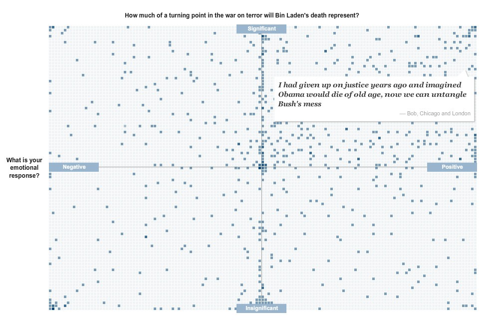
I really like this interactive feature from the excellent New York Times graphics team on readers’ reactions to the death of Osama bin Laden.

As a way of organising responses to a crowdsourcing exercise it isn’t anything new, it takes off from mapping responses geographically. But it is simple and effective, mixing text responses with a broad visual understanding of where the readership’s sentiments fall.

Interesting to see how many people sit right on the fence in the significance stakes.

The image below is a completely non-interactive screengrab of the feature, but follow this link for the full experience.

The NYT team has also put together some impressive graphics showing the layout of the compound, geography of the area and timeline of events.

Ten things every journalist should know about data

Data visuals

Every journalist needs to know about data. It is not just the preserve of the investigative journalist but can – and should – be used by reporters writing for local papers, magazines, the consumer and trade press and for online publications.

Think about crime statistics, government spending, bin collections, hospital infections and missing kittens and tell me data journalism is not relevant to your title.

If you think you need to be a hacker as well as a hack then you are wrong. Although data journalism combines journalism, research, statistics and programming, you may dabble but you do not need to know much maths or code to get started. It can be as simple as copying and pasting data from an Excel spreadsheet.

You can find out more about getting started and trying your hand at complex data journalism at news:rewired – noise to signal, on 27 May. More details about the event are here and you can order tickets, which cost £156 including VAT, by clicking here.

Here are 10 reasons to give data a go.

1. Everybody loves a list. Did you click on this post as you wanted an easy-to-read list rather than an involved article?

2. Everybody loves a map. Try Quantum GIS (QGIS), a free, open source tool, or OpenHeatMap, a fantastic, east-to-use tool as long as your data is categorised by country, local authority, constituency, region or county.

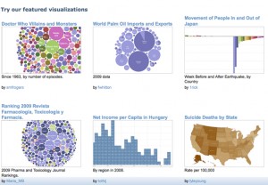
3. Tools bring data to life. Applications such as ManyEyes and Yahoo Pipes mash data and turn complex numbers and datasets into easy to read visualisations that work well both online and in print. Try this how to guide to Yahoo Pipes to get you started. Here are 22 data visualisation tools from Computer World.

4. Data may need cleaning up. Try using clean up tools like Scraperwiki, which helps non-technical journalists copy a few lines of code to turn a document such as pdf into a number-friendly file like a csv, and Google Refine, which Paul Bradshaw has written some useful posts on over on the Online Journalism Blog.

5. Data of all sorts is increasingly available. The open data movement across the UK is resulting in an increase in the release of data. The possibilities are huge, says Paul Bradshaw on the Guardian’s Datablog. January 2010, saw the launch of data.gov.uk, a fantastic resource for searching for datasets.

6. Data journalism can answer questions. A good place to start in data journalism is to ask a question and answer it by gathering data. Numbers work well. One option is to submit a Freedom of Information request to ask for the numbers. It helps if you ask for a csv file.

7. You can use the crowd. Crowdsourcing by asking a question on Twitter or using a site like Help Me Investigate, an open source tool for people can use to collaborate to investigate questions in the public interest.

8. Data can be personal to every reader. DocumentCloud can highlight and annotate documents to help readers see what is important and learn a document’s back story.

9. “Data journalism is not always presenting the data as journalism. It’s also finding the journalism within the data,” Jay Rosen said in relation to this article on Poynter on how two journalists from the Las Vegas Sun spent two years looking at 2.9 million documents to find out what “what’s right, and wrong, about our local health care delivery system”. The result was that the journalists exposed thousands of preventable medical mistakes in Las Vegas hospitals. The Nevada legislature responded with six pieces of legislation.

10. “Data ethics is just as important as ethics in journalism, in fact they are one in the same,” according to this post on Open Data Wire. Consider the BBC’s FoI request which showed a 43 per cent rise in GPs signing prescriptions for antidepressants and the ethics of unquestioningly relating this to the recession. Ben Goldacre has highlighted the problems with seeing patterns in data.

This is a cross post originally published on the news:rewired website. You can get your tickets here.

A full agenda for news:rewired – noise to signal, is here. A list of more than 20 speakers is here.