Category Archives: Data

#ODCC – Open data and the ‘new digital fields of exchange’

Today marked the first Open Data Cities Conference which kicked off in Brighton, set up by former head of digital development at the Telegraph Greg Hadfield.

The conference said it would “focus on how publicly-funded organisations can engage with citizens to build more creative, prosperous and accountable communities”.

Among those citizens are of course the journalists working to encourage the opening up of data held by such organisations, wishing to use it to inform their audience about the local area and/or their interests.

“Connected localism” and adopting a “principle of openness”

An interesting phrase used at the conference was “connected localism”. The man behind it, Jonathan Carr-West of the Local Government Information Unit, spoke to the conference about the importance of creating a cultural mindset around openness, as opposed to just focusing on whether or not data is useful. And once this mindset has been established, “connected localism” can thrive.

We’re going to hear a lot today about data and what we use it for and how we make it useful. That’s really important and I don’t want to move away from that too far, but I would suggest … usefulness is not the whole story.

We don’t always know what’s useful … We need to adopt … a principle of openness. Whether you’re a small organisation, a council, a government.

He added the “assumption” needs to be that information is made open and data is shared.

Don’t over-think whether it’s going to be useful or not.

And this “principle of openness” is “what creates a field of exchange within which connected localism can occur”.

If we have openness as the way of doing things, if it is culturally embedded in our practice, that would begin to enable that connected localism.

We’ll talk a lot about open cities, but we should remember in this sense it’s not just making the city open, it’s that open data is effectively a new city.

It enables us to perform radical transformations to public services, to how we live … that we need if we’re to meet the profound challenges our society faces.

He cited Mumsnet as an example of “connected localism”, and one of the “new digital fields of exchange where people can connect”, and share/discuss/solve common interests.

Encouraging responses to information requests

Tom Steinberg of MySociety offered some tips for conference delegates on how to encourage more open data and the release of information, such as that asked for in freedom of information requests:

1. Don’t expect to win an economic argument about open data with people who do not have some other reason to think it’s a good idea. It is really hard with open data as it is a new issue so literature is new.

2. You should show them tools that will improve their lives based on open data. If you’re persuading a councillor use something like TheyWorkForYou and show them how they can get sent email alerts when an issue is mentioned in parliament. 10 per cent of everyone working in parliament uses it each week.

3. Don’t shout too loudly about how it [open data] will hold everyone to account and expose wrongdoing. If people are overworked, having their lives made harder is not a thing that will make them your friend.

4. Make mock-ups. For lots of kinds of open data there aren’t good examples as government hasn’t released the data. But use the amazing power of Photoshop to say ‘here’s a page where people could go to, for example, if they wanted to complain that their bin had not been collected’. This is a way of connecting the abstruse nature of data to a concrete thing.

He suggested that bodies such as councils should consider having a person specially dedicated to looking out for, and filtering, requests, and possibly add a button to their websites asking exactly what data people want.

How the BBC is opening up its archives

An interesting example of how one organisation is opening up its archived data is the BBC, as speaker Bill Thompson, who is head of partnership development in archive development at the broadcaster, explained.

The situation, as he posed it, is about turning the BBC “into a data repository with an API” and making this data “available for public service use, for people who can find a value in it”.

One project called BBC Redux provides a store of digital recordings which, when combined with the BBC’s Snippets project, enables users to search programmes, such as news bulletins, from the last five years, for the mention of a given keyword using subtitle data.

For more from the conference follow #ODCC on Twitter.

Searchable database: National newspaper circulation figures for March

The Audit Bureau of Circulation today released audited March circulation figures for national newspapers.

The statistics stated that the Sun on Sunday averaged 2.43 million copies in first full month since launch.

The figures in the searchable database below.

[iframe src=”http://www.journalism.co.uk/uploads/abcmar2012new.html” width=”100%” height=”1000px”]

#Tip of the day from Journalism.co.uk – data journalism inspiration

Mindy McAdams has created a Storify featuring lots of examples of data journalism to inspire budding data journalists, as well as background reading and other resources, which she has posted on her blog.

Examples include projects by the New York Times and ProPublica.

See the post here.

Tipster: Rachel McAthy

If you have a tip you would like to submit to us at Journalism.co.uk email us using this link– we will pay a fiver for the best ones published.

Tool of the week for journalists: freeDive, to create a searchable database

Tool of the week: freeDive

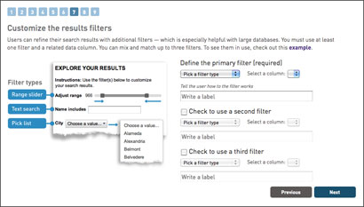
What is it? A wizard to turn a Google spreadsheet into a searchable, embeddable interactive

How is it of use to journalists? This is a fantastic tool from the Knight Digital Media Center, based at the UC Berkeley Graduate School of Journalism.

freeDive is a wizard that allows you to take a Google spreadsheet, turn it into an interactive database, embed it into a news story and let readers to explore the data.

A word of warning: the embed code created is mainly JavaScript which some platforms restrict.

WordPress users can download a plugin such as Artiss Code Embed which works with WordPress security settings, allowing you to embed JavaScript.

The tool generates a simple embed code and also has an option to allow you to download the HTML, upload it onto your server and use an iframe.

Here is one we made earlier. This searchable database shows the ABC-audited web traffic figures for regional news groups.

[iframe src=”http://www.journalism.co.uk/uploads/abcembedtest.html” height=”650px”]


Tool of the week for journalists: Data.gov.uk’s map-based search

Tool of the week: Data.gov.uk’s map-based search

What is it? An option of searching for data sets by geographical location

How is it of use to journalists? Since the launch of Data.gov.uk just over two years ago, and the promotion of open government data, the site has become a go to place for many journalists in search of a data set.

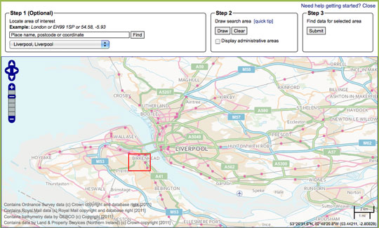
The site now has a map tool which allows you to search for data by location, potentially useful for journalists working on local news sites, newspapers and radio stations.

The map-based search allows you to draw a search area, submit the area and find data relating to that location.

Not tried your hand at data journalism? This guide written for Journalism.co.uk by Simon Rogers, editor of the Guardian’s Datablog tells you how to get a grip with data journalism.

  • Journalism.co.uk also offers a one or two-day course in data journalism, led by Kevin Anderson. The next introduction to data journalism courses are being held on 9 May or 28 May. The intermediate data journalism course will be on 29 May. Those looking to expand their skills quickly can book on both courses, turning it into a two-day course and saving £50 on the course fees.

Getstats: 12 ‘number hygiene’ rules for journalists in full

A campaign launched by the Royal Statistical Society has proposed 12 “rules of thumb for journalists” in order to encourage a better understanding of numbers in news.

Getstats is also calling for numeracy and statistics to be taught in journalism schools.

More details and a 12 point summary is at this link.

The full 12 rules of “number hygiene” for journalists are below:

1. You come across a number in a story or press release. Buyer beware. Before making it your own, ask who cooked it up; what are their credentials; are they selling something. What other evidence do we have (what numbers are they not showing us?); why this number, now? If the number comes from a study or research, has anyone reputable said it is any good?

2. Sniff around. Do the numbers refer to a whole group of people or things or a sample of them? If it’s a sample, are the people being questioned or the things being referred to a fair representation of the wider group? Say a company is claiming something applies to the population at large. If it is basing the story on a sample, such as a panel of internet users, the company goes back to time and again then beware: the panel may not be representative.

3. More probing. What was the sample asked? The wording of a question can hugely influence the answer you get. People’s understanding of what it means to ‘be employed’ or the nature of ‘violent crime’ may differ. What the public understands may not match the survey researcher’s idea. In government surveys bigamy was till recently classed as a violent crime. Might researchers’ choice of words have led people into a particular response?

4. One number is often used to sum up the group being measured, the average. But different averages measure different things. The mean is extremely sensitive to highs and lows: the very fact of Bill Gates coming to live in the UK would push up mean wealth. The median tells us, for example, the income of an average person – half the population get less, half more. Comparing earnings, the mode tells us the salary most people earn.

5. There is a lot of uncertainty about. We need to be sure the number on offer is a result and not just due to chance. With a sample, check the margin of error, the plus or minus 3 per cent figure, usually stated by reputable polling companies. A poll saying 52 per cent of people are in favour of something is not definitively saying half are in favour: it could be 49 per cent. Beware league tables, except in sports reports. Chelsea is higher than Arsenal for a simple and genuine reason: the side has collected more points. With hospitals or schools, a single score is a never likely valid basis for comparison (a teaching hospital may appear to have a worse score, but only because sicker patients are referred to it). Comparisons between universities or police forces are unreliable if the scores fall within margins of error. Midshires scores 650 on the ranking and Wessex 669: they could be performing at the same level or their respective positions reversed.

6. The numbers you are given show a big increase or sharp decrease. Yet a single change does not mean a trend. Blips happen often. Blips go away, so we have to ask whether the change in the numbers is just a recovery or return to normal after a one-off rise or fall (what statisticians refer to as ‘regression to the mean’). The numbers may come from a survey, like (say) ONS figures for household spending or migration. Is the change bigger than the margin of error?

7. Unless researchers carried out a controlled experiment (such as a trial of a new drug, based on a randomly chosen group, some of whom don’t know they are getting a placebo), it’s very difficult confidently to state that a causes b. Instead, the numbers may show an association (a correlation) between two things, say obesity and cancer. Beware spurious connections, which may be explained by a third or background factor. If use of mobile phones by children is associated with later behavioural disorders, the connexion could be the parents, and the way their behaviour affects both things. If the numbers suggest an association, the important thing is to assess its plausibility, on the back of other evidence. Finding a link can stimulate further study, but can’t itself be the basis for some new government policy. Recommendations for changing daily behaviour such as eating should not be based on speculative associations between particular food and medical conditions.

8. A key question for any number is ‘out of how many?’ Some events are rare — such as the death of a child. That’s why they are news, but that’s also why they deserve being put in context. Noting scarcity value is the way to reporting the significance of an event. An event’s meaning for an individual or family has to be distinguished from its public importance.

9. Billions and millionths are too big and too small to grasp. We take figures in if they are humanized. One way is comparing with, say, the whole UK; another is to plot the effect on an individual. Colourful comparisons can make risk intelligible: the risk of dying being operated on under a general anaesthetic is on average the same as the risk being killed while travelling 60 miles on a motorbike.

10. Good reporting gives a balanced view of the size of the numbers being reported. Better to focus on the most likely number rather than the most extreme, for example in stories about the effects of a flu pandemic. ‘Could be as high as’ points to an extreme; better to say ‘unlikely to be greater than’. Numbers may be misperceived so try to eliminate bias.

11. Risk is risky. ‘Eating bacon daily increases an individual’s lifetime risk of bowel cancer by 20 per cent.’ Another way of saying that is: out of 100 people eating a bacon sandwich every day one extra person will get bowel cancer. Using the first without noting the second tells a story that is both alarmist and inaccurate. If the information is available, express changes in risk in terms of the risks experienced by 100 or 100,000 people.

12. The switch from print to digital brings opportunities to present numbers more dynamically and imaginatively, for example in scatter plots. Graphics can show a trend. Stacked icons in graphs can show effects on 100 people. But the same rules of thumb apply whatever the medium: is the graphic clear; does it tell the story that is in the text.

Tool of the week for journalists: Tableau Public, for data visualisations

Tool of the week: Tableau Public

What is it? A data visualisations tool, allowing you to create interactive graphs, charts and maps.

How is it of use to journalists? Tableau Public is a free tool that allows journalists to upload an Excel spreadsheet or text file and turn the data into an interactive visualisation that you can embed on your news site or blog.

Here are five examples of how Tableau has been used by news sites to tell stories. A quick browse will give you a sense of how the tool can be used to explain news stories.

One of Tableau’s real strengths is providing the reader with the opportunity to move a slider or select a drop down and see how the visualisation alters when a variable changes.

In order to create a visualisation you will need a PC (or a Windows environment on your Mac) and to download the free software.

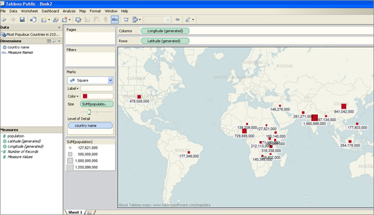
I was able to upload an Excel file and within less than two minutes had produced a map showing what are predicted to be the most-populous countries in 2100.

I had previously used this data set to create a visualisation in Google Fusion Tables and Tableau was equally easy to navigate.

For those who have not tried creating data visualisations, Tableau requires no technical ability and is easier to use than the wizard options that allow you to create graphs in Excel.

There are options for sorting and reordering data, plus changing the colours and view options.

Tableau also has a paid-for option. The difference between the free tool and the premium option is that Tableau Public requires you to publish your visualisation to the web.

Tableau launched version 7.0 a couple of weeks ago and will soon be adding functionality allowing you to create a map using UK postcodes, according to Ross Perez, data analyst at the US-based company.

Disclaimer: Tableau Public is a sponsor of the Journalism.co.uk-organised conference news:rewired. This relationship did not influence this review.

#Tip of the day from Journalism.co.uk – using spreadsheets for data stories

Poynter has a helpful lesson in Excel and other spreadsheet software for journalists dealing with data.

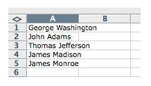
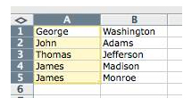
The post explains how to split names in a single column to two columns, for example.

Poynter’s post on how journalists can use Excel to organise data for stories is at this link.

There will be a workshop on data journalism – led by Simon Rogers, editor of the Guardian’s Datastore and Datablog – at Journalism.co.uk’s news:rewired – media in motion conference for journalists. The news:rewired agenda is at this link.

Tipster: Sarah Marshall

If you have a tip you would like to submit to us at Journalism.co.uk email us using this link– we will pay a fiver for the best ones published.

Guardian study finds just 22.6% of journalists are female

The New York Times newsroom in 1942. By Marjory Collins [Public domain], via Wikimedia Commons

 The Guardian today published the findings from its research into gender in the press, based on “a simple count of newspaper bylines” and those appearing on the Today programme on Radio 4.

The bylines were said to have been taken from articles published in a total of seven newspapers from 13 June to 8 July. The Guardian reports that the research, led by Kira Cochrane, found that women journalists accounted for just 22.6 per cent, as opposed to 77.4 per cent for male reporters.

National papers were all shown to have large gender gaps in byline averages. The Daily Mail and the Guardian recorded the lowest male dominance at 68 per cent male and 72 per cent male respectively.

In its ever-open approach to data the Guardian has made all the data available as a downloadable spreadsheet and is asking its audience to get involved by posing the question: “What can you do with this data?”

Read more here.

Research published earlier this year, commissioned by the Women in Journalism group, found that almost three quarters of journalists working in the national press were male.

What’s happening to mark open data day

The use of open data in our newsrooms has been growing in the past few years and many people believe that the future of data journalism relies on the collaboration between developers, designers and journalists to create better ways of extracting information from open datasets.

Tomorrow (3 December) is International Open Data Day and there is a series of worldwide events set up to gather coders, programmers and journalists around “live hacking” challenges.

International Open Data Hackathon

Where? The Barbican in London and around the world

When? Saturday, 3 December from 11am

Better tools. More Data. Bigger Fun. That’s how the 2011 Open Data Day Hackathon describes this year’s global event, taking place in more than 32 countries this weekend.

For journalists, it’s an occasion to give hacking a go and meet people from the world of data.

The past year has seen open data continue to gain traction around the world with new open data catalogues launched in Europe, North America and Africa and more data available from organisations such as the World Bank.

Open Data Day is a gathering of citizens in cities around the world to write applications, liberate data, create visualisations and publish analyses using open public data. Its aim is to show support for and encourage the adoption of open data policies by the world’s local, regional and national governments.

Join the Open Knowledge Foundation and CKAN at the Barbican tomorrow (Saturday, 3 December) as they assemble a “crack-team” of coders to break data out of its internet prisons and load it into the Data Hub.

For details about the event, see this blog post, and sign up on the event’s meetup page or by filling out the event’s Google form.

Participants will be on IRC and will also be using the hashtags #seizedata and #odhdLDN on Twitter. All journalists, data scrapers, coders and #opendata enthusiasts can join.

David Eaves, the organiser of this year’s Open Data Hackathon believes this event is a great opportunity to teach journalists, as well as the general public, how to tackle data on a day-to-day basis:

Its a Maker Faire-like opportunity for people to celebrate open data by creating visualisations, writing up analyses, building apps or doing what ever they want with data.

What I do want is for people to have fun, to learn, and to engage those who are still wrestling with the opportunities around open data … And we’ve got better tools. With a number of governments using Socrata there are more API’s out there for us to leverage. ScraperWiki has gotten better and new tools like Buzzdata, the Data Hub and Google’s Fusion Tables are emerging every day.

Who’s it for? Everyone. David Eaves says:

If you have an idea for using open data, want to find an interesting project to contribute towards, or simply want to see what’s happening, then definitely come along.

You can also check out the HackFest 2011 topic page on BuzzData.

London “Random Hacks of Kindness” event

Where? @Forward in London, and around the world

When? 3-4 December 2011, from 9am Saturday until 6pm Sunday

Starting on the same day as the Open Data Hackathon, the Random Hacks of Kindness’ Codesprint will gather thousands of experts in 25 countries to develop open tech solutions over two days of hacking challenges.

The unprecedented gatherings in collaboration with Google, Microsoft, Yahoo!, NASA, HP and the World Bank will bring together some of the world’’ most innovative social enterprises and volunteer technologists.

London’s event promises to be exciting as over 100 tech heads will gather to tackle one issue: financial exclusion and illiteracy. It will be the first ever hack day addressing this theme.

Financial and enterprise education group MyBnk will head a panel of CEOs and IT specialists from LSE, Morgan Stanley, Fair Finance, Three Hands, Toynbee Hall and the Forward Foundation to make major advances in helping young people master money management.

Mike Mompi, head of strategy and innovation at My BNK and the organiser of London RHoK event says:

The main objectives of the weekend are problem solving, capacity building, partnerships, and impact

A £500 cash prize will be given at the end of Sunday for the winning solution (among other prizes) and several media organisations, including The Huffington Post, will be joining in.

People from RHoK have hosted three global events to date, in 31 cities around the globe with over 3,000 participants. Past events resulted in apps and alert systems to warn people of bushfires in Australia and recipients of food stamps to sources of fresh produce in Philadelphia.

The RHoK community is open for anyone to join.

If you want to get an idea of what’s in store for this weekend, check out last year’s hackathon videos.

You will be able to follow the event on Twitter @RHoKLondon and the hashtag #rhokLDN. It is still possible to sign up for this weekend’s free event via this link.