Tag Archives: visualisations

#GEN2012: Interactive graphics case studies from the Guardian

The Guardian’s Alastair Dant took the the stage at the News World Summit in Paris today to share the news outlet’s approach to using interactivity to present data and stories to their audience.

Dant, who leads the interactive team at the Guardian, said types of interactives include those which plot “paths through space and time”, and those which work to relay “the roar of the crowd”.

Here are some of the interactives he showcased to delegates:

  • Afghanistan war logs

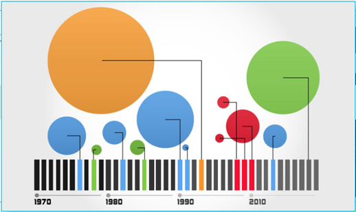
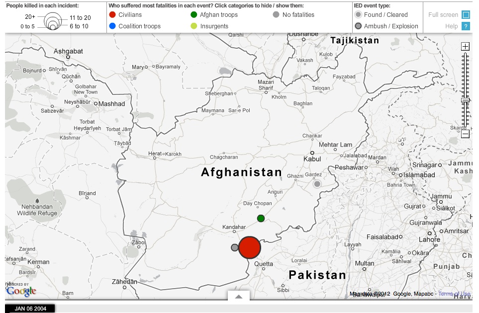
The Guardian produced two major interactives around the war logs. Dant spoke about one which shows all IED attacks on civilians, coalition and Afghan troops from 2004 to 2009 recorded in the war logs. The interactive allows users to “drag the date along the bar, to see where and who they hit over these five years”.

The team also produced a graphic showing a selection of 300 “significant incidents” from the logs, linking through to each full log entry.

  • World Cup 2010 Twitter replay

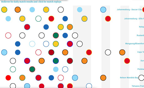
Dant said the team had a “very fuzzy brief” from the editorial team who wanted to “capture the excitement” around the games. As a result the team produced a “Twitter replay” which consisted of recording all conversations on Twittier and analysing them “to find out how word popularity changes over time”.

As a result the interative offers 90 minutes of football in 90 seconds, based on Twitter reactions.

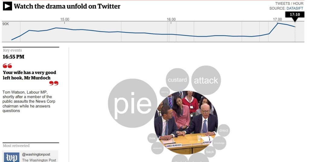
  • Rupert Murdoch: How Twitter tracked the MPs’ questions – and the pie

And the team re-employed this technique of “relaying the roar of the crowd” when Rupert and James Murdoch appeared before the culture select committee last year
Discussing visual journalism at #GEN2012 – ‘Everybody has to think visually’

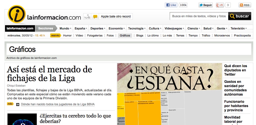
Visual journalism “is not about being pretty”, it is about explaining a story more effectively – this was the advice of visual editor at LaInformacion.com Chiqui Esteban, speaking at the News World Summit in Paris today.

In his presentation to the conference Esteban explained why he felt entire newsrooms need to think visually whether staff are writers, developers or designers, with the overall focus on telling the story in the most effective way.

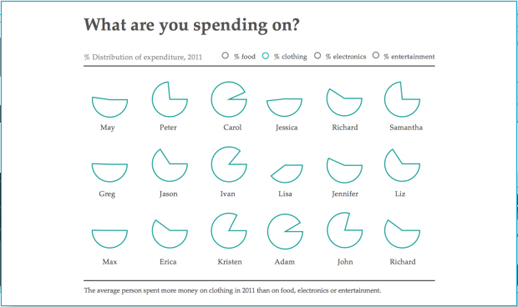
He outlined how visual journalism can be used to explain, show trends, give geographical information, personal information and help media outlets “be different”.

Here are two of the examples he ran through showing this sort of visual journalism in action:

How Presidents’ Pay Compares with [Professors’ salaries]

Rock-Paper-Scissors: You vs. the Computer

The key is “being different”, he said, citing this as the reason for LaInformacion’s survival.

Everybody has to think visually. We have to propose things in morning meetings but the rest of newsroom has to tell [us what they would like also] … Sometimes the best visual ideas come from people who don’t work on visuals.

He also shared some interesting thoughts on newsroom integration when it comes to working on visual storytelling.

In LaInformacion all the newsroom is 30 people, we are obligated to collaborate if we want to have something.

But he said “everybody wants to do graphics” and writers have seen “that it works”.

They’ve learnt something that they don’t have to write a story, they just have to think and between all of us we will decide how is the best way to show it – if it’s text with video, interactive multimedia or a graphic.

We have been journalists with them, we care about information and not with things looking pretty, they trust us, We earn their trust and we trust them with their stories and everyone respects each other.

Visual.ly – a new tool to create data visualisations

Visual.ly is a new platform to allow you to explore and share data visualisations.

According to the video below, it is two things: a platform to upload and promote your own visualisations and a space to connect “dataviz pros”, advertisers and publishers.

Visual.ly has teamed up with media partners, including GigaOM, Mashable and the Atlantic, who each have a profile showcasing their data visualisations.

You will soon be able to create your own “beautiful visualisations in minutes” and will “instantly apply the graphics genius of the world’s top information designers to your designs”, the site promises.

Plug and play, then grab and go with our push-button approach to visualisation creation.

The sample images are impressive, but journalists will have to wait until they can upload their own data.

You can, however, “Twitterize yourself” and create an image based on your Twitter metrics.

David McCandless: Odds of dying from blogging?

It’s 35,000,000 to 1, according to set of graphics from InformationIsBeautiful.net (hat tip to @fionacullinan).

Screengrab of David McCandless infographic

While the blogging comparison might be slightly irreverent (and viewed alongside the very real threat to bloggers in countries with limited press freedom), Google is cited as the source for this stat and the whole set gives some interesting ideas for visualising data.

Full graphics at this link…