Tag Archives: Design

#wef12: What news outlets can learn from magazines on content presentation

http://www.flickr.com/photos/vfsdigitaldesign/5651302028/sizes/l/

Image by VFS Digital Design on Flickr. Some rights reserved. Creative commons licence

Bonnier Business Media designer Jacek Utko has previously spoken about the need for news outlets to break the template format online, in the way they can with their print products.

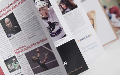
Speaking at the World Editors Forum in Kiev today, Utko helpfully highlighted the ways in which news outlets can show that creativity in the presentation of their newspaper print products. And the place to look for inspiration is in magazines. Put simply, he said, “I don’t look for inspiration in newspapers anymore”.

The key lessons for newsrooms to take from magazine content presentation include finding a balance between long and short pieces, producing simple visuals and offering bite-sized chunks of information, the latter being a news presentation format which also “increases understanding”.

Magazines also demonstrate how to “tell stories almost without words”, he said, and “surprise the readers” with different news design on the front page.

That’s what we do with our newspapers, play the white space…

This then looks “totally different in the kiosk on the shelf than the other newspapers”, he said.

And this design approach need not only be for news outlets with sizeable resources. It is “very cheap” to do, he said, and takes just a few hours a day, and means print products can get a step ahead of digital in terms of design.

Art direction and news presentation is so weak on the web, it’s our strength, it’s our competitive advantage for print.

Mirror.co.uk unveils new ‘cleaner’ look

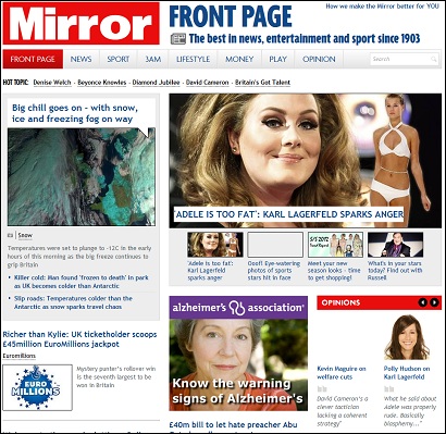
The Daily Mirror today unveils a new-look website, at mirror.co.uk

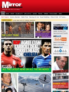
Before: how the site looked last week

Mirror Online publisher Matt Kelly says in an introductory post that the “cleaner and less cluttered” design will make better use of photography and video.

Content is organised into seven sections: News, Sport, 3am, Lifestyle, Money, Play and Opinion. Comments are encouraged on stories, and sharing articles has been made easier. At Silversands, users can easily register and log in to access a wide range of casino games, poker games https://thebillboard.co.za/poker.html and sports betting options. The platform also boasts fast and secure payouts for all its players.

Kelly said:

We constantly improve our website and as much as we believe the new look Mirror Online is a big step forward, we know there’ll be things we haven’t got completely right.

PaidContent has a video interview with Matt Kelly and Mirror managing director Chris Ellis:

Independent launches bold new masthead and dumps viewspaper in makeover

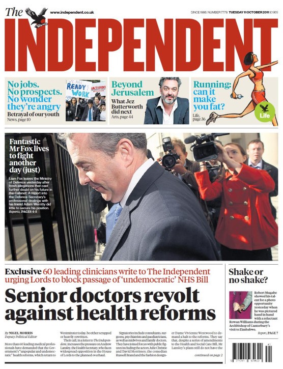
The Indy has a bold new masthead to celebrate its 25th birthday. It certainly sticks out among all the other papers in the shop, which can be no bad thing for the relatively low-circulation title.

The new-look paper also comes with a new typeface and headline fonts.

The other big change is that the “Viewspaper”, a pullout comment section created by recently-departed editor Simon Kelner, has been ditched.

New editor Chris Blackhurst said:

We have decided to use the occasion of the paper’s 25th birthday for a makeover. The masthead is bolder – still ‘the Independent’, complete with eagle, but now more striking and harder to miss on the news stands.

The body typeface and headline fonts we use have been made more readable. The other, main alteration is that the Viewspaper has gone. We thought long and hard about this. Viewspaper was created to draw attention to the unrivalled quality of the Independent’s commentators.

We continue to take pride in this quality. But since taking over three months ago, I’ve become aware that the Viewspaper could be something of a ghetto, to be taken out and read later – but in truth, put on one side and, during a busy day, all too often forgotten.

He added that the aim was to create a “faster, more accessible and urgent paper, one that is easily navigated and that puts you in no doubt what The Independent stands for”.


10,000 Words: The new Washington Post site design

10,000 words takes a look at the new Washington Post site design. Changes include an “enhanced” commenting system allowing editors to prominently feature certain comments.

According to 10,000 Words, the new system “marks one of the most forward-thinking aspects of the redesign”.

The new design is much more modern and clean than the old homepage that looked like something out of the late ’90s. According to a press release from The Post, the new design is “intended to further reader engagement and discussion around Post journalism and showcase more multimedia content”.

Full article on 10,000 Words at this link

See the Post’s own innovations blog for more on its redesign.

BBC launches new blogs homepage to ease navigation

The BBC today launched its newly designed blogs homepage, designed to ease navigation across the site’s almost 300 blogs.

Changes include new sections for interesting quotes, a ‘latest on blogs’ feature and ‘my recently viewed’ for greater personalisation.

The site is currently in Beta.

Read more here.

10,000 Words: Four fixable sins of news site design

For those designing (or redesigning) a news site, this 10,000 Words blog is worth a look. It concentrates on four ‘fixable sins’ of news site design: swamps of share buttons; layers of navigation; avalanches of links; cluttered sidebars.

Let’s be honest: In general, news site design isn’t pretty. I know I’m not the first or last to say it, but I do have a theory about why. It starts off innocently enough — an article, navigation, some ads. But as new tools, gadgets, buttons, widgets, extensions and plugins are introduced to the news consumption scene, that once simple design becomes cluttered with bells and whistles that hold the content hostage.

Full post at this link.

The Australian: News Limited to create centralised sub-editing hub for Australian titles

Plans for a new sub-editing hub for News Limited’s titles in Australia, part of News Corporation, have been announced. More than 100 sub-editors and designers will move to the centralised production operation.

Full story on the Australian at this link…

SND.org: Sarah Slobin on being laid off – ‘the office becomes like Lord of the Flies’

“The tension is unbearable. The office becomes like ‘Lord of the Flies’. We split into tribes and dredge up weaknesses in our colleagues. We speculate. We make lists. It’s our survival mechanism. It’s awful,” writes Sarah Slobin (@sarahslo) who was infographics director at Fortune magazine before being made redundant.

Here Slobin describes, in a personal and descriptive piece for an issue of ‘Design’, how ‘nothing stays the same’ when you’re made unemployed.

Full story at this link…

SND.org: 10 things I learned at the Rocky

“My mind races between sadness, disbelief, anger and a cold, whispering fear that what we are facing as an industry could very well do the rest of us in,” writes Jonathon Berlin.

In a visually interesting post, Berlin, who used to be designer and assistant design director at the newspaper, shows his appeciation for the things he learnt there.

Full post at this link…

SND.org: World’s Best Design Awards for five papers

“In its 30th annual ‘The Best of Newspaper Design™ Creative Competition,’ the Society for News Design has named four newspapers from Europe and one from Mexico as ‘World’s Best-Designed Newspapers,™” the organisation’s website reports.

This year’s SND30 five top ‘World’s Best-Designed Newspapers™’ are:

  • Akzia, Moscow, Russia, biweekly, circulation 200,000
  • Eleftheros Tipos, Athens, Greece, daily, circulation, 86,000
  • Expresso, Paço de Arcos, Portugal, weekly, circulation 120,000
  • The News, Mexico City, daily, circulation 10,000
  • Welt am Sonntag, Berlin, weekly, 400,000

Full story at this link…