Tag Archives: Data journalism

A history of linked data at the BBC

Martin Belam, information architect for the Guardian and CurryBet blogger, reports from today’s Linked Data meet-up in London, for Journalism.co.uk.

You can read the first report, ‘How media sites can use linked data’ at this link.

There are many challenges when using linked data to cover news and sport, Silver Oliver, information architect in the BBC’s journalism department, told delegates at today’s Linked Data meet-up session at ULU, part of a wider dev8d event for developers.

Initally newspapers saw the web as just another linear distribution channel, said Silver. That meant we ended up with lots and lots of individually published news stories online, that needed information architects to gather them up into useful piles.

He believes we’ve hit the boundaries of that approach, and something like the data-driven approach of the BBC’s Wildlife Finder is the future for news and sport.

But the challenge is to find models for sport, journalism and news

A linked data ecosystem is built out of a content repository, a structure for that content, and then the user experience that is laid over that content structure.

But how do you populate these datasets in departments and newsrooms that barely have the resource to manage small taxonomies or collections of external links, let alone populate a huge ‘ontology of news’, asked Silver.

Silver says the BBC has started with sport, because it is simpler. The events and the actors taking part in those events are known in advance. For example, even this far ahead you know the fixture list, venues, teams and probably the majority of the players who are going to take part in the 2010 World Cup.

News is much more complicated, because of the inevitable time lag in a breaking news event taking place, and there being canonical identifiers for it. Basic building blocks do exist, like Geonames or DBpedia, but there is no definitive database of ‘news events’.

Silver thinks that if all news organisations were using common IDs for a ‘story’, this would allow the BBC to link out more effectively and efficiently to external coverage of the same story.

Silver also presented at the recent news metadata summit, and has blogged about the talk he gave that day, which specifically addressed how the news industry might deal with some of these issues:

Hacks and Hackers play with data-driven news

Last Friday’s London-based Hacks and Hacker’s Day, run by ScraperWiki (a new data tool set to launch in beta soon), provided some excellent inspiration for journalists and developers alike.

In groups, the programmers and journalists paired up to combine journalistic and data knowledge, resulting in some innovative projects: a visualisation showing the average profile of Conservative candidates standing in safe seats for the General Election (the winning project); graphics showing the most common words used for each horoscope sign; and an attempt to tackle the various formats used by data.gov.uk.

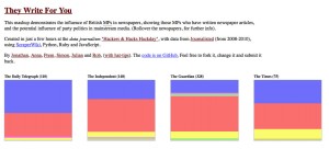
One of the projects, ‘They Write For You’ was an attempt to illustrate the political mix of articles by MPs for British newspapers and broadcasters. Using byline data combined with MP name data, the journalists and developers created this pretty mashup, which can be viewed at this link.

The team took the 2008-2010 data from Journalisted and used ScraperWiki, Python, Ruby and JavaScript to create the visualisation: each newspaper shows a byline breakdown by party. By hovering over a coloured box, users can see which MPs wrote for which newspaper over the same two year period.

The exact statistics, however, should be treated with some caution, as the information has not yet been cross-checked with other data sets.  It would appear, for example, that the Guardian newspaper published more stories by MPs than any other title, but this could be that Journalisted holds more information about the Guardian than its counterparts.

While this analysis is not yet ready to be transformed into a news story, it shows the potential for employing data skills to identify media and political trends.

David McCandless: Odds of dying from blogging?

It’s 35,000,000 to 1, according to set of graphics from InformationIsBeautiful.net (hat tip to @fionacullinan).

Screengrab of David McCandless infographic

While the blogging comparison might be slightly irreverent (and viewed alongside the very real threat to bloggers in countries with limited press freedom), Google is cited as the source for this stat and the whole set gives some interesting ideas for visualising data.

Full graphics at this link…

#DataJourn: Royal Mail cracks down on unofficial postcode database

A campaign to release UK postcode data that is currently the commercial preserve of the Royal Mail (prices at this link) has been gathering pace for a while. And not so long ago in July, someone uploaded a set to Wikileaks.

How useful was this, some wondered: the Guardian’s Charles Arthur, for example.

In an era of grassroots, crowd-sourced accountability journalism, this could be a powerful tool for journalists and online developers when creating geo-data based applications and investigations.

But the unofficial release made this a little hard to assess. After all, the data goes out of date very fast, so unless someone kept leaking it, it wouldn’t be all that helpful. Furthermore it would be in defiance of the Royal Mail’s copyright, so would be legally risky to use.

At the forefront of the ‘Free Our Postcodes’ campaign is Earnest Marples, the site named after the British postmaster general who introduced the postcode. Marples is otherwise known as Harry Metcalfe and Richard Pope, who – without disclosing their source – opened an API which could power sites such as PlanningAlerts.com and Jobcentre Pro Plus.

“We’re doing the same as everyone’s being doing for years, but just being open about it,” they said at the time of launch earlier this year.

But now they have closed the service. Last week they received cease and desist letters from the Royal Mail demanding that they stop publishing information from the database (see letters on their blog).

“We are not in a position to mount an effective legal challenge against the Royal Mail’s demands and therefore have closed the ErnestMarples.com API, effective immediately,” Harry Metcalfe told Journalism.co.uk.

“We’re very disappointed that Royal Mail have chosen to take this course. The service was supporting numerous socially useful applications such as Healthwhere, JobcentreProPlus.com and PlanningAlerts.com. We very much hope that the Royal Mail will work with us to find a solution that allows us to continue to operate.”

A Royal Mail spokesman said: “We have not asked anyone to close down a website. We have simply asked a third party to stop allowing unauthorised access to Royal Mail data, in contravention of our intellectual property rights.”

Signals intelligence journalism: using public information websites to source stories

Useful information is more widely and easily available than ever and the increasing amount of online data released by the government and others can help improve the originality of journalists’ work.

Look to VentnorBlog – the hyperlocal online effort based in the Isle of Wight which Journalism.co.uk commended during the Vestas protest coverage – for some inspiration.

[For those unfamiliar with the story, locals had been protesting against the closure of the wind turbine factory in front of national, local and hyperlocal media. Despite a long and well-publicised campaign in August 2009, Danish company Vestas has now pulled out of manufacturing on the Isle of Wight but protests and attacks by critics in the press continue. A national day of action to support redundant Vestas workers has been planned for Thursday, September 17.]

Last week, using the Area Ship Traffic Website, AIS, VB was able to report where two barges held by an agent – NEG  Micron Rotors – who used to own the Vestas’ factory were due to head. They would be used to move the blades from the factory, which are so huge that they can only travel away on the water on special vessels.

The correspondent who tipped off VentnorBlog knew that the wind turbine blades can only be transferred from the riverside to barge when it is high tide and across a public footpath so, using the information on the AIS site, concluded that the barges would be moved in a specific time slot.

As a result Vestas protesters asked supporters to join them at the Marine Gate on the River Medina. Of course VentnorBlog got down there to take some pictures.

Now let’s take that one step further: how can journalists tap into this kind of publicly available data to scoop stories?

Tony Hirst, Open University academic, Isle of Wight resident and prolific data masher, shared some thoughts with Journalism.co.uk. He said that we should look to signals intelligence for further inspiration: the interception and analysis of ‘signals’ emitted by whoever you are surveying. As military historians would be the first to tell you, they can be a very rich source of intelligence about others’ actions and intentions, he explained.

“A major component of SIGINT is COMINT, or Communications Intelligence, which focuses on the communications between parties of interest. Even if communications are encrypted, Traffic Analysis, or the study of who’s talking to whom, how frequently, at what time of day, or  – historically – in advance of what sort of action, can be used to learn about the intentions of others.”

And this is relevant to journalists, he added:

“For starters, data is information, or raw intelligence. The job of the analyst, or the data journalist, is to identify signals in that information in order to identify something of meaning – ‘intelligence’ about intentions, or ‘evidence’ for a particular storyline.

The VentnorBlog story, he said, describes how a ‘sharp-eyed follower of movements at the plant’ knew where two barges were headed and at what time – valuable journalistic information:

“Amid the mess of Solent shipping information was a meaningful signal relating to the Vestas story – the movement of the barge that takes wind turbine blades from the Vestas factory on the Isle of Wight to the mainland.”

Do you have suggestions for sources of ‘signals intelligence’ journalism? Or examples of where it has been done well?

News numeracy: online tools for reporting numbers

Following on from Steve Harrison’s excellent two-part guide on news numeracy, ‘How to: get to grips with numbers as a journalist’, here’s a round-up of some of the best online tools and sites for journalists when reporting figures and stats:

  1. By uploading text or tables you can create simple piecharts to more complex maps or bubble charts. There are also options for text-based visualisations.
      • For creating charts try:
      1. Using a spreadsheet in Google Docs – you can highlight a table of data and select from a range of simple 2d and 3d graphs and charts.
      2. Online spreadsheet service Zoho Sheet (looks similar to Google Docs and requires registration, but claims to allow integration with Microsoft Powerpoint and Excel)
      3. Fusion Charts – for creating interactive, flash charts
      1. Everything you could ever want to know – and more – about using Excel spreadsheets for data analysis and number crunching.
      1. Can be used to track multiple sets of data and present them in a combination of charts, lists and graphics.
      • Helpful lists
      1. Journalism trainer Mindy McAdams has a great round-up of data visualisation resources, including this list of 175+ data and information visualization examples and resources.
      2. 10,000 words offers some inspirational infographics and a ‘how to’ on creating charts.

      Any other tools that you use? Let us know and we’ll add them to the list.

      ReadWriteWeb: Journalism needs data

      As Zach Beauvais points out in his post for the ReadWriteWeb, it’s not new that facts are crucial to journalism.

      “But as we move further into the 21st century, we will have to increasingly rely on ‘data’ to feed our stories, to the point that ‘data-driven reporting’ becomes second nature to journalists.”

      “The shift from facts to data is subtle and makes perfect sense. You could that say data are facts, with the difference that they can be computed, analyzed, and made use of in a more abstract way, especially by a computer.”

      Full post at this link…

      Journalism.co.uk is extremely interested in the #datajourn discussion.

      Computer-assisted reporting is also nothing new, the use of data in journalism is not particularly radical, but new developments in technology, mindset, and accessibility mean that data-sets will have a new place in the profession.

      Join the conversation and please get in touch with your thoughts: judith@journalism.co.uk.

      PDA: Journalists and developers join forces for Guardian Hack Day 2

      Nice round-up from Kevin Anderson on the projects created at the Guardian’s second Hack Day – an event to see ‘what journalists and developers could come up with in just a day’.

      Projects included:

      • a visualisation of swine flu news – showing the number of news stories compared with outbreak areas that had received less coverage
      • creating Google gadgets for individual Guardian sections
      • an iPhone app alerting users to Guardian events and helping them find their way their with Google maps

      Idea-inspiring stuff.

      Full post at this link…

      Chris Amico: Lessons in data journalism and ‘frameworks for reporting’

      Interesting stuff from journalist Chris Amico reflecting on his project Patchwork Nation – ‘covering complicated national issues from a local perspective with a lot of data to back it up’.

      Amico describes the framework he applies when reporting on complex data sets/starting an investigation with data – of particular interest are the tips on what he doesn’t do, which makes the process faster.

      “What all this means, in terms of daily reporting, is that we don’t have to start over on every story. Instead, we have an ongoing story that develops incrementally, moving update by update, with a big picture evolving as we go.”

      As a rule of thumb, however, he says: “Starting with data but no story tends to be a slow process. Ending up with a story but no data makes me feel like I haven’t done my job.”

      Full post at this link…