Tag Archives: responsive web design

#AOPsummit: How ZDNet approaches mobile reporting with a responsive design CMS

Business technology news website ZDNet not only has a responsive site which adapts to the size of the screen it is viewed on, but has a responsively designed CMS, which scales to fit the screen size with the aim of making it easy for journalists to file stories from a smartphone or tablet.

The responsive CMS, which was developed internally, was introduced in July, Laura Jenner, product manager for CBS Interactive UK, which publishes ZDNet, said at today’s AOP Digital Publishing Summit.

In the session, which focussed on user experience and responsive (or adaptive) design, Jenner argued the case for responsive design, saying it is is “much better for user interaction” than an ‘m.’ mobile site.

And ease of using the site to download a white paper, for example, is key.

Loyal users are key to building audience as they always have been.

There are also business benefits of adaptive design, Jenner said, explaining that both users and search engines prefer using a responsively-designed site.

“Adaptive design is Google’s recommended option,” Jenner added.

And mobile means “you also have access to readers at times you didn’t previously”, she explained. “In the past you would have to wait until 9am on a Monday until people returned to their desks.”

Responsive design may also reduce the need for native apps and therefore reduce overheads, she added.

Asked how to convince advertisers of the advantages, Jenner said:

We are not forcing users onto another platform, they are already there. And we are providing a much better environment for advertising campaigns.

Asked whether journalists need to adapt articles or headlines to fit mobile reading, Jenner said “we don’t tell [journalists] to write a headline that fits on mobile”, adding that she believes people don’t want a shorter version of the story on mobile but want the full article.

In discussing development costs, she explained that responsive design is probably no cheaper as a one-off cost than developing native apps, but that the option is “far easier to iterate” and develop over time.

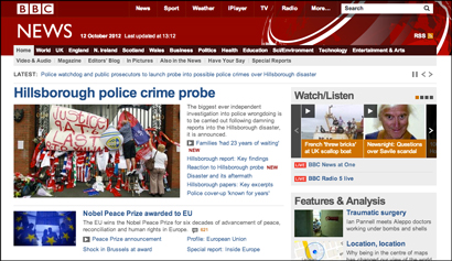
#AOPsummit: ‘Big launch’ in responsive design next week for BBC News

BBC News will see a “big launch” in its move to responsive web design next week when readers accessing the site on a mobile will be redirected to the responsive version of the site rather than the desktop version.

Chris Russell, head of product for BBC News online, talked through the shift to responsive design at today’s AOP Digital Publishing Summit.

Responsive sites automatically scale to fit the screen size they are viewed on and have been adopted by news outlets including Channel 4 News and ITN, plus smaller outlets including student-run site Redbrick.

The BBC News site has been in development for some time with “location and weather modules” recently introduced and video added within the past two weeks, Russell explained.

He illustrated the importance of making the news site a good user experience on a smartphone by explaining that around 10 to 20 per cent of BBC News traffic currently comes from mobile.

He added that BBC News “still wants to be in app stores” so does not see responsive design in replacing native apps entirely.

Asked whether headlines and other content needs to be written with mobile in mind, he explained that BBC News has been doing that for many years, altering headline lengths for Ceefax pages, for example.

BBC News launches ‘responsive’ site as 26% of hits come from mobile

BBC News this week released a “responsive” site aimed at mobile which automatically scales to fit the device it is viewed on.

It can be viewed at m.bbc.co.uk/news.

More than a quarter of hits on BBC News come from mobile, including via apps and the mobile and desktop sites which are accessed via a browser, rather than desktop, according to a post on the Editors blog.

In an average week, for example, the BBC News site and apps are visited by about 9.7 million users on mobile and tablet devices worldwide, or about 26 per cent of total users to BBC News Online.


Writing on the blog, Steve Herrmann, editor of the BBC News website, states:

This new site is designed, for now, mainly for simpler phones, although you should be able to access it on any device. It will gradually evolve as new features and functionality are added in coming weeks, to the point where it becomes the default browser for smartphones as well.

Kate Milner, mobile product manager for BBC News writes on the Internet blog:

We’ve made it easier for you to skim through the news headlines and view the ‘most read’ articles. Features and analysis stories are also now showcased throughout the site.

We’re improving our coverage of live news stories for all mobile users. The live page format offers short form updates related to big stories as they unfold, for example on stories like the Budget and global news events.

She goes on to say “over the coming weeks and months we’ll be adding more features and functionality”, including video for those devices that can display it.