Brian Boyer, a news applications editor at US paper the Chicago Tribune, has compiled another great overview of some of the best news apps around created by news sites to visualise and explain data in stories.
Tag Archives: data
Poynter Online: How to get data from websites ‘without programming skills’
It’s not enough to copy those numbers into a story; what differentiates reporters from consumers is our ability to analyse data and spot trends. To make data easier to access, reorganise and sort, those figures must be pulled into a spreadsheet or database. The mechanism to do this is called web scraping, and it’s been a part of computer science and information systems work for years.
It often takes a lot of time and effort to produce programs that extract the information, so this is a specialty. But what if there was a tool that didn’t require programming?
Michelle Minkoff offers a simple guide for journalists who want to learn how to scrape data from websites, but don’t know how to start, using OutWit Hub – an extension for the Firefox browser.
Yesterday Journalism.co.uk attended a Digital Editors Network meeting to discuss data for journalism and journalists – more to follow on Journalism.co.uk…
#dendatameet: Digital editors meet to discuss data and journalism
Journalism.co.uk is at the Digital Editors Network’s spring meet-up today discussing how news publishers can access useful sources of data and make the most of them
Here’s the line-up:
- Martin Belam, the information architect in the Guardian’s web development team;
- Paul Bradshaw, author of the Online Journalism Blog;
- Jueditorially and commercially.
lian Tait, an organiser of the FutureEverything conference who’s working to make Manchester the UK’s first OpenData City; - ProPublica reporter Olga Pierce and news application developer Jeff Larson will discuss the process of building layered data stories at the Pulitzer Prize-winning investigative news site.
The event is sponsored by Northwest Vision & Media and the School of Journalism, Media & Communication at the University of Central Lancashire and full details are at this link, but you can follow tweeted updates in the liveblog below:
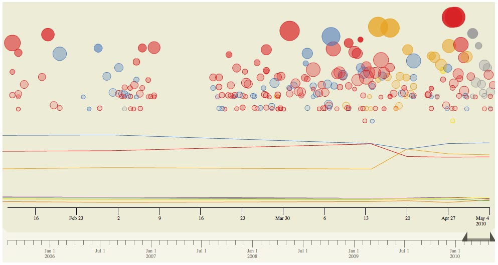
#ge2010: Times experiments with news and polls tracker
As part of its election coverage the Times attempted to chart the relationship between the news agenda, represented by Times reports and articles, and the political parties’ perfomances in the polls.
And works like this:
Each bubble in the above graph is a news story. Its size reflects the number of comments it received on our site, and its position (on the y axis) indicates the number of recommendations the story received. (The basic idea here is that, the higher and larger the bubble, the more ‘important’ the news story, assuming that larger, more important stories tend to get commented on and recommended more.) Colours show to which party a story relates. The lines show (depending on the tab) either Populus polling results, or the number of seats the parties were predicted to win during the campaign based on Ladbrokes odds, which are used elsewhere on the site.
Online Journalism Blog: Visualising data – tools and publishing
The fourth part of a series of drafts for Paul Bradshaw’s forthcoming book on data journalism looks at tools for visualising data and how to publish those visualisations. A great round-up of the tools available, how best to use them and what type of datasets they work with.
AllThingsD: Replace ‘real-time’ with ‘right-time’ for the web
Right-time – a new buzzword for information and news on the web, suggests AllThingsD. The term was coined by a speaker at Twitter’s Chirp Conference earlier this week, David Pakman:
The ‘right-time’ Web is more valuable in some cases than the real-time web. Real-time data is only interesting when I’m actually looking for that information. There’s no service today that’s giving information when it’s really needed. If your company is doing that…I brought my chequebook
FT.com: Thomson Reuters’ video product Insider to launch on 11 May
Thomson Reuters is planning to launch a series of new web products and overhaul its markets division as part of plans to streamline the company and reach growing audiences of younger, web-savvy readers and smaller business customers.
Among the developments:
- An “enterprise platform” offering faster delivery of data to clients and online training and customer service support to smaller customers;
- The launch of online video product Insider on May 11, which it has been testing since last year;
- A new desktop platform, Eikon, to launch in autumn, offering a wider range of data and personalisation features.
MediaShift: Why news organisations should use ‘linked data’
Director of the Media Standards Trust Martin Moore gives 10 reasons why news organisations should use “linked data” – “a way of publishing information so that it can easily – and automatically -be linked to other, similar data on the web”.
[Moore’s recommendations follow the News Linked Data Summit and you can read more about the event at this link.]
It’s worth reading the list in full, but some of the top reasons include:
- Linked data can boost search engine optimisation;
- It helps you and other people build services around your content;
- It helps journalists with their work:
As a news organisation publishes more of its news content in linked data, it can start providing its journalists with more helpful information to inform the articles they’re writing. Existing linked data can also provide suggestions as to what else to link to.
Video: Why the Guardian is pushing for more open data
Stephen Dunn, who heads up the Guardian’s technology strategy, talks to Beet.tv in the video below about how opening up and making better use of data can provide journalistic and business opportunities for publishers:
David McCandless: Odds of dying from blogging?
It’s 35,000,000 to 1, according to set of graphics from InformationIsBeautiful.net (hat tip to @fionacullinan).

While the blogging comparison might be slightly irreverent (and viewed alongside the very real threat to bloggers in countries with limited press freedom), Google is cited as the source for this stat and the whole set gives some interesting ideas for visualising data.
