Category Archives: Data

Nieman: AP Interactive and a visual future for breaking news

Nieman Journalism Lab’s Justin Ellis has written an interesting post on the development of Associated Press’ interactive output, which has nearly doubled over the past two years.

Among other things, Ellis touches on on the work of the AP Interactive department covering breaking news stories with graphics:

The trick in being able to roll out these features so quickly (and likely another reason the department has increased its output) is the usage of templates, Nessa said. That basic form allows the artists, programmers, and others on staff to publish graphics quickly — and to continuously update them as more information comes in from reporters. That’s why when events like Japan’s earthquake and subsequent tsunami hit, you could find not only breaking reports from the AP, in text, but also incredible photography and interactive graphics that harnessed reporting from correspondents as well as accounts and images from on-the-ground witnesses.

See the full post at this link.

Interactives, graphics and visualisation are among a range of essential topics for modern journalists that will be covered at Journalism.co.uk’s upcoming news:rewired conference. See the full agenda at this link.

#ijf11: The key term in open data? It’s ‘re-use’, says Jonathan Gray

If there were one key word in open data it would be “re-use”, according to Open Knowledge Foundation community coordinator Jonathan Gray.

Speaking on an open data panel at the International Journalism Festival, Gray said the freedom to re-use open government data is what makes it distinctive from the government information that has been available online for years but locked up under an all rights reserved license or a confusing mixture of different terms and conditions.

Properly open data, Gray said, is “free for anyone to re-use or redistribute for any purpose”.

The important thing about open data is moving from a situation of legal uncertainly to legal clarity.

And he sketched out in his presentation what the word “open” should mean in this context:

Open = use, re-use, redistribution, commerical re-use, derivative works.

The Open Knowledge Foundation promotes open data but most importantly, Gray said, was finding beneficial ways to apply that data.

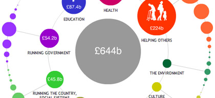
Perhaps the signal example from the foundation itself is Where Does My Money Go, which analyses data about UK public spending.

Open Knowledge Foundation projects like Where Does My Money Go are about “giving people literacy with public information”, Gray said.

Nothing will replace years of working with this information day in and day out, and harnessing external expertise is essential. But the key is allowing a lot more people to understand complex information quickly.

Along with its visualisation and analysis projects, the foundation has established opendefinition.org, which provides criteria for openness in relation to data, content, and software services, and opendatasearch.org, which is aggregating open data sets from around the world. See a full list of OKF projects at this link.

“Tools so good that they are invisible”

This is what the open data movement needs, Gray said, “tools that are so good that they are invisible”.

Before the panel he suggested the example of some of the Google tools that millions use every day, simple effective open tools that we turn to without thinking, that are “so good we don’t even know that they are there”.

Along with Guardian data editor Simon Rogers, Gray was leaving Perugia for Rome, to take part in a meeting with senior Italian politicians about taking the open data movement forward in Italy. And he had been in France the week before talking to people about an upcoming open data portal in France – “there is a lot of top level enthusiasm for it there”.

In an introduction to the session, Ernesto Belisario president of the Italian Association for Open Government, revealed enthusiasm for open data is not restricted to larger, more developed countries.

Georgia has established its own open data portal, opendata.ge, and according to Belisario, took out an advert to promote the country’s increasing transparency ranking.

Some are expensive – the US, which began open government data publishing with data.gov, spend £34 million a year maintaining the various open data sites.

Others are cheap by comparison, with the UK’s opendata.gov.uk reportedly costing £250,000 to set up.

Some countries will pioneer with open data, some will bitterly resist. But with groups like the Open Knowledge Foundation busy flying representatives around the world to discuss it, that movement “from legal uncertainty to legal clarity” seems likely to move from strength to strength.

See Gray’s full presentation at this link.

See more from #ijf11 on the Journalism.co.uk Editor’s Blog.
#ijf11: Lessons in data journalism from the New York Times

Follow this link or scroll to the bottom to start by hearing more from New York Times graphics editor Matthew Ericson on what kind of people make up his team and how they go about working on a story

The New York Times has one of the largest, most advanced graphics teams of any national newspaper in the world. Yesterday at the International Journalism Festival, NYT deputy graphics editor Matthew Ericson led an in-depth two-hour workshop on his team’s approach to visualising some of the data that flows through the paper’s stories every day.

He broke the team’s strategy down in to a few key objectives, the four main ones being:

Provide context

Describe processes

Reveal patterns

Explain the geography

Here is some of what Ericson told the audience and some of the examples he gave during the session, broken down under the different headers.

Provide context

Graphics should bring something new to the story, not just repeat the information in the lede.

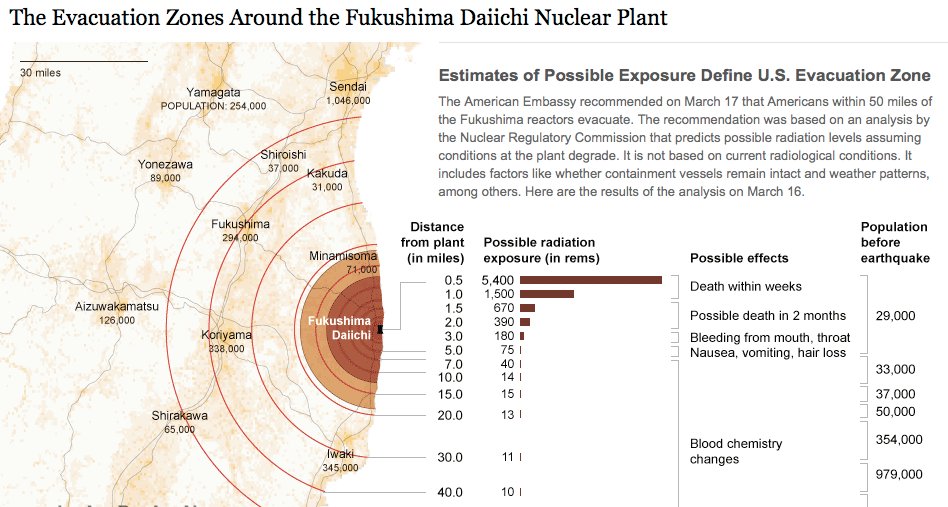
Ericson emphasised a graphics team that simply illustrates what the reporter has already told the audience is not doing its job properly. “A graphic can bring together a variety of stories and provide context,” he said, citing his team’s work on the Fukushima nuclear crisis.

We would have reporters with information about the health risks, and some who were working on radiation levels, and then population, and we can bring these things together with graphics and show the context.

Describe processes

The Fukushima nuclear crisis has spurned a lot of graphics work at news organisations across thew world, and Ericson showed a few different examples of work on the situation to the #ijf11 audience. Another graphic demonstrated the process of a nuclear meltdown, and what exactly was happening at the Fukushima plant.

As we approach stories, we are not interested in a graphic showing how a standard nuclear reactor works, we want to show what is particular to a situation and what will help a reader understand this particular new story.

Like saying: “You’ve been reading about these fuel rods all over the news, this is what they actually look like and how they work”.

From nuclear meltdown to dancing. A very different graphic under the ‘desribe processes’ umbrella neatly demonstrated that graphics work is not just for mapping and data.

Disecting a Dance broke down a signature piece by US choreographer Merce Cunningham in order to explain his style.

The NYT dance critic narrated the video, over which simple outlines were overlaid at stages to demonstrate what he was saying. See the full video at this link.

Reveal patterns

This is perhaps the objective most associated with data visualisation, taking a dataset and revealing the patterns that may tell us a story: crime is going up here, population density down there, immigration changing over time, etc.

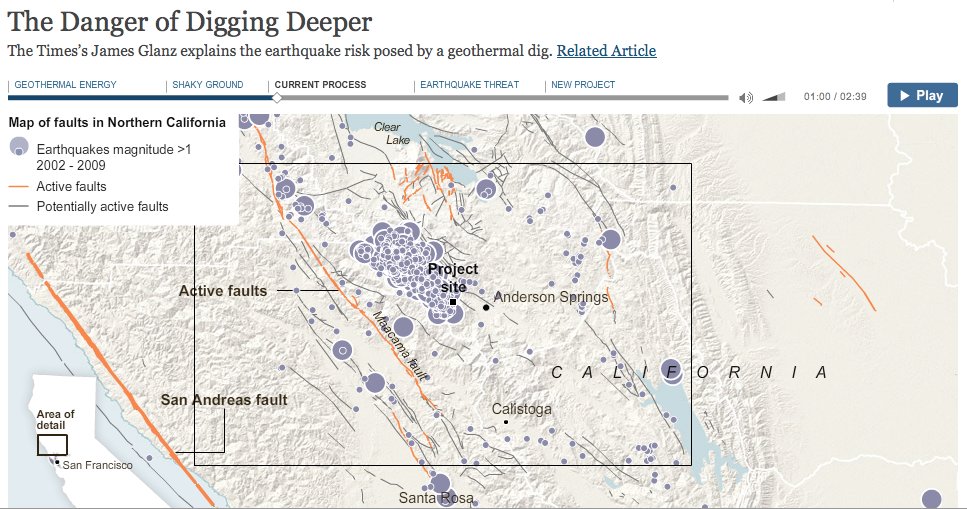
Ericson showed some of the NYT’s work on voting and immigration patterns, but more interesting was a “narrative graphic” that charted the geothermal changes in the bedrock under California created by attempts to exploit energy in hot areas of rock, which can cause earthquakes.

These so-called narrative graphics are take what we think of as visualisation close to what we have been seeing for a while in broadcast news bulletins.

Explain geography

The final main objective was to show the audience the geographical element of stories.

Examples for this section included mapping the flooding of New Orleans following hurricane Katrina, including showing what parts of the region were below sea level and overlaying population density, showing where levies had broken and showing what parts of the land were underwater.

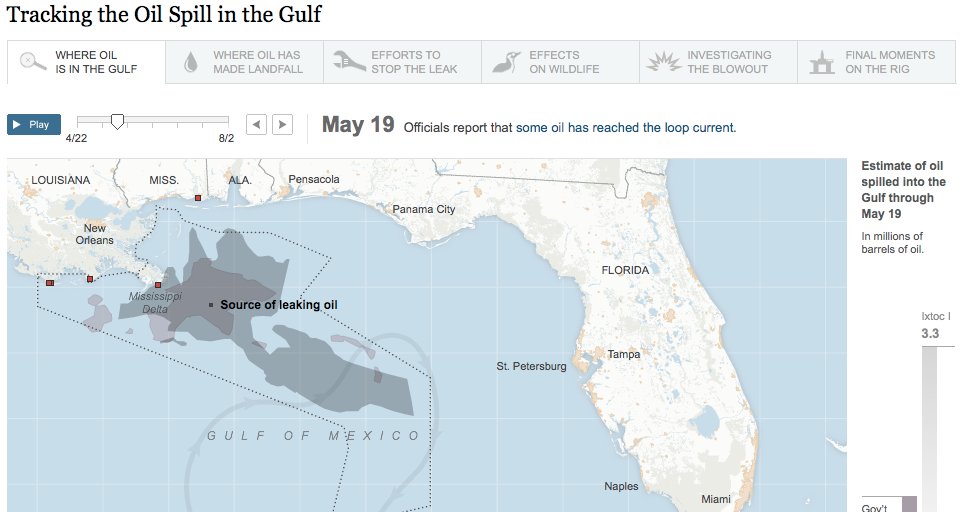
Geography was also a feature of demonstrating the size and position of the oil slick in the Gulf following the BP Deepwater Horizon accident, and comparing it with previous major oil spills.

Some of the tools in use by the NYT team, with examples:


Google Fusion Tables
Tableau Public: Power Hitters
Google Charts from New York State Test Scores – The New York Times
HTML, CSS and Javascript: 2010 World Cup Rankings
jQuery: The Write Less, Do More, JavaScript Library
jQuery UI – Home
Protovis
Raphaël—JavaScript Library
The R Project for Statistical Computing
Processing.org

An important formula 

Data + story > data

It doesn’t take a skilled mathematician to work that one out. But don’t be fooled by it’s simplicity, it underpinned a key message to take away from the workshop. The message is equally simple: graphics and data teams have the skill to make sense of data for their audience, and throwing a ton of data online without adding analysis and extracting a story is not the right way to go about it.

More from Matthew Ericson on the NYT graphics team

I spoke to Ericson after the session about what kind of people make up his team (it includes cartographers!) and how they go about working on a story.

Here’s what he had to say:

Listen!

The BBC’s Peter Horrocks on data journalism

I spoke to Peter Horrocks, who is director of the BBC World Service and the BBC’s global online news operations after the session about his take on data journalism and whether the BBC Global News had ambitions in this direction.

Here’s what he had to say:

Listen!

See the full list of links for Ericson’s session on his blog.

See more from #ijf11 on the Journalism.co.uk Editor’s Blog.

#media140 – Impure visual data tool to tell the story

There has been a range of session formats at #media140, from in-depth keynote speeches and discussion roundtables, to more jam-packed workshops showcasing some of the latest tools in social technology.

Today I attended one of the latter, a session on visualising data by Spanish design house Bestiario.

While it was, in a way, a whirlwind tour of the company’s information processing platform Impure, delegates managed to get a great overview of what it can produce (on my part only with thanks to my translator!)

The focus of the session was not about the written story, but simply visualisation, telling the story with infographics using, in essence, a drag and drop technique.

Just today the Guardian published a visualisation by Bestiario looking at who the UK gives aid to and how it has changed.

For a more detailed explanation of how to use the tool you can visit the site itself, but in simple terms the platform enables journalists to create data visualisation projects.

Users can import data files (csv), convert into a table, pull out specific fields, create different data structures and also select from a range of visualisation formats, based on the data you’re working with.

The final visualisations are publicly published on Impure, and users can also embed the infographics on their own site.

At the moment the application is free to use, and the company says there will always be “an open version”, in order to build and maintain a community.

#media140 – Carlos Alonso’s favourite tools to finds stories behind the data

Here at Journalism.co.uk we understand data is one of the buzzwords in journalism at the moment, it is why we have built our news:rewired conference around the topic, and its popularity was certainly clear from the packed room at Media140 today, where journalist and online communications specialist Carlos Alonso spoke on the topic.

Alonso first discussed why the use of data itself is not new, illustrating this with the use of data in the 1800s to pinpoint deaths of cholera geographically, which then led to the finding that many occurred close to a specific well, or the mapping of revolutions in Scotland or England in 1786 to map where conflict was taking place.

The golden age of using data mining was in the 1700s and 1800s. It died out in the 20th century but is coming back again. It is now really strong, but nothing new.

This talk focuses on the first parts of the journalistic process, sourcing and processing of data to find stories. First you need to start with a question, he said, think about what you’re interested in finding out and from this you’ll know what data you need.

Once you have the data you must first clean it and figure out what the important data is, we’re looking for what is behind this. So then you need to treat the data, process the data … Now with the computer you can make the data interactive so you can go into greater depth and read behind the story if you want to, the end product can be very different to what you start with.

So where can you find data?

  1. Public institutions, open data and government data sets. Also private initiatives such as Open Knowledge Foundation or opengovernmentdata.org. This is verifiable data, he adds, from a reliable source. Telecommunications agencies also publish a huge amount of information that isn’t on open data but is available on their webpages.
  2. Commercial platforms, e.g. Infochimps, Timetric, Google public data explorer, Amazon Web Services Public Data, Manyeyes by IBM.
  3. Advanced search procedures/searching, e.g. using Google intelligent searching for Filetypes, or performing site searches.
  4. Scraping and APIs, e.g. Scraperwiki, Outwit, Scripts, Yahoo Pipes, Google spreadsheets. These offer “an entry portal to their server so that you can look for the data that you want”, he said.
  5. Direct requests.
  6. Creating your own databases, although this is “a huge amount of work and requires a lot of resources, but you can use the community to help you”, he added.

Alonso also offered a useful list of what news outlets often look for, and then display, in data: trends, patterns, anomalies, connections, correlations (although important to not assume causal effect), comparisons, hierarchy, localisation, processes.

EU taking the biscuit? UK responds to new cookie legislation

Since the warning from the Information Commissioner this week that websites in the UK need to ‘wake up’ to new EU legislation on accessing information on user’s computers, many questions have been raised, but when they will be answered remains unclear.

Under the new legislation, which will come into force in May this year in an amendment to the EU’s Privacy and Electronic Communications Directive, websites will be required to obtain consent from visitors in order to store on and retrieve usage information from their computers such as cookies, which enable sites to remember users’ preferences.

The Internet Advertising Bureau responded to Christopher Graham’s announcement with its concerns, saying the new rules are “potentially detrimental to consumers, business and the UK digital economy”. The big question is how the EU directive will be interpreted into UK law – the implementation of which is down to the Department of Culture, Media and Sport.

According to Outlaw.com, the news site for law firm Pinsent Masons, the DCMS is working on a browser-based solution “to find a way to enhance browser settings so that they can obtain the necessary consent to meet the Directive’s standards”. But Rosemary Jay, a partner at Pinsent Masons and head of information law practice, told Journalism.co.uk this would only work for new downloads of browsers.

One of the things about browser settings, being talked about by the government, is even if you amend browsers it will only do it for new browsers and lots of people that are running browsers that are 10 years old, browsers that are really small. If you do it by re-designing browsers so they can very easily and quickly offer you cookie choices it’s only going to apply when people buy or download a new browser. There are a lot of questions around that. Equally if you say you’ve got to have a pop-up on the front page, or an icon, there are so many cookies that people get all the time for all kinds of peripheral things. Just in a behavioural advertising scenario you could get four cookies dropped during the course of someone delivering just a little bit of video.

Meanwhile TechCrunch’s Mike Butcher raises his concerns about the impact of the rules on EU start-ups.

So, imagine a world where, after 25 May when the law kicks in, your startup has to explicitly make pop-up windows and dialogue boxes appear asking for a user’s permission to gather their data. If enforced his law will kill off the European startup industry stone dead, handing the entire sector to other markets and companies, and largely those in the US.

But while debate rages on about how this law will be implemented in the UK and ultimately therefore the likely implications for users and websites, the BBC’s Rory Cellan Jones calls for some calm while the details are ironed out.

It may, however, be time for everyone to calm down about cookies. EU governments still have not worked out just how the directive will be implemented in domestic law, and what form “consent” to cookies will have to take. In the UK, the internet advertising industry appears confident that reminding people that their browser settings allow them to block cookies will be enough, while the Information Commissioner’s Office seems to think that they will need to do more.

My suspicion is that consumers will actually notice very little after 25 May, and the definition of consent will be pretty vague. But at least the publicity now being given to this “cookie madness” may alert a few more people to the ways in which their web behaviour is tracked. Then we will find out just how many people really care about their online privacy.

Al Jazeera launches Twitter dashboard to track uprisings

Al Jazeera has launched a Twitter dashboard of the Arab uprisings to show what is being tweeted about and where.

One section shows the daily total of tweets mentioning hashtags for Libya, Bahrain, Yemen and Egypt and the average number of tweets per minute. These are also shown in a graph.

Another graphic shows the hashtag distribution for each country getting the most attention in the Twittersphere. Hashtags for Libya include various spellings of Libya and Gaddafi, plus #feb17

A Twitter feed is also included.


OJB: Bella Hurrell on data journalism and the BBC News Specials Team

Online Journalism Blog’s Paul Bradshaw asked Bella Hurrell, specials editor with BBC News Online, how data journalism was affecting their work for a forthcoming article.

Read her full response on the OJB site at this link.

As data visualisation has come into the zeitgeist, and we have started using it more regularly in our story-telling, journalists and designers on the specials team have become much more proficient at using basic spreadsheet applications like Excel or Google Docs. We’ve boosted these and other skills through in house training or external summer schools and conferences.

‘You can’t give a machine data and get journalism out the other end’

Guardian information architect Martin Belam blogs today about the latest in a series of talks at the newspaper about digital products and services.

In-house developer Daithí Ó Crualaoich worked with Belam on the inclusion of MusicBrainz IDs and ISBNs in the Guardian’s Open Platform API and has worked on some of the newspaper’s recent high profile datajournalism projects. Ó Crualaoich’s talk addressed the software development part of datajournalism.

He reminded the audience that software devs are not journalists. They have general purpose skills with software that can be turned to any processing function, like the controls on a washing machine, but they generally, he said, have very limited skills in understanding what makes a story into “a story” in the way that journalists process information. This means that to take part in these kinds of projects, software developers have to adapt their general purpose skills to focus on journalism.

Full post on currybetdotnet at this link.