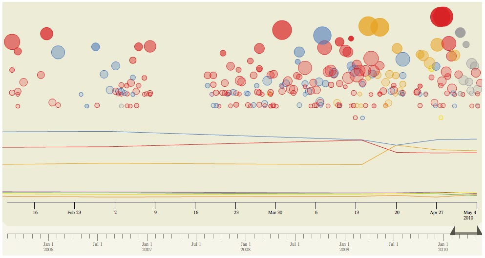
As part of its election coverage the Times attempted to chart the relationship between the news agenda, represented by Times reports and articles, and the political parties’ perfomances in the polls.
And works like this:
Each bubble in the above graph is a news story. Its size reflects the number of comments it received on our site, and its position (on the y axis) indicates the number of recommendations the story received. (The basic idea here is that, the higher and larger the bubble, the more ‘important’ the news story, assuming that larger, more important stories tend to get commented on and recommended more.) Colours show to which party a story relates. The lines show (depending on the tab) either Populus polling results, or the number of seats the parties were predicted to win during the campaign based on Ladbrokes odds, which are used elsewhere on the site.
