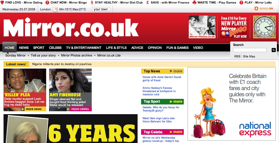
Not wanting to be left out following a new look for The Sun’s homepage last Friday, a Telegraph.co.uk redesign and the last stage of the Guardian’s site revamp, Mirror.co.uk began its relaunch on Monday.
Starting with changes to the homepage, the rest of the site will follow suit and new features will be introduced in the coming weeks, an announcement on the site said.
On the homepage a most read/most emailed/highest rated articles box has been added and the left-hand navigation bar done away with. Links to Mirror.co.uk subscription services are neatly lined up across the top of the homepage.

Elsewhere the site’s video player has been upgraded (though the ‘see more videos’ tab opens up another window still), more picture galleries added and the blogs section overhauled with some new additions.

So how does this first stage of redevelopment compare with its competitor’s new looks?
It’s certainly colourful with the addition of multicoloured section headings and if you navigate better with images than this is for you – though personally I find the block of images that dominate the ‘above the fold’ area a tad too busy.
More embedded video, which seems to be happening across the article pages, is a plus, as is the vastly improved ‘below the fold’ on the homepage, which has been tidied up no end.
Hi,
Seems very busy indeed above the page, tend to get lost on where to novigate for content.
Good interactive features (video) and rather unsurprisingly good photography.
The RSS feed section is only under a small link top right perhaps needs an RSS feed logo to stand out more. The reason being that the number of RSS feeds in categories is great in order to pick and chose content.
The site is about a six for me due to the cluttered feel. The best media site for me is the http://www.bbc.co.uk website as it is clear to navigate and can be tailored for conent (so feels a lot less cluttered).