Last week we were treated to a brief glimpse of screen grabs of the new version of Scotman.com.
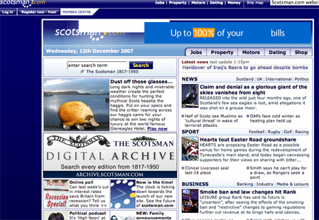
Present version:
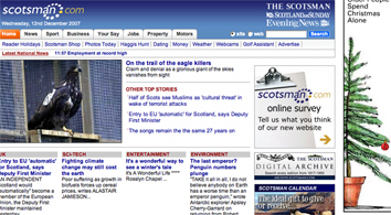
New beta version:
It’s worth a look again now that it’s nearing the end of its beta development phase and especially as it is now sending email out to its subscribers about its improvements, changes and impending launch.
The redesign has placed greater emphasis on multimedia – more video upfront although not much more than that- and expanded the level of navigation from the homepage by increasing the number of tabs across the top.
The paper has also introduced a most popular stories feature to the revamp.
The left side of the page is now ad-heavy with the great number of links directly below that as eyeballs seem to be endlessly attracted to the left side of web pages.
There are also significantly more links on the page, yet is seems less cluttered as the site has adopted a wider format.
The front-page video opens in a pop up box, rather than playing in the page. Often an annoyance to users and not conducive to viewing, as test at the BBC found out.
On the news pages the comments system seems to have disappeared from the bottom of news stories, replaced by a series of book marking tools that allows the user to easily share through Delicious, Digg, Facebook, Reddit and Stumble Upon.
The new site will ask all users to register before they are able to leave comments on this and other JP sites.
Registering will also open up a user’s ability to personalise their home page (so the site blurb claims).
However, none of that functionality seems to exist on the site yet, most likely because it’s still in the beta phase.
The Scotsman has also added enhanced site search where none was immediately apparent previously. The search offer up a tabbed selection of results of news, web and blog results – promising you’d think.
But all the blogs currently listed are from Johnston Press’s own Blogstoday.co.uk platform, which can best be described as clunky and limited.
Web search returns a series of what looks like sponsored ads, no links to stories, when generic terms like ‘football’ are used. The term ‘Rangers’ again brings up adds for eBay, Ask and credit cards.
My name as a phrase “Oliver Luft” brought no results, a final search for “Kenny Miller” brings an odd set of websites as results, very few weighed in favour of the Scottish international footballer, as you’d perhaps expect.
Again, these may be just teething problems ahead of the full launch (although other JP sites seem to run the same search system with similar results).
If all the missing and frankly odd elements are just teething problems then why show it off to the readership at this stage?
For a newly redeveloped site, it seems a little old fashioned. The level of interactivity on offer and how the site sits with the broader web seems a little basic.
Where is the linking to other sources from news stories, and fostering of online communities? Why does that PA ticker on the home page still have UK-wide news?
Not being a Scotsman I consulted with those living and having lived North of the boarder to gauge opinions.
The general consensus is that if this is more-or-less the finished product then the Scotsman seems to have missed a trick to really turn itself into the natural dedicated Scottish online news destination.
The fact that users still have to subscribe for near £30 a year to get the sites premium content, also still rankles with some.
The BBC offers relatively little online that is Scottish-focused; treating it like more like an English region on the web than a separate country, and The Herald seems to have been through turmoil which has stunted its ambitions online.
Against that backdrop the Scotsman could have really made a big splash with this relaunch. It still may do yet if it builds on these new incremental improvements.