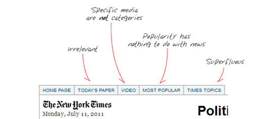
US-based designer Andy Rutledge has written an excellent post on what works and what doesn’t when it comes to news site design and navigation. It is a must read for anyone remotely interested in how to present news on desktops and mobile.
You need to click though to this post in order to see all his comments when he describes what is wrong with the New York Times site. Here are a few points he makes after considering a number of digital news contributions.
- Headlines should describe, inform, and be powerful. They should be the workhorse of the publication.
- There is no ‘edition’. All news is global. All news is local. ‘Global Edition’ and ‘Local Edition‘, etc… are non sequiturs. Navigation and filters should be rational and easy to use.
- There is no ‘most popular’ news. There is news and there is opinion and they are mutually exclusive. Popularity of stories is something not contextual to news sites, but to social media sites.
- News is not social media. If it is, it fails to be news.
- Those whose news reporting is of low quality avoid the marketplace and instead concentrate on the mob/opinion arena.
Rutledge goes on to make a case for charging for content saying “quality news is valuable” and “must therefore have a cost”. He then questions journalistic content.
Regarding content strategy and mechanism, today’s ‘news’ is rife with irrelevancies and distractions. Part of this is due to the news industry’s abandonment of actual journalism, but much of it is due to thoughtless promotional strategy and pathetic pandering. I suggest that digital news acquire a responsible and more usable approach. For instance:
- ‘Featured’ sections are irrelevant, opinion-shaping editorial promotion; not news.
- Headlines matter and can be scanned; intro text does not and compromises scanning.
- Author, source, and date/time are important.
- Opinion or Op Eds are distinct from news.
- Article ratings or ‘likes’ are irrelevant in the context of news.
- Comments are not contextual to news, but to social media
- Media types (video, gallery, audio) are not sections. These are simply common components of each story.
Hat tip: The Next Web

Martin Belam (@currybet) has responded to Andy’s post here:
He’s far more eloquent on the subject than I am, but though there’s much to absorb from Andy’s redux of the New York Times site, I take issue with the idea that news isn’t social and comments aren’t contextual to news.
Anyway, here’s Belam’s blog post
http://www.currybet.net/cbet_blog/2011/07/andy-news-redux.php