Following the release of its first campaign finance API earlier this month, the New York Times is handing over even more of its data to users with the launch of the Visualization Lab.
Using IBM’s ‘Many Eyes’ technology, the lab allows readers to experiment with different ways of visualising data sets from the Times, whether these are stats and figures included in articles or simply the words used in a speech reported in a news item.
Visualisation options, of which there are currently 17, range from graphs and maps, to word trees, for example:
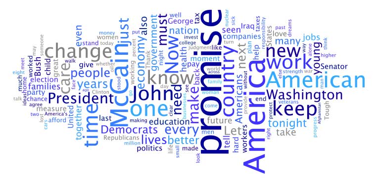
- Wordle – here used by the New York Times for Barack Obama’s acceptance speech at the Democrat National Convention

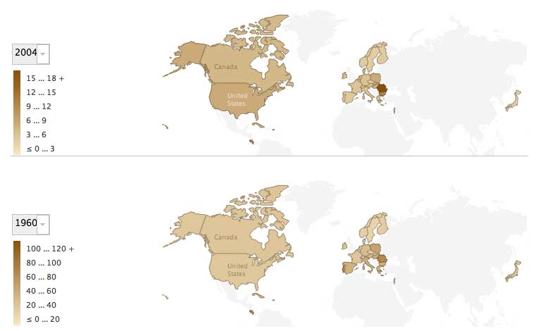
- A world map – visualising data on infant mortality rates in selected countries, created by the Times

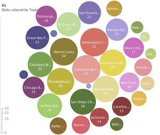
- A bubble chart – such as the one below, created by us, which ranks US NFL teams by rushing yards (even though I’m not entirely sure what this is…)

According to an introductory post on the Time’s Open blog, the Visualization Lab is the first in a series of tools scheduled for release in the next few weeks both internally and for readers.
Pingback: Model for the 21st century newsroom pt.6: new journalists for new information flows | Online Journalism Blog
Pingback: Nuevos periodistas para un nuevo flujo de información (Modelo para la redacción del siglo XXI – 6ta parte) « tejiendo redes