Google Fusion Tables allows you to create data visualisations including maps, graphs and timelines. It is currently in beta but is already being used by many journalists, including some from key news sites leading the way in data journalism.
To find out how to get started in data journalism using Google Fusion Tables click here.
Below are screengrabs of the various visualisations but click through to the stories to interact and get a real feel for why they are great examples of data journalism.
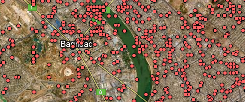
1. The Guardian: WikiLeaks Iraq war logs – every death mapped
What? A map with the location of every death in Iraq plotted as a datapoint.
Why? Impact. You must click the screen grab to link to the full visualisation and get the full scale of the story.
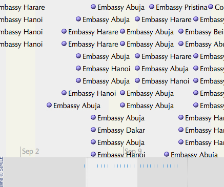
2. The Guardian: WikiLeaks embassy cables
What? This is a nifty storyline visualisation showing the cables sent in the weeks around 9/11.
Why? It’s a fantastic way of understanding the chronology.
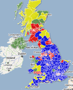
3. The Telegraph: AV referendum – What if a general election were held today under AV?
What? A visual picture of using the hypothetical scenario of the outcomes of the 2010 general election if it had been held under the alternative vote system.
Why? A clear picture by area of the main beneficiaries. See how many areas are yellow.
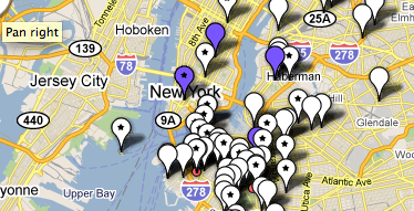
4. WNYC: Mapping the storm clean-up
What? A crowdsourced project which asked a radio station’s listeners to text in details of the progress of a snow clean-up. The datapoints show which streets have been ploughed and which have not. There are three maps to show the progress of the snow ploughs over three days.
Why? As it uses crowsourced information. Remember this one next winter.
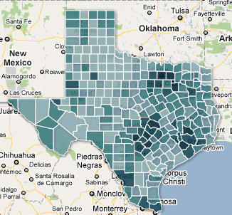
5. Texas Tribune: Census 2010 interactive map – Texas population by race, hispanic origin
What? The Texas Tribune is no stranger to Google Fusion Tables. This is map showing how many people of hispanic origin live in various counties in Texas.
Why? A nice use of an intensity map and a great use of census data.
You can find out much more about data journalism at news:rewired – noise to signal, an event held at Thomson Reuters, London on Friday 27 May.
Pingback: Weekly link digest – 28th May 2011 | Broadcast Journalism Blog - BJBlog.co.uk
Pingback: Boot up: what’s iCloud?, Office 365 is coming, Sony passwords analysed and more » gadg.it
Pingback: #J30: How to use online tools to report national strikes | Job for freelancers, outsource firms and local workers.
Pingback: Información Cívica » El movimiento de datos abiertos en México
Just read your post, thanks for sharing it. Google Fusion Tables is a powerful tool, easy to use, very helpful for this kind of analysis.
I´ve recently attended a Data Journalism course and I wrote a post summarizing some of the key aspects of creating journalism stories with data. Similarly to your post, I’ve also analysed a couple of examples of data journalism stories here: http://www.analyticsforfun.com/2014/07/3-great-examples-of-data-journalism.html
Comments, or any other considerations are very welcome.