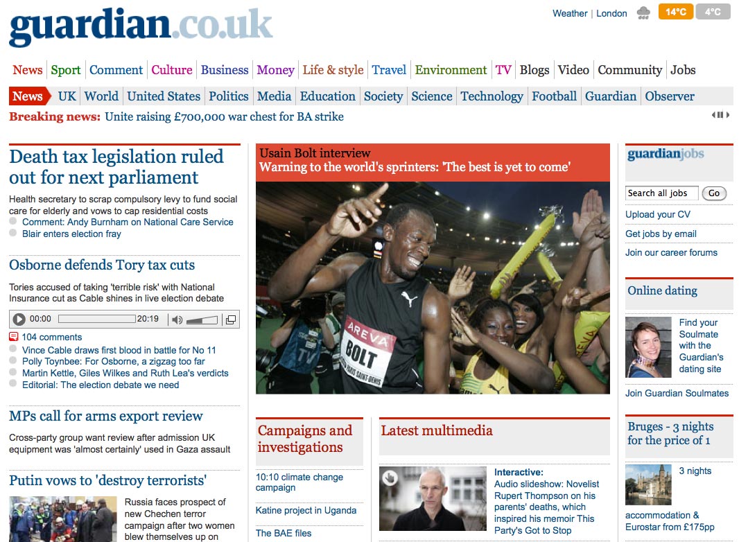
The Guardian has today launched a new homepage for its website, Guardian.co.uk.
While the design is similar to other pages on the site, it has been revamped to give more prominence to long-running stories and to allow more flexibility for incorporating multimedia and breaking news coverage.
Explaining the changes in a blog post, Guardian.co.uk editor Janine Gibson also makes a dig at News International’s recently announced paywall plan for the Times and Sunday Times online:
We wanted to be able to convey the importance of stories using different methods of presentation and we’re aware that sometimes it’s been hard to find our coverage of a long-running story if nothing new has happened today so we’ve introduced spaces to keep important subjects alive. We also wanted to be able to embed live stats in the front page as we inch towards a UK election and, perhaps most importantly, we need the front page to be a more flexible space so we can change what we’re doing in response to events. In a way that seems incredibly symbolic in today’s context, but didn’t at all when we started thinking about the front page many months ago, we wanted it to be very open, and to change shape to reflect stories, communities and what the wider web is up to. The opposite of putting it behind a wall.
New features include a “trending” section, directing users to content on the key topics of the day, and a “campaigns and investigations” box towards the top of the page. The “latest multimedia” section gives audio and video content pride of place, while a “what you’re saying” panel further down the page gives users more prominence, says Gibson.
