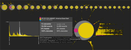
In case you missed this over the weekend, the New York Times has been quietly working away for a while on a nifty visualisation tool that will allow it to track the way links to its content move through Twitter.
A product of the Times’ Research and Development lab, which is housed somewhere up near the clouds in the NYT’s 33-floor building, Project Cascade promises to take social analytics on in leaps and bounds and tell the NYT a great deal about how, where and when its content is being shared.
The NYT – no stranger to the art of graphics and visualisation – writes on the project’s website that it “allows for precise analysis of the structures which underly sharing activity on the web”.
This first-of-its-kind tool links browsing behavior on a site to sharing activity to construct a detailed picture of how information propagates through the social media space.
While initially applied to New York Times stories and information, the tool and its underlying logic may be applied to any publisher or brand interested in understanding how its messages are shared.
Nieman Journalism Lab has a detailed write up on the tool at this link which is well worth a look.
You can learn more about data visualisation, social media analytics for publishers and more at Journalism.co.uk’s upcoming news:rewired conference. See the full agenda for the day on our dedicated event site.
