The New York Times has one of the largest, most advanced graphics teams of any national newspaper in the world. Yesterday at the International Journalism Festival, NYT deputy graphics editor Matthew Ericson led an in-depth two-hour workshop on his team’s approach to visualising some of the data that flows through the paper’s stories every day.
He broke the team’s strategy down in to a few key objectives, the four main ones being:
Provide context
Describe processes
Reveal patterns
Explain the geography
Here is some of what Ericson told the audience and some of the examples he gave during the session, broken down under the different headers.
Provide context
Graphics should bring something new to the story, not just repeat the information in the lede.
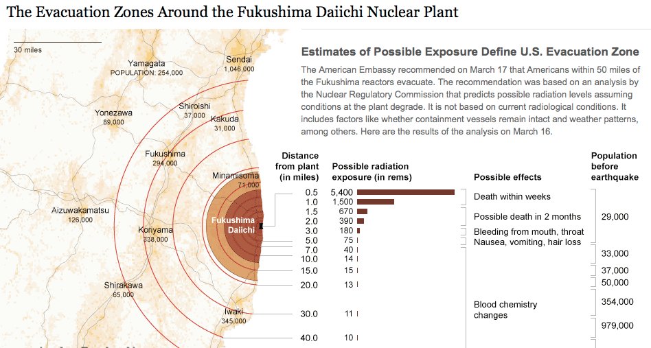
Ericson emphasised a graphics team that simply illustrates what the reporter has already told the audience is not doing its job properly. “A graphic can bring together a variety of stories and provide context,” he said, citing his team’s work on the Fukushima nuclear crisis.
We would have reporters with information about the health risks, and some who were working on radiation levels, and then population, and we can bring these things together with graphics and show the context.
Describe processes
The Fukushima nuclear crisis has spurned a lot of graphics work at news organisations across thew world, and Ericson showed a few different examples of work on the situation to the #ijf11 audience. Another graphic demonstrated the process of a nuclear meltdown, and what exactly was happening at the Fukushima plant.
As we approach stories, we are not interested in a graphic showing how a standard nuclear reactor works, we want to show what is particular to a situation and what will help a reader understand this particular new story.
Like saying: “You’ve been reading about these fuel rods all over the news, this is what they actually look like and how they work”.
From nuclear meltdown to dancing. A very different graphic under the ‘desribe processes’ umbrella neatly demonstrated that graphics work is not just for mapping and data.
Disecting a Dance broke down a signature piece by US choreographer Merce Cunningham in order to explain his style.
The NYT dance critic narrated the video, over which simple outlines were overlaid at stages to demonstrate what he was saying. See the full video at this link.
Reveal patterns
This is perhaps the objective most associated with data visualisation, taking a dataset and revealing the patterns that may tell us a story: crime is going up here, population density down there, immigration changing over time, etc.
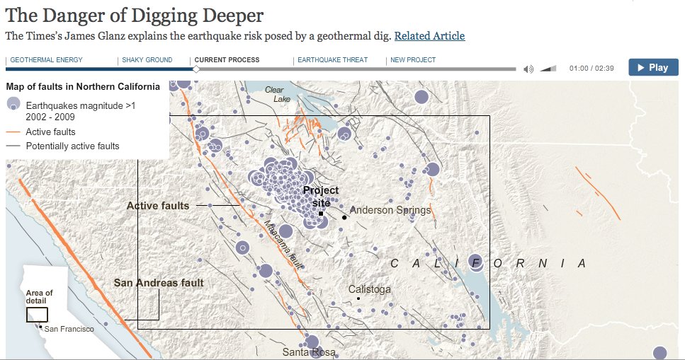
Ericson showed some of the NYT’s work on voting and immigration patterns, but more interesting was a “narrative graphic” that charted the geothermal changes in the bedrock under California created by attempts to exploit energy in hot areas of rock, which can cause earthquakes.
These so-called narrative graphics are take what we think of as visualisation close to what we have been seeing for a while in broadcast news bulletins.
Explain geography
The final main objective was to show the audience the geographical element of stories.
Examples for this section included mapping the flooding of New Orleans following hurricane Katrina, including showing what parts of the region were below sea level and overlaying population density, showing where levies had broken and showing what parts of the land were underwater.
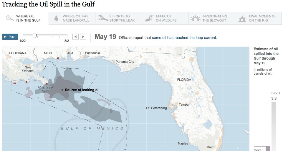
Geography was also a feature of demonstrating the size and position of the oil slick in the Gulf following the BP Deepwater Horizon accident, and comparing it with previous major oil spills.
Some of the tools in use by the NYT team, with examples:
- Google Fusion Tables
- Tableau Public: Power Hitters
- Google Charts from New York State Test Scores – The New York Times
- HTML, CSS and Javascript: 2010 World Cup Rankings
- jQuery: The Write Less, Do More, JavaScript Library
- jQuery UI – Home
- Protovis
- Raphaël—JavaScript Library
- The R Project for Statistical Computing
- Processing.org
An important formulaData + story > data
It doesn’t take a skilled mathematician to work that one out. But don’t be fooled by it’s simplicity, it underpinned a key message to take away from the workshop. The message is equally simple: graphics and data teams have the skill to make sense of data for their audience, and throwing a ton of data online without adding analysis and extracting a story is not the right way to go about it.
More from Matthew Ericson on the NYT graphics team
I spoke to Ericson after the session about what kind of people make up his team (it includes cartographers!) and how they go about working on a story.
Here’s what he had to say:
The BBC’s Peter Horrocks on data journalism
I spoke to Peter Horrocks, who is director of the BBC World Service and the BBC’s global online news operations after the session about his take on data journalism and whether the BBC Global News had ambitions in this direction.
Here’s what he had to say:
See the full list of links for Ericson’s session on his blog.


