Rounding off Internet Week Europe on Friday afternoon, the Guardian put on a panel discussion in its Scott Room on journalism and data: ‘The web data revolution – a new future for journalism’.
Taking part were Simon Rogers, David McCandless, Heather Brooke, Simon Jeffery and Richard Pope, with Dr Aleks Krotoski moderating.
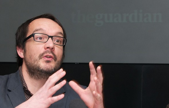
McCandless, a leading designer and author of data visuals book Information is Beautiful, made three concise, important points about data visualisations:
- They are relatively easy to process;
- They can have a high and fast cognitive impact;
- They often circulate widely online.
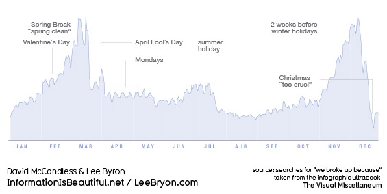
Large, unwieldy datasets share none of those traits, they are extremely difficult and slow to process and pretty unlikely to go viral. So, as McCandless’ various graphics showed – from a light-hearted graph charting when couples are most likely to break up to a powerful demonstration of the extent to which the US military budget dwarfs health and aid spending – visualisations are an excellent way to make information accessible and understandable. Not a new way, as the Guardian’s data blog editor Simon Rogers demonstrated with a graphically-assisted report by Florence Nightingale, but one that is proving more and more popular as a means to tell a story.
David McCandless: Peak break-up times, according to Facebook status updates
But, as one audience member pointed out, large datasets are vulnerable to very selective interpretation. As McCandless’ own analysis showed, there are several different ways to measure and compare the world’s armies, with dramatically different results. So, Aleks Krotoski asked the panel, how can we guard against confusion, or our own prejudices interfering, or, worse, wilful misrepresentation of the facts?
McCandless’ solution is three-pronged: firstly, he publishes drafts and works-in-progress; secondly, he keeps himself accountable by test-driving his latest visualisations on a 25-strong group he created from his strongest online critics; third, and most important, he publishes all the raw data behind his work using Google docs.
Access to raw data was the driving force behind Heather Brooke’s first foray into FOI requests and data, she told the Scott Room audience. Distressed at the time it took her local police force to respond to 999 calls, she began examining the stats in order to build up a better picture of response times. She said the discrepancy between the facts and the police claims emphasised the importance of access to government data.
Prior to the Afghanistan and Iraq war logs release that catapulted WikiLeaks into the headlines – and undoubtedly saw the Guardian data team come on in leaps and bounds – founder Julian Assange called for the publishing of all raw data alongside stories to be standard journalistic practice.
You can’t publish a paper on physics without the full experimental data and results, that should be the standard in journalism. You can’t do it in newspapers because there isn’t enough space, but now with the internet there is.
As Simon Rogers pointed out, the journalistic process can no longer afford to be about simply “chucking it out there” to “a grateful public”. There will inevitably be people out there able to bring greater expertise to bear on a particular dataset than you.
But, opening up access to vast swathes of data is one thing, and knowing how to interpret that data is another. In all likelihood, simple, accessible interfaces for organising and analysing data will become more and more commonplace. For the release of the 400,000-document Iraq war logs, OWNI.fr worked with the Bureau of Investigative Journalism to create a program to help people analyse the extraordinary amount of data available.
Simply knowing where to look and what to trust is perhaps the first problem for amateurs. Looking forward, Brooke suggested aggregating some data about data. For example, a resource that could tell people where to look for certain information, what data is relevant and up to date, how to interpret the numbers properly.
So does data – ‘the new oil’ – signal a “revolution” or a “new future” for journalism? I am inclined to agree with Brooke’s remark that data will become simply another tool in the journalists armoury, rather than reshape things entirely. As she said, nobody is talking about ‘telephone-assisted reporting’, completely new once upon a time, it’s just called reporting. Soon enough, the ‘computer-assisted reporting’ course she teaches now at City University will just be ‘reporting’ too.
See also:
Digital journalist Sarah Booker liveblogged presentations by Heather Brooke, David McCandless and Simon Rogers.

