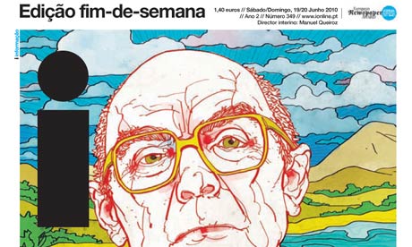
Portuguese daily newspaper i (short for informação, not to be confused with the new bite-sized Independent), has been named the world’s best designed newspaper by the Society for News Design.
Judges in the 32nd annual Best of Newspaper Design Creative Competition said that the paper “stood out for its ability to take the best of the visual language of newspapers, magazines and other publications and create something new that is more than the sum of its parts”.
It’s compact. It’s fresh. It’s consistent, yet full of surprises. Its magazine-like size allows the reader to hold the newspaper close; the format invites the reader to engage more deeply. The publication is packed with information, yet extremely well organized, using elements of layering and editing to draw readers into every page.
i, which is closer to a magazine in format and is stapled, launched in May 2009, aiming to experiment as much as possible with design and layout. “”We just don’t care,” said Martim Figueiredo, publisher and editor of i, at the 2009 World Association of Newspapers (WAN) conference.
“There are no obligations. The only obligation of our news team is to target what people want each morning (…) we organise the news so that people don’t get lost.”
The paper also launched with the idea of targeting an untapped audience. According to a report from the Editors Weblog in 2009, 23 per cent of i’s readers had not regularly read newspapers before.
The title won European Newspaper of the Year in the 2009 European Newspaper Awards.
