Last Friday’s London-based Hacks and Hacker’s Day, run by ScraperWiki (a new data tool set to launch in beta soon), provided some excellent inspiration for journalists and developers alike.
In groups, the programmers and journalists paired up to combine journalistic and data knowledge, resulting in some innovative projects: a visualisation showing the average profile of Conservative candidates standing in safe seats for the General Election (the winning project); graphics showing the most common words used for each horoscope sign; and an attempt to tackle the various formats used by data.gov.uk.
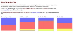
One of the projects, ‘They Write For You’ was an attempt to illustrate the political mix of articles by MPs for British newspapers and broadcasters. Using byline data combined with MP name data, the journalists and developers created this pretty mashup, which can be viewed at this link.
The team took the 2008-2010 data from Journalisted and used ScraperWiki, Python, Ruby and JavaScript to create the visualisation: each newspaper shows a byline breakdown by party. By hovering over a coloured box, users can see which MPs wrote for which newspaper over the same two year period.
 The exact statistics, however, should be treated with some caution, as the information has not yet been cross-checked with other data sets. It would appear, for example, that the Guardian newspaper published more stories by MPs than any other title, but this could be that Journalisted holds more information about the Guardian than its counterparts.
While this analysis is not yet ready to be transformed into a news story, it shows the potential for employing data skills to identify media and political trends.
