Some news outlets are reporting that today will see the biggest day of industrial action for 30 years. But the news landscape and tools used in reporting the strikes are a world away from the 1980s.
Here is a quick round-up to inspire ideas for coverage.
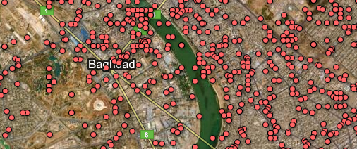
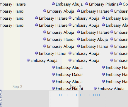
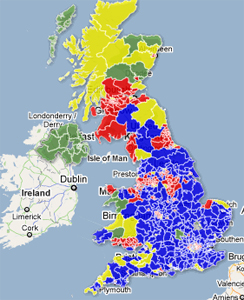
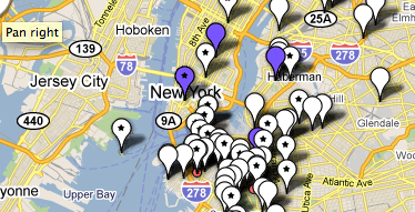
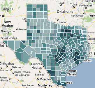
- The Guardian is using Google Maps to plot where rallies are taking place. To build your own map or a timeline you can follow Journalism.co.uk’s how to use Google Fusion Tables. You can also use this tip on how to use Open Heat Map, which can also be embedded on your site;
- The BBC has a live text blog running and student journalists are liveblogging on Elephant. To follow suit, read this how to guide on liveblogging;
- The Telegraph is running a poll to gauge public opinion. Why not run one on your site’s Facebook page? Here’s how to set one up.
The nationals are providing an overview and inspiring debate, but many readers will be turning to local news sites to find out which schools are closed and which services disrupted.
- A simple list is perhaps the most accessible way of accessing information, as created by hyperlocal Uckfield News;
- KentOnline has started a Storify which it is updating throughout the day. You could also use Bundlr, which is similar in that you can collate video, photos and tweets, or Chirpstory presenting selected tweets.
For more tools and guidance on how to use Storify, Audioboo, OpenHeatMap, Many Eyes and Qik, check out this guide to livening up local election reporting.
For ideas in adding audio, follow these 10 tips.
Related content:
How to: get to grips with data journalism
