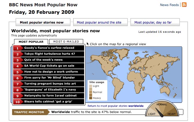
Hadn’t come across this before, so thought I’d share this map form the BBC showing the most popular news stories on the BBC News website:

The map can be filtered by continent (and the UK) to show the top 10 ‘most popular’ and ‘most emailed’ BBC News articles.
There’s also a speedometer indicating how traffic to the site is compared to ‘normal’ levels = compared with the recent traffic average for that time of day calculated from the BBC News Live Stats system.
At time of writing (12:38pm GMT) it shows us that ‘Goody’s fiance’s curfew relaxed’ is the most popular worldwide story, but that worldwide traffic to the site is 35 per cent below normal.
Plus you can see how the number of stories viewed on BBC News online yesterday dropped at peak time when the site went down.