Category Archives: Design and graphics

10,000 Words: Four fixable sins of news site design

For those designing (or redesigning) a news site, this 10,000 Words blog is worth a look. It concentrates on four ‘fixable sins’ of news site design: swamps of share buttons; layers of navigation; avalanches of links; cluttered sidebars.

Let’s be honest: In general, news site design isn’t pretty. I know I’m not the first or last to say it, but I do have a theory about why. It starts off innocently enough — an article, navigation, some ads. But as new tools, gadgets, buttons, widgets, extensions and plugins are introduced to the news consumption scene, that once simple design becomes cluttered with bells and whistles that hold the content hostage.
Full post at this link.

Headline mishaps at Johnston Press and Newsquest titles

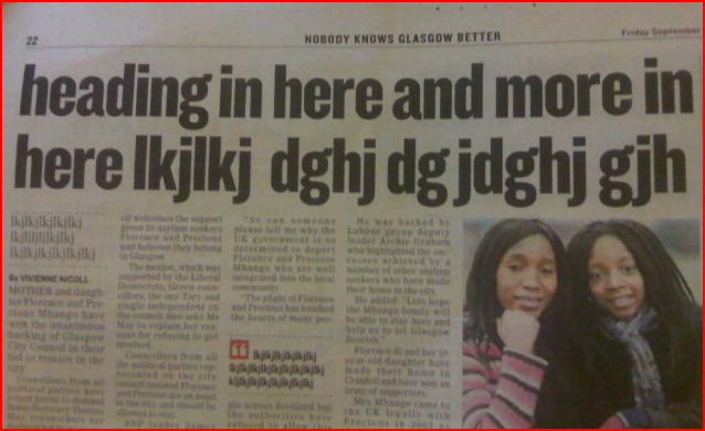
There’s been headline embarrassment in the past week both for Johnston Press and Newsquest. This headline filler was spotted by Jon Slattery in the Glasgow Evening Times on Friday.


Commenting on Slattery’s post Ol Peculier offers a link to another similar headline mess-up over at JP’s the Scarborough Evening News, posted on Facebook.

The use of the Atex production system at JP has been blamed for similar problems which have occured at titles since integration of the new system, such as cropped, misaligned or even missing pictures and other headline gaffs.

Earlier this year the NUJ wrote to the Press Complaints Commission claiming that a memo from Johnston Press management showed the new Atex rules “removed a number of checks for accuracy and seriously undermined the role of the editor, removing their final responsibility for the content of the paper”.

Update: We originally incorrectly linked the Glasgow Evening Times to Johnston Press, it has now been corrected as a Newsquest title.

BBC Dimensions: Making the news more geographically relevant

The BBC has launched ‘Dimensions’ – an interactive map prototype which aims to ignite a public interest in history and the news by making it geographically relevant to an individual.

The technology uses the address of a user to show the scale of an event in history, such as the recent oil spill in the Gulf, and applies it to a map of the user’s home and vicinity.

Discussing the technology, which currently “sits by itself”, BBC commissioning executive Max Gadney says the tools are being considered for use on BBC History and News pages.

When I took over the online History commissioning job, I knew that we would need a mix of traditional, trusted BBC content with some attention-grabbing digital stuff to get people to it.

It’s easier said than done. Many technologists and designers are not really interested in history. Like much of the audience they were turned off by dull lessons at school. Our challenge was to make it relevant to audiences.

See his full post here…

Times joins forces with Applied Works to create iPad interactives

While many newspaper publishers see the iPad as a place for digital replicas of their print editions, the Times has joined forces with brand-strategy company Applied Works to create a series of interactive graphics for its iPad application.

The video below from Applied Works on Vimeo shows the range of interactives – from a World Cup planner to coverage of the the UK’s emergency budget earlier this year:

Full post on Applied Works’ website at this link…