Tool of the week: Tableau Public
What is it? A data visualisations tool, allowing you to create interactive graphs, charts and maps.
How is it of use to journalists? Tableau Public is a free tool that allows journalists to upload an Excel spreadsheet or text file and turn the data into an interactive visualisation that you can embed on your news site or blog.
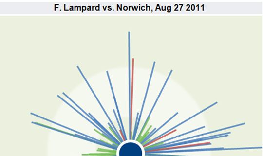
Here are five examples of how Tableau has been used by news sites to tell stories. A quick browse will give you a sense of how the tool can be used to explain news stories.
- We aint got no history: Chelsea passing analysis
- Guardian Datablog: Gender pay gap
- New Scientist: Hurricanes in 2011
- PocketLint: Mobile OS Market Share
- Qualita Della Vita [in Italian]
One of Tableau’s real strengths is providing the reader with the opportunity to move a slider or select a drop down and see how the visualisation alters when a variable changes.
In order to create a visualisation you will need a PC (or a Windows environment on your Mac) and to download the free software.
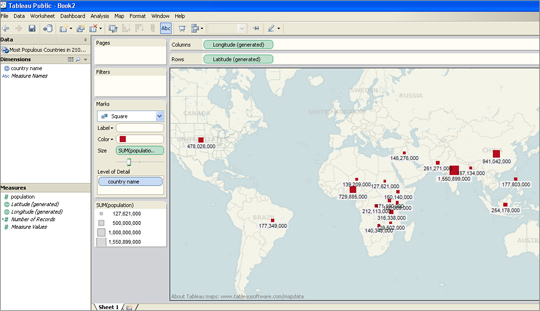
I was able to upload an Excel file and within less than two minutes had produced a map showing what are predicted to be the most-populous countries in 2100.
I had previously used this data set to create a visualisation in Google Fusion Tables and Tableau was equally easy to navigate.
For those who have not tried creating data visualisations, Tableau requires no technical ability and is easier to use than the wizard options that allow you to create graphs in Excel.
There are options for sorting and reordering data, plus changing the colours and view options.
Tableau also has a paid-for option. The difference between the free tool and the premium option is that Tableau Public requires you to publish your visualisation to the web.
Tableau launched version 7.0 a couple of weeks ago and will soon be adding functionality allowing you to create a map using UK postcodes, according to Ross Perez, data analyst at the US-based company.
Disclaimer: Tableau Public is a sponsor of the Journalism.co.uk-organised conference news:rewired. This relationship did not influence this review.

