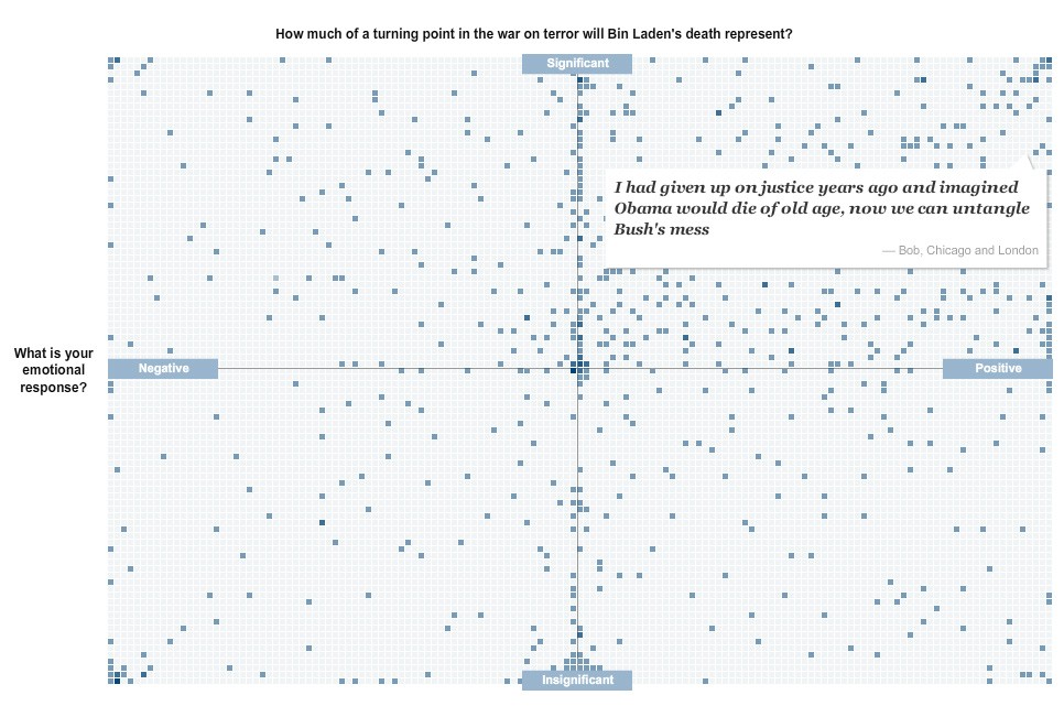
I really like this interactive feature from the excellent New York Times graphics team on readers’ reactions to the death of Osama bin Laden.
As a way of organising responses to a crowdsourcing exercise it isn’t anything new, it takes off from mapping responses geographically. But it is simple and effective, mixing text responses with a broad visual understanding of where the readership’s sentiments fall.
Interesting to see how many people sit right on the fence in the significance stakes.
The image below is a completely non-interactive screengrab of the feature, but follow this link for the full experience.
The NYT team has also put together some impressive graphics showing the layout of the compound, geography of the area and timeline of events.
