Today sees the biggest release of government spending data in history. Government departments have published details of all spending over £25,000 for the past six months and, according to this morning’s announcement, will continue to publish this expenditure data on a monthly basis.
According to minister for the Cabinet Office and paymaster general Francis Maude, it is part of a drive “to make the UK the most transparent and accountable government in the world”.
We’ve already released a revolutionary amount of data over the last six months, from the salaries of the highest earning civil servants to organisation structure charts which give people a real insight into the workings of government and is already being used in new and innovative ways.
A huge amount of public spending data has indeed been published under the current government, and today’s release is a significant addition to that. So who is doing what with the vast amount of new data? And who is making it easier for others to crunch the numbers?
The Guardian is usually streets ahead of other newspapers in processing large datasets and today’s coverage is no exception:
- The excellent Guardian Data Blog posted an interactive visualisation and data spreadsheets this morning;
- And published searchable datasets and called on readers to help crowdsource analysis;
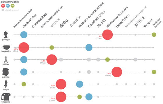
- Leading designer and data expert David McCandless has also lent a hand, analysing expenditure department by department.
Who else?
- The BBC have also been up to a bit of crowdsourcing asking people to send in any items of interest they have picked out;
- The Telegraph is leading with coalition spend on PR and marketing, but gets pretty quickly stuck into yoga and pet food, the real nitty gritty.
- Pets are not only being fed, according to Thinq.co.uk, but kept on trend: “Among the more bizarre payments listed is £1,000 given the Department for Business, Innovation and Skills to a company that sells jewel-encrusted dog collars.”
- The Financial Times (registration required) has done some analysis of the effect of cuts on the private sector, but also made sure to dig some dirt: £750 an all-day meeting in a bar for Equalities and Human Rights Commission staff and £164,000 on water coolers for staff at HMRC.
There are, of course, different ways of looking at the numbers, as one Guardian commenter, LudwigsLughole, highlights:
There are 90,000 HMRC staff. They spent £164,000 in six months on bottled spring water. That equates to an annual spend per head of only £3.64. So the FT are seriously suggesting that £3.64 per head to give staff fresh bottled water is excessive? Pathetic journalism.
Exploring the data yourself
“The biggest issue with all these numbers is, how do you use them? If people don’t have the tools to interrogate the spreadsheets, they may as well be written in Latin.” – Simon Rogers, Guardian Data Blog editor.
“Releasing data is all well and good, but to encourage the nation’s ‘armchair auditors’, it must be readily usable.” – Martin Stabe, FT.
Here are some of the places you can go, along with the Guardian, to have a crack at the numbers yourself. Please add your own suggestions in the comments below.
- @timetric has built an interactive tool which you can use to produce various diffrerent graphs from the dataset, and is blogging about the release here;
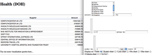
- Open University communications and systems lecturer Tony Hirst has been working on a ‘Government Data Spending Explorer’:
Lots and lots of data. So what? My take on it was to find a quick and dirty way to cobble a query interface around the data, so here’s what I spent an hour or so doing in the early hours of last night, and a couple of hours this morning… tinkering with a Gov spending data spreadsheet explorer:
- Head to Where Does My Money Go? for more good work in making the data searchable and interactive:
[T]he real power of this data will become clear in the months to come, as developers and researchers – you? – start to link it to other information, like the magisterial OpenlyLocal and the exciting WhosLobbying. Please make use of our API and loading scripts to do so.
Also see the good suggestions on Where Does My Money Go? for how government data publishing might be improved in the future.
So, coming full circle I return to the Guardian, and to the data-minded Simon Rogers, who asks: Will the government spending data really change the world?
A big question. Feel free to add your opinion below and any other data projects you have seen today or that pop up in the future.


Want to analyze the UK government’s recent batch of expenditure data (above £25,000, from May 2010) using advanced, drill-down spend analytics? Unlike other sources, the web-based RA.Pid spend analytics platform enables you to analyze spend by a number of views (dimensions) including by department, by supplier, by expense type, expense area. You can also search by key word, i.e., look for a particular transaction within a department. You’re in control of what you want to analyze. To view the data, which we pulled from the Guardian’s website (it was quicker than doing so from data.gov.uk) please visit https://www.rosslynanalytics.com/rosslyn-uk-expenditure.php
Kind regards,
Lance
Lance Mercereau
Rosslyn Analytics
Lm@rosslynanalytics.com