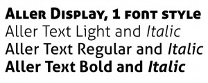
Quite a long time ago (September 8, in fact), a press release arrived. It announced the arrival of a rather sophisticated font, courtesy of the Danish School of Media and Journalism – available to all.
But, the font didn’t arrive with it so I held off publishing this post; it’s become a bit of a joke after it’s been sitting in the draft folder for so long. But I couldn’t bring myself to delete it.
Now, two months later, the font has arrived. Here, we introduce you to: ALLER.

Aller has been especially designed for the school by Dalton Maag and it will be available for free downloads for two years.
Marc Weymann was the lead designer, and he worked in collaboration with Henrik Birkvig of The Danish School of Media and Journalism.
It beat off other fonts for its ‘highly legible’ and ‘lovely texture’ and the font’s pitch explained how ‘the cleanness of the letter forms are softened when a curve leads into a perky point in some of the characters.’
I don’t like it… Is that bad?
Not really down with the non-intersecting lines in the Ks, Xs and Ys, and really not down with the mix of caps and lower case in the Display weight.
Will probably download it anyway.