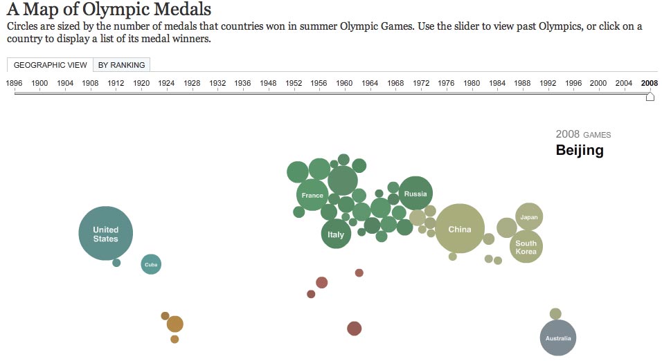
The New York Times has created a great visualisation tool for the medals table from the Beijing Olympics.
Each country that has made it onto the podium is represented by a circle – its size relative to the number of medals won.
Clicking on the graphic gives an overview of how many gold, silver and bronze accolades have been won, with a fuller breakdown listed below the map.
