The Linked and Open Data conversation is extremely relevant for news telling and I’m hoping this week’s Linked Data meetup – Web of Data – will introduce me to some new ideas which could be used effectively in journalism. There’s some incredibly inspiring stuff going on outside traditional newsrooms, but some media organisations have also been building some fantastic interactive features on their sites, which allow users to customise the way they view and consume data.
Last month at the first official UK Future of News Group meeting, the Financial Times deputy interactive editor, Cynthia O’Murchu, shared some inspiring ways of news storytelling. She later sent me a list of inspirational links, which I’ll share with you here.
O’Murchu believes that data visualisations can add so much value to a story, and allow more user control, too. The great thing about various data visualisations was that “you allow people to choose their story”, she said. Here are some of the visualisations she flagged up in particular:
[Note: for FT.com articles, you will need to register or subscribe to receive full access after a limited number of views]
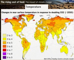
 This Financial Times feature from 2007 mapped the different factors affecting food prices around the world: export restrictions, price measures, civil unrest, trade balances and inflation. Additional text boxes, brought up by clicking on a certain location, give additional information.
Another feature brought together video and slide shows that explain why food prices are rising.
It was about presenting things in a comprehensible way for users to understand, said O’Murchu.
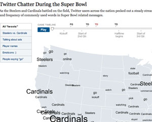
She flagged up how the New York Times had used geolocal information to show what people were talking about on Twitter (see below, for example).
O’Murchu urged the room of journalists to go and play with data tools: “If you’re inclined to do a type of story telling, just do it!”
Some of the other interactive packages at the FT:
- One of O’Murchu’s own, ‘The Pensions Crisis’ (May 2009) – experts advise on dilemmas faced by savers, companies and governments.
- ‘Trading places: Migration in the crisis’ (August 2009). Audio and video slide shows examining which migrants were hit hardest in the economic downturn.
Data visualisations:
- ‘Shrinking Titans’ (February 2009): a visualisation showing the scale of Obama’s proposed pay caps for the executives of large companies.
- ‘Oil and gas chief executives: are they worth it?’ (November 2009): graphic allowing users to view different information about chief executives’ compensation packages.
- ‘The decade for global banks’ (March 2009) An interactive allowing users to see how different banks fared from 1999 -2009.
- ‘How different groups spend their day’ on NYTimes.com (July 2009): a rather beautiful interactive graph showing chunks of time spent on various activities by different groups, with time of day along the X axis. Accompanying news story at this link.
- Guardian.co.uk (September 2008): De Menezies shooting with CCTV videos labelled, with angle, on tube station map.
- International Monetary Fund (IMF) Data Mapper, looking at real GDP growth, by country and over time.
She also showed examples of applications that helped users customise information, to help with a particular problem:
- Is it better to rent or buy? An interactive calculator over at the New York Times, for comparing the cost of renting or buying property. Сайт – каталог индивидуалок: проститутки Самара Сохрани себе чтобы не потерять
O’Murchu also mentioned the non-profit information site Gapminder. In this video, Gapminder’s Hans Rosling shows users how countries have developed since 1809, based on individual life expectancy and income. [You can see another Rosling video here, ‘Let my dataset change your mindset’].
O’Murchu also recommends taking a look at these links, for further inspiration:
And finally, for even more examples of interactive graphics:
- If you’re registered or subscribed to the FT.com site you can browse through all their interactive graphics at this link…
- The Guardian’s bank of interactive features can be found here: http://www.guardian.co.uk/interactive
- The New York Times’ full multimedia content (interactive features on the right). Check them out quickly before the paywall goes up next year.
- 10,000words.net by Mark Luckie, now multimedia producer for California Watch, flags up clever interactives.
- Times Labs is showcasing ways to use data at this link.
- David McCandless’ new book, ‘Information is Beautiful’, was published this month. He shares excellent visualisations here: http://www.informationisbeautiful.net/
What are your favourites? Add them in the comments below…

Pingback: Visualizar as notícias : Ponto Media
Pingback: links for 2010-02-24 « A Web editor's tale
Pingback: Guardian’s phone hacking interactive: ‘The growing web’ | Journalism.co.uk Editors' Blog
Pingback: Coders meet journalists; journalists meet coders | Journalism.co.uk Editors' Blog
Pingback: links for 2010-04-29 « Onlinejournalismtest's Blog