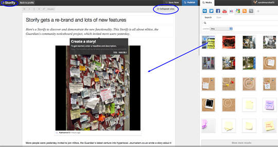
Storify has a new look, logo and functionality. The tool, which allows you to curate stories using elements from social media like tweets, Flickr photos and YouTube videos, is today rolling out its new features and promising to “revise the entire reader experience” in the coming months.
Building a Storify is smoother and the ability to narrate and explain your curated story is improved. You now view photos as a gallery and drag and drop from right to left. The system also seems more robust. I also tested closing a browser without saving while building this test Storify, which is all about the Guardian’s n0tice platform (the news group’s latest venture into hyperlocal which yesterday invited more users) and found my Storify had auto-saved.
Xavier Damman, Storify’s co-founder, explained the changes:
We’ve taken feedback from users and have rebuilt Storify on a stronger and more reliable foundation, which includes:
- A new logo and new look. The search and the editor sides of the interface have been switched, and we have made it easier to write your own text into stories, and to add subheds, or headers.
- An elegant new drag-and-drop functionality, which makes it easier to build stories, and to reorganise them.
- A collapsed view of your Storify story while it’s being built, so you can see it all easily, and organise it better.
- A revised Storypad bookmarklet that lets you gather information from all over the web for your Storify stories. You can add the material to a story at any time, and share your Storypad with other users.
The changes are explained in more detail using, of course, Storify itself below:

Pingback: Weekly comms news round up | Cision UK Blog